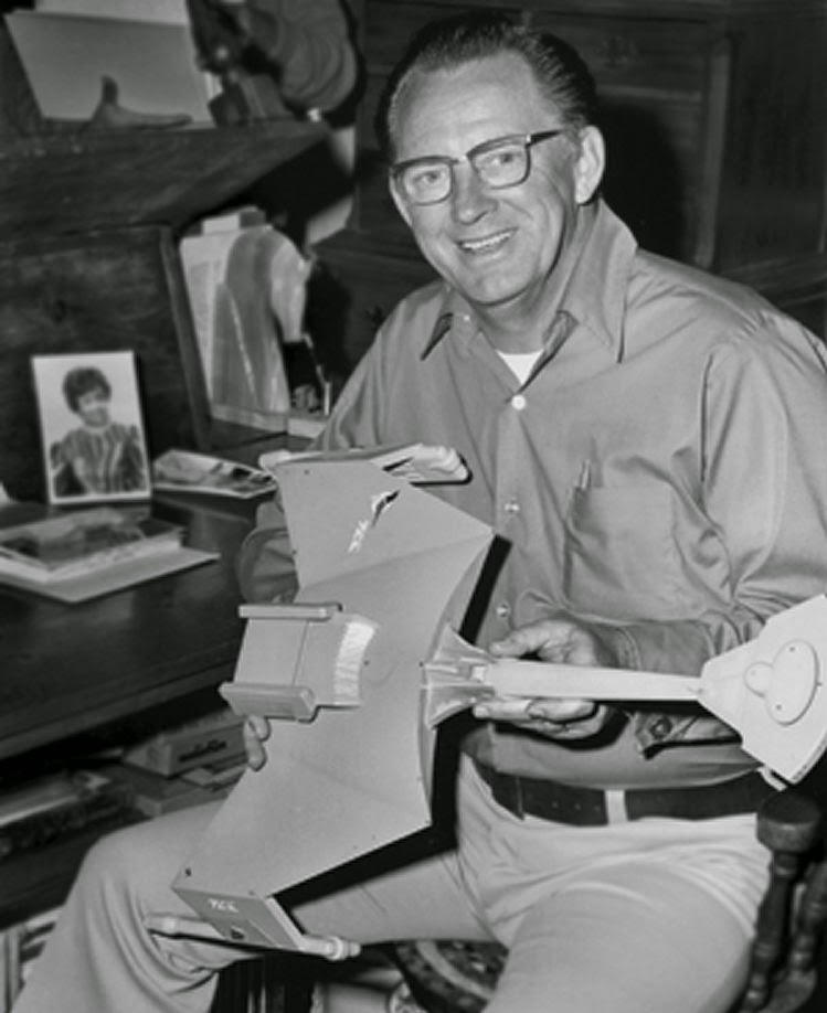
Unseen TOS....

I totally agree that TOS was very good about not showing more than one ship in the same shot in situations where the ships are supposed to be far apart. The only time I remember where it was questionable was "The Tholian Web" with the web spinners.

However, have you guys ever tallied the actual number of times more than one ship appeared in the same shot? As far as I can tell there are 29 episodes that ships (space creatures and shuttles excluded) encountered each other and of those, 11 episodes show more than one ship in the same shot.

That makes 38% of these space encounters to have more than one ship in the same shot. That doesn't sound like it being a rare occurrence IMO.

More than 1 ship in same shot - Name - Ships
Yes - The Corbomite Maneuver - Enterprise+Cube, Enterprise+Fesarius, Enterprise+Fesarius Small Ship
No - Mudd's Women
No - Charlie X
No - Balance of Terror
No - The Conscience of the King
No - Court Martial
No - Arena
Yes - The Alternative Factor - Enterprise with phaser straight to planet targeting Lazarus' ship
Yes - Space Seed - Enterprise+Botany Bay
No - Errand of Mercy
No - Operation Annihilate
No - Friday's Child
Yes - The Doomsday Machine - Enterprise+Constellation, Enterprise+DDM, Constellation+DDM
No - The Changeling
No - The Deadly Years
Yes - The Trouble With Tribbles - Enterprise+K7
No - Journey to Babel
No - Patterns of Force
Yes - The Ultimate Computer - Lexington+Excalibur+Potemkin+Hood
Yes - The Omega Glory - Enterprise+Exeter
Yes - Spectre of the Gun - Enterprise+Melkotian Device
No - Elaan of Troyius
Yes - The Enterprise Incident - Enterprise+3 Romulan Battlecruisers
No - Spock's Brain
Yes - The Tholian Web - Enterprise+Defiant, Enterprise+Tholian Webspinners
Yes - For The World is Hollow and I Have Touched the Sky - Enterprise+Asteroid Ship
No - Day of the Dove
No - Let That Be Your Last Battlefield
No - The Way to Eden
 
^^ A more meaningful analysis is how many of those were miniatures or objects actually photographed together versus shots composited with more than one exposure.

The four ships in “The Ultimate Computer” were actually one miniature composited to look like four separate ships, but the giveaway was the perspective was all wrong for four ships in the same frame.
 
^^ Considering how fragmented the information we have on the models and FX shots from TOS then I do not see how you can get any meaningful analysis. What we do know for certain is that there are 11 episodes that have two or more ships in the same frame. Sure they could be composited a bit wonky but that is the charm of TOS and isn't that what you're trying to emulate?
 
Last edited:
If they had had “a bit more time and money” then they could have had more polished fx shots.

One can wonder what difference an extra $5,000 (1960’s dollars) per episode would make. Or an extra $10,000. Seems like nothing today, but back then it would have been real money.
 
Last edited:
If they had had “a bit more time and money” then they could have had more polished fx shots.

One can wonder what difference an extra $5,000 (1960’s dollars) per episode would make. Or an extra $10,000. Seems like nothing today, but back then it would have been real money.
This is the reason I always want to slap people who call TOS effects "cheesy." Maybe by today's standards, but back then, they were state of the art. And expensive.
 
TOS was trying to do a feature film level concept on an average television show budget. It’s amazing what they managed to accomplish faced with those constraints.
 
The TOS ship effects still look pretty good when compared to the TOS-R version.
TOS had a look, an aesthetic, that was distinct. By putting in contemporary cgi fx to make it look more in line with then TNG/DS9/VOY/ENT fx they totally disrupted that distinct overall look TOS had. After the novelty quickly wore off you’re left with poorly aging mediocre cgi that just doesn’t work with the remaining live-action footage. It’s like trying to fit actual photographs as panels within a comic book with a particular artistic style.

Once again TOS was shortchanged. Just as TOS deserved a better budget for the kind of show it was it also deserved a better and more focused approach to clean up the original fx or remake them to look like cleaned up original fx (which some fans have done).

I have been thinking about expanding my Unseen TOS project somewhat to include how things we are already familiar with could have been done a bit better, using the resources they had available, without costing a lot more time and money.
 
Last edited:
I think I've taken this about as far as I'm comfortable with. Maybe one or two more little tweaks. Next up is to add a few windows and start thinking about colouring. I've added a bit of detail to suggest disruptor emitters (nubs on leading and trailing edges of the swept back support pylons) and a small housing on the bow to suggest torpedo launchers. The rest is largely up to imagination and interpretation. In terms of colouring I will avoid the darker tones of post TOS Trek. Certainly Wah Chang did not paint his BoP in sombre tones and neither did Jefferies colour his D7 design such. I will take my cue from them and particularly Jefferies' thinking regarding the D7–if thats how he viewed it a year or two later I have little reason to think he would feel otherwise during the first season.

 
Last edited:
The problem there is - we don't actually know what the colors really were on the D7.

The first miniature may have gone through several different schemes during it's short time in use.
Matt-Jefferies.jpg

That photo - while it's in black and white shows somewhat clearly, a two-tone finish. Matt stated it was a greenish grey and a darker grey color over the back.

There also is no sign of a two-tone finish around the bridge/sensor dome area as seen later.

He mentions taking queues from Manta Rays and those critters tend toward a very pale grey tone on their bellies and an almost black tone on their backs.

It's clearly not the finish in that photo. It may be similar to the second miniature now in Seattle:
LzNc0sz.jpg

However, there are also the shots from the Garber Center at NASM that show what it looked like before it was sent back to Paramount in 1977:
HjRei9E.jpg

Very distinctly three-tone finish. In fact, looks somewhat like RLM75/RLM76/RLM78 (WW2 Luftwaffe colors). This would fit Matt since was a founding member of the American Aviation Historical Society, aviation artist, veteran of the USAAC/USAAF in WW2 etc...
 
Last edited:
I’m pretty sure I’ve seen colour photos of the D7 miniature somewhere and it did look sorta turquoise and lilac or something. I’m not going to try reproducing that exactly, but play with unusual colouring to get an interesting effect. We’ll see.

Apparently the consensus is the upper surfaces are light grey and the lower surfaces are greenish grey. I’m not sure where I thought there was some purplish hue or something in there.
 
Last edited:
Fixed the original post (had to host the images myself).

The colors on the second miniature are basically similar to these paint "chips" from AK Interactive's current 3rd Generation Acrylic paints.

WW1 German Lilac
g7AXGao.jpg

WW1 German Grey-Green Primer
uJElLPq.jpg

Maybe RLM 76 Version 1
BhAIvyo.jpg

Both greenish greys are too dark and the paints themselves - of course - are much darker when dry (duh).

It seems possible that the first miniature was painted similar to this but, without the Lilac tone around the bridge - in it's original form. Though, Matt's comment about it being a grey tone on the back of the ship contradicts this.

The finish on the first miniature at the NASM (before being 'borrowed and broken' by Paramount) were similar to these:
RLM 75
s3DmOY4.jpg

RLM 76 Version 2
hZMRrlH.jpg

RLM 78 1941
IVSzxLX.jpg


Both of the later colors also need to be lightened quite a bit to be closer to that shot. The RLM 75 is very dark but, some shots of the miniature after coming back (in pieces) seem to support a very dark tone.

Yes, I've been digging into this subject for a while. It's fairly obvious now that the first miniature was repainted several times. It's doubtful that the final combination at the NASM was ever onscreen. I believe the scheme in Elan of Troyius was probably similar to the Lilac on the upper surfaces of the aft hull and around the bridge (Cobra head). RLM 76 for the forward pod and boom and then RLM 78 for the lower aft hull and engines.
 
^^ Very cool! Those samples are great references!

Unfortunately those colours don’t really show up onscreen. In the episodes the ship looks pretty much light grey all over, probably due to the studio lighting.
 
Always washed out by stage lighting - just like the Enterprise herself (probably the same lighting setup).

I actually suspect that's why the miniature was repainted - the original scheme probably washed out really badly under strong lights.

I also suspect that some of the test footage was used as there are a number of shots that show a very light washed out image - particularly the shots where the miniature is shown head-on. Little or no contrast between any colors. Probably the original two-tone.

The million dollar question being "What was that color on the back of the original miniature?". Lilac, or a grey tone?
 
Here we are. I think I'm done with tweaking. Now working on colours.


As I said upthread I see this with a main hull four decks thick. Klingons like hardship so the ceilings are set at 8 to 8.5 ft. the deck/ceilings are about 1 ft. I did a rough deck layout to get my windows set consistently. I didn't want a pronounced neck between the forward and aft sections, but I put some recesses on the upper and lower part of the forward hull to sorta hint at the idea.

As I said earlier I don’t want to just mimic the D7 on a smaller scale, but one can reason Jefferies could have had similar ideas a year earlier for a smaller craft. Certainly it would likely be less elaborate than the full size warship.

If the Klingons really are saddled with “poor” planets and limited resources then it’s possible ships like this scout might be more commonly encountered than the larger and much more powerful D7.
 
Last edited:
Wow, go on a three day weekend and come back to that post. Oh well. No disrespect to MJ or GR was ever intended or insinuated.
(And "[Rube]? Who talks like that?" - Chris Knight, Real Genius :lol: )
Here we are. I think I'm done with tweaking. Now working on colours.


As I said upthread I see this with a main hull four decks thick. Klingons like hardship so the ceilings are set at 8 to 8.5 ft. the deck/ceilings are about 1 ft. I did a rough deck layout to get my windows set consistently. I didn't want a pronounced neck between the forward and aft sections, but I put some recesses on the upper and lower part of the forward hull to sorta hint at the idea.

As I said earlier I don’t want to just mimic the D7 on a smaller scale, but one can reason Jefferies could have had similar ideas a year earlier for a smaller craft. Certainly it would likely be less elaborate than the full size warship.

If the Klingons really are saddled with “poor” planets and limited resources then it’s possible ships like this scout might be more commonly encountered than the larger and much more powerful D7.
Does it land planetside? If so, maybe a bit of a chin—say, a fifth deck in that area—to facilitate that.
 
(And "[Rube]? Who talks like that?" - Chris Knight, Real Genius :lol:
That's actually "Rue?" because the character said "You'll rue the day!"
Here we are. I think I'm done with tweaking. Now working on colours.


As I said upthread I see this with a main hull four decks thick. Klingons like hardship so the ceilings are set at 8 to 8.5 ft. the deck/ceilings are about 1 ft. I did a rough deck layout to get my windows set consistently. I didn't want a pronounced neck between the forward and aft sections, but I put some recesses on the upper and lower part of the forward hull to sorta hint at the idea.

As I said earlier I don’t want to just mimic the D7 on a smaller scale, but one can reason Jefferies could have had similar ideas a year earlier for a smaller craft. Certainly it would likely be less elaborate than the full size warship.

If the Klingons really are saddled with “poor” planets and limited resources then it’s possible ships like this scout might be more commonly encountered than the larger and much more powerful D7.
Much as this isn't the intent, I can see this as a TOS era BOP. It fits the design ethic for both that and the D7.
 
That's actually "Rue?" because the character said "You'll rue the day!"
It is, which is why there are square brackets around 'rube', denoting that I have changed the quote. The use of one archaic word reminded me of that quote about the other.
Much as this isn't the intent, I can see this as a TOS era BOP. It fits the design ethic for both that and the D7.
Exactly.
 
Back
Top