All this talk about pylons and stuff, if they created modern renders of both the TOS and the DISC versions of the TOS Enterprise, I wouldn't even be able to tell which is which. And I definitely wouldn't be able to tell by their pylon shape.
-
Welcome! The TrekBBS is the number one place to chat about Star Trek with like-minded fans.
If you are not already a member then please register an account and join in the discussion!
You are using an out of date browser. It may not display this or other websites correctly.
You should upgrade or use an alternative browser.
You should upgrade or use an alternative browser.
Spoilers Strange New Worlds General Discussion Thread
- Thread starter NewHeavensNewEarth
- Start date
[*Chef's kiss*]
Top one looks better IMO.
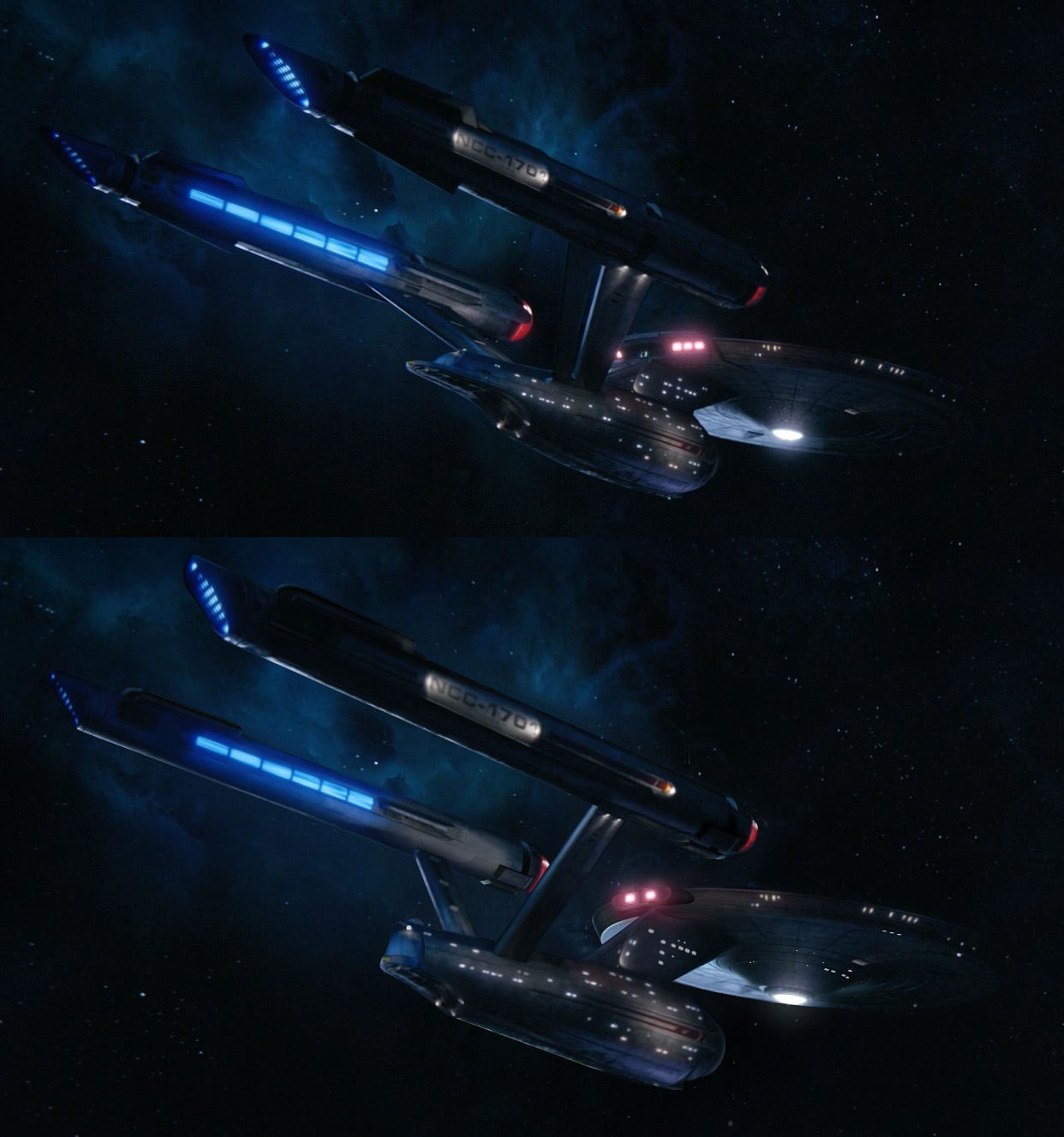
Yeah that was Eaves final submitted design, but someone higher up asked the FX house to change the pylons to slanted.
They also made the deflector single antennae (which I prefer) and added more glows to the nacelles.
Eaves only made the deflector double pronged so it would fit with all the other Season 1 ships which also had double deflector antennae. You can't see it in those orthos, but the inward facing sides of the nacelles don't have the blue glows either, they're grey/white similar to the original.
Damn, that look works. Both the one in the artwork and the DSC version with straight pylons.
Yeah that was Eaves final submitted design, but someone higher up asked the FX house to change the pylons to slanted.
They also made the deflector single antennae (which I prefer) and added more glows to the nacelles.
Eaves only made the deflector double pronged so it would fit with all the other Season 1 ships which also had double deflector antennae. You can't see it in those orthos, but the inward facing sides of the nacelles don't have the blue glows either, they're grey/white similar to the original.
Last edited:
I never liked the double-prong deflector dish.
Prolly don’t like Klingons, either.I never liked the double-prong deflector dish.
Well, the deflector dish doesn't pee two streams on walls. 
In Eaves' mind according to his comments in the Eaglemoss booklet, (so 99% won't happen since he doesn't decide story.) For a future Refit, the rear part of the pylons could be removed to make it look more TOS. it does have the same black rectangles seen on the original.


He tried to design parts of it modular, so it looks like it could be refit to something that looks closer to the TOS version.
He tried to design parts of it modular, so it looks like it could be refit to something that looks closer to the TOS version.
Same. No matter what people say the view doesn't stand out.All this talk about pylons and stuff, if they created modern renders of both the TOS and the DISC versions of the TOS Enterprise, I wouldn't even be able to tell which is which. And I definitely wouldn't be able to tell by their pylon shape.
Please tell me something then. During the original series run there were multiple models of the USS Enterprise used for effects shots. Said models had minor visual differences (such as nacelle caps with antenna, as well as the nacelle caps being painted differently compared to ones fitted with electric lights, or nacelles with exhaust vents, compare tin this cells with balls on the end.)
TNG too. I believe there were 3 main models? 2 that had some very obvious differences.
Roughly count the differences between the Cage, WNMHGB, TOS models. Roughly count those between the TNG models. Then those between the Discoprise and the TOS one. You don't even have to count, just guessIn the same way that you're desperately trying to claim that Star Trek has had visual consistency all through its run. The problem is that has never been the case from day one. So yes, please exit your high horse.

A CBS-approved reference book published in just the past couple of years states that the Enterprise looks like that in DSC and looks the way it does in TOS by the time Kirk takes command of the ship. I know books aren't canon but that sounds like a good answer to me. By 2265 the ship has the TOS look to it. A post-Pike drydock refit or one that even happens while he's still Captain.
Because it would have to fit between two very similar ones. If they went from A to B, why did they go back to A then? If there's a refit at the end of SNW that turns the ship into something closer to TOS, it will at least match at that end and only contradict the Cage version. They don't even have to show the TOS version at the end of SNW. Just show the ship undergoing repairs, and the old pylons and neck are gone... or some worker bees carrying TOS parts to the ship, something like that. They don't even have to show anything at all, and can just run a log entry that mentions getting new parts.Hell, I'm critical of some of the DSC and SNW look but why does this not occur to people? It's not a retcon designed to erase how the ship looked in TOS. It's just the way she looked in the years right before that series. Nobody at CBS is saying "the TOS look is silly and outdated and should be rejected" and if they are they're the silly ones.
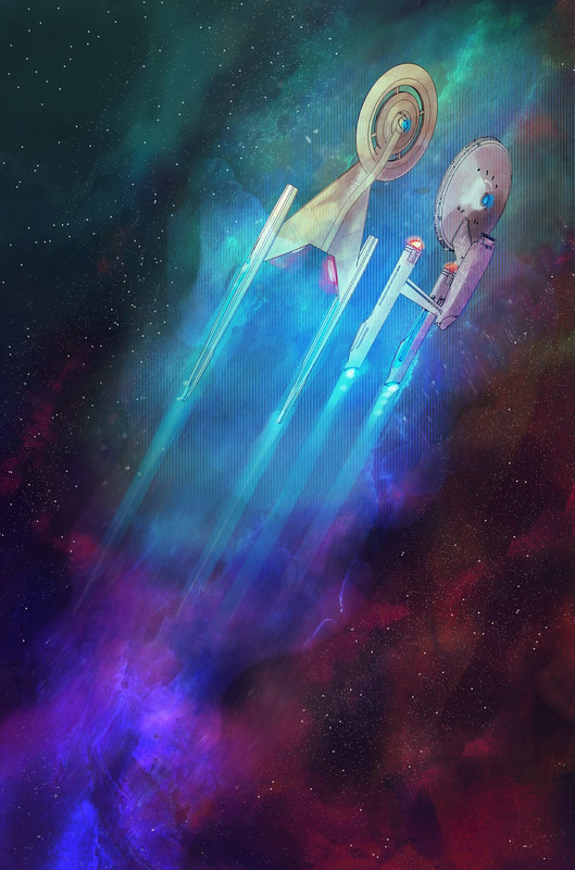
Move the pylons a bit more forward and it's great.I just found this piece of artwork on Facebook and had to share it. Discovery and the TOS Enterprise but with DSC-style pylons with the gap in them but also...straightened and shifted back on the stardrive section and closer to the main hangar bay doors. I'm not going to lie, this look works for me.
Now can any of the changelings here tell me why the bottom picture "wouldn't work for modern audiences"? What makes the upper one "modern 2020s" and the lower one "outdated 60s", please?
")
Last edited:
I can't tell the difference so go for it. After this thread I want the faithful reproduction of TOS. I want them to James Cawlet/Star Trek Phase 2 this franchise. I want it so that there is zero argument.Now can any of the changelings here tell me why the bottom picture "wouldn't work for modern audiences"? What makes the upper one "modern 2020s" and the lower one "outdated 60s", please?
#makeTrekfunagain.
Last edited:
the one on the bottom is far superior and it’s really not close.
Obvious differences highlighted...

(my own personal opinion color code: green, minor change; red, major change; pictures from EAS)
Is the overall difference between the upper and the middle one seriously comparable to the difference between those and the bottom one?
Timeline as suggested:

Does that make sense?
(my own personal opinion color code: green, minor change; red, major change; pictures from EAS)
Is the overall difference between the upper and the middle one seriously comparable to the difference between those and the bottom one?
Timeline as suggested:
Does that make sense?
Yes, in a post scarcity world.Does that make sense
Not entirely. It's close enough for my money.Is the overall difference between the upper and the middle one seriously comparable to the difference between those and the bottom one?
I'm sure if they (hypothetically) write Captain Kirk into the show and have him able to shoot phasers from his eyes because the showrunners have decided to make him more modern, then different people would be expressing their annoyance with that, and I hope there'd be some understanding to why that might be frustrating.
I admit, I now want to see a version of Kirk with phaser eyes.


That's why we need a Star Trek: What If...? series.
It was indeed. Doug cheated with his cutaway and scaled the ship up to comfortably fit the 9'+ sets inside (unlike Franz Joseph who assumed 8' ceilings)There was a user here, who's name I'm blanking on, that measured Doug Drexler's TOS Connie cutaway to be around 400+ meters if using the TOS set height + Leonard Nimoy's height compared to doors and such.
I think it was @F. King Daniel ?
Did everyone forget "Ephraim and Dot"? The Discovery version of the design overwrote the TOS one in that episode, leading into the unchanged classic movie design.Obvious differences highlighted...
(my own personal opinion color code: green, minor change; red, major change; pictures from EAS)
Is the overall difference between the upper and the middle one seriously comparable to the difference between those and the bottom one?
Timeline as suggested:
Does that make sense?
They recast the ship just like they did Pike and Spock. If you're gonna come up with diagrams to explain refits, I'd like some to show exactly what plastic surgery Ethan Peck has to look exactly like Leonard Nimoy.
Well I had managed to forget Ephraim and Dot, until you brought it up again!
Also we've got deep fake technology appearing on other series now to de-age actors or give them another actor's appearance. Fortunately we don't have to go that far with the classic Enterprise design, as it hasn't aged and it's still working.
Also we've got deep fake technology appearing on other series now to de-age actors or give them another actor's appearance. Fortunately we don't have to go that far with the classic Enterprise design, as it hasn't aged and it's still working.
Similar threads
- Poll
- Replies
- 543
- Views
- 44K
- Poll
- Replies
- 1K
- Views
- 60K
- Poll
- Replies
- 556
- Views
- 49K
- Replies
- 3
- Views
- 330
- Poll
- Replies
- 619
- Views
- 41K
If you are not already a member then please register an account and join in the discussion!