Is anyone really going to argue that the original TWILIGHT ZONE has disappeared forever because it's in black-and-what and not exactly filmed in 4K?
Well, film is natively high-definition. Though TZ did have a handful of episodes shot on videotape.
Is anyone really going to argue that the original TWILIGHT ZONE has disappeared forever because it's in black-and-what and not exactly filmed in 4K?
Is anyone really going to argue that the original TWILIGHT ZONE has disappeared forever because it's in black-and-what and not exactly filmed in 4K?
It might be a smaller portion of the original audience but that does not mean it disappears, especially for those who want to enjoy the material as it was originally presented.
So, everything should be updated then because people give up easily? Like, I know I'm the outlier preferring older style of viewing to the ultra crisp unrealistic looking tech nowadays but are people that lazy they can't be bothered? Yeah, the answer is probably yes.It does get harder and harder to locate, though. Most seekers give up and watch something else.
Some remastering of DS9 was done for the documentary, "What We Left Behind". I suspect it was a test to gauge reactions, and pending the costs of new tech coming down over time.
That wasn't done by CBS though, just with their help and permission.
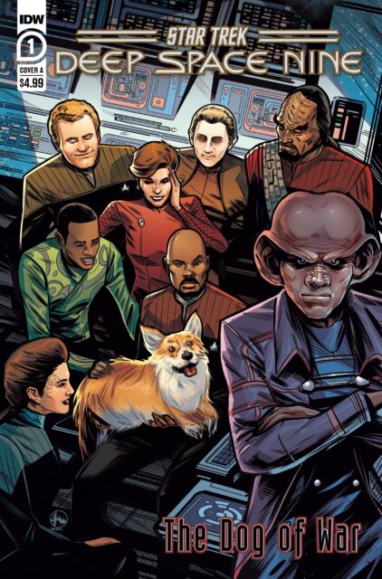
The uniforms on the cover are weird though, they look like the post-First Contact uniforms, but have the early seasons' colored shoulders.
First thought upon seeing a deep space corgi was wondering if it was a tribute to the late Queen Elizabeth who was the world’s most famous corgi lover.
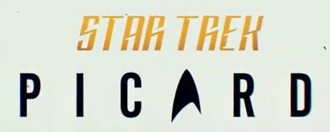
I am obligated to comment on the weird logo variant. Has the TOS-style branding taken over series that didn't have it to begin with!?
This came up on the trekmovie site....
https://trekmovie.com/2022/12/14/id...-deep-space-nine-with-dogs-of-war-miniseries/
It also happened to DiscoveryI am obligated to comment on the weird logo variant. Has the TOS-style branding taken over series that didn't have it to begin with!?

I am obligated to comment on the weird logo variant. Has the TOS-style branding taken over series that didn't have it to begin with!?
It also happened to Discovery

At least on Disco, the show's own logo changed.It also happened to Discovery
I hadn't noticed this TNG stuff, thanks. The Paramount+ shows have largely moved to a unified logo, but I hadn't known that they were branding stuff tying into the older shows this way too.They do seem to now be using it as an overall Star Trek branding logo, regardless of series.
And Picard...
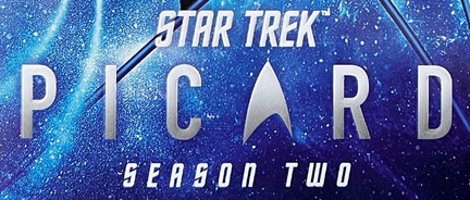
Season 2 Intro
Subsequently changed for merchandising:
Season 2 Blu-Ray
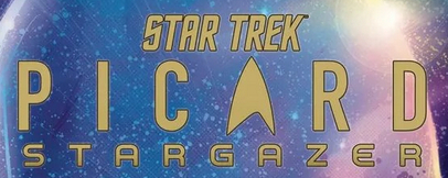
Stargazer Issue #1
And here it is used in some TNG merchandising (with, I believe, the "The Next Generation" subtitle written in Serpentine):
heh IIRC the first airing of Season 3 Episode 1 used the old logo typeface (accidentally?), but they later went back and 'fixed' it.It also happened to Discovery
I bet if Terry Matalas had his way, Season 3 would probably use the TNG Title Card font lolIt's weird to me that the on-screen logo for Picard S2 still used Redrail Superfast. I don't think anything Picard-branded ever used it except the show itself!
We use essential cookies to make this site work, and optional cookies to enhance your experience.