-
Welcome! The TrekBBS is the number one place to chat about Star Trek with like-minded fans.
If you are not already a member then please register an account and join in the discussion!
You are using an out of date browser. It may not display this or other websites correctly.
You should upgrade or use an alternative browser.
You should upgrade or use an alternative browser.
Spoilers Star Trek:Discovery Uniforms Sneak Peak
- Thread starter uniderth
- Start date
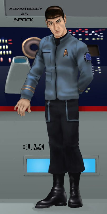
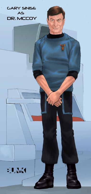
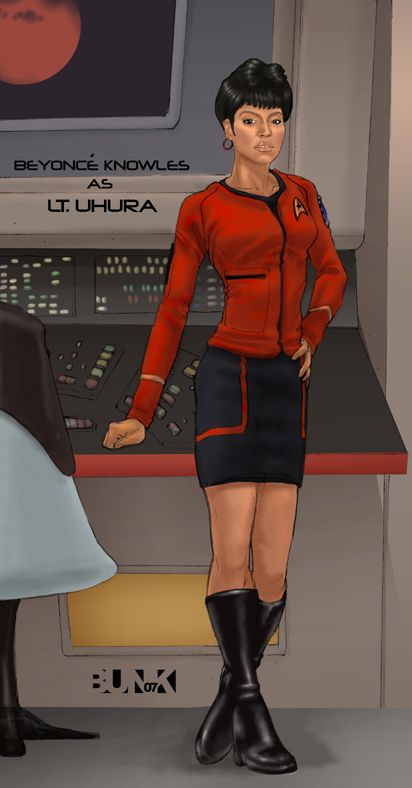
Some of the other images done by the same artist:
Where did you find these? Know the artists name?
^
Lt. Uhura is hot.
When was she ever not hot?
Starfleet could easily look like Starfleet.
Why can't we be following civilians this time around?
Why can't we be following civilians this time around?
Where did you find these? Know the artists name?
He put his watermark on each image. I believe this is his current DA account where the images can be found (along with one more, that was done slightly later with Quinto and Pine as Spock and Kirk.)
http://bunk2.deviantart.com/
I really wish people would quit throwing around terms like "cheap" and "low budget" in connection with TOS. It was one of the most expensive television shows of its time.
I do agree with the concept of doing an updated version of the "Cage" look, the way the KelvinVerse movies did with the regular TOS series uniforms as well as the ship and set designs. The general 1960s design mode of original Trek is the only Trek aesthetic that I like. In fact, one of the reasons I don't watch the spinoffs from TNG through ENT anymore is that I can't stand the way they look!
Kor
 :rolleyes:")
Yeah the show was very expensive for its time about $250,000 per episode. Most people act like the production quality wa crap. The look of the Enterprise itself when in space was nicely done and the sets Jefferies came up with were excellent and felt otherworldly.
I didn't like the look of the newer shows at first but they grew on me over the years. I now love the Enterprise D. I like the uniforms of the TNG era well enough but I still think the TOS uniforms are much better.
Yeah the show was very expensive for its time about $250,000 per episode. Most people act like the production quality wa crap. The look of the Enterprise itself when in space was nicely done and the sets Jefferies came up with were excellent and felt otherworldly.
The issue is, because its so very dated it looks cheap. It does not matter how much it cost, it looks like a cheap set. Mostly its color and the 1960's look that makes it look bad. And lets all be honest here, that materiel they used for the uniforms looks cheap as all hell. It was good calls for the time, with how TV worked and all that, but it shows it age. When they used that stuff on ENT and DS9 it showed its age and just looked cheap.
I think we've already decided that the new show should have a strong 70s aesthetic. That's definitely an advance from the 60s.Fuller already said it will look like a modern show and not a 60s show. Don't expect them to copy anything from TOS just because that's what people thought the future would look like in the 60s.
")

Some of the other images done by the same artist:
Why is McCoy holding his crotch, did he just piss himself?

I posted this earlier in the other uniform thread. I think it has a place in this conversation as well.
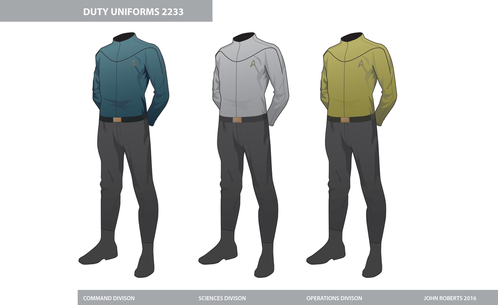
I'm assuming this is pretty much what we'll see, maybe with more of the colour pallete used in Beyond. Something I've been playing with for a while....

...Bit of a merger between Cage, TOS and Kelvin styles.
I'm sure they'll hire someone who'll do something much better, but I'm wondering if they'll take some cue's from the Kelvin era more than the Cage era and slap TOS colours on it.
But if it's a show about Klingons, why so obsessed with a background species like humanity?
Last edited:
I'm assuming this is pretty much what we'll see, maybe with more of the colour pallete used in Beyond. Something I've been playing with for a while....
...Bit of a merger between Cage, TOS and Kelvin styles.
I'm sure they'll hire someone who'll do something much better, but I'm wondering if they'll take some cue's from the Kelvin era more than the Cage era and slap TOS colours on it.
Tweaks to the colours, and I would love to see these Kelvin type uniforms.
Actually looking at these Kelvin uniforms, the colours are reminiscent of The Cage...

Last edited:
I'd never saw the muted colours being similar - until nowTweaks to the colours, and I would love to see these Kelvin type uniforms.
Actually looking at these Kelvin uniforms, the colours are reminiscent of The Cage...

I thnk the Kelvin style - or at least elements of it - could work, as long as they advanced that piping to look more naturally a piece of the uniform instead of a giant comedy moustache.
I always had the alternate future uniforms in mind when I saw the Kelvin ones...I'd never saw the muted colours being similar - until now
I thnk the Kelvin style - or at least elements of it - could work, as long as they advanced that piping to look more naturally a piece of the uniform instead of a giant comedy moustache.


With the FAR worse cut of the alt-future unis, it looks like they're doing a bad USS Kelvin cosplay.
With the FAR worse cut of the alt-future unis, it looks like they're doing a bad USS Kelvin cosplay.

I always hated those AGT future uniforms, they can make anyone look frumpy. Not seen them be flattering on anyone.
The Kelvin uniforms are nice but a little early-TNG. Very unforgiving. I'm not convinced they'd be appropriate for a series cast, taking into account things like actor comfort. Aesthetically though, they're a good starting point. One aspect of the Cage uniforms that should be incorporated is the field jacket, perhaps as a variant on ship too, like wearing a jumper. A forerunner to the monster maroons.
Engineers in Jump Suits - Away Mission Jackets - Appropriate uniforms for hostile terrain - Medical and Science Lab clothing
I always hated those AGT future uniforms, they can make anyone look frumpy. Not seen them be flattering on anyone.
The Kelvin uniforms are nice but a little early-TNG. Very unforgiving. I'm not convinced they'd be appropriate for a series cast, taking into account things like actor comfort. Aesthetically though, they're a good starting point. One aspect of the Cage uniforms that should be incorporated is the field jacket, perhaps as a variant on ship too, like wearing a jumper. A forerunner to the monster maroons.
I'm assuming this is pretty much what we'll see, maybe with more of the colour pallete used in Beyond. Something I've been playing with for a while....
...Bit of a merger between Cage, TOS and Kelvin styles.
I'm sure they'll hire someone who'll do something much better, but I'm wondering if they'll take some cue's from the Kelvin era more than the Cage era and slap TOS colours on it.
I made a slightly modified version of your design. I hope you don't mind.

I made a slightly modified version of your design. I hope you don't mind.
I massively protest! Not really, but it seems like the logical reaction
Is it my imagination, or have you Caged up the Collars among the tweaks? I considered something like that strangely enough, but as I'm making them and couldn't be bothered with that style, switched it out for cuff/waistband fabric.
I say "making them" - I haven't moved past a mountain of fabric in my bedroom that my wife glares at me for ordering
Similar threads
- Replies
- 99
- Views
- 10K
- Replies
- 15
- Views
- 3K
If you are not already a member then please register an account and join in the discussion!