-
Welcome! The TrekBBS is the number one place to chat about Star Trek with like-minded fans.
If you are not already a member then please register an account and join in the discussion!
You are using an out of date browser. It may not display this or other websites correctly.
You should upgrade or use an alternative browser.
You should upgrade or use an alternative browser.
What would you like to see in the 2010 SOTL Calendar?
- Thread starter Probert
- Start date
 yes I know most people probably don't like the ship but I have a weak spot for old freighters..
 Your implication that Mr. Eaves' was tightly restrained by producers (possibly more than I thought) and that his unseen work is actually quite good is something of a revelation. Perhaps you could convince him to post here as well. I would be interested in seeing some of this unpublished work.
I would LOVE to see his concepts for the NX-01 before he was supposedly ordered to "just modify the Akira, nobody'll notice."")
Agreed. If nothing else, it would go a long ways towards redeeming him in the eyes of a big chunk of the fanbase.
And it's always fun to see "what if..." stuff.
Last edited:
Throw in some 2D contributions by Mike Okuda and I´m sold....
I gather from many of the posters here that what many would like to see is an ANDREW PROBERT calendar. Or even better, a Probert/Sternbach calendar.
...
There´s something to those three artists that just feels "right".
Damn Right!!!!!!!!!!
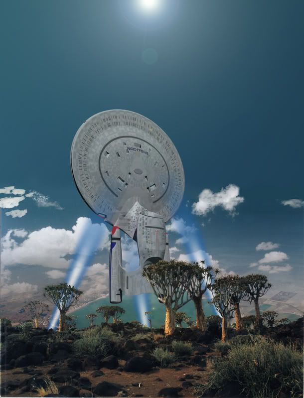
not my best work, but i couldn't resist


Very true. The surface, remember, would be the diameter of the Earth's orbit, some 200 odd million miles, so it would vanish in the haze. It might be discernable as an odd faint pattern in the sky, but probably not.Nah, you'd see no horizon curvature. The interior would be so gigantic it would appear flat.
Thanks, pal, but they're just having fun and, you know, I'm kinda flattered to have inspired them to those efforts.Not nice to do Andy's idea before he does, either.
Andrew-
The pic was just me playin around the other afternoon, not a highly detailed version. I wasn't trying to step on anyone's toes. I can't wait to see Andy's high-quality version though.
While I think that the image could stand some harsher contrast between the highlights and the shadows (it is daylight after all...and I'm a sucker for high highlight/shadow contrast ") ), I just noticed the subtle flame on the nose and the phaser array of the Enterprise. Very nice attention to detail there!
), I just noticed the subtle flame on the nose and the phaser array of the Enterprise. Very nice attention to detail there!
), I just noticed the subtle flame on the nose and the phaser array of the Enterprise. Very nice attention to detail there!Very true. The surface, remember, would be the diameter of the Earth's orbit, some 200 odd million miles, so it would vanish in the haze. It might be discernable as an odd faint pattern in the sky, but probably not.Nah, you'd see no horizon curvature. The interior would be so gigantic it would appear flat.
I addressed that in another thread and did an illustration to show how fast detail falls off with distance, even minus haze.
Thanks, pal, but they're just having fun and, you know, I'm kinda flattered to have inspired them to those efforts.Not nice to do Andy's idea before he does, either.
I was just worried that it would dissuade you from painting it!
Thanks, pal, but they're just having fun and, you know, I'm kinda flattered to have inspired them to those efforts.Not nice to do Andy's idea before he does, either.
Nope,... enough people seemed to like it, so I'll just put it in the queue. Even if someone else took a shot at it, my painting would be.... different.I was just worried that it would dissuade you from painting it!
Andrew-
Andy, I've heard alot over the years about some of the background ideas leading up to TMP. How the entire Sol system would be sort of like a "great barrier reef" of stations and development built up over years, ships buzzing around, ect.
Now, this couldn't be done within the budget or effects capability of the time, obviously. But I'd always wanted to see what you could have done with this concept for TMP. Perhaps you could show a what if of the system, a "Lariange city" or "Asteroid Belt 'reef' colony" or something like that?
Now, this couldn't be done within the budget or effects capability of the time, obviously. But I'd always wanted to see what you could have done with this concept for TMP. Perhaps you could show a what if of the system, a "Lariange city" or "Asteroid Belt 'reef' colony" or something like that?
if only it worked that way, and one fanbashed enterprise with six warp nacelles and fifteen phaser cannons would dissuade them all.I was just worried that it would dissuade you from painting it!

Looks great. Too bad we didn't get to have a view like this in "Relics." Probably no one on the staff even thought of something like this.
I's like to see a move more toward strictly realistic VFX shots, in lieu of the painting and/or overly post-processed CG shots that end up looking more like paintings.
I'd like to see a better consistent quality of composition too. Cut out any posed "here's a Star Trek ship" compositions as they are completely lacking of life and drama IMO, and thus equal boring.
And while I love the gatefold layout, the middle two-hole hanging system works very poorly IMO. The corners every year end up curling in on both sides. So either move the holes out toward the corners more, maybe even adding two more holes (kinda a hanging PITA, but so is curling art), or go with a traditional calander layout/hanging.
I'd also like to see my own TOS.5 E in the calander (once the new bussard(s) efx is worked out, almost done with that), for obvious personal artist/Trekker reasons, but also, because I believe she's easily a mesh of qualifying quality. And a fine updated and quite honorable (if not thee most honorable TOS update done thus far) take of the ol' gal that I think other E-loving Trekkers would enjoy.
Also, I'd like to know where you guys have seen the previews of the 2009 calander...
Can any other Trekker help a fellow Trekker out with a link or some other type of info on these previews?
Thanks ahead of time if you can.
LLP,
deg
Similar threads
- Replies
- 84
- Views
- 19K
- Replies
- 7
- Views
- 615
- Replies
- 24
- Views
- 1K
- Replies
- 4
- Views
- 632
- Replies
- 3
- Views
- 605
If you are not already a member then please register an account and join in the discussion!