-
Welcome! The TrekBBS is the number one place to chat about Star Trek with like-minded fans.
If you are not already a member then please register an account and join in the discussion!
You are using an out of date browser. It may not display this or other websites correctly.
You should upgrade or use an alternative browser.
You should upgrade or use an alternative browser.
USS Enterprise (eventually) on Discovery?
- Thread starter EJD1984
- Start date
Just now having a chance to look at the bridge photo on a screen larger than my phone, and I have to say...no complaints. Fifty-odd years later, I couldn't ask for better than this.
Okay, I agree about turning off a few of the white accent lights.
The Eaves exterior is still lazy and slapdash.
Okay, I agree about turning off a few of the white accent lights.
The Eaves exterior is still lazy and slapdash.
Isn't that what the Enterprise graphical area is?
Yes and no. The consoles + graphics have pretty much the exact same height as the TOS bridge. But since the bridge is so, so much bigger overall - I wish they would have raised the height of the monitor walls as well. Just to have more similar proportions. Also - more colors would be nice. I can't stand the standardized 2000's SF-series graphics light blue.
I felt like it was well proportioned and made the graphics actually feel readable and usable.Yes and no. The consoles + graphics have pretty much the exact same height as the TOS bridge. But since the bridge is so, so much bigger overall - I wish they would have raised the height of the monitor walls as well. Just to have more similar proportions. Also - more colors would be nice. I can't stand the standardized 2000's SF-series graphics light blue.
As for the blue, well I cannot agree on that point. I'll take as much blue as I can get.
I felt like it was well proportioned and made the graphics actually feel readable and usable.
As for the blue, well I cannot agree on that point. I'll take as much blue as I can get.
Personal preferences and stuff.
I simply would have liked another row of monitors with colorfull pictures above the consoles, over the actors heads. As it is - the bridge IMO very very much looks like the VOYAGER-bridge. Same proportions and everything, just more colors.
That's not a bad thing mind you. Just had hoped for even more of a throwback. Can't say I'm in any way unhappy with the final product though, despite my nitpicking.

See, I think it demonstrates a highly function bridge as well as keeping some of TOS more colorful aspects. It strikes as being very useful, without cluttering it with multiple monitors.Personal preferences and stuff.
I simply would have liked another row of monitors with colorfull pictures above the consoles, over the actors heads. As it is - the bridge IMO very very much looks like the VOYAGER-bridge. Same proportions and everything, just more colors.
That's not a bad thing mind you. Just had hoped for even more of a throwback. Can't say I'm in any way unhappy with the final product though, despite my nitpicking.
These were two of my three complaints as well. The insane amount of lights, and them being reflected from the shiny floor.I just want Them to tone down the lighting on the new set.
It looks very grand but waaay to busy with the lighting.
That is probably the one thing I didn't care for with the JJ-Trek bridge.
So much lighting ya can't see the find details.
Not crazy about the shiny reflection in the floor either.

My third complaint is the size. I'm fine it being larger, but I think there is too much empty space between the inner circle and the consoles, and there is a whole dance floor in front of the viewscreen.
But a lot of the details are good, and overall, it is okay.
442.06m actually.No wonder they upped the size from 289m to 340m.
the disply in the center has straight pylons,
Nah they’re angled on all the screens.
These were two of my three complaints as well. The insane amount of lights, and them being reflected from the shiny floor.
My third complaint is the size. I'm fine it being larger, but I think there is too much empty space between the inner circle and the consoles, and there is a whole dance floor in front of the viewscreen.
But a lot of the details are good, and overall, it is okay.
Kirk is going to put down some Starfleet regulation low pile carpet after the first few midshipmen on his watch stumble, get injured, and McCoy won't leave him alone about it.
For once I actually think carpet on the bridge isn't a bad idea. It wouldn't surprise me if they do find some way to tone down the reflection on that floor next season or whenenever the bridge makes an appearance, next, if for nothing else it will help not trying like mad to keep reflections of the filming equipment out of the shot.
442.06m actually.
Nah they’re angled on all the screens.
Could be. The view looks to be from the bottom so I could be wrong.
I have mixed feelings about the new bridge.
I am reminded of this:
https://www.theguardian.com/commentisfree/2013/sep/15/nsa-mind-keith-alexander-star-trek
Six years ago, the head of the NSA was modeling the war room after Star Trek.
Now, in some ways, it almost seems like we are going the opposite way. Star Trek is looking a bit like the inside of the NSA and CIA:


Personally, more than in any other previous design, I feel that the overhead makes it seem like everyone is under the lens of a microscope:

All of the bright lights is one issue, but that highly-polished black floor just serves to double the effect.
With all of that said, do I hate it? No. I would definitely work there. My only adaptation would be some transition lenses.
I am reminded of this:
https://www.theguardian.com/commentisfree/2013/sep/15/nsa-mind-keith-alexander-star-trek
Six years ago, the head of the NSA was modeling the war room after Star Trek.
Now, in some ways, it almost seems like we are going the opposite way. Star Trek is looking a bit like the inside of the NSA and CIA:


Personally, more than in any other previous design, I feel that the overhead makes it seem like everyone is under the lens of a microscope:

All of the bright lights is one issue, but that highly-polished black floor just serves to double the effect.
With all of that said, do I hate it? No. I would definitely work there. My only adaptation would be some transition lenses.

From the stills:
The lighting needs to be turned down a lot. Bridge looks too large but filled about the same. Captains chair was not expected to match this well.
The lighting needs to be turned down a lot. Bridge looks too large but filled about the same. Captains chair was not expected to match this well.
Did you not see it in the opening credits? lolCaptains chair was not expected to match this well.
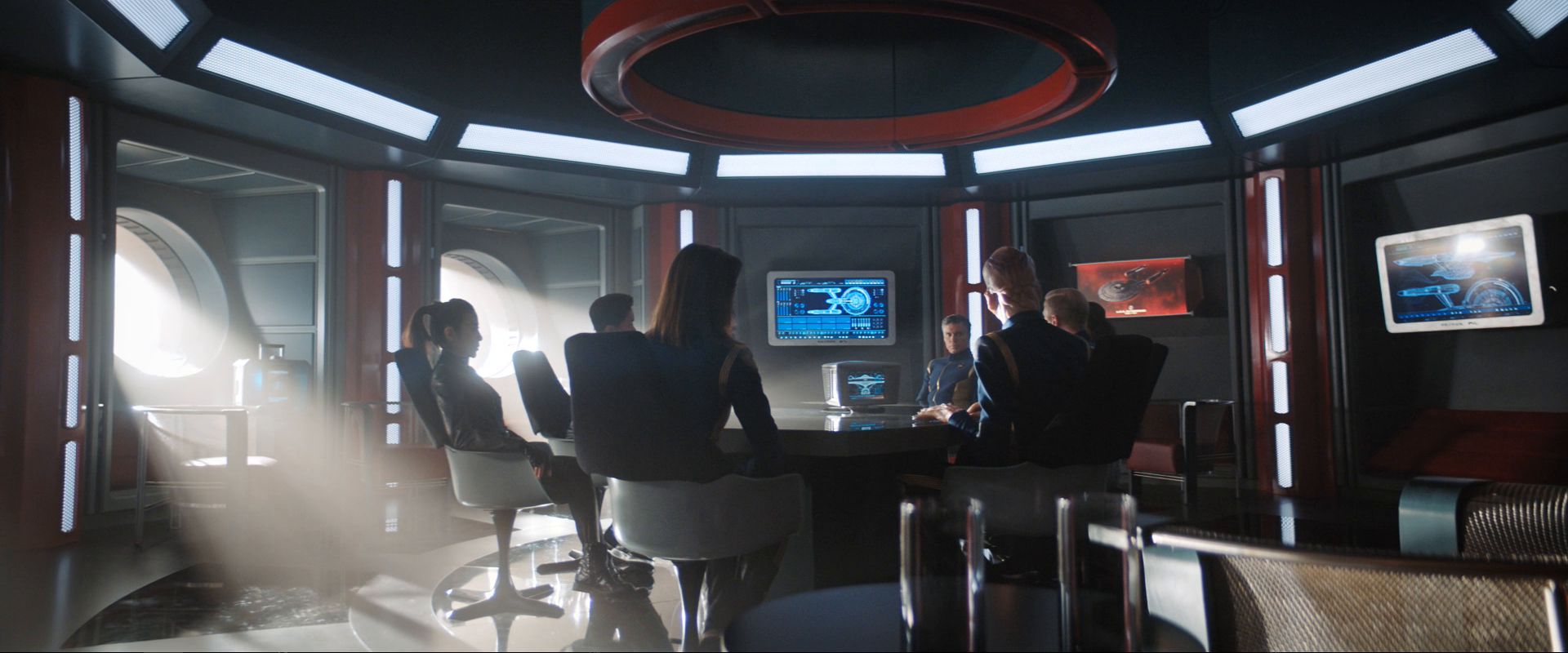
I have one tiny nitpick, but it's not about the bridge. I always assumed that the briefing room in WNMHGB was on deck 2 at the center of the saucer. Now it has two round portholes that suggest it's somewhere much lower in the saucer, and not centered. This seems odd to me for a circular room.

It looks really nice though.

It looks really nice though.
This looks much better than what we saw in the JJ Abrams films. We've finally reached the point where TV production design is capable of exceeding movie production design. (special exemption for the 1978 Galactica bridge, which looked unbelievably great when it first aired)
Similar threads
- Replies
- 24
- Views
- 968
- Replies
- 223
- Views
- 18K
- Replies
- 9
- Views
- 6K
- Replies
- 65
- Views
- 8K
If you are not already a member then please register an account and join in the discussion!
