• Welcome! The TrekBBS is the number one place to chat about Star Trek with like-minded fans.
    If you are not already a member then please register an account and join in the discussion!

Never seen TOS scenes...round 3

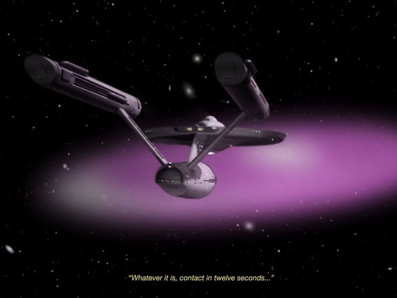
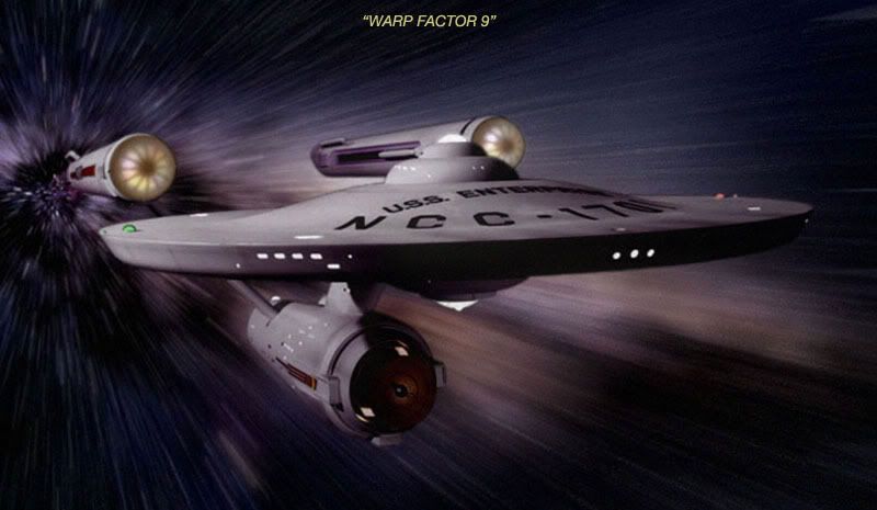
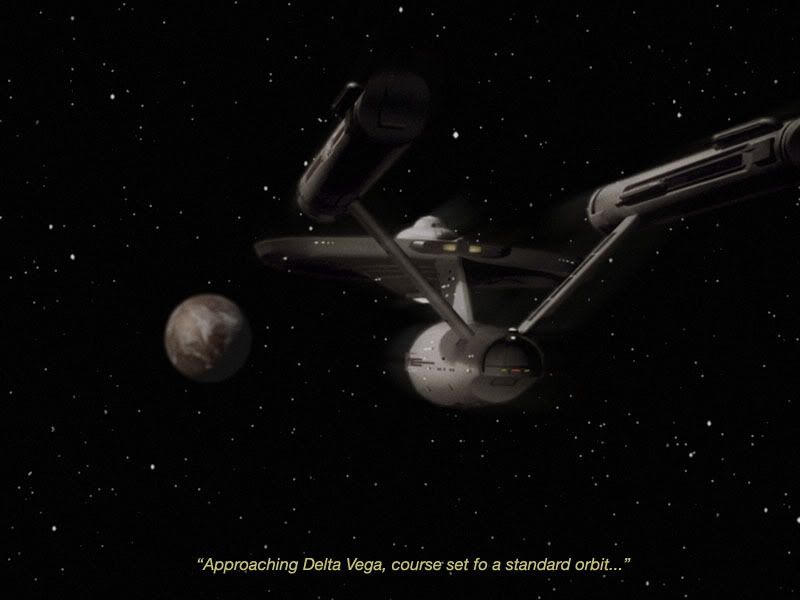
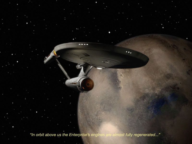
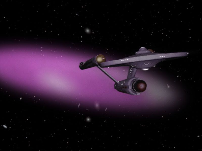
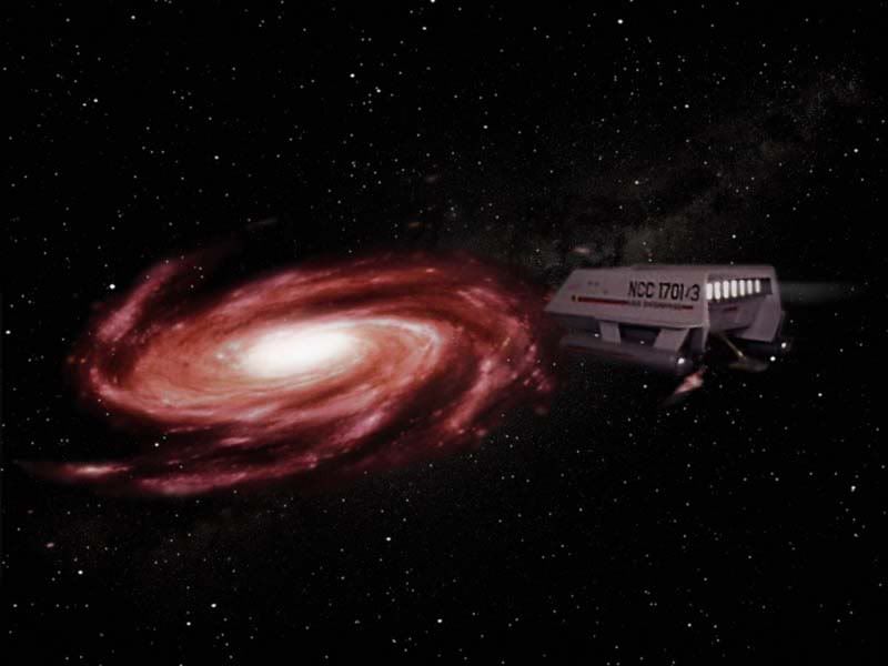
^^ Thanks. I had to perform some photoshop surgery to get her to look more like the pre TOS era version while retaining a little more detail. The spacescape background is actually three layers with a solid black background, an image of the Milky Way band somewhat transparent on top of that and then a more sparse regular type starfield on top of that. I was trying to get some depth while capturing the sense of the Enterprise leaving the heart of the galaxy behind as it neared the galaxy edge. I then tried to darken the ship as much as possible while still trying to imagine what she could look like onscreen (I tried going darker and it looks kinda cool, but it would probably be too dark for tv). The deeper shadowing also lends a feel of remoteness and being really out there I think. There's also a hint of motion blur to suggest capturing the ship in mid flyby.

Actually maybe I could have gone a little deeper with the shadowing. I have the brightness turned down a bit on my own computer to save my eyes some strain. But when I see some of my work on other monitors it can look a bit brighter than I see it at home. Hmm.
 
It's odd how the TNG characters look okay in TOS attire, but the TOS characters look rather strange in TNG garb.
 
FicPic121.jpg


The deep void lays beyond. There are no familiar type starfields in view, but only the faint glow of distant galaxies beckoning. The previously invisible energy barrier suddenly appears as a violet elongated elipse of slowly flowing energy directly in the ship's flight path (my reasoing here is that while the barrier no doubt spread outward a great distance all that appears visible is an elipsed segment of it directly in one's line of sight no matter where you look at it. Kinda wierd). The Enterprise approaches and it's hull reflects ambient violet coloured light from the energy barrier.

The Enterprise I've depicted here is really the series production version with some "Cage" era version elements added, such as the raised bridge dome, the nacelle aft caps, fewer windows and the lower saucer running lights set more aftward. I retained the inboard nacelle detail as well as the detail on the forward sides of the support hull simple because it gives the ship more detail overall (and because in a sense the first pilot version of the ship was incomplete since it wasn't even lighted). I also prefer the first pilot version to the WNMHGB. I've never liked the lighted rectangle on the front of the bridge dome nor the "drilled holes" nacelle end capes nor the different impulse exhausts or whatever they are.
 
FicPic123.jpg


As much thrown clear as escaping under its own power the Enterprise breaks free of the energy barrier even as its main engines begin to go dark.
 
I half expect Data to say, "Norman, Coordinate." :lol:
FicPic124.jpg


On a more dramatic note the Enterprise pivots towards us then our POV skims over the saucer and right between the warp nacelles as the ship fights to escape the energy barrier.
FicPic125.jpg


The crippled Enterprise crawls along in the ever so remote dark with even some of its windows darkened as well as its sensor domes dimmed. The warp engines are completely dark.
FicPic128.jpg


The Enterprise struggles to reach Delta Vega, an inhospitable world looming remotely out of the void.
FicPic129.jpg


Things are looking brighter.
FicPic130.jpg


Leaping back into the galaxy...
FicPic127.jpg


Note how in all these images I subtly vary the overall hue of the ship's hull to reflect the ambient light (artistic licence here) as well as to enhance the mood of the scene.
 
I'm curious in regards to how some of these images appear on other monitors. I'm creating these works on an Apple eMac with Photoshop CS. I have the brightness on my monitor turned down a bit to be easier on the eyes. I often try to push the images to be as dark as reasonable as a nod to going for something more realistic in terms of how something might be lighted in space while acknowledging that folks still have to see something. However on some monitors I've noticed my images look brighter wherein some of them don't look so good anymore and lose their effect. For example some of the blurring effects become more obvious than intended and the different blacks (shadows) become noticeable.

Any observations, anyone?
 
Here's a quick-and-dirty work-up of my idea for a live-action version of a TAS scene: the Copernicus passing near Beta Lyra.
FicPic140.jpg
 
If you are not already a member then please register an account and join in the discussion!

Sign up / Register


Back
Top