Okay, so I stumbled into something that made me want to send
myself back to art school.
Well, I grew up in one. And I remember learning about
the sculptor Henry Moore, who said, "We distort form to create space." He created objects that were, in terms of archetype, clearly based on people. Yet they weren't made up of heads and bones and muscles. They were images that fit the space but did something different.
Last night, I wrestled with my own description, realizing that this shape that floats majestically in my head like a Henry Moore sculpture is, um, very difficult to draw. So I took my own medicine, borrowing from my suggestion to Adam that he make a model out of household items. I took some posterboard, made a cylinder, and drew the outline of the shape around it so that I could understand it better dimensionally.
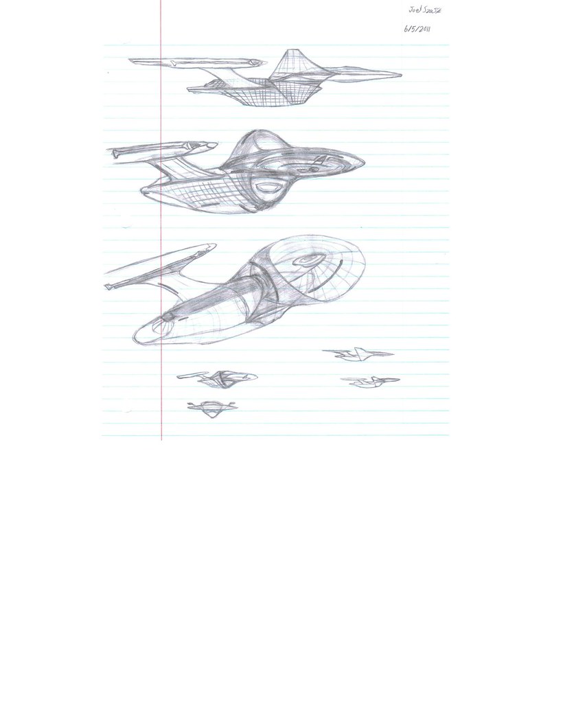
The latest result is hot off the presses:
You're looking at just the engine enclosure, which would wrap around Adam's existing two hulls. The rest of Adam's ship is
not pictured here. The open ring formed by the engine enclosure that is pictured here, is slightly wider than the closed ring (that would be in front of it) that wraps the habitable area of the ship. The outside is completely smooth and unhindered, like the surface of an aluminum can. It's one single curve from top to bottom and top again. Insignias or license plate numbers or whatever can be anodized to the outside.
And while it's a completely different shape, from the side view and the top view, they actually provide very familiar silhouettes. The resulting form doesn't cease to say "Enterprise;" it's still iconic. Henry Moore did this all the time: make wild, weird forms that suddenly, from only one or two viewing angles, looked like a madonna and child.
All the inner workings are in the interior. You see my two copper "Bussard surfaces" extending from flaps folding down from the top. The mechanism of the engines may conceivably extend into the ring area; it doesn't all have to be in the long fins.
On the underside, each of the fins provides a canopy for the leaner, meaner "warp driveshaft." Now, some may ask me, why not enclose these mechanisms in neat little cylinders like everyone else does? First of all, I tend to treat "what everyone else does" as a big "Do Not Enter" sign. Second, is there some reason why everything
must be encased in an ugly coffin?
What's more: Adam's primary and secondary hull epiphany creates a usable space in the center of the ship. Why ruin that space with a tangle of pylons?
Notice the "interior lighting." Imagine a similar light array on the spine of the secondary hull. The result would be a kind of mobile drydock, a tunnel where shuttles could enter and exit from either approach vector.
Now,
Ihlecreations, you may use all of this design or part of it or none of it (I may take this idea forward in any event with a non-Enterprise design), but if you take anything away from this suggestion, I hope it's this: No single part of any creation coming from you should be perfunctory, like the obligatory nacelle caps or the mandatory rear brake lights or the traditional sofa cushion. When I imagine you building great 3D forms for theme parks, I see you observing everything from every angle to make sure it's expressive and wild and fun, and that there's artistry in every stroke. I see you taking pride in that, and watching kids delight as their imaginations wrap themselves around your work. If this Enterprise truly represents
you, then make it
kick, from every conceivable angle, so that we're awestruck. You can't strike awe with a couple of coffins on planks.
DF "Assimilate This!" Scott

")