• Welcome! The TrekBBS is the number one place to chat about Star Trek with like-minded fans.
    If you are not already a member then please register an account and join in the discussion!

Design the Next Enterprise

Yeah, I was also thinking that weapons could be added to the roll bar if Ihlecreations desired to do so, but forgot to go there. Besides, I'm kinda afraid of what happens if the weapons are hit hard. They might overload or catch on fire if hit properly, which if that spreads to the center where the warp/slip plasma flows, that would ignite, and BOOM!!! The whole ring explodes. I fear it might get as bad as when the Bozeman collided with the Enterprise's starboard nacelle, and we all know how badly that ended. Albeit that I would expect the ring to have armor, but even that might only do so much. Besides, I think that weapons usually attract weapons fire, and that is the last thing you would want the warp/slip ring to do!

*Maverisms: I thought I recognized the style of your ship. You're the one who did the ship that resembles Atolm's Soulwolf class! I have to say, I loved how you managed to retain the neck, while also giving your entry a sleek stance. I definitely look forward to any other work you do.

*Cary L. Brown and Maverisms:

I know what you mean, and yes, I agree that the roll bar is a radical departure from what has come before. But at the same time, I believe that an open mind is appropriate. Besides, the ring itself is a radical departure in itself. And if mounting the ring by it's center improves the ship's look, then I don't think it should be dismissed just yet.

Riker's Beard! I'd never seen the Soulwolf before. It's kind of uncanny. Had I split the neck on my entry it would have looked almost Exacty. Like. That.

Suddenly I'm glad I didn't. Not that it looks bad. It doesn't. I like what he did there. I'm just glad I didn't reinvent that particular wheel.

But thanks! I wish I could claim it was pure talent, but what I did was figure out the spacing I wanted between the primary and secondary hulls, and the general geometry of the ship, and then built a neck to connect them. The nice thing about being a 3D artist is you get all of the benefits of sculpting a prototype with easy access to "undo." :D

As for the weapons fire, I try not to think too hard about what the ship does and why when I'm designing. I used to build function --> form, but I've found the results more pleasing if I start with form and technobable the function in later.

I do see what you mean about letting the idea be and seeing if it can fill the space, as it were, but I'm too close to my work to make that step back. If Mr. Ihle wants to play with the roll bar, I'm not going to object. My inner "enterprise" critic said the Enterprise doesn't do split necks. Adam not only proved me wrong, he made me a believer.

During the time that I thought your ship was the Soulwolf, I perferred the way that you connected the two sections to Atolm's. I personally think that the way that the neck rears back makes it look like a duck (no offense intended towards Atolm, of course:D).

And I'm not against the roll bar having weapons if Ihlecreations should choose to do so, I'm just thinking that it isn't without it's risks. Besides, in the end, I'm a sucker for more firepower.:p
 
I can completely understand a desire not too stray from the original design formula established with the Constitution class.
I think you're misinterpreting me a little bit. I didn't say it should be a "direct copy of the Constitution." I said that there are certain, nearly-universally-accepted "mathematical relations for beauty," and that the TOS 1701 was designed around those relations, either intentionally or "fortuitously."

The problem with most ships I see is that they tend to be "ugly" to my eye. I've learned that the ships I like, when ran through the "golden rules" filter, seem to be the ones which best fit those rules.
At the same time, I want to approach this with an open mind, I'm honestly not really thrilled with how the saucer looks while separated, with the ring hanging down. To me, it looks unbalanced. In my head, I think that by mounting it in the middle like a Vulcan vessel, the saucer will look much better on it's own.
Yes, but to me it looks terribly UNBALANCED with that "balanced ring." You'd have to alter the rest of the ship's design as well to bring it all back into balance.

Not to say that you CAN'T do that... but it rapidly becomes something totally different from what's currently being discussed. You'd be developing a new DESIGN PHILOSOPHY, not "tweaking" Adam's already-accepted design.
Personally, I would have taken to an approach similar to the Sovereign's saucer-on-top-of-engineering-section, or would have used a half ring instead, and mounted that directly on top of the engineering section, bypassing the neck/necks entirely (hmm, come to think of it, that might be something I should try for myself some day). Because that is not within the design perimeters, I think it is safe to say that it might be necessary to take some unconventional approaches to make the ship look great both together and separated.

The Cetea class might not be what I initially envisioned the Enterprise-F would be, but it is what it is, so I think the best action now is to help in her refinement, which is a challenge, since it is so different from what I normally would think of, but I relish the challenge of finding ways to refine her.

I think that it is going to be a matter which design looks better overall, separated and whole, if we come up with a better solution, or whether or not Ihlecreations thinks my idea is worth continuing to refine.
Well, that's the trick... we can suggest all we like, but it's his baby... ;)

But to me, I'm a big believer in the idea that "what we see as beautiful" can actually be defined, in some manner, mathematically, and that these rules seem to be the most consistent way to do so.
 
I can completely understand a desire not too stray from the original design formula established with the Constitution class.
I think you're misinterpreting me a little bit. I didn't say it should be a "direct copy of the Constitution." I said that there are certain, nearly-universally-accepted "mathematical relations for beauty," and that the TOS 1701 was designed around those relations, either intentionally or "fortuitously."

The problem with most ships I see is that they tend to be "ugly" to my eye. I've learned that the ships I like, when ran through the "golden rules" filter, seem to be the ones which best fit those rules.

Nah, I just used the wrong choice of words. What I meant was that I understand not wanting to stray to far from the formula of the saucer attached the cylindrical secondary hull, followed by the pylons with nacelles attached, but in a much more condensed way. Perhaps I should have just said the formula of the saucer, secondary hull, pylons, and nacelles. Oh well, my bad!:D

At the same time, I want to approach this with an open mind, I'm honestly not really thrilled with how the saucer looks while separated, with the ring hanging down. To me, it looks unbalanced. In my head, I think that by mounting it in the middle like a Vulcan vessel, the saucer will look much better on it's own.
Yes, but to me it looks terribly UNBALANCED with that "balanced ring." You'd have to alter the rest of the ship's design as well to bring it all back into balance.

Not to say that you CAN'T do that... but it rapidly becomes something totally different from what's currently being discussed. You'd be developing a new DESIGN PHILOSOPHY, not "tweaking" Adam's already-accepted design.

Yeah, I know. I CAN change it, but Ihlecreations certainly won't adopt it for his design if I cross that line (and I wouldn't blame him either; after all, it is his design). Still, I think I'm headed in a new direction that I can play with some time later (as soon as I finish and post my huge backlog of sketches that I already have:rolleyes:), it's just that none of them will ever carry the name Enterprise.

On the other hand, I think that a neck-less variant of the design I already have could be a plausible ancestor to the Cetea class, assuming that Ihlecreations would approve me using such a history, and assuming that I decide to make this one of those designs that I'm going to focus on.
 
Hmmm, this design is actually very nice. In the side elevation, I would raise the warp engines just enough to clear the engineering hull while raising the saucer the same amount.

I'd be interested to see a 3/4 rear view as well.

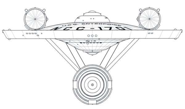
Meanwhile, I keep playing with a couple of versions of the 'ringed'-saucer... lots o' fun.

Thanks! That made my day. If I don't seem to be overly gushy, know that my inner fanboy is throwing a wild party in my soul and the clean up costs will be epic.

I finished the gross work on the secondary hull last night. I'll be pumping out a few renders tonight. I'm definitely going to look at raising the saucer and nacelles. I'd started with Saucer sitting much higher, but the nacelles were exactly where they are from the start.

Yeah, I was also thinking that weapons could be added to the roll bar if Ihlecreations desired to do so, but forgot to go there. Besides, I'm kinda afraid of what happens if the weapons are hit hard. They might overload or catch on fire if hit properly, which if that spreads to the center where the warp/slip plasma flows, that would ignite, and BOOM!!! The whole ring explodes. I fear it might get as bad as when the Bozeman collided with the Enterprise's starboard nacelle, and we all know how badly that ended. Albeit that I would expect the ring to have armor, but even that might only do so much. Besides, I think that weapons usually attract weapons fire, and that is the last thing you would want the warp/slip ring to do!

*Maverisms: I thought I recognized the style of your ship. You're the one who did the ship that resembles Atolm's Soulwolf class! I have to say, I loved how you managed to retain the neck, while also giving your entry a sleek stance. I definitely look forward to any other work you do.

*Cary L. Brown and Maverisms:

I know what you mean, and yes, I agree that the roll bar is a radical departure from what has come before. But at the same time, I believe that an open mind is appropriate. Besides, the ring itself is a radical departure in itself. And if mounting the ring by it's center improves the ship's look, then I don't think it should be dismissed just yet.

Riker's Beard! I'd never seen the Soulwolf before. It's kind of uncanny. Had I split the neck on my entry it would have looked almost Exacty. Like. That.

Suddenly I'm glad I didn't. Not that it looks bad. It doesn't. I like what he did there. I'm just glad I didn't reinvent that particular wheel.

But thanks! I wish I could claim it was pure talent, but what I did was figure out the spacing I wanted between the primary and secondary hulls, and the general geometry of the ship, and then built a neck to connect them. The nice thing about being a 3D artist is you get all of the benefits of sculpting a prototype with easy access to "undo." :D

As for the weapons fire, I try not to think too hard about what the ship does and why when I'm designing. I used to build function --> form, but I've found the results more pleasing if I start with form and technobable the function in later.

I do see what you mean about letting the idea be and seeing if it can fill the space, as it were, but I'm too close to my work to make that step back. If Mr. Ihle wants to play with the roll bar, I'm not going to object. My inner "enterprise" critic said the Enterprise doesn't do split necks. Adam not only proved me wrong, he made me a believer.


Improved is in the eye of the beholder, isn't it? I'm just hoping it's in the anti-magic eye and not the disintegrate or flesh to stone ones.

Well, there's a certain "look" that says "Enterprise" to me. That's really the geometric relationships from the original-series ship, nearly perfectly replicated with the TMP ship. These are not just "random" but are actually able to be defined with equations and relationships which are quite distinct.

From a "purely mechanical" standpoint, yes, you can do pretty much anything... nacelles in different orientations, nacelles in front, cubic primary hulls, you name it. But the basic, geometrically-balanced "golden ratio" characteristics were best met by the TOS design (and I'm not certain that MJ wasn't aware of the so-called "golden ratios" when he was designing the ship, since he met so many of them!) But these aren't just "Star Trek" aesthetic design rules... they're pretty much universal, and have been accepted since pre-Roman times.

It may seem odd... but it's something that's hard-wired into the human brain, and arguably into basic physics as well. Check it out here...

http://en.wikipedia.org/wiki/Golden_ratio

This, and several other "golden rules of design," which are both aesthetically and mechanically advantageous, should be followed in any design. Start just "clunking" boxes and loops and so forth willy-nilly and you may have all the right features, but they won't "feel right."

There are many other designs, besides the TOS one, which conform to these design rules... but if your design doesn't... it's likely a bad design, at least from an aesthetic standpoint.

I try NOT to think of the Golden section while I'm working on stuff. I'm not against it, I just prefer to start from a place of maximum creativity, and then retrofit into the best practices. I jumped into the ring (Ha ha ha) early for me. Really I'm still soft and tender on the inside and taking criticism gracefully is something I fear I might fail at.

In any event, I did a minor golden section analysis of the ship and I've got a few good ratios in without trying. I don't think that's magic or skill. As you point out, a preference for it seems hardwired into humans, so logically some of the ratios I find pleasing should conform to it.

The question becomes "do I want to force other aspects into the ratio?" Right now I've put that Jury in recess. I do owe another guy a ship and if I start fooling with that, I'll never get to his.

Hey...

Here's a fun page for Starship Designers: http://www.ex-astris-scientia.org/articles/design.htm

The only area where my work differs is in the indicated deck spacing, as my decks are 10 feet apart instead of 11 (3.4m).

I have these memorized :D I try not to break the rules as much as my aesthetic allows. Both of my recent ships have bent Rule 3 in that the Bussard collectors are fully visible from the front but there's a tiny bit of nacelle behind the saucer.

I can get pretty fanatic about some things, so I start with a cage that shows me where all of the decks are on each ship. The ring ship has over 50 decks due to the mission pod.

I do tend to put the nacelle's low, but I keep the 50% rule in mind.

nacelle.jpg


Here are some additional views. Since these are all fairly large, I'll just put the URLs in.

These are based off of a slightly less polished the model than the current, but I don't have that version with me. The differences are details, like shuttle bays and such. So the gross geometry is no different.

I added some aft 3/4 views at the end. Most of these I'd already done just for giggles.

https://lh4.googleusercontent.com/-tRcx9thcves/TfD9wvoFHpI/AAAAAAAAANo/sfYSE9MFnyE/s1152/Render1.png
https://lh3.googleusercontent.com/-yT35qAbgEjM/TfD9xP1uuxI/AAAAAAAAANs/RhxOVOJg-5E/s1152/Render2.png
https://lh4.googleusercontent.com/-ArNuVuZJ5yA/TfD9xj5JN_I/AAAAAAAAANw/qt-JwLretWE/s1152/Render3.png
https://lh5.googleusercontent.com/-QEY_sYxWM2c/TfD9vpNCshI/AAAAAAAAANY/RpCdSytBGmU/s1152/Render4.png
https://lh5.googleusercontent.com/-04clIc57u0c/TfD9vrNuWCI/AAAAAAAAANc/DDSOkqGMs5g/s1152/Render5.png
https://lh6.googleusercontent.com/-7uGWLU2UByc/TfD9vCgF6sI/AAAAAAAAANU/p8Pnapm4M-U/s1152/Render6.png
https://lh6.googleusercontent.com/-bBpK-qp_F8E/TfD9wACxhGI/AAAAAAAAANk/IyEILwyhoQA/s1152/Render7.png


I have to admit this is starting to look good.
 
I have to admit this is starting to look good.

Dude. I love your DTNE design.

Love. With hearts and stuff. I intentionally avoided the contest site until I was ready to upload. Yours was one of those that made me think "I wish I'd thought of that." when I finally did look at the entries.

Thanks!

The last few days have been kinda rough IRL, but I do have something to show. This be the last of mine for a little while. I still haven't got to that that ship I owe and I have a host of new problems to solve :(

Anywho, I've done up a version with Mr. Probert's suggestions, and added in the base for the Engineering hull bridge. I'm not sure about the changes to hull, but I'm pretty satisfied with the new nacelle and saucer positions. I'm thinking of pushing the Nacelles out, to better clear the saucer.

Render9.png


Links to more
https://lh4.googleusercontent.com/-...hI/AAAAAAAAAN4/ucINsk2NRFc/s1152/Render12.png
https://lh4.googleusercontent.com/-...FI/AAAAAAAAAN8/qHtza86hRR0/s1152/Render10.png
https://lh3.googleusercontent.com/-...rI/AAAAAAAAAOA/pEXtV9ISzmU/s1152/Render11.png
https://lh3.googleusercontent.com/-...II/AAAAAAAAAOI/xo3kItejnf0/s1152/Render16.png
https://lh4.googleusercontent.com/-...uI/AAAAAAAAAOQ/DElSkw2ZYmU/s1152/Render15.png
https://lh3.googleusercontent.com/-nGauQHRUuxo/TfYhQ2PZz2I/AAAAAAAAAOM/YreQHZc54F4/s1152/Render8.png
https://lh4.googleusercontent.com/-...MI/AAAAAAAAAOU/nyMGcJQuF2E/s1152/Render13.png
https://lh5.googleusercontent.com/-...RI/AAAAAAAAAOY/bdK63xALpDI/s1152/Render14.png
 
Re: Maverism's design...

I have no idea how to quantify this, but for some reason, that design just "feels small" to me. Something about the shapes, not the lack of detail (which is normal, of course). I can't explain WHY... and that's bugging me (I hate giving just opinion without ANYTHING to support it).

It strikes me as something in the size range of the Nova class, really, or the Defiant. But I know your intention is for it to be a huge ship.

Does anyone else get the same "feeling" from this that I do?

Aside from the details such as windows that give a sense of scale, all I can think of is maybe the size of the nacelles. They seem quite big, and relatively speaking, it would indicate a smaller ship. The big ships don't generally have nacelles that large compared to the body.
 
Re: Maverism's design...

I have no idea how to quantify this, but for some reason, that design just "feels small" to me. Something about the shapes, not the lack of detail (which is normal, of course). I can't explain WHY... and that's bugging me (I hate giving just opinion without ANYTHING to support it).

It strikes me as something in the size range of the Nova class, really, or the Defiant. But I know your intention is for it to be a huge ship.

Does anyone else get the same "feeling" from this that I do?

Without any details, like the actual bridge and such, it's hard to know the scale of the ship. If it helps any, she's 891m long. That's 130% the length of the Enterprise-E. Interior volume, however may only be slightly larger than the Enterprise-D. I'm hoping that's not the case. Not because i want 'em bigger and stronger. Unlike the Prometheus, this ship has to have two mostly separate Warp drives (The Prometheus has one drive that splits into three, so they say).

That said, there are two details that give a sense of scale to the ship. The shuttle bays. Each bay is two decks high, at the bay doors.
Render17.png


The Engineering hull's bay is kinda hard to see, so I highlighted it in the box.
Render9-bay.png


For giggles I borrowed some Defiants from Google's 3D warehouse to help with the visualization. It'll be a while before I have time to get my greebles on.
Render18.png


Render19.png

The middle Defiant is actually between the nacelles. I scaled them to about 122m in length

Aside from the details such as windows that give a sense of scale, all I can think of is maybe the size of the nacelles. They seem quite big, and relatively speaking, it would indicate a smaller ship. The big ships don't generally have nacelles that large compared to the body.

[Edit] Forgot to reply to this :(

So, the nacelles are 132% larger than the E's. Given that the ship is 130% larger, one could say they are of similar scale. What they are is WIDE. That's just a personal thing. I know the trend has been toward smaller nacelles. Lately I've been thinking the nacelles are getting too small. It misses out on the Matt Jefferies impossible engineering. In the development of my DNTE entry, I wanted the nacelles to be these massive objects on spindly struts. When I switched to a ringship angle, I tried to pump up the effect.
 
It's hard to do the Oberth "open" front and have the vessel seem large. This is where having a nice wide circular saucer helps 'mass-out' a ship design. An pointed arrow also seems to say 'small' to me. Now one of the things that I have noticed is that many more artist out there have paid more attention to secondary hulls. The aft of this secondary hull is very interesting. Gabe focused on the front of his Enterprise, and here and other recent examples we see more of a layering that started with Enterprise-D.

Having a wider true saucer and perhaps placing extra detail on top might help. In Star Fleet Battles, the Klingon designs were basically scaled up D-7s, with extra towers not unlike those seen on Japanese capital ships of WWII. Imagine something that looks like lower bridge towers behind and below the actual bridge. These could be auxilliary shield emitters or pulse phasers. Having that added detail also match the busy secondary hull on a wide saucer says--this is a bigger ship than smoother TOS/TMP that are less busy. We see that with the super star destroyer in its layered township type "cortex," so something similar might be in order here.
 
So, the nacelles are 132% larger than the E's. Given that the ship is 130% larger, one could say they are of similar scale. What they are is WIDE. That's just a personal thing. I know the trend has been toward smaller nacelles. Lately I've been thinking the nacelles are getting too small. It misses out on the Matt Jefferies impossible engineering. In the development of my DNTE entry, I wanted the nacelles to be these massive objects on spindly struts. When I switched to a ringship angle, I tried to pump up the effect.

Interesting. They "feel" a lot bigger. Maybe it is the width, given the angle of the render. And maybe it's deceptive due to the size of the secondary hull. Your secondary hull seems relatively smaller, with less overlap with the saucer section. I didn't really notice until I went back a few posts to the side view. But your nacelles are a lot longer than the secondary hull. It's not a design configuration I'm used to seeing, so the sense of scale is hard to judge comparatively without the details. But I like it anyway. :techman:
 
Maverisms - Are you working in Sketchup? If so, those are some very fluid shapes and I am curious as to how you are making them.
 
It's hard to do the Oberth "open" front and have the vessel seem large. This is where having a nice wide circular saucer helps 'mass-out' a ship design. An pointed arrow also seems to say 'small' to me. Now one of the things that I have noticed is that many more artist out there have paid more attention to secondary hulls. The aft of this secondary hull is very interesting. Gabe focused on the front of his Enterprise, and here and other recent examples we see more of a layering that started with Enterprise-D.

Having a wider true saucer and perhaps placing extra detail on top might help. In Star Fleet Battles, the Klingon designs were basically scaled up D-7s, with extra towers not unlike those seen on Japanese capital ships of WWII. Imagine something that looks like lower bridge towers behind and below the actual bridge. These could be auxilliary shield emitters or pulse phasers. Having that added detail also match the busy secondary hull on a wide saucer says--this is a bigger ship than smoother TOS/TMP that are less busy. We see that with the super star destroyer in its layered township type "cortex," so something similar might be in order here.

I'm against round Saucers in the late 24 century. It's another personal thing. I'd have no problem with them in principle, or aesthetically, but I won't go there in my work. Indeed, if there's one thing that really burns me about the E-J it's that...well, it's that it is just a futuristic NX-01. But if there are two things it's that and the round saucer.

(Not say I hate NX-01. It's just, there's an iconic shape to the Enterprise and NX-01 doesn't have it, while NX-01.5 does.)

In any event, I'll keep your other suggestions in mind. When I finish this model, I plan to have a lot of detail. I plan to normal map.

Interesting. They "feel" a lot bigger. Maybe it is the width, given the angle of the render. And maybe it's deceptive due to the size of the secondary hull. Your secondary hull seems relatively smaller, with less overlap with the saucer section. I didn't really notice until I went back a few posts to the side view. But your nacelles are a lot longer than the secondary hull. It's not a design configuration I'm used to seeing, so the sense of scale is hard to judge comparatively without the details. But I like it anyway. :techman:

I don't mean to down play their size. They're huge O_O

One of those nacelles probably out-masses CVN-65, they are longer than the aircraft carrier Enterprise, and probably 75-85% the volume.

Thing is, E-E's nacelles are--both together--in the same ball park. Which isn't an excuse. I'm admitting here, that, despite keeping them a "reasonable" length, I did make them big.

Maverisms - Are you working in Sketchup? If so, those are some very fluid shapes and I am curious as to how you are making them.

No, I'm using Blender (blender.org). The model has 2951 faces and looks like this:
Render20.png


I have subdivision surfaces applied, which ups the final render to about 0.75 million faces and generates that smooth curve.
 
Last edited:
So, Blender can now import .skp files? I am basing this on your post about the Defiant models you used from 3dwarehouse.
 
So, Blender can now import .skp files? I am basing this on your post about the Defiant models you used from 3dwarehouse.

There may be some scripts out there that can do it, but I just pulled the files in Sketchup 6 format and ran them through this website: http://www.babel3d.com/

I set the export to .obj and imported that. I believe the site can handle Skp 7 files but not 8.
 
Aside from the details such as windows that give a sense of scale, all I can think of is maybe the size of the nacelles. They seem quite big, and relatively speaking, it would indicate a smaller ship. The big ships don't generally have nacelles that large compared to the body.

[Edit] Forgot to reply to this :(

So, the nacelles are 132% larger than the E's. Given that the ship is 130% larger, one could say they are of similar scale. What they are is WIDE. That's just a personal thing. I know the trend has been toward smaller nacelles. Lately I've been thinking the nacelles are getting too small. It misses out on the Matt Jefferies impossible engineering. In the development of my DNTE entry, I wanted the nacelles to be these massive objects on spindly struts. When I switched to a ringship angle, I tried to pump up the effect.

Yeah, about the pylons: I think that they are too spindly.

I'm not a fan of Matt Jefferies's idea of using technology to use less structural support. It is one of the things that I don't like about the Enterprise-J. I think that it is wise that the pylons are more supportive for their nacelles. I have no problem with big nacelles, so long as their pylons look like they could easily keep them attached to the ship (JJprise: I'm looking at you >_>).

My view is: just because you have the technology that allows you to use less support, does that mean you should? This is considering that you could make them stronger physically, and they would look just as good, if not better, than making them smaller, unless the reason for making them smaller has something to do with performance, which can't be addressed by any other means.

I'm thinking that it is dangerous to become so dependent on structural integrity fields and shields to keep the pylons (and nacelles) attached to their hull, especially considering that there is violate warp plasma flowing through them.

I think that you should make the pylons longer, if you know what I mean. I would add more transition between the hull they are attached to and the pylons themselves. This would take some stress off of the SIF system, and make the pylons harder to shoot off in one shot should the shields/armor be unable to protect them.

Sorry for my rant, but I had to say it.:lol:

By the way, I'm loving the look of your ship, and I'm glad that my idea has inspired you.
 
I'm not a fan of Matt Jefferies's idea of using technology to use less structural support. It is one of the things that I don't like about the Enterprise-J. I think that it is wise that the pylons are more supportive for their nacelles. I have no problem with big nacelles, so long as their pylons look like they could easily keep them attached to the ship (JJprise: I'm looking at you >_>).
Actually, I don't believe that was M.J.'s perspective at all. (Otherwise I agree with your point, though).

This is an argument often made by people who think that the TOS ship was just "Popsicle sticks" holding things together. But this is not really necessarily the case. In fact, in many modes, the TOS nacelle pylons are actually more robust than the TMP pylons. (This can be seen, intuitively, simply by comparing the "nacelle slump" of the 1701(r) to the 1701 in any model you may have built.)

I created a real (well, "real in the computer") physical attachment method for the 1701's pylons, and even did engineering analysis on that attachment method. It's really pretty robust.

The dorsal-to-saucer, on the other hand, is a bit "iffy." I came up with an approach which works, but it still puts a tremendous amount of strain on that interface, and that's really not desirable. That's the one place in the TOS design where you really need "magic." And, as I've said before, if could go back to 1965, I'd suggest this as a change:

new1vt.jpg
 
If you are not already a member then please register an account and join in the discussion!

Sign up / Register


Back
Top