-
Welcome! The TrekBBS is the number one place to chat about Star Trek with like-minded fans.
If you are not already a member then please register an account and join in the discussion!
You are using an out of date browser. It may not display this or other websites correctly.
You should upgrade or use an alternative browser.
You should upgrade or use an alternative browser.
Design the Next Enterprise
- Thread starter Shikarnov
- Start date
Actually,... I DO know what a Federation Ship should look like and I think you're doing a fine job on yours.Hi everybody, You can even think you are a bigger star trek fan than me, and only you KNOW what a federation ship should look like, again your opinion and right.
Adam
Ya know... there are LOTS of people who do not like some of the Designs I produce. I especially enjoy engaging in conversations about Trek design ideology with those who do not know who I am because I get honest feedback on current stuff that I can apply to my next round. Let me suggest looking for the feedback and ignoring the non-constructive criticism. It's easier on the nerves.
Keep up the good work,
Andrew-
Last edited:
Don't listen to this guy... he's a hack. And what does he have to show on this topic, anyway?Actually,... I DO know what a Federation Ship should look like and I think you're doing a fine job on yours.Hi everybody, You can even think you are a bigger star trek fan than me, and only you KNOW what a federation ship should look like, again your opinion and right.
Adam
Ya know... there are LOTS of people who do not like some of the Designs I produce. I especially enjoy engaging in conversations about Trek design ideology who do not know who I am because I get honest feedback on current stuff that I can apply to my next round. Let me suggest looking for the feedback and ignoring the criticizing. It's easier on the nerves.
Keep up the good work,
Andrew-
Andrew-
(Running away and ducking!)
Actually the feedback has been more than helpful. Even the criticism has been. And Andrew, if I may call you that?Actually,... I DO know what a Federation Ship should look like and I think you're doing a fine job on yours.
Ya know... there are LOTS of people who do not like some of the Designs I produce. I especially enjoy engaging in conversations about Trek design ideology who do not know who I am because I get honest feedback on current stuff that I can apply to my next round. Let me suggest looking for the feedback and ignoring the criticizing. It's easier on the nerves.
Keep up the good work,
Andrew-
Andrew-
") I would love any advice or critique you could give now and then.
I would love any advice or critique you could give now and then.Adam
Last edited:
I've been staying out of these latest exchanges,... more interested in hearing what people have to say: likes/dislikes, etc. But since you asked...my advice would be to refine the orthos you posted on ImageShack. I thought there were some some nice things going on there... the nacelles and overall proportions of the ship and I like the 'separated' ancillary drawing too. Any front/back views available yet?Andrew, I would love any advice or critique you could give now and then.
Adam
As for a crit... I'd suggest downsizing the engineering section a bit, lowering it's top areas in the process. That would provide a curved bottom to answer to the curved top of the saucer. Also, play with extending the warp pylons down to wrap below the hull dividing line... kind of like your original double-dorsals, providing more continuity with the up-sweeping 'ring'.
I'm still fascinated with that warp ring idea and how to blend it into the overall design a little better... and am, in fact, even playing with it myself now.
We never stop learning-
Andrew-
While i am putting out the feelers on this one any other input from anyone? Probert, i never thought to bring the nacelle pylons below the center. Definately going to try that, now if i thin out the secondary hull i was already thinking i should raise it slightly do you think this will work? Just looking at how it seperates it needs room to move but to streamline it a bit i think it needs it. Seriously guys I know I kinda made it seem as tho i didnt want the advice, but thats how this kind of stuff works best. And since i dont have a production staff or a director to help guide this you guys are my sounding board.
I think a lot of it is due to the recent dev diary and the discussion of how or why they chose the winners. It "reopened" their animosity toward how the contest was handled, and you are receiving the spillover, even though none of that is your fault.
There's always going to be people who don't think your ship should be an Enterprise (heck, there are people who still loathe the Galaxy 25 years later) - but that is okay, because like you said, Trek is supposed to be about accepting other viewpoints, even if they come across a little "foaming at the mouth" from time to time.
Infinite Diversity in Infinite Combinations, right?
Don't close the gap between secondary and primary too much, otherwise people will wonder why it has a gap at all.
This is my issue, LOL. I want to streamline the design without losing the look. I am going to do a few mockups with my existing side view, also still not sure if the nacelles are quite right. Any opinions on the nacelles? Do they look to classic and not in the right era?
While i am putting out the feelers on this one any other input from anyone?
Well, that depends. I sometimes cruise into these threads as the Starship Foot-in-Mouth, and have been known to make the artist feel lectured to. (See: Vektor, "waddle.") My only qualification to even do this is, "I am a Trek fan who is an artist." But if you're absolutely serious, Adam, there are some things I could say right in front of Andrew Probert himself that you could take or leave (or that you could leave and Mr. Probert could take). Up to you.
DFS
DF- I am serious, again I want to apologize for my attitude as of late, I do wish to discuss all the ideas people have. Some I will find useful some I will not. That's how things get made. And if you have some ideas I am all ears.While i am putting out the feelers on this one any other input from anyone?
Well, that depends. I sometimes cruise into these threads as the Starship Foot-in-Mouth, and have been known to make the artist feel lectured to. (See: Vektor, "waddle.") My only qualification to even do this is, "I am a Trek fan who is an artist." But if you're absolutely serious, Adam, there are some things I could say right in front of Andrew Probert himself that you could take or leave (or that you could leave and Mr. Probert could take). Up to you.
DFS
BTW I am seriously looking at your sketch of the nacelle and trying to see if I can use the concept.
I wonder why the nacelles can be so difficult, but I know what you mean, the nacelles pose the biggest challenge.
BTW I am on here because I got the afternoon off (YAY) which is a rarity, so I get some time to touch base with everyone and do a little work on the F.
BTW I am on here because I got the afternoon off (YAY) which is a rarity, so I get some time to touch base with everyone and do a little work on the F.
A little OT-
See what our man Probert been up to lately.
http://scoop.diamondgalleries.com/public/default.asp?t=1&m=1&c=34&s=265&ai=109290
Jim
See what our man Probert been up to lately.
http://scoop.diamondgalleries.com/public/default.asp?t=1&m=1&c=34&s=265&ai=109290
Now back to Trek.Scoop: What can you tell us about the art of the book?
DG: The novel has over thirty full color paintings, nineteen scratch board illustrations, and eleven black and white character studies. We've got an incredible line up of top industry professionals as well as up and coming new blood. Conspiracy has a fantastic cover by legendary artist Jim Steranko, who created the original concept paintings Lucas used to sell Raiders of the Lost Ark to Paramount back in 1979, as well as creating innumerable logos for major sci-fi and fantasy films and designing the look of Francis Ford Coppola's take on Bram Stoker's Dracula. We've got beautiful pieces by Joe Jusko and European artist Sanjulian. We have additional paintings by Dave Dorman, Chris Scalf, Matt Busch, and Brian Rood of Star Wars fame, as well as Ken Kelly, Barron Storey, Chandra Free and Mark Texiera to name a few. Dan Dussault, my artist on Critical Millennium, has even provided us with three fantastic paintings.
I was even able to get veteran sci-fi designer Andrew Probert of Star Trek: the Motion Picture, Star Trek: The Next Generation, Back to the Future and classic Battlestar Galactica fame to design the rest of the Liberty-1. The Liberty is Taylor’s ship, which we see the nose cone of sticking out of the water in the first movie, but we have never gotten a look at the rest of the ship, as it was never designed. Utilizing story notes I provided, Probert gave us what apes fans have always wanted to see, a good look at the whole ship.
The book is lavishly illustrated and truly a work of art.
Jim
All right, then, here goes:
A few years ago on this BBS, some of the fellows and I were discussing the subject of form vs. function, and whether every cool idea implemented in a sci-fi art design needed a clearly discernable raison d'etre. Why put something on a ship for no reason other than it looking cool? The case-in-point that someone brought up was the way that Voyager's nacelles flex like big-boy muscles; someone made the argument that there was no real reason for that other than to look cool on-screen. Then Rick Sternbach chimed in and explained why, in the world where he worked every day, there was at least some explainable reason for everything you see on-screen, even if it's something that gets discovered in an episode down the road.
So why would you have the Enterprise-F's upper hull cradled in place by two supports along the sides, instead of the customary neck in the middle, other than the fact that it looks elegant? I thought of an answer, and I think even at this late date it's worth considering: It's so you can launch shuttles and other vessels from the front.
You already have your deflector dish tucked below the center line of your secondary hull. So that's already done. Consider creating an elongated retractable canopy along the top cone of the secondary hull, and move your hangar bay there. Perhaps I'm just too literal about things, but I've always felt a bit. . . awkward about the idea of entering and/or exiting the mothership from the base of its spine. I've let it go for about four decades now, but every time someone trots out another Enterprise, there's the hangar bay right at the point where a robin or mockingbird. . . does its business. Whenever I brought up the subject, the answer I got was, "Well, Mr. Engineer, where else would you put the hangar bay?" And that's a hard question to answer because there's a deflector dish up front, and there's this neck that prevents easy egress from the front. And the primary hull is best used for housing personnel; it shouldn't double as a hangar bay. Well, now the neck is gone! And with the deflector tucked underneath, now's the chance to make better use of the front for docking.
With the hangar bay gone from the back. . . you're free to completely rethink the rear of the ship. My guess is, the only reason you have the tail of the secondary hull as long as you have it, is so that it can serve as the hangar bay. Consider instead the following other possible purposes, all of which may be used at once: 1) a massive docking ring for any compatible attached vessel that does not need to be housed inside a giant, enclosed room; 2) a platform for a shield generator, like the one at the rear of the primary hull of Excelsior class; 3) auxiliary impulse engine exhausts; 4) rear torpedo tubes from hell. (If you can read my flare-up, you are way too close.)
And then there are nacelles. . . Ever since the Excelsior (and yes, I know Mr. Probert is listening out there), I haven't gotten over the fact that most Trek starship nacelles are like extruded Tic-Tacs, or metal coffins for NBA stars. Sure, they're decorated with long blinking neon tubes, but if they just sit there blinking and flashing and beeping and blinking, then they just don't say "engines" to me. And don't get me started on the 1701-XI nacelles, which if they weren't capped with blue Bussards would have qualified as product placement for Hooters.
You may or may not appreciate me acknowledging Jason "Vektor" Lee in this thread, but the thing I have always loved about his approach to Trek starship design is that he has never, not once, treated the nacelles as an afterthought. He always works to make them look like functional, believable, mechanical devices, my favorite example being the pre-TOS Vanguard design.
I think with the Enterprise-F, the time has come to finally toss out the Bomb-Pop and devise a mechanism for the 25th century that fits the space but blows you away with a different approach. Go radical. One thought I had: You have one ring in front that encompasses the ship from the primary hull down to the base of the secondary hull. Remove your current nacelles and your hangar bay. In your mind, take an aluminum can with a slightly larger circumference then your front ring (not much), squash it a bit, and position it behind your ship. Cut a strip out of the top of the can so that its cross-section becomes a fattened "U." Then cut away the back bottom of the can, leaving two strips at the top that provide the profile of the nacelles, and two wings toward the bottom of the ring that substitute for the pylons.
At the front of this cut-up can, you should imagine two sharp points at the tips of the "U." Bend those down and inward to create what I'll call "Bussard surfaces" -- collectors for the hydrogen particles. Color those surfaces whatever you choose, though I would suggest bright copper like the rearviews on Alex Tagliani's IndyCar. Beneath these surfaces, on the front of the flange pointing forward, I would station a series of bright, BMW-style headlights.
Behind the smooth shields on the outside of the engine strips, position long, identical rods that look like Cardan shafts, not like neon light tubes but which may be illuminated by such tubes along the side. Expose a mechanism that looks like it has a purpose rather than like some balloon a clown blew up.
Then just like the front ring, the back ring of the ship can be jettisoned in one piece, or replaced. Hopefully you see what I'm getting at. Too often, amateur fashion designers place their best new works on their models, and send them out to the runway wearing whatever passes for shoes at the time. And the shoes can ruin the entire look. Too often, Trek ships' nacelles blow the entire ambiance of the ship, because somebody stuck some flattened cylinders back there. Whatever you decide to do with your ship, here is a real opportunity for you to create a completely new design motif and have it stick -- something that 20 years down the road, guys on this BBS will use as a benchmark for determining what "looks Federation" and what "doesn't look Federation." Go long. Dare to jettison an old part of history off the back end and start over.
Hopefully that wasn't a lecture. (Though if it was, you owe me $4.95.)
DF "Sees a Future in Aluminum Cans" Scott
Last edited:
All right, then, here goes:
A few years ago on this BBS, some of the fellows and I were discussing the subject of form vs. function, and whether every cool idea implemented in a sci-fi art design needed a clearly discernable raison d'etre. Why put something on a ship for no reason other than it looking cool? The case-in-point that someone brought up was the way that Voyager's nacelles flex like big-boy muscles; someone made the argument that there was no real reason for that other than to look cool on-screen. Then Rick Sternbach chimed in and explained why, in the world where he worked every day, there was at least some explainable reason for everything you see on-screen, even if it's something that gets discovered in an episode down the road.
So why would you have the Enterprise-F's upper hull cradled in place by two supports along the sides, instead of the customary neck in the middle, other than the fact that it looks elegant? I thought of an answer, and I think even at this late date it's worth considering: It's so you can launch shuttles and other vessels from the front.
You already have your deflector dish tucked below the center line of your secondary hull. So that's already done. Consider creating an elongated retractable canopy along the top cone of the secondary hull, and move your hangar bay there. Perhaps I'm just too literal about things, but I've always felt a bit. . . awkward about the idea of entering and/or exiting the mothership from the base of its spine. I've let it go for about four decades now, but every time someone trots out another Enterprise, there's the hangar bay right at the point where a robin or mockingbird. . . does its business. Whenever I brought up the subject, the answer I got was, "Well, Mr. Engineer, where else would you put the hangar bay?" And that's a hard question to answer because there's a deflector dish up front, and there's this neck that prevents easy egress from the front. And the primary hull is best used for housing personnel; it shouldn't double as a hangar bay. Well, now the neck is gone! And with the deflector tucked underneath, now's the chance to make better use of the front for docking.
With the hangar bay gone from the back. . . you're free to completely rethink the rear of the ship. My guess is, the only reason you have the tail of the secondary hull as long as you have it, is so that it can serve as the hangar bay. Consider instead the following other possible purposes, all of which may be used at once: 1) a massive docking ring for any compatible attached vessel that does not need to be housed inside a giant, enclosed room; 2) a platform for a shield generator, like the one at the rear of the primary hull of Excelsior class; 3) auxiliary impulse engine exhausts; 4) rear torpedo tubes from hell. (If you can read my flare-up, you are way too close.)
And then there are nacelles. . . Ever since the Excelsior (and yes, I know Mr. Probert is listening out there), I haven't gotten over the fact that most Trek starship nacelles are like extruded Tic-Tacs, or metal coffins for NBA stars. Sure, they're decorated with long blinking neon tubes, but if they just sit there blinking and flashing and beeping and blinking, then they just don't say "engines" to me. And don't get me started on the 1701-XI nacelles, which if they weren't capped with blue Bussards would have qualified as product placement for Hooters.
You may or may not appreciate me acknowledging Jason "Vektor" Lee in this thread, but the thing I have always loved about his approach to Trek starship design is that he has never, not once, treated the nacelles as an afterthought. He always works to make them look like functional, believable, mechanical devices, my favorite example being the pre-TOS Vanguard design.
I think with the Enterprise-F, the time has come to finally toss out the Bomb-Pop and devise a mechanism for the 25th century that fits the space but blows you away with a different approach. Go radical. One thought I had: You have one ring in front that encompasses the ship from the primary hull down to the base of the secondary hull. Remove your current nacelles and your hangar bay. In your mind, take an aluminum can with a slightly larger circumference then your front ring (not much), squash it a bit, and position it behind your ship. Cut a strip out of the top of the can so that its cross-section becomes a fattened "U." Then cut away the back bottom of the can, leaving two strips at the top that provide the profile of the nacelles, and two wings toward the bottom of the ring that substitute for the pylons.
At the front of this cut-up can, you should imagine two sharp points at the tips of the "U." Bend those down and inward to create what I'll call "Bussard surfaces" -- collectors for the hydrogen particles. Color those surfaces whatever you choose, though I would suggest bright copper like the rearviews on Alex Tagliani's IndyCar. Beneath these surfaces, on the front of the flange pointing forward, I would station a series of bright, BMW-style headlights.
Behind the smooth shields on the outside of the engine strips, position long, identical rods that look like Cardan shafts, not like neon light tubes but which may be illuminated by such tubes along the side. Expose a mechanism that looks like it has a purpose rather than like some balloon a clown blew up.
Then just like the front ring, the back ring of the ship can be jettisoned in one piece, or replaced. Hopefully you see what I'm getting at. Too often, amateur fashion designers place their best new works on their models, and send them out to the runway wearing whatever passes for shoes at the time. And the shoes can ruin the entire look. Too often, Trek ships' nacelles blow the entire ambiance of the ship, because somebody stuck some flattened cylinders back there. Whatever you decide to do with your ship, here is a real opportunity for you to create a completely new design motif and have it stick -- something that 20 years down the road, guys on this BBS will use as a benchmark for determining what "looks Federation" and what "doesn't look Federation." Go long. Dare to jettison an old part of history off the back end and start over.
Hopefully that wasn't a lecture. (Though if it was, you owe me $4.95.)
DF "Sees a Future in Aluminum Cans" Scott
DF I am sitting here with the broadest grin on my face! WOW. This is beyond cool. First off I would never begrudge anyone dropping Vektor's name or designs, he has in my eyes created some of the best fan ships ever produced and I am always in awe of how he makes his designs seem as if they are effortless.
Now my only fear is that i am pretty sure there is an established "look" for Federation ships. Somewhere in the Trek Bible there is a design rule that there has to be warp nacelles, Mr. Probert would be much more versed in this than I am.
Now that being said, I am seeing the engine strip in my head and to tell you the truth it looks cool as hell. Could you do me a favor and throw a sketch together so I can be sure what I see in my head is what you are describing.
As for the shuttlebay, functionally a front shuttle bay is a good and bad in my opinion. If a starship is traveling in a forward direction at say full impulse and wants to launch a shuttle, the shuttle will have to accelerate to a speed faster than full impulse even with the inertia gained by traveling at the same speed as the the ship to get a safe navigating distance. This is why a rear facing shuttle bay works IMHO. Think Knightrider, Kitt was ejected out the rear of the truck that was moving, a shuttle leaving the rear of a moving ship doesn't have to waste fuel and resources to begin navigation.
Now the opposite is true for docking said shuttle, if the ship is moving at impulse and the shuttle is coming home it has to be moving faster to catch up to the ship just to dock, if the docking bay was in the front the shuttle could use warp speed to achieve a position in front of the ship and travel at the same speed or slower to enter the ship. Now I realize in Trek the use of tractor beams are used to pull a shuttle into the bay but this could also be used to bring a shuttle into a forward facing bay. Or better yet what if the shuttle bay was built into the secondary hull where it had both, rear door for exiting and front for entering kind of like BSG. And as for the $4.95 can I get that to you later, just paid the rent and I am a little short.
A little OT-
See what our man Probert been up to lately.
http://scoop.diamondgalleries.com/public/default.asp?t=1&m=1&c=34&s=265&ai=109290
Mehhh, I just have one painting and a couple of diagrams tucked in amongst all these other great Artists.
Heh, I know this is probably way above my pay grade, but this is how I would like to see Ihlecreations' initial sketch represented in a side view. The details are nice in the existing one, but it just looks too clunky. I'm a firm believer of streamlining designs, yes, I know in space that isn't necessary but it just looks faster.
Anyhow, here's what I came up with with another deviation on the saucer sep idea.
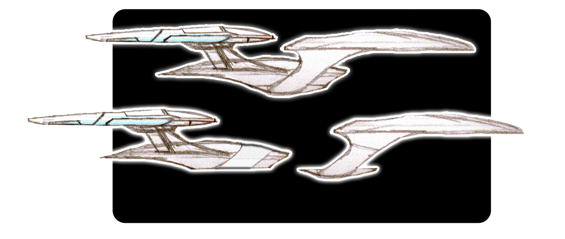
Anyhow, here's what I came up with with another deviation on the saucer sep idea.
Pretty nice, but the bit of engineering hull left attached to the ring feels a bit superfluous and ruins the lines of the engineering hull when separated.Heh, I know this is probably way above my pay grade, but this is how I would like to see Ihlecreations' initial sketch represented in a side view. The details are nice in the existing one, but it just looks too clunky. I'm a firm believer of streamlining designs, yes, I know in space that isn't necessary but it just looks faster.
Anyhow, here's what I came up with with another deviation on the saucer sep idea.
Similar threads
- Replies
- 5
- Views
- 756
- Replies
- 5
- Views
- 3K
- Replies
- 3
- Views
- 5K
If you are not already a member then please register an account and join in the discussion!