Love the TNG and VOY aesthetic combined like this.
-
Welcome! The TrekBBS is the number one place to chat about Star Trek with like-minded fans.
If you are not already a member then please register an account and join in the discussion!
You are using an out of date browser. It may not display this or other websites correctly.
You should upgrade or use an alternative browser.
You should upgrade or use an alternative browser.
3D interiors in Blender
- Thread starter Rekkert
- Start date
@Ryan Thomas Riddle: Glad you do!
@danellis: The room certainly isn't very deep, so it's a bit of a balancing act to have enough room both at the front for people to pass through and at the back for the Captain to sit, I played with it a bit more and I'm confident there's enough room back there.
Last week I caught a nasty throat bug (it's getting cold over here) so not much got done since the last update until today. Had a lot of time to think how to handle the room while I was feverish at least haha.
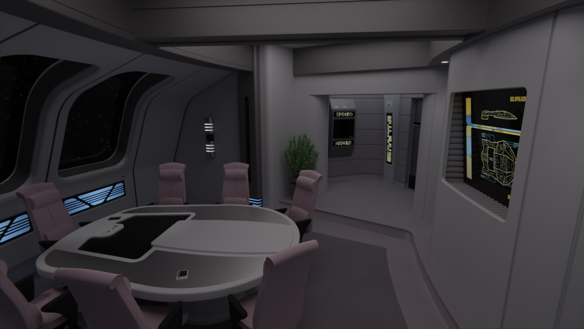
I further revised the table and I think I'll consider it finished now. I added the central screen (a reuse of the TNG lounge screen) and more details to the wall around it. Below the windows I added lights similar to those on the bridge, to try and tie the rooms together a bit more. Also, I added the windows back lol.
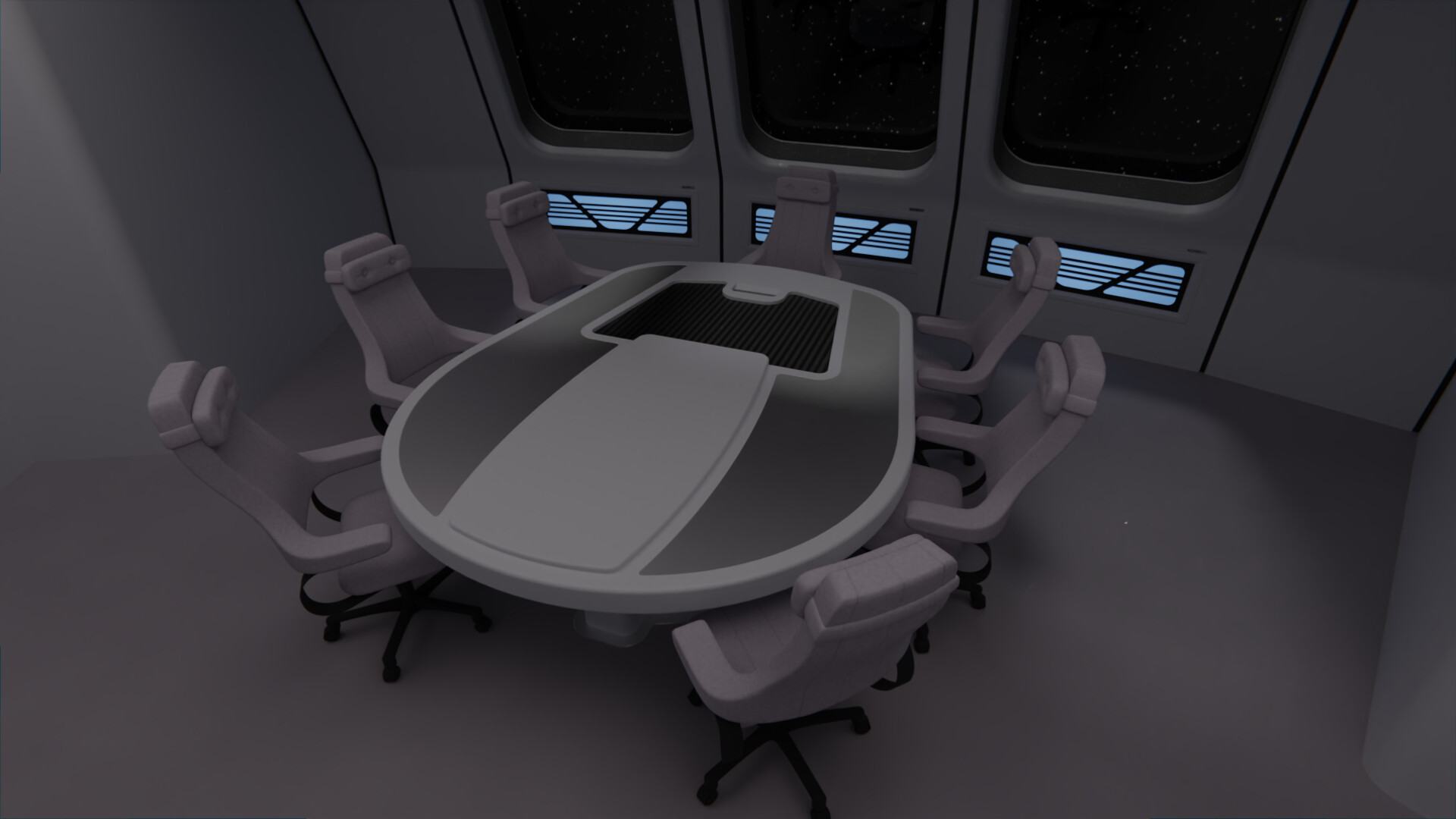
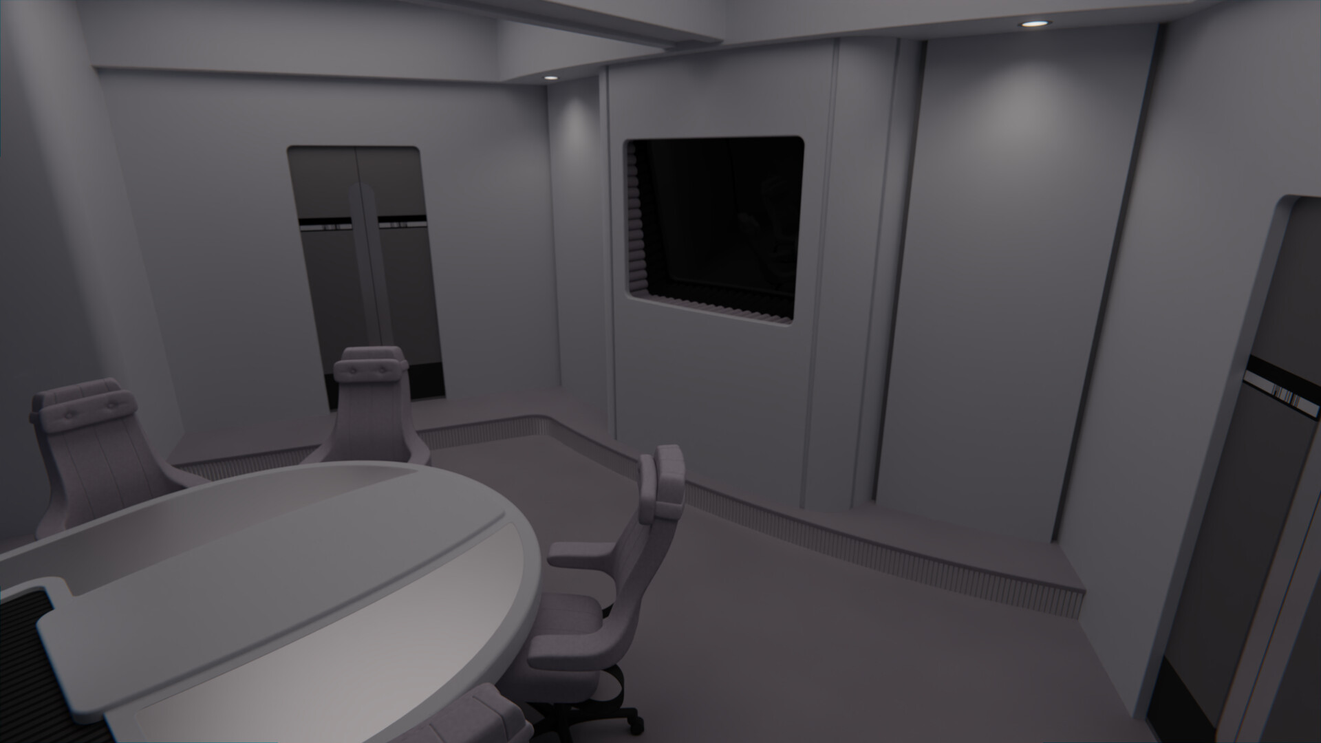


Awesome work as always, love seeing the design process from start to finish.
@batboy853: Thanks, glad you think so!
@Nays: Ohh, that's something I hadn't considered, interesting! I was gonna go with a simple copy of the angular shapes from the late-TNG obs lounge wall, but I think I can merge the two ideas to make it more unique, thanks for the inspiration!
@Bry_Sinclair: Thanks!
So, I finally bit the bullet and modeled the Ent-E observation lounge chairs (HÅG Signét 8400). @Donny helped me out with this one by providing some references of his own model, though I didn't went full-on with the realistic details such as screws and all that, I tend to imagine these as futuristic versions with no need for such 20th century details. I might tweak them a bit more (Blender's cloth sculpting is just too fun, I go back and forth between adding too many wrinkles and not enough hahaha) but overall I'm happy with how they turned out.
Other than that, I've added a few more details to the walls and light sconces. Plus as you can see both the chairs and the fabric edges of the screen are now a nice dark pink color, I wanted to expand the colors I've used on the Appalachia bridge, and I think this works quite well.
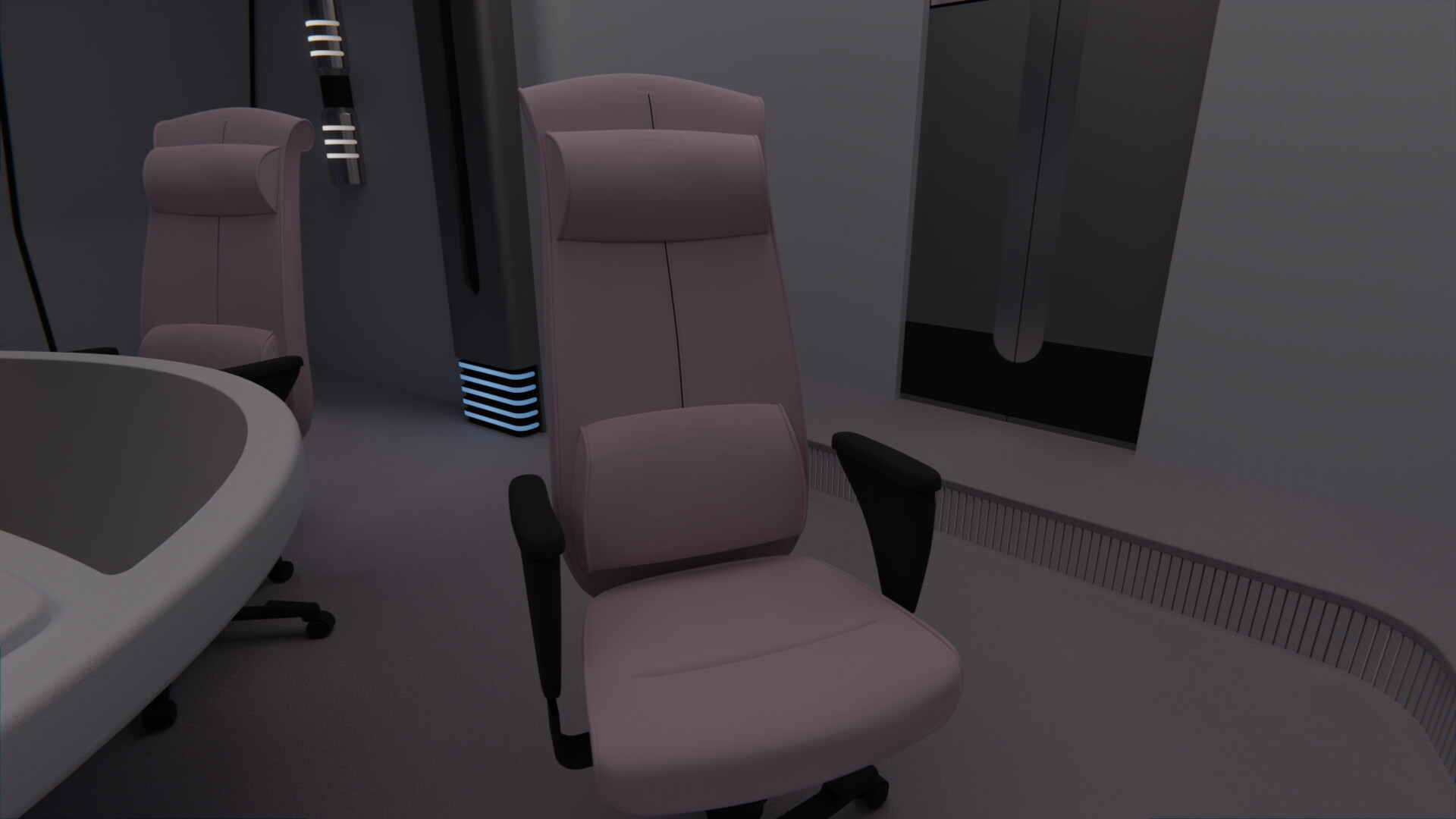
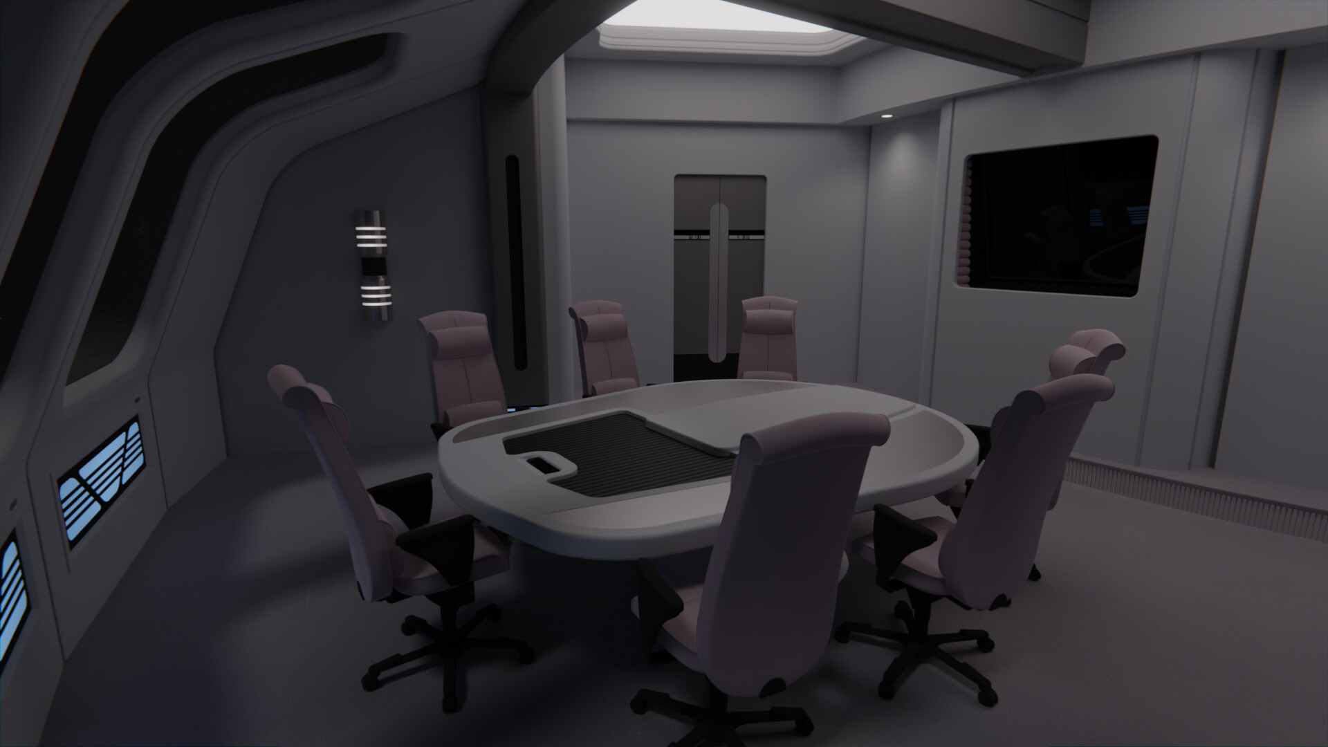
@Nays: Ohh, that's something I hadn't considered, interesting! I was gonna go with a simple copy of the angular shapes from the late-TNG obs lounge wall, but I think I can merge the two ideas to make it more unique, thanks for the inspiration!
@Bry_Sinclair: Thanks!
So, I finally bit the bullet and modeled the Ent-E observation lounge chairs (HÅG Signét 8400). @Donny helped me out with this one by providing some references of his own model, though I didn't went full-on with the realistic details such as screws and all that, I tend to imagine these as futuristic versions with no need for such 20th century details.
 I might tweak them a bit more (Blender's cloth sculpting is just too fun, I go back and forth between adding too many wrinkles and not enough hahaha) but overall I'm happy with how they turned out.
Other than that, I've added a few more details to the walls and light sconces. Plus as you can see both the chairs and the fabric edges of the screen are now a nice dark pink color, I wanted to expand the colors I've used on the Appalachia bridge, and I think this works quite well.


@danellis: Only the small keypad is actually an LCARS surface, the larger inset is just decorative, exactly like the similar looking inset on the Voyager conference table. And regarding the chairs, indeed the central seam is most likely a groove as @batboy853 pointed out. 
Didn't have much time to work on this, but I managed to add some further details. The table now has the LCARS controls at the Captain's place; I added a darker element to the carpeting under the table; added a plant for some more color; and added some decorative elements to the side walls at each side of the screen.
I did do some tests with more Voyager-esque ideas for these walls, including @Nays' sugestion, as well as some padded elements using the same fabric as the chairs to add even more color rather than grey on grey, but in the end the first idea I had won out. I wanted to add a very TNG element, as I don't want the Voyager aesthetic to overwhelm the room. This ship is meant as a mix of styles after all, unlike say the USS Budapest which I do keep very much in the Voyager style only (except for the chairs, I hate the Voy chairs).
On the screen I'm planning to do an LCARS graphic with views of the ship, very similar to what the TNG observation lounge had in later seasons.
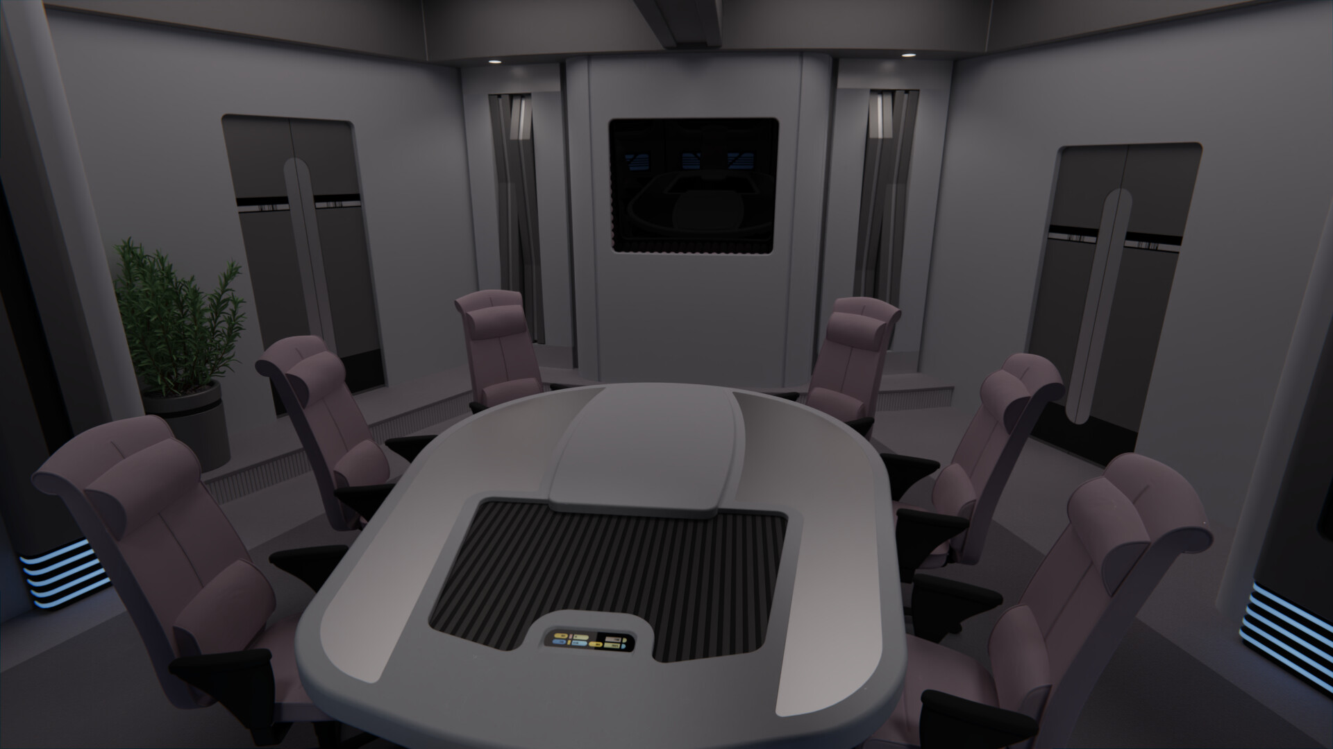

Didn't have much time to work on this, but I managed to add some further details. The table now has the LCARS controls at the Captain's place; I added a darker element to the carpeting under the table; added a plant for some more color; and added some decorative elements to the side walls at each side of the screen.
I did do some tests with more Voyager-esque ideas for these walls, including @Nays' sugestion, as well as some padded elements using the same fabric as the chairs to add even more color rather than grey on grey, but in the end the first idea I had won out. I wanted to add a very TNG element, as I don't want the Voyager aesthetic to overwhelm the room. This ship is meant as a mix of styles after all, unlike say the USS Budapest which I do keep very much in the Voyager style only (except for the chairs, I hate the Voy chairs).

On the screen I'm planning to do an LCARS graphic with views of the ship, very similar to what the TNG observation lounge had in later seasons.

Didn't they occasionally have alien-looking plants in early TNG? Maybe you can do something with color there, like a red or blue plant.
Didn't they occasionally have alien-looking plants in early TNG? Maybe you can do something with color there, like a red or blue plant.
Indeed, but I actually wanted some green as there's already blues and reds from other elements in the rooms (plus there'll be more when the LCARS screen is added). I want to avoid these being too monochromatic, which I felt was a problem I had with the mess hall.
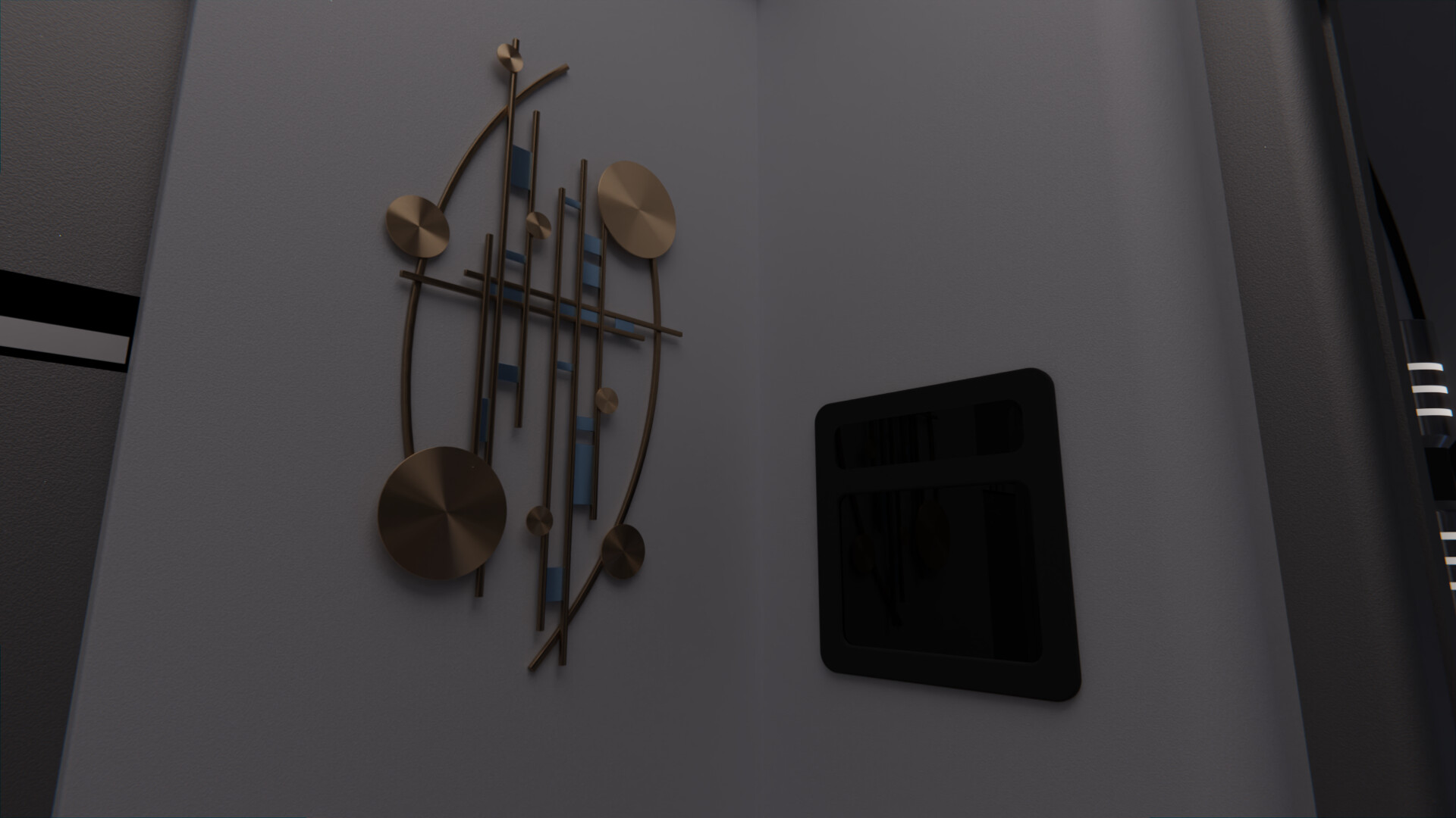
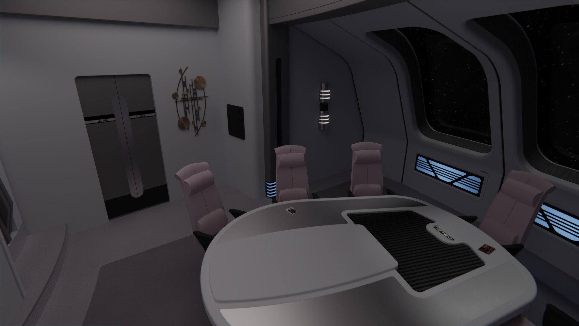
After looking at some vertical wall decorations online that I felt would fit the style (thanks Pinterest lol), I created a piece out of metal elements to hang on one of the walls, which I then colored in order to make a bit more interesting.
I've also placed a small replicator next to it, though I haven't added the LCARS to it yet. Honestly I'm not sure I like it or the placement, I might eliminate the replicator entirely from this room. Thoughts?
Also, I moved the two doors a bit towards the inner wall of the room (so, in the render below, the door is more to the left than it was before). This was in order to add more space for the decorations on one side, rather than having the doors centered on their walls as was the case on TNG.


That corner or the one on the opposite side of the room is really the best place for a replicator to go if you're going to have one.
Maybe if you moved the decor a smidge to the left (closer to the door frame) it wouldn't seem like the corner was quite so cluttered. Or maybe move the decor — which I really love, it looks like the kind of funky art they'd decorate sets with in '90s Trek — to another location. I like the practicality of having the replicator but also love the art, so if this was me designing the room, I'd hate to lose either of them.
Maybe if you moved the decor a smidge to the left (closer to the door frame) it wouldn't seem like the corner was quite so cluttered. Or maybe move the decor — which I really love, it looks like the kind of funky art they'd decorate sets with in '90s Trek — to another location. I like the practicality of having the replicator but also love the art, so if this was me designing the room, I'd hate to lose either of them.
I think the TNG style detailing for those walls was definitely a great choice. The wall decoration is great too! However, this room needs either a warmer gray paint, brighter lights, or different colored accent walls to break up the overall cold gray feeling of the room. Everything just kinds of blends in together in my opinion.
Also, another option for added detail is mirroring the metal accents from the floor step onto the ceiling supports.

Also, another option for added detail is mirroring the metal accents from the floor step onto the ceiling supports.

That looks cool!After looking at some vertical wall decorations online that I felt would fit the style (thanks Pinterest lol), I created a piece out of metal elements to hang on one of the walls, which I then colored in order to make a bit more interesting.
@cardinal biggles: I agree that losing either would be a shame, but I don't like how they were all together on one side before.
@Nays: I concur regarding how everything blended together, I had the same problem on the Appalachia mess hall, I really don't like the Voyager color pallet. Hopefully today's update helps.
  As for the metal accents on the ceiling, I'm leaving that bit for the USS Budapest interiors when I do more of that.
@Commander Troi: Thanks, glad you like it!
I started work on the main display. Still very early, some of the LCARS elements are just stretched to fit into the panel rather than properly fitting, I need to do further passes on it, but the main idea is there.
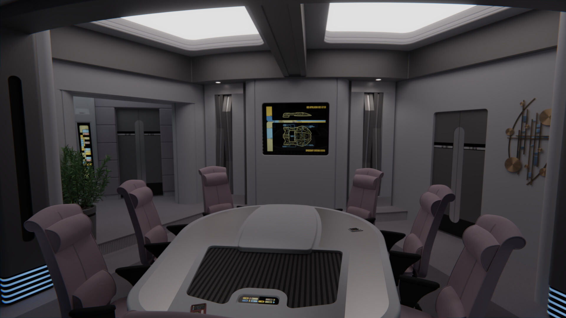
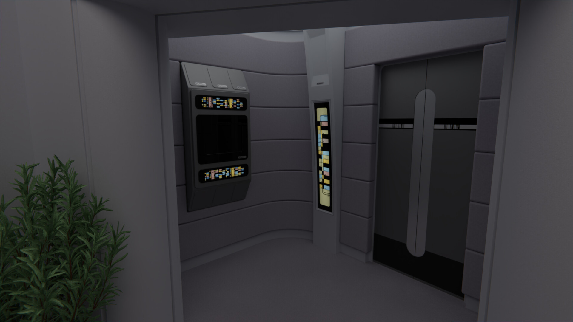
Had a somewhat crazy idea on Saturday, but I think it works: In an attempt to add some further surfaces and depth to the room, I did a test to add one of the bridge's alcoves replacing the entrance door from the bridge. This somewhat solves the problem of where to place the replicator, as a larger unit can now replace one of the alcoves doors, plus it adds some more color from the alert status indicator panel and the light purple wall fabrics. Thoughts?
@Nays: I concur regarding how everything blended together, I had the same problem on the Appalachia mess hall, I really don't like the Voyager color pallet.
 Hopefully today's update helps.
  As for the metal accents on the ceiling, I'm leaving that bit for the USS Budapest interiors when I do more of that.
@Commander Troi: Thanks, glad you like it!
I started work on the main display. Still very early, some of the LCARS elements are just stretched to fit into the panel rather than properly fitting, I need to do further passes on it, but the main idea is there.
Had a somewhat crazy idea on Saturday, but I think it works: In an attempt to add some further surfaces and depth to the room, I did a test to add one of the bridge's alcoves replacing the entrance door from the bridge. This somewhat solves the problem of where to place the replicator, as a larger unit can now replace one of the alcoves doors, plus it adds some more color from the alert status indicator panel and the light purple wall fabrics. Thoughts?


Excellent solution!
Similar threads
- Replies
- 482
- Views
- 60K
- Replies
- 7
- Views
- 678
Contest: ENTER
January 2026 Art Challenge - Suggest Your Themes!
- Replies
- 2
- Views
- 268
If you are not already a member then please register an account and join in the discussion!
