3D interiors in Blender

Rekkert

Fleet Captain
Premium Member
Howdy!

I'm not very active here, but I've decided to hop in and get more involved in other forums besides SciFi-Meshes and Deviant Art if that counts.

I don't have any work in progress right now, but when I do my idea is to update this thread with it, not only to show my finished stuff.

In late 2016 I've learned how to use Blender (I used 3DS Max before) and started modeling a starship bridge. That became bridge of the USS Patagonia:

uss_patagonia_bridge__3_by_rekkert-darnyjb.png

uss_patagonia_bridge_cutaway_by_rekkert-daudbj4.png


After that I started a new bridge, intended for small ship from 'the lost era', the USS Galatea:

uss_galatea_bridge__3_by_rekkert-db2x9ji.png

uss_galatea_bridge_cutaway_by_rekkert-db2xhwt.png


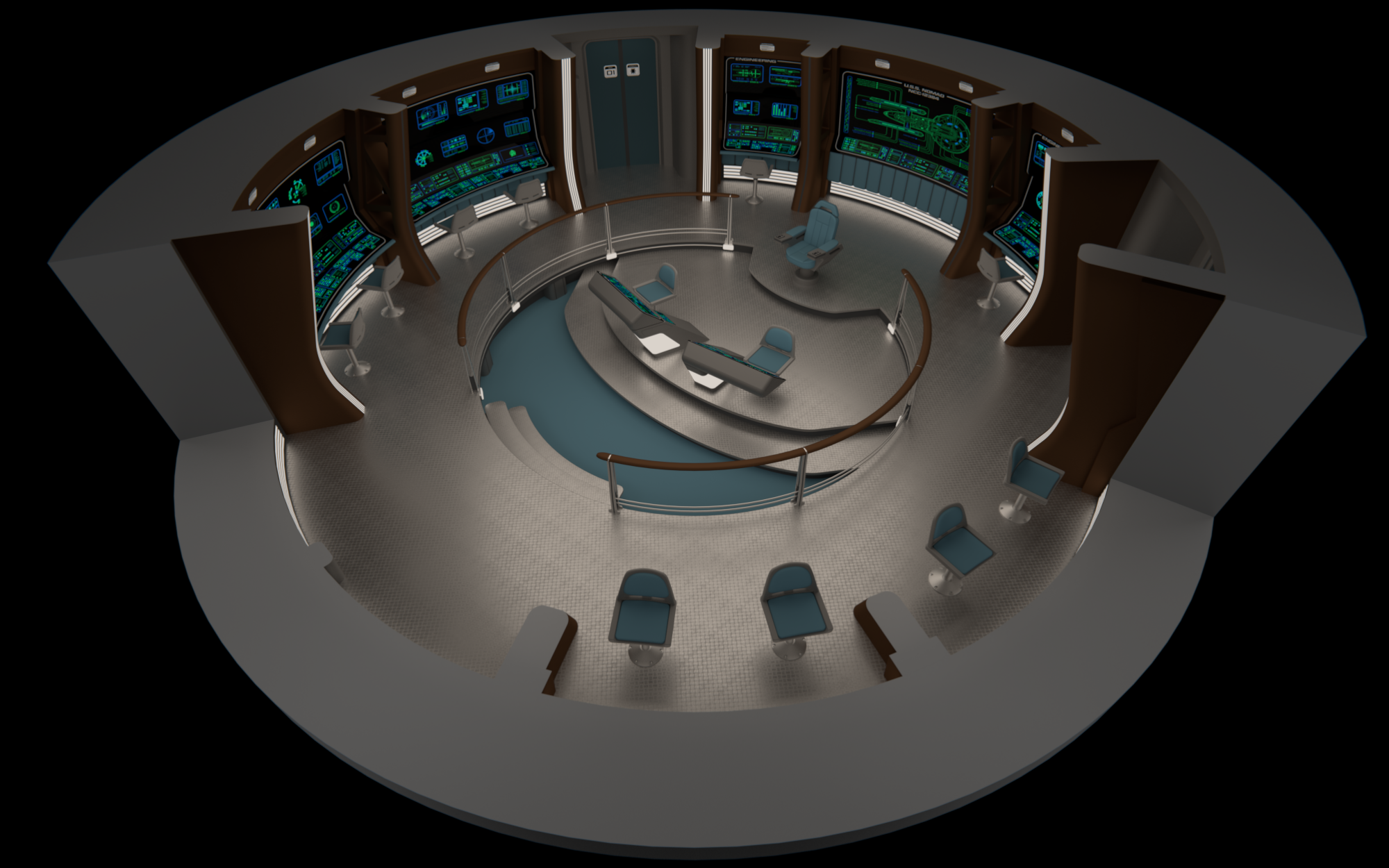
At the same time, I received my first commission, to modify the Patagonia bridge and make it look similar to the Ent-B one. Hence the bridge of the Nomad was born, to be used on the new RPG at nomad.bravofleet.com.
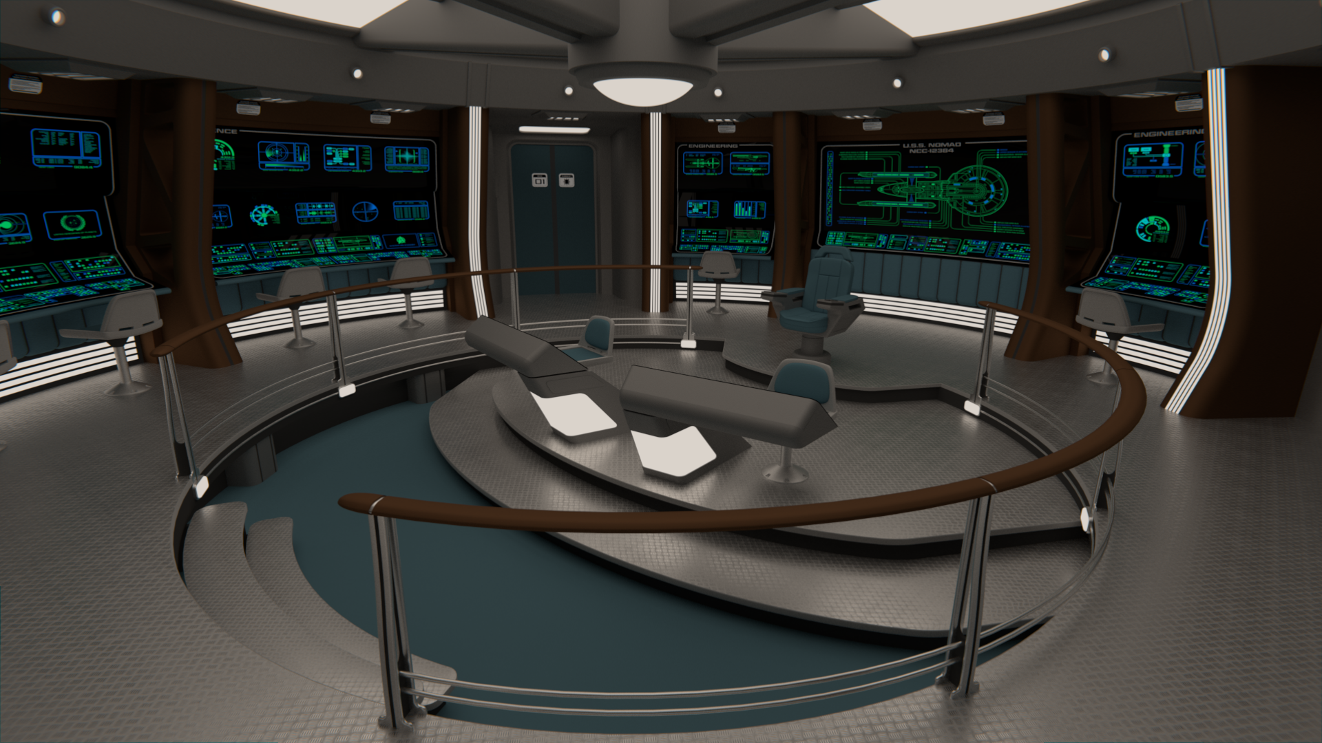
uss_nomad_bridge__1_by_rekkert-db251db.png

uss_nomad_bridge_cutaway_by_rekkert-db251ab.png


Finally, I decided to bring the Galatea bridge into the TNG era, and modify it heavily to fit into that era. This became the bridge of the Charybdis, my latest design:
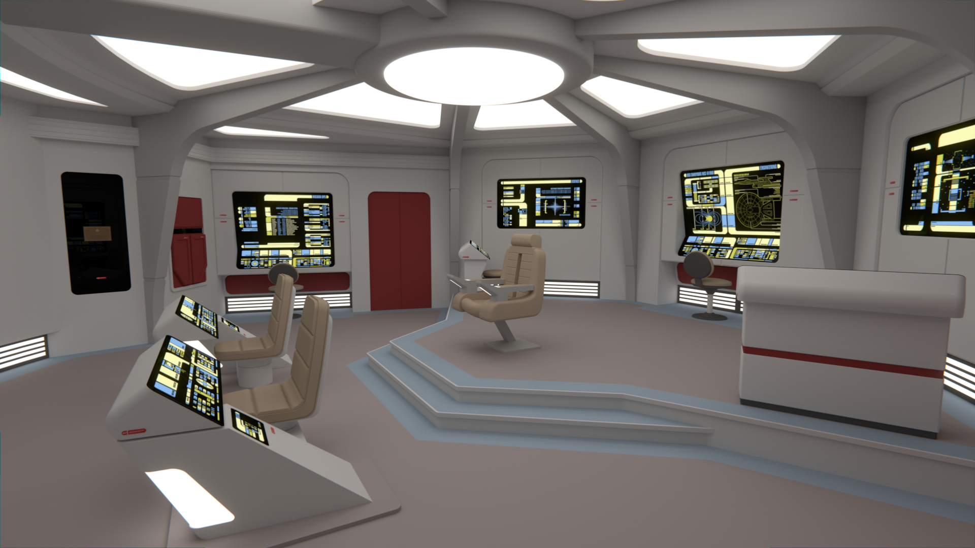
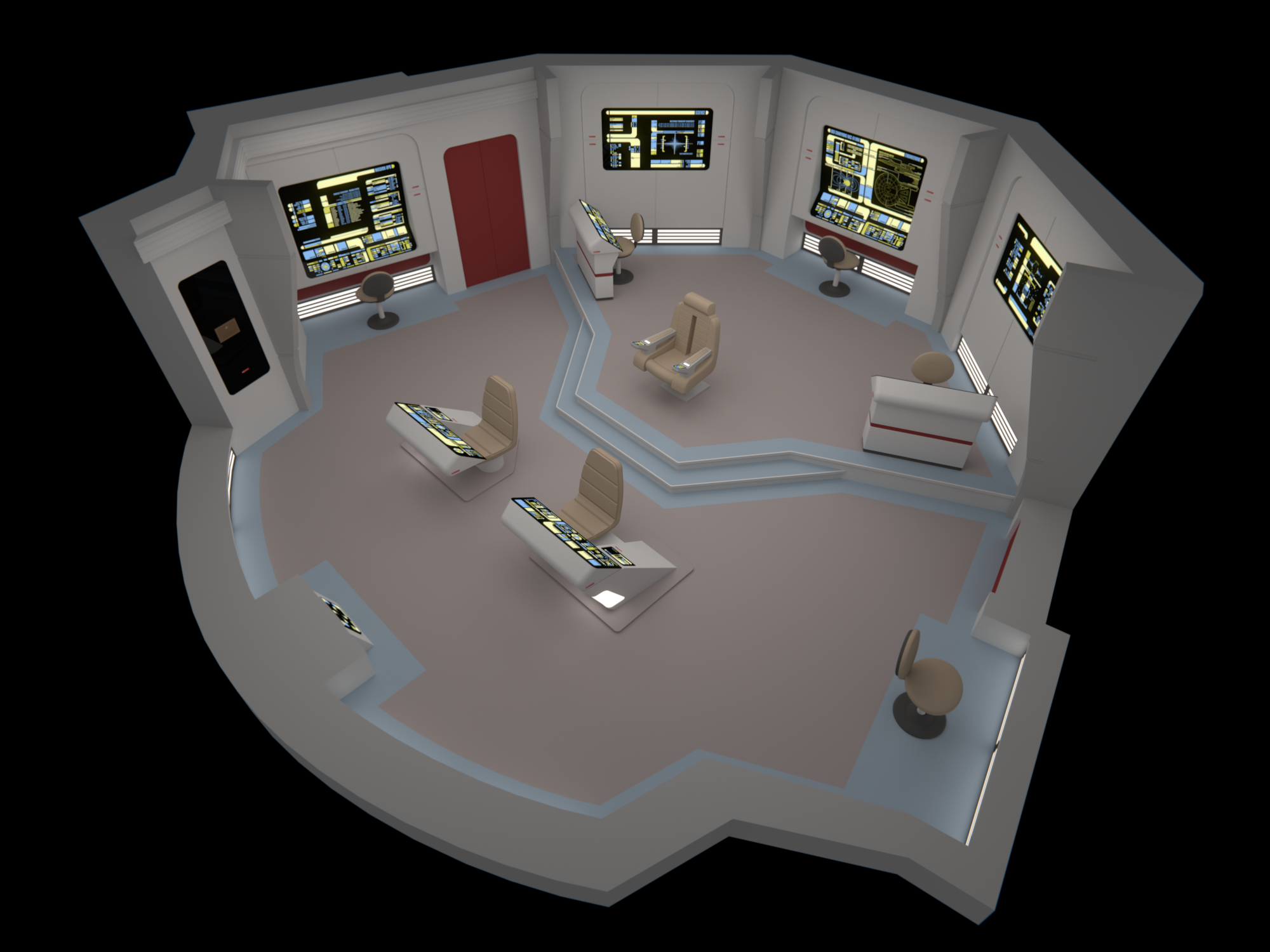
uss_charybdis_bridge__3_by_rekkert-db6hnq6.png

uss_charybdis_bridge_cutaway_by_rekkert-db6hnqp.png


I've got a lot more images, but I don't want to make this post that long, so you can see more of each bridge at deviantArt or at Art Station.

I'm more than open to ideas about what to do next, and any critiques to my work is welcome in order to improve it. Of course, if you're interested in a commission, feel free to drop by here. Thanks for looking!
 
You inspire me.

I'm not totally happy with the Patagonia's floor--I think it's a bit bright and sanitary--but I love just about everything else about the bridges you've presented.

I'll certainly check your other work out.
 
Awesome, I think they look great!

The Nomad color scheme is my favorite, probably since my favorite Trek bridges are from around the time of ST:VI. :)

-Ricky
 
Seeing as SFM is currently down (and has been a few days) I'd say you found yourself a new home ;-)

Nice work, it always is interesting to see how a few additions and removals change the whole ambiance of a bridge. I think I like it better as a Lost Era bridge though, but both are great!
 
Just stumbled onto these and really like your work.

I use Blender to model/render the interiors for my trek-ish webcomic and always find myself struggling with the color palette, (specifically getting away from beige/grey in every room). So I have to say I'm a bit inspired by how well the bolder color choices work on your Nomad and Charybdis bridges. Really well done.
 
what I really like about the bridges is that they look like they would be easy for any fan or fan film production to build.
 
Wow, I didn't think I would get this much of a response. Thanks everyone!

@Scribble: Thanks! I wanted to go in the style of the Final Frontier bridge, but I get that it's not to everyone's taste, indeed several people have told me that it's too bright.

@BorgMan: Yeah, SFM has been down for a week now, don't know what happened. :/

@Tapper: Haha, the same happened to me, when trying to differentiate the Charybdis from the Galatea, I wen't ahead and added color. However all my color choices (so far) are actually shown on canon bridges. The Nomad is based on the Enterprise-B, while the Charybdis is based on the Prometheus from DS9, I always go to canon for inspiration.

@batboy853: I tried to keep it true to the spirit of the set. If a bridge is based on the TNG era, I try to do it 'doable' within a TV budget, that way it looks more authentic to the time period.

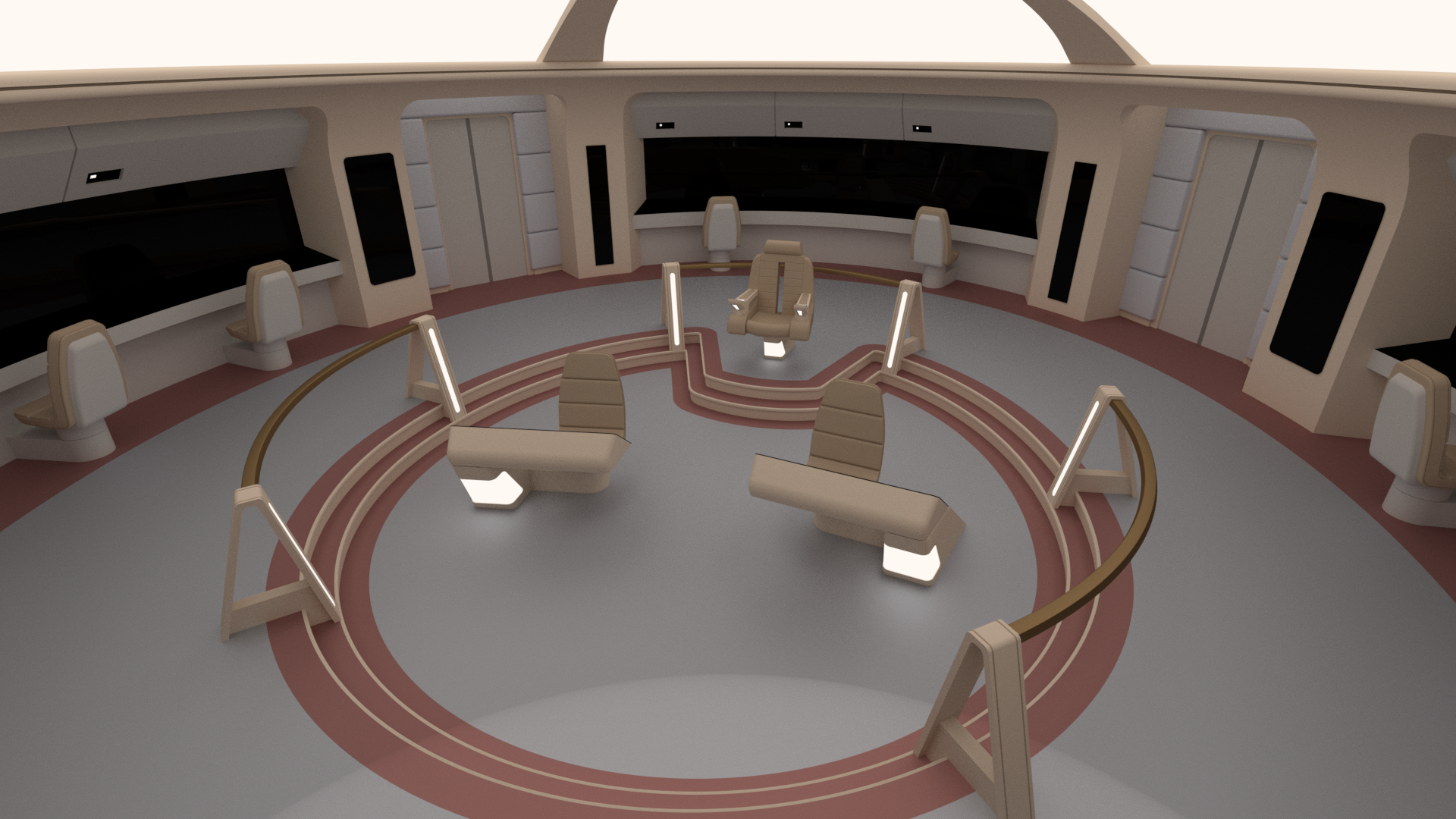
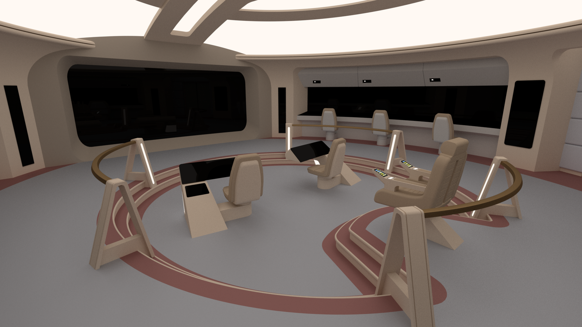
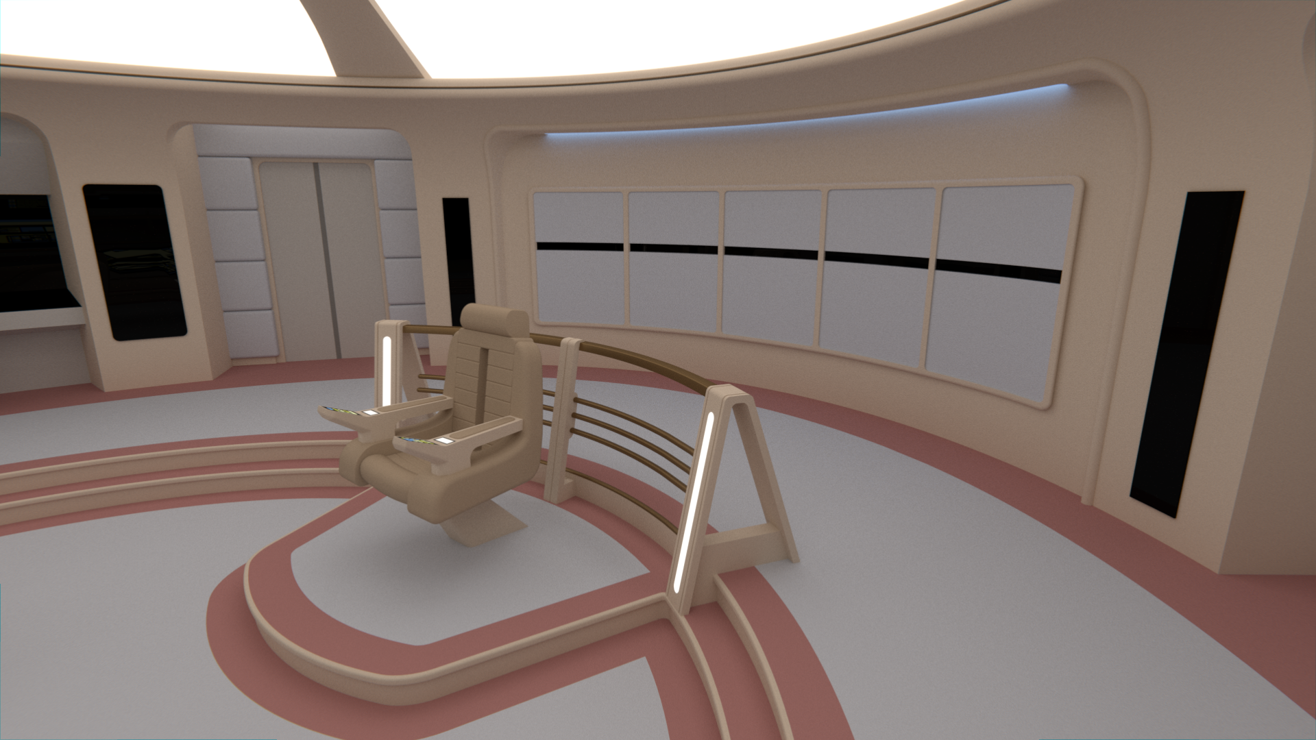
Speaking of the TNG era, here's a bridge I started work on when I finished the Patagonia, and that I then abandoned to work on other stuff. It's the bridge of a Buenos Aires class ship, and I wanted it to have a TMP era layout but with TNG elements (just like the exterior of the ship).

I abandoned it because I felt it was too big, with too much open space between the central consoles and the wall mounted consoles.

What do you think? Should I keep working on it the way it is now, redo the outer walls so that the scale is right, or just drop it?

c3_01_by_rekkert-db70295.png

c4_01_by_rekkert-db70278.png
 
Nothing wrong with it. I actually like the sensation of space, even though I'd add an extra support for that railing; right now it looks flimsy. And perhaps an extra console behind the captain? Also, for the captain to first take steps down, and then back up doesn't feel natural. I had a quick look and none of the established bridges does that, probably because of that. Now, if you'd split up that railing behind the captain to his left and right and move the chair a little bit to the aft, there's no problem.

Now that I look at it a bit better... That railing looks awfully low...
 
I love it! I'd echo the something seems off about the captains chair, perhaps lower it a step? Then put a console behind the captain for tactical, like a mini galaxy tactical station, but with a standard rail instead of the horseshoe.
 
The only things that bother me a bit are the aforementioned railing and the empty space in front of the central consoles and the viewscreen. It almost seems like there should be another console ahead of them.

I do like the overall design, though, especially the way the consoles in the middle are lower than the rest of the bridge. I once had an idea for a ship with a 'command pit' of sorts, where the primary stations (ops, tactical, helm) were located in the center of the bridge, much like you have here.

My idea would have them about twice as deep as your design here with the Captain's (and X.O.'s) chairs also in the pit, located behind the others. They would have been surrounded by auxiliary stations on the higher level.

I also considered the notion of the Captain's ready room being located under the command pit. Like, there would be an opening in the floor that would lead to several steps or a ramp that would lead into the Ready Room, but that seemed a bit over the top and too complicated.
 
I actually like it the way it is now, with the possible exception of the captain's chair. Seems like it's a bit too close to the stairs in front of it. Also, the way it is, whoever sits there has to go down stairs, then up again to get to the chair.

The empty space in front doesn't bother me as you want an unobstructed field of view to the viewscreen. As for the floor space around the outside, there's a lot of space but not so much that I'd change it. It seems fairly functional in comparison to the relatively cramped bridge of the otherwise massive 1701-D.
 
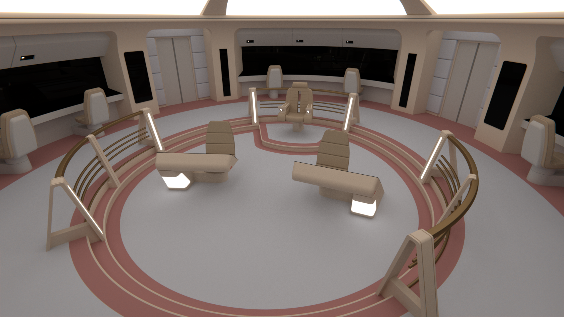
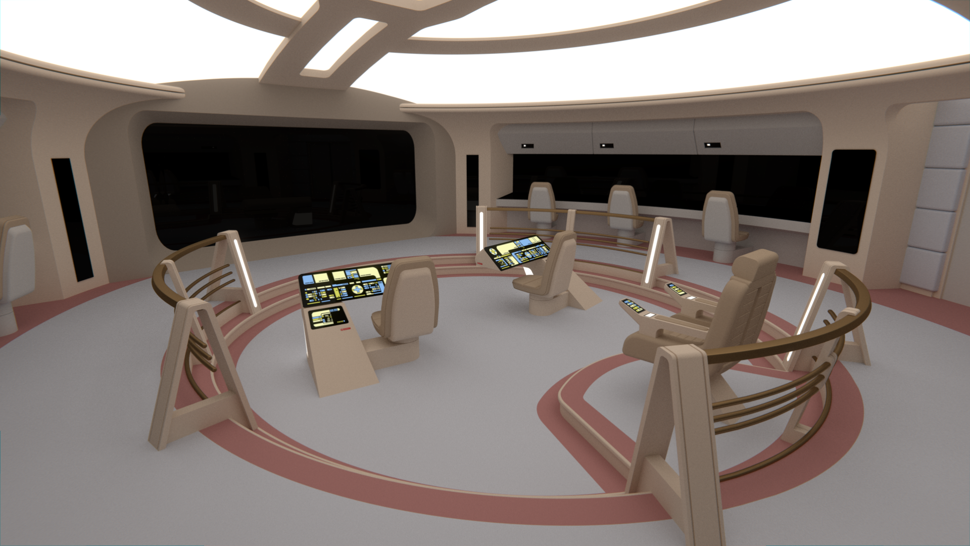
Well, I went ahead and changed the scale of the walls and ceiling to 90% of the original size. This also affected doors but they're still over 2 meters tall, so no problem there. I had to make some adjustments, but nothing major.

You can open both the images above and the ones below for a direct comparison, it's still a very big bridge, but not enormous like before. It was almost twice as wide as the Enterprise-D bridge!

The railing had the exact same height as the ones on the previous bridges, it was the scaling of the 'set' that made it look so small in comparison.

I've added more details (and support) for the railing, and, per all the suggestions, made the captain's chair sit on a lower step. Also, I've updated the central consoles to the UV mapped model I used on the other bridges, so they now have decals and LCARS.

c3_06_by_rekkert-db725nv.png

c4_04_by_rekkert-db725my.png
 
Last edited:
Yeah, that definitely looks better. Good stuff. Only thing I'd change might be use a blue outline on the carpet rather than red. I feel like that'd provide some nice contrast to the other colors used.
 
That looks really good, particularly the railing. I also like that you removed the light from underneath the captain's chair.

The TNG era happens to be my favorite and I really feel you've captured the design aesthetic while creating something original.

If I may make a suggestion, as I look at it now, I think the area just above the viewscreen looks funny. It sort of bluntly meets the lights/roof as well as the beams coming in from the side. Perhaps a ledge there matching the material you've used for the roof structure and side walls would make for a nicer transition?
 
Yeah, it looks much better like this. If you still think it's too big, you could always scale it down a bit more but make it higher. This brings the forward consoles closer to each other as well, making a bit more use of the space while still feeling spacious. I think that's the main problem here: the "pit" is a bit oversized, but the rest looks pretty good. If you make a plateau on which to rest the conn and ops, you get more of that TOS/TMP feeling while simultaneously breaking up the emptiness. Keep the plateau on the same level as they are now, though, and make the rest of the pit deeper in that case. Vertical movement is a great eye-pleaser in spaces like this.

Seconded on the viewcreen ledge. Perhaps let that ridge continue on in a curve so that the viewscreen is a little bit in an alcove? I also like the wood you're using that cuts off the carpet underneath the railing. I had to do a double check to make sure it wasn't an actual railing at foot level, but it seriously looks good.
 
@Jay Everington: For this particular bridge, I want to keep the color pallet as close to the season 3 Enterprise-D as possible, hence the red carpet outline. Ironically, when I first did a bridge for the Buenos Aires (some 10 years ago using SketchUp), the floor was blue. I hope to recreate that bridge using my new techniques at some point.

@Tapper: That light under the captain's chair was something that I thought would look cooler than it actually did. :lol:

As for the area above the viewscreen, I don't plan on changing it, as it's pretty identical to the way the same area actually looks on the Enterprise-D. I still have to add details on the ceiling, so maybe I'll add something to make the transition smoother, but it looks fine as far as I'm concerned.

The fact that I originally did this bridge with no regards to scale keeps giving me problems now. The consoles on the walls are waaay too wide, giving each station almost 1.5 meters. Because of that, I decided to put more stations on the side walls (5 on each one), and remove the back consoles, replacing them with those padded bits the Ent-D had. I might add some LCARS to them, I'll test out a few things.

c5_01_by_rekkert-db74m0u.png
 
Last edited:
You're right about the roof/viewscreen in TNG, which I think was a result of the viewscreen being easily detached from the rest of the set.

I like your solution for the consoles and rear wall. And while I know you're trying to stay true to the era, specific detail/coloring on those panels may give you an opportunity to set this bridge apart from the Enterprise-D while still keeping it rooted in the same design family.

When it comes to the consoles on the side walls, I'd be interested to see how it looks with 5 stations. Perhaps too crowded? On the Enterprise-D bridge the consoles on the back wall were almost always not in use. If your stations are meant to be permanently manned then those poor officers will demand sufficient elbow room! :)

Looking forward to more.
 
I liked it more the way it was before... If you do keep the rear section the way it is now perhaps put a tactical station behind the captain's chair?

And / or maybe style the rear panels similar to how they looked from yesterday's enterprise:
wSecPeM.jpg
 
Back
Top