• Welcome! The TrekBBS is the number one place to chat about Star Trek with like-minded fans.
    If you are not already a member then please register an account and join in the discussion!

Spoilers Strange New Worlds General Discussion Thread

so the M'Benga and Spock names aren't (the) correct ones
APRIL 9 UPDATE: CBS/Paramount+ reached out to our team this morning to “clarify” that these updated character posters were “inadvertently displayed with Spock and M’Benga’s names that were incorrect.”

While the posters remained on display at the Mission Chicago Strange New Worlds costume and prop exhibit as of this writing, the statement continues: “Sometimes when you work at warp speed, mistakes are made. While Spock and M’Benga do indeed have first names, they have yet to be revealed.”

https://blog.trekcore.com/2022/04/star-trek-strange-new-worlds-mbenga-spock-first-names/
That could also explain why the Kelvin Universe 1701 Enterprise is on the posters.:rommie:
 
What an odd thing. Sounds like "uh oh, we weren't supposed to reveal that yet!"
If TikTok hadn’t spoiled Paul Wesley’s guest star as Kirk, we probably would’ve gotten that either today or after the first season ended. So that’s an “uh oh” too
 
If TikTok hadn’t spoiled Paul Wesley’s guest star as Kirk, we probably would’ve gotten that either today or after the first season ended. So that’s an “uh oh” too
The filming leaks never said who he was though. Most people were speculating people other than Kirk.
 
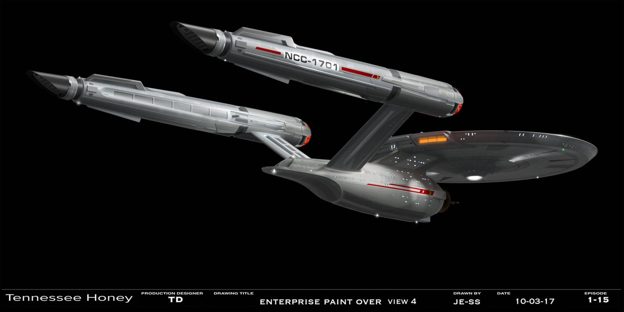
The John Eaves straight pylon and TOS hull color version of the Enterprise looks so good. I wish it's what we were getting even now(except for the row of illumination lights on the upper hull of the saucer, those needed to go in any iteration).

277792097-10166298626700008-7575555057768957479-n.jpg
 
The John Eaves straight pylon and TOS hull color version of the Enterprise looks so good. I wish it's what we were getting even now(except for the row of illumination lights on the upper hull of the saucer, those needed to go in any iteration).

277792097-10166298626700008-7575555057768957479-n.jpg
Broken link.
 
I'm okay with the surface lights.

If I had the chance to change one and only one thing about the model, it'd be the font on the registry. I'm so tired of microgramma bold extended, and elements of it aren't optimal for distance reading.
 
I actually like the swept back pylons with the wider sized pylons. I think it looks a little odd with them straight at that size. Straight and a little less wide works though. And absolutely agree with the color.
 
If you are not already a member then please register an account and join in the discussion!

Sign up / Register


Back
Top