• Welcome! The TrekBBS is the number one place to chat about Star Trek with like-minded fans.
    If you are not already a member then please register an account and join in the discussion!

Spoilers Star Trek: Discovery 3x05 - "Die Trying"

Rate the episode...


  • Total voters
    214
Shame about the horribly fuzzy and badly lit visual effects that made Discovery showing up at Starfleet HQ feel like a hazy, blurry headache, whilst as usual, barely showing off any ship designs thanks to terrible camera angles, but oh well.
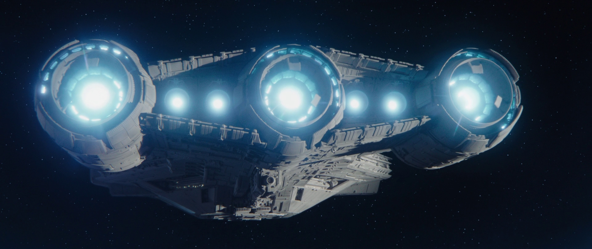
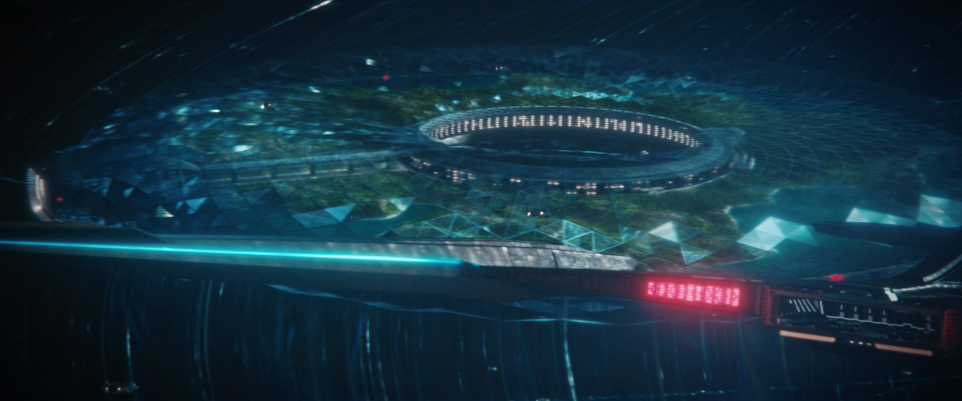
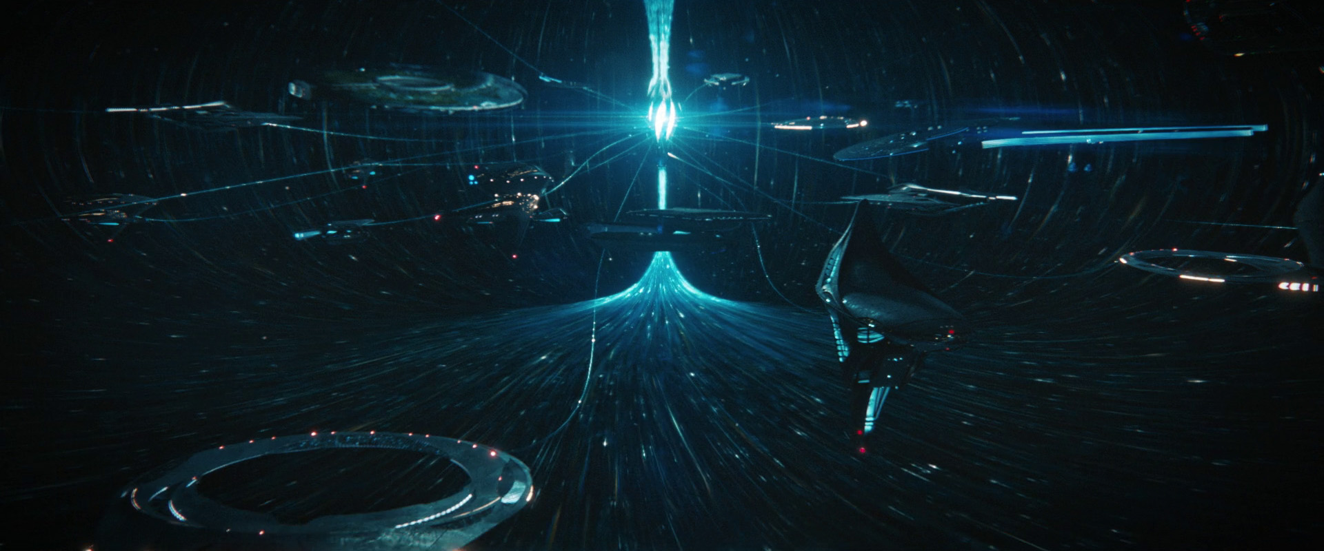
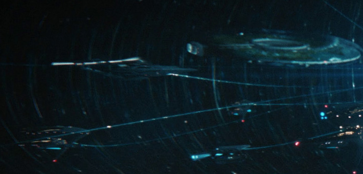
yeah, I really wonder why they keep doing this…They got beautiful detailed models but do horrible lighting on them and barely show them on screen.
 
It blows my mind that they had a long sequence of starship porn... without actually showing much of the starships at all. And what they did show was either: badly lit so you couldn't see what you were looking at, low poly models lacking any sort of detail, or bizarre extreme close ups focusing on a registry. Or a combination of all three.

I've almost given up on the space visual effects in this series, they're so badly made.
 
it's amazing how dark space is :crazy:

You can make dark space shots look good, using highly detailed and well lit models that show off exactly what a ship looks like:

bac3.jpg


Or you can make dark space shots look like a badly lit, badly staged, blurry mess:

c652.jpg

73d1.jpg

All three of the above screen shots are the full 1080p frames
71a4.jpg

A crop of the top left corner, wtf is going on ? Why is the quality so bad?
 
99% of our space sci-fi has totally fake impossible lighting. And sound in space. It's all stylized, just to different degrees. The Starfleet HQ stuff is a weird bubble lit by the HQ base itself and it's energy field. It won't look as crisp as shots "outside"
 
99% of our space sci-fi has totally fake impossible lighting. And sound in space. It's all stylized, just to different degrees. The Starfleet HQ stuff is a weird bubble lit by the HQ base itself and it's energy field. It won't look as crisp as shots "outside"
problem is that many, many discovery and Picard shots are like this: blurred and confused.

The other I can see fine.
and the new federation ships are basically blobs.

I mean, when this sequence aired nobody understood the shape most of them were supposed to have.
 
Compare this with lower decks, where the changes on the Cerritos were immediately obvious in the second season.
 
I'll take the middle ground in this discussion.
The behind the scenes stuff and Eaglemoss models, e.g. of Seven of Nine's Fenris Ranger Ship, confirm that the models are highly detailed and rigorously thought-through. But in the onscreen appearance, the shape of the vessel is barely discernible.

Now on the FedHQ scene, we got to see the ships okay, except for names and registry numbers when there was no deliberate closeup.

Now, compared to Lower Decks? Yes, the ships/space scenes there are much better lit.

Overall, some of the best DSC shots are deliberate beauty shots, or cool shots (like when Discovery is halfway stuck in mycelium).
 
:lol: on freeze frame closeups? I promise you, to me and 99.9% of the audience the Cerritos looks exactly the same.
it was REALLY obvious they changed the nacelles to me.

The behind the scenes stuff and Eaglemoss models, e.g. of Seven of Nine's Fenris Ranger Ship, confirm that the models are highly detailed and rigorously thought-through. But in the onscreen appearance, the shape of the vessel is barely discernible.
Indeed, which is really odd…why go all the way to detail them but not show any of that detail?

Overall, some of the best DSC shots are deliberate beauty shots, or cool shots (like when Discovery is halfway stuck in mycelium).
indeed: in season 2 and specially in season 3 the situation improved a lot. In season 1 getting good shots of even the discovery was really rare.
 
Blurry blobs is a good way to describe recent Trek’s starship visuals.

I just don’t think the production team care. It must be a low priority, that’s the only explanation why the quality can be so poor most of the time.

I love starship porn but I just can’t get excited by anything shown lately because the ships are visualised so badly. Everything has this weird grainy, muddy filter on top of already excessive grading. The compositing seems really strange too, based on the above crop. Like that top left corner was AI upscaled from 480p.
 
You can make dark space shots look good, using highly detailed and well lit models that show off exactly what a ship looks like:

bac3.jpg


Or you can make dark space shots look like a badly lit, badly staged, blurry mess:

c652.jpg

73d1.jpg

All three of the above screen shots are the full 1080p frames
71a4.jpg

A crop of the top left corner, wtf is going on ? Why is the quality so bad?

For Star Trek, starships would employ a different strategy than say Star Wars or other scifi.
Why?
Well, mainly because dating back to TOS, when the 1701 was designed, the idea was to have all of the most important technological bits INSIDE the hull.
In short, Trek ships don't need a 'greeble mess'. In my opinion, the 24th century ships that came after TNG (aka DS9 and VOY) should have applied a similar methodology and would have been more 'smooth' on the outside (less triangles... more curvature).

The 32nd century ships seem to use this method, but they also seem relatively low poly with questionable textures.
The VFX team I think needs to do more work on them for the 4th season.
Keep the general design, but higher quality meshes along with higher resolution textures that look good when well lit.
 
If you are not already a member then please register an account and join in the discussion!

Sign up / Register


Back
Top