-
Welcome! The TrekBBS is the number one place to chat about Star Trek with like-minded fans.
If you are not already a member then please register an account and join in the discussion!
You are using an out of date browser. It may not display this or other websites correctly.
You should upgrade or use an alternative browser.
You should upgrade or use an alternative browser.
Klingon change for season 2?
- Thread starter Roald
- Start date
I liked the photoshop job that put a beard on L'Rell.
Kor
Was it a neckbeard?


You mean like all the Human looking Klingon Captains (like Kor, Kang, and Koloth) and other leaders (like Khaless in TOS - "The Savage Curtain") during TOS three season run?Thing is, that tiny percentage of the overall population of the Klingons we saw were all their leaders and a notable group of Captans and commanders. So while we of course don't have a good overview how the vast majority of Klingon population dresses, we know how their leaders and notable character dresses and all "regular" people we saw followed that trend. So while it may only be a tiny percentage of the overall population, they very much stand in for the klingon "ideal" way better than theri actual raw numbers account for.
")

Looks fine in terms of refining the DSC design to mesh with the TOS/TNG movies/TNG/DS9/VOY/ENT designs. Kinda looks like her head lost it's pointed crest from Season one; wonder if that's just a trick of the camera angle or if they retconned that?
So, outside of the 4 nostrils she looks like a regular TNG-VOY era Klingon. Cool.
They had four nostrils? I thought those were just extra folds/ridges/whatever. Didn't Worf have something similar?
Makeup changes due to addressing actor’s comfort and ability to perform is very common. Plus the makeup artist merely refining the look over time just because they wanted to do so.
Compare Worf’s makeup in “Encounter at Farpoint” to scenes in “All Good Things” that take place at the exact same time. His makeup does not match. They improved it over the course of the series. They made no effort to explain it. It’s not comparing different Klingons who lived at different times. This was the exact same guy at the same moment in time. They changed his look to improve it. it happens.
Agreed. Besides, with both Worf and L'Rell, while you can tell that they've changed the makeup, the designs are close enough that they still look like their character and don't really feel like an inconsistency. IMHO, it's not much different then comparing the original TOS effects of the Enterprise and the remastered ones.
They need to work on the skin texturing so her face doesn't look so artificial.
Her skin looks absolutely fake in this picture. But then agsain, ALL previous promotional pictures from DIS have been heavily photoshopped so far - in the S1 pictures, they not only removed Mary Wisemans mole - they completely erased her freckles and gave her the face of a barbie doll.
So I'm guessing this look (which IS "too smooth" for real skin) is just that - and that the "real" version will look better.
And then add in some shading to thin out her face, because the prosthetics along side her natural head shape makes her head way too fat for her body.
Marry Chieffo has a very angular face, and she's a big woman! Yeah, the make-up maaay make her look a bit more chubby than she actually is. But Klingons do love strong women.

She definitely has the Amazonian/wariiour woman type of body. And that's IMO perfect for the rolw.
Honestly kind of surprised the guys let her on screen with those problems given if anyone put forward a makeup that on Face//Off they would have sent them home..
Yeah, the klingon make-up is definitely not one of the finest work of these make-up guys. For all klingons. The ridges look way too artificial and pronounced, TNG/DS9 managed to get a much more organic look to it. But then, at this point it's at least noticeably Klingon, which is a BIG improvement over whatever happened on season 1....
I'm watching a TrekYards (I know, I know) video on L'Rell's new look, according to Samuel (the younger one) he met Mary at the Birmingham con, he says that she said she's trying to get them to use less and less makeup around the face.
He also said she recognized him for some of the youtube videos he's done on Klingons in the past which is a cool thing for him.
I like how much Mary has embraced her role as a Klingon.
Yes, Mary Chieffo is absolutely one of my absolute highlights of the show, even though I don't even really like her character on the show. But she's just all around awesome.

No wonder they send her to pick up all the awards and do the interviews for the show! More so than even the main cast, actually.

I don’t agree

Looks to me they started with the Kelvin and imagined what it would look like in 20 years, so it's a little cleaner and a bit more high-tech.
Looks to me they started with the Kelvin and imagined what it would look like in 20 years, so it's a little cleaner and a bit more high-tech.
The thing is: The Kelvin bridge is the one outlier of the Kelvin timeline franchise.
It's the one ship that is supposed to look as closely as a "classic" Star Trek design as possible on a big budget.
If you did the same comparison with the hero ships of the Kelvin timeline - the Enterprise, the Vengeance, or even the Franklin - you'll notice them to be much more apart from the traditional look than this one.
I would say the Discovery and the Vengeance bridges share a lot, right down to the Vengeances bank of blinking purple lights behind the captain's chair being in an alcove to the (camera) left of the Discovery bridge.The thing is: The Kelvin bridge is the one outlier of the Kelvin timeline franchise.
It's the one ship that is supposed to look as closely as a "classic" Star Trek design as possible on a big budget.
If you did the same comparison with the hero ships of the Kelvin timeline - the Enterprise, the Vengeance, or even the Franklin - you'll notice them to be much more apart from the traditional look than this one.


I would say the Discovery and the Vengeance bridges share a lot, right down to the Vengeances bank of blinking purple lights behind the captain's chair being in an alcove to the (camera) left of the Discovery bridge.
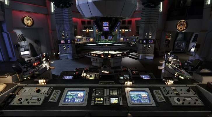
Slightly off-topic, but: Look at that floor! The Vengeance-floor is just SO. MUCH. better. than the Discovery-floor.
That being said: They look like Star Trek bridges?
Like, put the Voyager bridge next to it (or the one from the NX-01, or the Ent-E), and the arrangement of consoles and screens would look similar as well. But I honestly don't see how the DIS-bridge is "more" or "less" inspired by the Kelvin bridge than from the prime-bridge: It's essentially the same layout since TOS "the cage", the only thing that changes is production value. And yeah, a 2018 production is going to look closer to a 2009 production. But the 1998 production looks also pretty close, perhaps even closer. The only thing I can honestly say is that they took more inspiration from the TOS bridge than from the "living room"-look of the TNG bridge.
Slightly off-topic, but: Look at that floor! The Vengeance-floor is just SO. MUCH. better. than the Discovery-floor..
While I can understand wanting levels for dramatic purposes, I would think in terms of bridge design there's absolutely no reason to put steps on the bridge, considering they're a trip hazard, which can be the difference between life and death in a battle situation where crewmen have to rush between stations.
The Bridge is on top of the ship. Logic has nothing to do with this design.While I can understand wanting levels for dramatic purposes, I would think in terms of bridge design there's absolutely no reason to put steps on the bridge, considering they're a trip hazard, which can be the difference between life and death in a battle situation where crewmen have to rush between stations.
Looks to me they started with the Kelvin and imagined what it would look like in 20 years, so it's a little cleaner and a bit more high-tech.
I would say the Discovery and the Vengeance bridges share a lot, right down to the Vengeances bank of blinking purple lights behind the captain's chair being in an alcove to the (camera) left of the Discovery bridge.
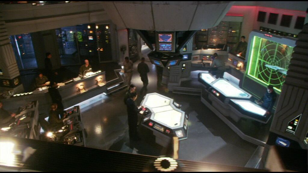
Nothing beats this though

While I can understand wanting levels for dramatic purposes, I would think in terms of bridge design there's absolutely no reason to put steps on the bridge, considering they're a trip hazard, which can be the difference between life and death in a battle situation where crewmen have to rush between stations.
Yeah, steps in the middle of the bridge floor - while they look absolutely cinematic - are probably pretty dangerous on a real life command center.
No, what I actually meant was the texture of the floor. It doesn't have to be glass like on the Vengeance (probably can get pretty slippery), but I think having some kind of texture (it can even be a carpet) is vastly better than the flat studio floor that the Discovery bridge has.
There was actually another thread with concept art for the Discovery bridge. And while the yellow/white panneling on the floor didn't have an immediate logical reason to it, the Disco bridge simply looked so, so, so much better with it:


Last edited:
Considering we saw five Federation Bridges in JJ -Trek continuity the Kelvin, the Enterprise, The Vengeance <--- Which WAS a dark as the Shenzhou/Discovery Bridge, the Simulator Bridge <--- also somewhat dark; and the Franklin <--- which was ALSO dark, but the ship was damaged so who knows; sorry, the fact the 1701 Bridge looks like a lit up Apple store doesn't mean every Bridge was well lit.The thing is: The Kelvin bridge is the one outlier of the Kelvin timeline franchise.
It's the one ship that is supposed to look as closely as a "classic" Star Trek design as possible on a big budget.
If you did the same comparison with the hero ships of the Kelvin timeline - the Enterprise, the Vengeance, or even the Franklin - you'll notice them to be much more apart from the traditional look than this one.
Yhe kelvin Bridge was hardly an outlier compared to the rest in the JJ Verse.
Because it's a design that makes sense? I know, I was as shocked as you were.Nothing beats this though
Yeah, steps in the middle of the bridge floor - while they look absolutely cinematic - are probably pretty dangerous on a real life command center.
No, what I actually meant was the texture of the floor. It doesn't have to be glass like on the Vengeance (probably can get pretty slippery), but I think having some kind of texture (it can even be a carpet) is vastly better than the flat studio floor that the Discovery bridge has.
Yeah, even TOS got that right. And the openness of the Discovery design really draws attention to it. Just looks like flat, dead space.
Here is a L'Rell in Episode 4

And here she is immediately after in Episode 5.

I think there might be some stock in that theory that her face was more 'bony' because they were malnourished after those 6 months of being stranded. The cheek bones are still there in episode 5, they're just less pronounced.
And here she is immediately after in Episode 5.
I think there might be some stock in that theory that her face was more 'bony' because they were malnourished after those 6 months of being stranded. The cheek bones are still there in episode 5, they're just less pronounced.
Very good point about the lack of food, I had not considered that. And now she's ruling the Klingons, she's well fed and probably moving around a lot less than when she was on starships and organizing botched spy missions.
Similar threads
- Replies
- 17
- Views
- 3K
- Replies
- 14
- Views
- 527
- Replies
- 3
- Views
- 1K
If you are not already a member then please register an account and join in the discussion!