They're both ugly, but the Beyond version is way worse.By the way, whoever is bashing jjPrise, which version are you bashing?
The one from Star Trek (2009) and one from Star Trek Beyond (2016) are very different:


These are taken from this video which shows off even more of the differences.
-
Welcome! The TrekBBS is the number one place to chat about Star Trek with like-minded fans.
If you are not already a member then please register an account and join in the discussion!
You are using an out of date browser. It may not display this or other websites correctly.
You should upgrade or use an alternative browser.
You should upgrade or use an alternative browser.
USS Enterprise (eventually) on Discovery?
- Thread starter EJD1984
- Start date
Musta been another refit between the movies
I'll say. The Enterprise leaves at the end of Into Darkness for its five-year mission, and halfway through it it's gone through several massive structural changes!
They're both ugly, but the Beyond version is way worse.
Nah, only the Beyond one is ugly. The 2009 one is a thing of beauty.
What about this one?
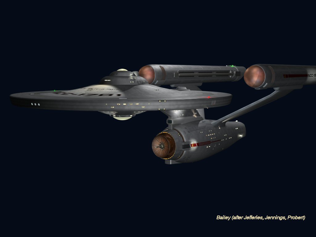
It's pretty clearly very derivative fan work, don't you think? In fact, ten years ago I incorporated a great deal of the same imitative stuff into this that the hacks at Discovery put into their "design," which is one of the reasons that I'm thoroughly unimpressed with what they've done.
I wasn't the first or the last fan artist to recombine bits of the Phase II and ST:TMP ships into the TOS Jefferies design - it really is a left-handed exercise. Frankly, I'm shocked that anyone would be paid for this kind of thing.
As far as fan work that's slightly more imaginative and well-done is concerned, I can recommend Madkoifish's Enterprise variation, which while still derivative has some very nice touches. Judging from the rear-view angle of the Discoprise I'm pretty sure the CG people working on it have seen this one as well.
If you're going to imitate, might as well do it with some style if you can - Madkoifish can, Discovery evidently cannot.
![c09a4f2c6bb867ed0bc1ba7accf7f961[1].jpg](https://www.trekbbs.com/data/attachments/3/3326-c09a4f2c6bb867ed0bc1ba7accf7f961.jpg "c09a4f2c6bb867ed0bc1ba7accf7f961[1].jpg")
![tomorrow_is____today_by_dawnie2008[1].jpg](https://www.trekbbs.com/data/attachments/3/3327-2c71cefdc6ecff8698ef3d2fee04375e.jpg "tomorrow_is____today_by_dawnie2008[1].jpg")
Last edited:
it really is a left-handed exercise.
Hey. Check your right-handed privilege.
I think it's understandable that the Enterprise is almost entirely derived from previous designs. It is after all a ship that most of the audience is already very familiar with, so they felt obligated to keep it mostly the same. Putting Aztec paneling and an aft torpedo tube on the Defiant wasn't particularly revolutionary, but someone was still paid to do it. Heck, most of the ideas for the refit in TMP came from Matt Jefferies, but most of the credit goes to Andy Probert and Richard Taylor for refining it into the ship that made it into the film.It's pretty clearly very derivative fan work, don't you think? In fact, ten years ago I incorporated a great deal of the same imitative stuff into this that the hacks at Discovery put into their "design," which is one of the reasons that I'm thoroughly unimpressed with what they've done.
I wasn't the first or the last fan artist to recombine bits of the Phase II and ST:TMP ships into the TOS Jefferies design - it really is a left-handed exercise. Frankly, I'm shocked that anyone would be paid for this kind of thing.
As far as fan work that's slightly more imaginative and well-done is concerned, I can recommend Madkoifish's Enterprise variation, which while still derivative has some very nice touches. Judging from the rear-view angle of the Discoprise I'm pretty sure the CG people working on it have seen this one as well.
View attachment 3982
View attachment 3983
As for imitating with style, I personally like the new Enterprise, but aesthetics are pretty subjective so your mileage may vary.
Last edited:
They're both ugly, but the Beyond version is way worse.
I think we agree on something LOL. Although, really, this design could have been saved. Move the neck forward and thin those chicken legged Nacells and it improves it vastly.
If the pylons are wrong on the reboot, they mustn't be very great on the original, being blocky and frail and all.
IMO, Both are wrong, but the Kelvin ones just look wrong and off to me, like they are backward and combined with the chicken leg nacells, it looks bad. Some folks love em, I dislike that design greatly. But it is fixable.
Well the Kelvin 1701-A sure didn't fix them. The pylons are way too wide at the base. I find that design very disappointing.
I agree, it has some nice points, but to many wrong IMO. I also hate the deflector, but I hated all the Kelvin Deflectors
You probably have the person they’re quoting on ignore if you can’t see the quote.What quote?
The interiors look nothing like the JJ ones. They’re all angular, the JJ ones are round and smoothThe ship interiors and viewcreen layouts are more consistent with JJ Abram's Star Trek 2009 alternate universe/timeline then anything in the 'Prime' TOS timeline.
I'll give Madkoifish this much. His Enterprise does look pretty good head-on.
The stories as defined by the writers.Then, what is Prime?
The design for the '09 Enterprise has grown on me over the years, and I quite like it. But, the utter glee I felt when seeing the DSC version automatically put that design equal with the original and refit. It took me back to when I was a young kid just seeing the ship for the first time, a feeling I hadn't had for a long time. This incessant shitting on either the DSC VFX designers or the fans who like the design is tiring and rather insulting.
Then they should do a better job.The design for the '09 Enterprise has grown on me over the years, and I quite like it. But, the utter glee I felt when seeing the DSC version automatically put that design equal with the original and refit. It took me back to when I was a young kid just seeing the ship for the first time, a feeling I hadn't had for a long time. This incessant shitting on either the DSC VFX designers or the fans who like the design is tiring and rather insulting.
The divide in Trek fandom has been going strong since 1987 and not slowing down any time soon.This incessant shitting on either the DSC VFX designers or the fans who like the design is tiring and rather insulting.
They're both ugly, but the Beyond version is way worse.
I rather like the 2016 version, but then again I also like 2009 version. I also like original 1966 version as well as 2018 version. I also like Enterprise-D and Enterprise-B (not too impressed with the whole Ambassador class Enterprise-C). Can I truly be a Trek fan if I like most of the styles show-runners throw at me? (notice, I only mean I like the style, VFX of STD sucks completely, writing continuously sucks since mid-90s)
The divide in Trek fandom has been going strong since 1987 and not slowing down any time soon.
Pretty sure it started in 79 with TMP and those "Fake" Klingons.
Similar threads
- Replies
- 24
- Views
- 995
- Replies
- 223
- Views
- 18K
- Replies
- 9
- Views
- 6K
- Replies
- 65
- Views
- 8K
If you are not already a member then please register an account and join in the discussion!