That's even smaller than the TOS briefing room monitor! I love their retro design, making it look somehow even more primitive than the TOS desktop monitor.
-
Welcome! The TrekBBS is the number one place to chat about Star Trek with like-minded fans.
If you are not already a member then please register an account and join in the discussion!
You are using an out of date browser. It may not display this or other websites correctly.
You should upgrade or use an alternative browser.
You should upgrade or use an alternative browser.
I wore my original C-64 out.

Lost several of the keys and eventually used ductape on it after dropping it once.
I was going to get a C-128, but by the time I saved up enough money, the Packard Bell computers were becoming popular so I got one of those instead.
Every E set but the 1701 Bridge was a redress of DSC?
What?Every E set but the 1701 Bridge was a redress of DSC?
What?
He asked whether all of the Enterprise's interior sets, save the bridge, were redresses of Discovery's.
It looks that way.
I really, really really really would want to see a updated version of TOS' engine room. Every other engine room we saw had the warp core, but TOS' was unique.
Yeah....they started that 'warp core' business with Phase II:

Considering the ultra-wide viewscreen is the only functional difference between Pike's bridge and Kirk's bridge, I am wondering if the "it was always that way" view means that TNG, DS9, VOY, and all the movies also really had ultra-wide viewscreens too?
My personal take is that for some reason Starfleet got rid of the ultra-wide viewscreens (and that Pike's bridge was changed to Kirk's after a voice command reconfiguration, an actual refit, or just repair alterations after a bridge-damaging battle), but I'm wondering if the fans who feel that Pike's bridge is supposed to be Kirk's bridge also feel that all of the Star Trek franchise really had ultra-wide viewscreens the whole time.
My personal take is that for some reason Starfleet got rid of the ultra-wide viewscreens (and that Pike's bridge was changed to Kirk's after a voice command reconfiguration, an actual refit, or just repair alterations after a bridge-damaging battle), but I'm wondering if the fans who feel that Pike's bridge is supposed to be Kirk's bridge also feel that all of the Star Trek franchise really had ultra-wide viewscreens the whole time.
Apparently that's not the engine room. It's an engineering lab if I recall.Disco's engine room doesn't have a familiar warp core. Behind the hatch there's something more like the pipes in the TOS room.
I could see it looking a bit like this (but with more of a Discovery aesthetic). I particularly like how the dilithium chamber is visibly embedded in the floor, suggesting it's part of a much larger piece of machinery.It looks that way.
I really, really really really would want to see a updated version of TOS' engine room. Every other engine room we saw had the warp core, but TOS' was unique.

But I do believe they called it part of the warp core or engine core.Apparently that's not the engine room. It's an engineering lab if I recall.
You're probably right. Been awhile since I watched early season one episodes.But I do believe they called it part of the warp core or engine core.
Last edited:
I could see it looking a bit like this (but with more of a Discovery aesthetic). I particularly like how the dilithium chamber is visibly embedded in the floor, suggesting it's part of a much larger piece of machinery.
Seeing that reminded me of 'The Enemy Within':

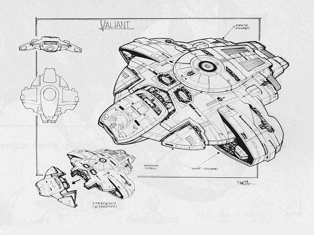
Yep, and while similarly never shown onscreen, only in concept art, the Defiant from DS9 and the Enterprise-E were both originally envisioned as being separable as well:One of the various scripts for TMP had the Enterprise being seriously damaged by V'ger and needing to do a separation. Here is Andy Probert's artwork for the scene:


Also, I don't recall having seen this particular Mike Minor Phase II bridge artwork image posted here before:

Susan Sackett and Gene Roddenberry's The Making Of Star Trek: The Motion Picture (1980, pg. 85) sheds some light on how it was envisioned to work, and how it came to be eliminated from the film revamp of the bridge set by production designer Harold Michelson at Robert Wise's request:I've seen this one before. I really wonder what the radar-like circular thing would've looked like on screen.
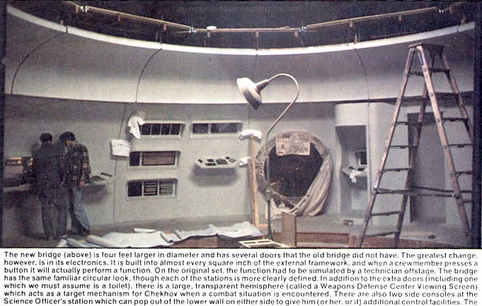
Harold and his newly hired art department became heirs to the semicomplete Enterprise sets which had been begun by art director Joe Jennings in the summer of 1977—sets that conformed almost exactly to Matt Jefferies's original design for the sixties television show. Construction on stage 9 had been shut down five months before, after a halt had been called on the new television series. Joe had done a fine job of designing for the television show, and now it was up to Harold to completely redesign these sets so that they fit the then budgeted $15 million, 70mm production wide-screen motion picture.
He began with the bridge, the nerve center of the Enterprise, whose basic framework was now completed. Because the bridge is primarily a circular set, this symmetrical, curved design had to be given a different look. Harold began by eliminating the television-designed weapons defense station. Chekov's new weapons section was to be a huge plastic bubble already grafted onto a cutaway section of bridge wall. The Russian lieutenant would have sat at this station and looked out toward space while neon-lit crosshairs contained within the bubble tracked and locked onto a target. Harold had the bubble removed and the round hole that remained was sealed shut and covered over with various technical readouts. Bob Wise had asked that Chekov's attitude be toward the Enterprise's main viewer—difficult to do on a circular bridge. But there was one area in the corner which had been sculpted slightly differently. (No one seemed quite sure just what was supposed to have gone there; many joked that it was the ship's elusive "head"—something the original series had conspicuously lacked.) Bob Wise spotted the potential of this corner and production illustrator Michael Minor designed a completely new look for this area, which became the new (and present) home of Chekov's weapons defense station.
He began with the bridge, the nerve center of the Enterprise, whose basic framework was now completed. Because the bridge is primarily a circular set, this symmetrical, curved design had to be given a different look. Harold began by eliminating the television-designed weapons defense station. Chekov's new weapons section was to be a huge plastic bubble already grafted onto a cutaway section of bridge wall. The Russian lieutenant would have sat at this station and looked out toward space while neon-lit crosshairs contained within the bubble tracked and locked onto a target. Harold had the bubble removed and the round hole that remained was sealed shut and covered over with various technical readouts. Bob Wise had asked that Chekov's attitude be toward the Enterprise's main viewer—difficult to do on a circular bridge. But there was one area in the corner which had been sculpted slightly differently. (No one seemed quite sure just what was supposed to have gone there; many joked that it was the ship's elusive "head"—something the original series had conspicuously lacked.) Bob Wise spotted the potential of this corner and production illustrator Michael Minor designed a completely new look for this area, which became the new (and present) home of Chekov's weapons defense station.
You can see the hole where the "bubble" was going to go in this image of the Phase II iteration under construction, taken from the August 1978 issue of Fantastic Films:
And as reworked in the final film:

Incidentally, despite the "head" joke (reiterated in the Fantastic Films caption as well), it in fact seems that "corner" was at one or more points supposed to be a "mini-transporter" unit:

But TMP nevertheless does get credit for showing the first toilet facilities ever in Trek, by virtue of including portions of Franz Joseph's 1975 Booklet Of General Plans for the Constitution Class in the scenes where V'ger is running through the Enterprise's records:
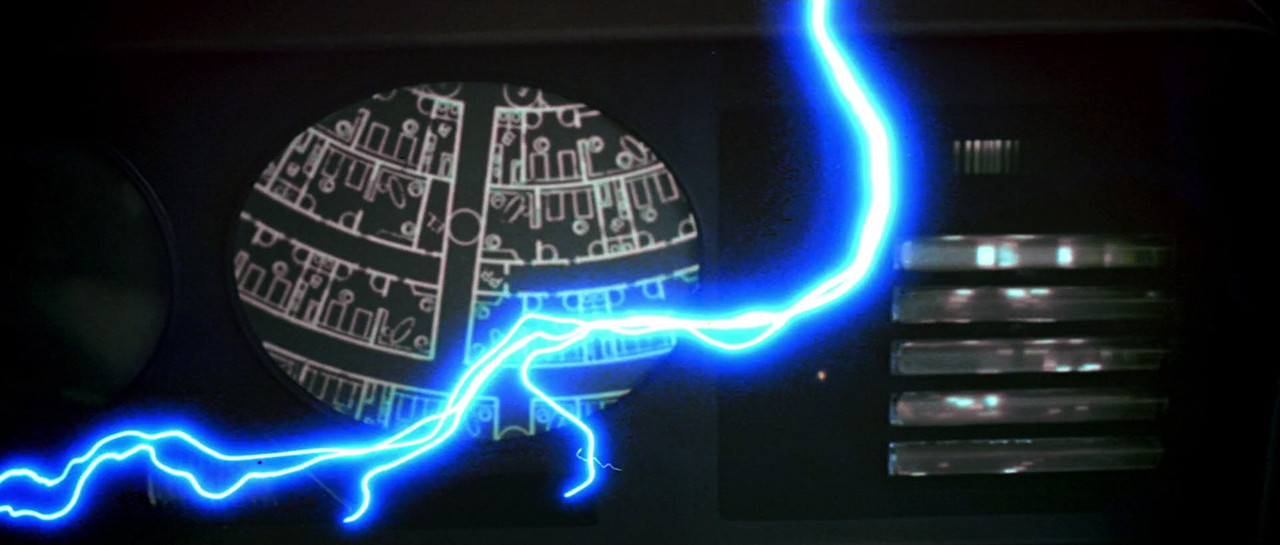
If you look closely, despite being upside-down in the transparency, you can recognize the tiny letter 'B's designating "BATHROOM"!


Of course, as one transparent dome was removed, another (seen at upper frame in one of the above screencaps) was added, as Sackett continued onto page 86:
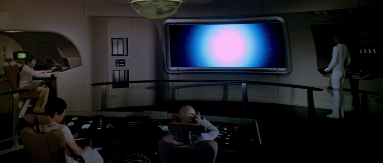
Another Michelson innovation is the ceiling on the bridge. His inspiration this time came from the look of a jet engine fan. Mike Minor's artistic talents were again utilized in the center bubble designed for this ceiling. The basic idea behind this was, according to Mike, to give the bridge something of a human touch. A starship really would have no need of a gyroscopic device, which is essentially what the bubble appears to be. Therefore, voilà, the center bubble became sophisticated equipment telling the captain precisely what was happening to the ship's attitude, and completely corrected and adjusted to the fact that there is no "up" of "down"—not even really any "sideways"—in actual space terms. It became all of that because the wonderful world of movies is a sensible world in which everything works the way the writer, producer, and director need them to work! During the wormhole sequence this device can be seen in operation as its tilting lights indicate something drastically amiss—which was the whole point of building the bubble in the first place.
As long as I've got the book out, a cool random tidbit about the chairs from pp. 87-88:
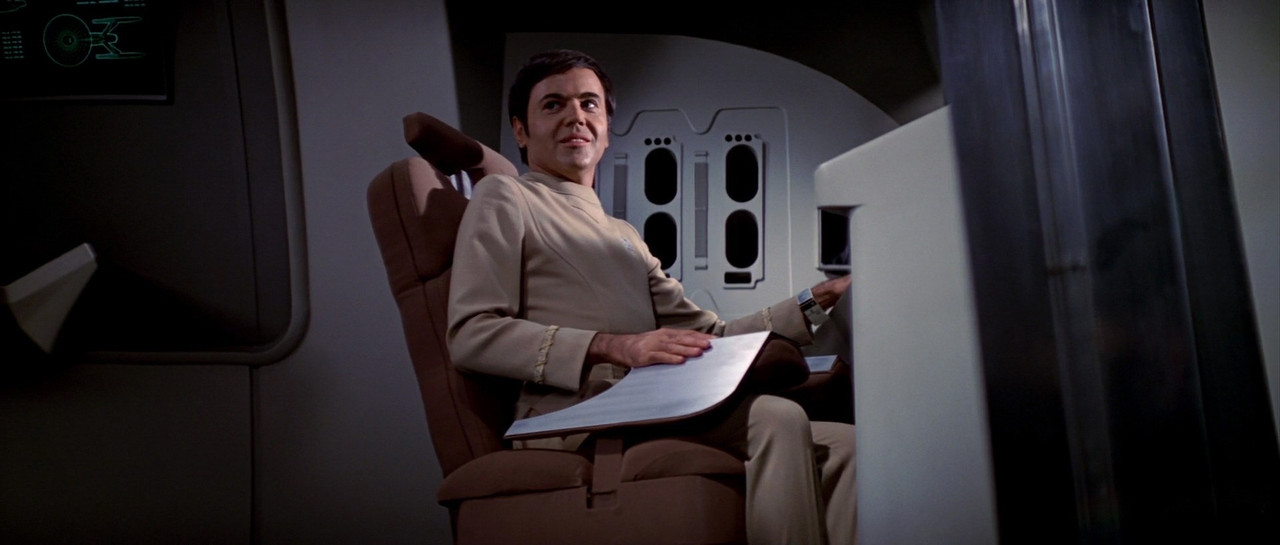
Another very noticeable change on the bridge was the design of the new seats. Gone are the simple pedestal swivel seats of the early tv series. Gone too is the boxlike original captain's seat. Harold Michelson's redesigned Enterprise seats have automatic bracing devices, which operate at the touch of a switch to fold in over the person's lower body, keeping him in place in case the starship is shaken by Klingon torpedo fire or some unusual space turbulence. (Ralph Nader's great-great-great-great-grandson can rest easy!) Harold and set decorator Linda DeScenna designed the backs of the seats in vertebraelike sections, which would massage and calm one's nerves at the touch of another button and, according to Harold, three hundred years from now aspirin won't be necessary because the seats can even stop a headache!
And returning to the broader topic at hand on page 90...
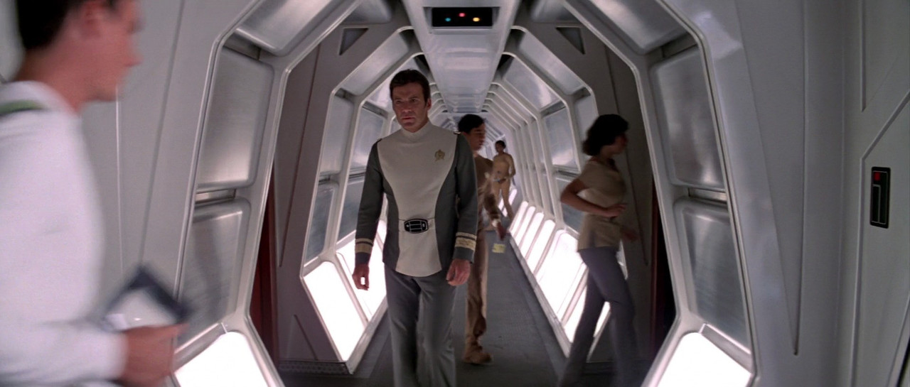
Redesign of the Enterprise's corridors was another major area of Harold Michelson's responsibility. When he came on the picture, the corridors were of straight plywood construction in the style of the original tv show—something Gene Roddenberry calls "Des Moines Holiday Inn style." In order to get away from this hotel corridor look, Harold modified the perfectly straight up and down walls and with a major movie budget was able to give them an angular, bent look. During preproduction meetings with Gene Roddenberry and Bob Wise (the two had final approval on all plans), they decided that in three hundred years, lighting need not be overhead, so they had the lighting radiate upward from the floor to give it a more interesting feeling. Naturally all these changes became examples of the Enterprise's refitting in drydock, so that the differences from the television Enterprise were believably explained.
It must be noted, though, that Sackett rather glosses over the role played in all of this by Richard Taylor, initially art director following the studio's decision to turn the series into a feature instead, and prior to Michelson being brought in by Wise. Taylor recalled that both the ceiling dome and the seat restraints were his ideas. He also had some choice words to say on the subject of confronting the shortcomings of what had thereto been a television production in the harsh light of the silver screen:
Star Trek: The Motion Picture was the first film ever produced by Jeff Katzenberg. It seemed that after Star Wars came out there was a knee-jerk reaction by the studio to turn what was going to be a television series (Star Trek: Phase II) into a theatrical feature...
As a designer, as someone who understands mechanical things and how they work, I started doing all kinds of research on what would really be done to build structures in space; foil folding mechanisms and the technologies that were being developed at the time to build structures in space. The center of gravity of an object is critical with objects built for weightlessness. Well, the center of gravity of the Enterprise is outside itself. It is one of the most unbalanced objects ever created for space. It would be a real nightmare to actually maneuver the Enterprise in space. You’d have more gyros onboard than in all the flying craft on Earth...
But it was a mandate from Gene Roddenberry that the configuration of the Enterprise is similar to that of The Original Series; meaning that there be a saucer, the large dorsal, fuselage, two-struts at an angle and nacelles. So, it needed to have a similar configuration, but not be exactly the same...
When we first came on the project, we had to look at everything that existed and Roddenberry said, “Just use the sets that we’re building and the models we are building.” So I gave the models [an] honest look but had to tell them in the end that, “If you use these models and sets, you’re going to be laughed out of the theater.” The models would have been embarrassing at best. They were really old-school in their detail and were not built to armature and light the way we needed for motion control. They looked like the old television show...they were building for a television movie. The resolution of television is forgiving; the big screen is not.
I sat down with Roddenberry and Katzenberg and said we are going to have to redesign the Enterprise because it needs to be armatured from six sides and it needs to have lighting systems in it. I told them, “You saw Star Wars. You saw the quality of those models...”
I told them we were going to have to redesign them and the sets. Well, Joe Jennings, the art director at the time, and the team who had worked on the sets was not happy about that. There was resentment there. It was tough to tell them that the sets had to match the new models and therefore the sets needed to be redesigned as well. The sets needed to have a much more hi-tech look and they needed to have a lighting concept built into them. Part of the battle that we went through was that Gene Roddenberry had his ideas about what these things should be. He’s one of the few people I’ve ever met that believed he knew what things looked like at the speed of light. I did research on it and got some film from MIT where they had done simulations of what things might look like at the speed of light. The fact is it’s pretty boring! In the end things have to look good and be entertaining...
I wanted the same for the Enterprise when I first came on the project. I said, “Good, we’ll redesign it,”...But Roddenberry said, “No, it’s got to have that configuration, because that’s the signature configuration of Star Trek.”
...I got into this and one of the first things I did was tell Roddenberry and Wise (and this probably ruffled some feathers), “Look, I’ve watched the television series and I’ve noticed that every time there is an emergency everyone is falling out of their seats. Even airplanes have seatbelts. You’ve got to have seats that hold them in in some way.” So, I convinced them to do the thing where the arms come down over your lap. I mean, here you are flipping around in this vehicle that is going through a wormhole and to have people falling around all over the bridge would have been stupid...I thought the chairs we designed could have been even more interesting and hold the person in even more.
Another thing is, around the bridge, at Spock’s station, etc., Roddenberry insisted that they have oval shaped screens and if you know anything about design you know that’s one of the most inefficient shapes to put a lot of information on, because you are cutting the corners off the display area.
I also said, “I think the consoles should not have switches and knobs, they should be tactile touch screens. You touch the screen and the things change and arrays come up, etc.” I had been to Lawrence Livermore and had seen what was coming up down the road regarding tactile display design and Roddenberry wouldn’t go for any of that. He said, “You’ve got to have round screens or oval screens,” and the kind of graphics they ended up using on those screens were very hokey compared to what it could have been...on the bridge they had the viewscreen and that worked out OK, but I wanted to have another kind of celestial sphere space navigation device that came down out of the ceiling with concentric spheres of stars but they nixed that...I convinced them to do that [navigation dome], because to have that detailed ceiling and with the circular design you needed to have that dome up there...
Again, plus ça change, plus c'est la même chose...within every group of disparate minds behind each revamp of Trek, there has been a continual push and pull between the mindsets of altering as much and/or little as possible from previous iterations (often with even the same individual playing both sides of the fence regarding different aspects). What ends up onscreen has always been the result of compromise between them, and there's always been some 'smoothing out' in the way the tale is told by one or another after the fact. DSC is no different on that front. It's just the latest in a long line.
-MMoM

Last edited:
Susan Sackett and Gene Roddenberry's The Making Of Star Trek: The Motion Picture (1980, pg. 85) sheds some light on how it was envisioned to work, and how it came to be eliminated from the film revamp of the bridge set by production designer Harold Michelson at Robert Wise's request:
Wow, that is a lot more information than I expected, and I thank you for that, especially the floorplan of the bridge. I had never seen that one before.
plus ça change, plus c'est la même chose...
I don't know about the rest of the French world, but in Canada that's "plus ça change, plus c'est pareil."
")
Cheers,
The Enterprise-D might have had the ability to separate many more parts, had they gone that route:


Apparently that's not the engine room. It's an engineering lab if I recall.
But adjacent to or possibly connected to main engineering. The TOS-like glowing elements behind the partition may be warp core components.
Interestingly enough, they do pull-outs to the exterior that suggest Stamets' little kingdom is actually at an angle wrt the ship centerline - the same angle as the leading edges of the secondary hull. The scenes of the ship half submerged in sporespace sorta support that notion. And then there's that briefly glimpsed Jeffries tube layout from S1 that's also at angles to the secondary hull spine.
Basically, there could be two rooms like we see, both looking at the same warp core from different directions. Wasn't there supposed to be a door sign saying Starboard Engineering somewhere on the set, too? Meaning "this way to Starboard Engineering", obviously, since all the exterior shots put the facility at the port side.
For all we know, the Enterprise could have similar funny angles involved somewhere, what with Engineering being off a curving rather than straight corridor.
Timo Saloniemi
Similar threads
- Replies
- 24
- Views
- 2K
- Replies
- 223
- Views
- 24K
- Replies
- 1
- Views
- 187
- Replies
- 65
- Views
- 9K
If you are not already a member then please register an account and join in the discussion!