• Welcome! The TrekBBS is the number one place to chat about Star Trek with like-minded fans.
    If you are not already a member then please register an account and join in the discussion!

Panoramas of Enterprise interior on official site

VaderboardsEnterprise.jpg


Sorry. Had to do it.:devil:

Damn it, I was just starting to work on that :lol::lol:

:bolian:
 
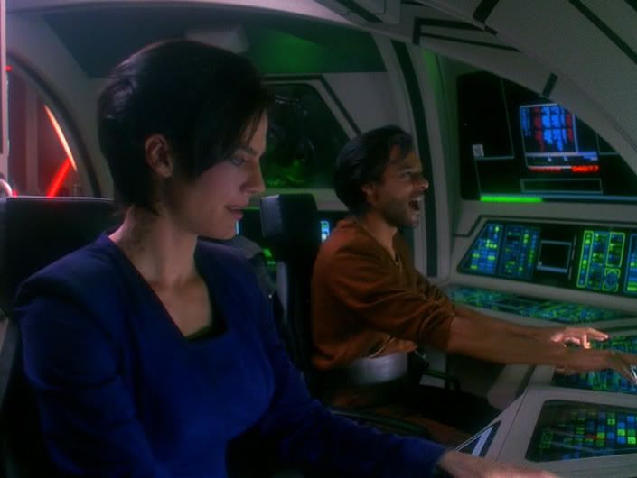
I think lots of sets thrown together quickly and cheaply for a few seconds of screen time in a single episode look much better. Here's an example:

shatteredmirror_3001.jpg
 
^^^ Doesn't look very much like that comparison at all.
And wow, here comes the technobabble bull.

"Technobabble," certainly in the sense of being the opposite of a scientific approach to analysis - which is to say cherrypicking or fabricating information in order to support a pre-selected conclusion.
 
When I first saw the pics, I instantly thought of the Star Wars Prequel Trilogy... I really don't get the ST vibe from this at all. But, this isn't gonna influence my opinion of the movie... not yet anyway.;)
 
They look white to me. Then again, traditional lightbulbs tend to give out a yellowish glow, so it's almost impossible to get white to look 100% white without special lighting.
 
Scotty-What are you inserting a data disk into my mouth Uhura?!

Trooper-Sir the computer is saying something

Klingon Commander Kruge- lets hear it

6......5.....

Klingon Commander Kruge- GET OUT OF THERE!!!!!
 
:( I miss the old days here on trekbbs (about a year ago, after we saw those pictures of the interior of a shuttle) when we were all complaining that Abrams was going to make the Enterprise look "too dirty and gritty."
 
Last edited:
:( I miss the old days here on trekbbs (about a year ago, after we saw those pictures of the interior of a shuttle) when we were all complaining that Abrams was going to make the Enterprise look too dirty and gritty.

Yes, but Trek fans having disagreements over whether the corridors are yellow or white is the stuff this board was made for. ;)
 
Do Curved Walls hurt less that straight ones, when one is slammed against them during a crisis?
Actually, they hurt a lot MORE. No matter what angle you hit the wall with, it's far more likely that you'll twist your ankle, or even hit your head first (potentially breaking your neck).

In "The Andromeda Strain," there was legitimate reason for the corridors to be round. The "Wildfire" facility was deep underground... drilled into solid rock. The reason that the corridors were round was that they were the first elements constructed, and they'd been bored with rotating drilling rigs. It requires a lot more work to make square corridors than round ones when you're drilling them.

In other words, for "Wildfire," round corridors made sense. (Oh, and short of a massive earthquake, the people down there were unlikely to ever be tossed around.)

By contrast, in more conventional construction, rectalinear shapes are more commonly used. Why? First, it's just easier to work that way... remember, you're building up, not taking away as you would be with "Wildfire."

Second, it's more compatible with the human body, including our (ingrained-by-all-of-human-existence) sense of "up" and "down," not just the fact that you're far more likely to end up injured or dead if you're thrown against a rounded wall like that versus a flat surface (which is also very much true).

Mechanically, there are no real advantages to this sort of construction, but no fundamental drawbacks, either(beyond the ease of construction)... it's just as easy (no more, no less) to make a strong structure with either approach. However, the rectalinear approach is advantageous in terms of ease of construction, no question. Perhaps in a couple of hundred years, that'll no longer be the case. But that only removes a potential DRAWBACK, it doesn't give an ADVANTAGE to this approach.

So... anyone able to come up with a single ADVANTAGE (other than "well, it looks kewl") to the rounded corridor form? How about a single advantage to the eyestrain-inducing color/lighting scheme, over a more conventional approach?

So far, all I've seen is a lot of gushing "dood, that's so kewl" comments. So, if you really think this is a great approach... explain your position in terms of real-life arguments.

In other words... if it was you, in real life, living and/or working in either environment, what would be the advantage to you of either style?
 
what are the four white\black filled markings on the wall suppose to represent?
I was wondering that myself. They vary from corner to corner, so it's presumably some sort of code, but darned if I can figure out what for.
I'm thinking they're similar to the sort of (often color-coded) markings you see in airports, hospitals and large industrial buildings. These could indicate what departments or services can be accessed via a particular corridor, or whether it's a thru corridor or a blind passage -- even which way to the nearest turbolift or the restroom.

:( I miss the old days here on trekbbs (about a year ago, after we saw those pictures of the interior of a shuttle) when we were all complaining that Abrams was going to make the Enterprise look "too dirty and gritty."
No kidding! "Where's the dirt," I ask, "why don't we see any dirt?" :scream:
 
what are the four white\black filled markings on the wall suppose to represent?
Incomprehensible and unnecessarily-complicated artsy details that we're supposed to think make sense in some way we haven't been made aware of yet.

The "interlocking shapes" you see in those signs are actually replicated in other places... for instance, in the doors... or at least the two have very similar shapes. I think that the set-designer came up with a shape and decided to use it as "a theme" without any real logic behind it.

Supposing that this symbology is intended to represent, say, frame locations... or anything else that can be represented numerically... realize you're basically filling in an 8-bit binary word there, or perhaps two four-bit binary words. If it's 8-bits, this means 256 possible values. If it's two four-bit words (which seems more likely) then it's 2x16 possible values, or 32.

So if that's intended to represent positions within the ship, you'd be limited to 256 maximum "identifiable points." A ship of this size and complexity requires far more resolution than that, I think. In the less space than this eight-symbol "graphic art doodad" occupies, you could print something like


  • Deck 4
  • Section 8
  • Frame 47
and have far more useful information conveyed.
 
what are the four white\black filled markings on the wall suppose to represent?
Incomprehensible and unnecessarily-complicated artsy details that we're supposed to think make sense in some way we haven't been made aware of yet.

The "interlocking shapes" you see in those signs are actually replicated in other places... for instance, in the doors... or at least the two have very similar shapes. I think that the set-designer came up with a shape and decided to use it as "a theme" without any real logic behind it.

Supposing that this symbology is intended to represent, say, frame locations... or anything else that can be represented numerically... realize you're basically filling in an 8-bit binary word there, or perhaps two four-bit binary words. If it's 8-bits, this means 256 possible values. If it's two four-bit words (which seems more likely) then it's 2x16 possible values, or 32.

So if that's intended to represent positions within the ship, you'd be limited to 256 maximum "identifiable points." A ship of this size and complexity requires far more resolution than that, I think. In the less space than this eight-symbol "graphic art doodad" occupies, you could print something like

  • Deck 4
  • Section 8
  • Frame 47
and have far more useful information conveyed.

You just made it sound simplistic. I thought it was "unnecessarily complicated".
It is "unnecessarily complicated" as a method of conveying information.

Using the approach I gave above, the same information conveyed by that symbology would simply read


  • Station 28
(for example). And you'd be limited to only 256 possible stations to choose from throughout the entire ship.

It's an "unnecessarily complicated" way to convey a small amount of information, in other words. Meanwhile, a "real" ship would require far more information in order for the information to be meaningful.

My example showed how, using the same amount of wall space, you could convey far more information in a much easier-to-understand form.

And before someone says something lame like "well, they don't want to use English signs because aliens may be on the ship," you might want to look closely at the use of English in other (more critical) applications. For instance, to inform people on the ship that the door they're about to open is actually an airlock. I'd say that pretty much establishes that the crew all have to know how to read English, wouldn't you?
 
If you are not already a member then please register an account and join in the discussion!

Sign up / Register


Back
Top