Sorry for the length of this post but there were a lot of things I wanted to respond to.
What I never really liked about the TOS Enterprise is the neck. It's just... there, without any details, with no transition from saucer to neck, or from neck to secondary hull. I dunno. The TMP Enterprise fixed that somehow by including the torpedo tubes at the bottom of the neck.
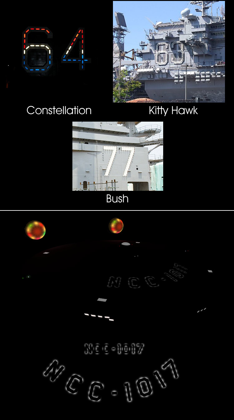
The original
Enterprise was definitely a more modular, somewhat more utilitarian design. In the TNG era and beyond, it seems like they can afford to crank out a new ship configuration every six months with as much consideration given to the style and appearance as to the functionality of the design, but back in the TOS era they still had to be a bit more practical-minded than that. Simple, standardized components like the interconnecting dorsal would allow them to mate a saucer section to, say, a cargo module or a single warp nacelle as easily as an engineering hull without having to worry about how the parts flowed together. Certainly there were aesthetic considerations, but not where they would tend to interfere with the functionality.
For my update, or redesign or whatever you want to call it, I’ve tried to incorporate more detail and more practical features so that it looks more like something that was actually constructed rather than just a relatively featureless assemblage of shapes carved out of a giant hunk of plastic. I get what Matt Jeffries was trying to do by eliminating hatches and hull plates and putting all of the mechanics
inside the nice smooth hull where they would be more easily accessible, but unfortunately that doesn’t lend itself well to the way 21st century human beings perceive large, constructed objects and the visual cues that normally convey that impression. I’m not saying you have to have Star Wars style greebling for something like a starship to look real, but some degree of detail and texture certainly helps.
Beyond that, I am giving some consideration to a few, slightly more radical alterations to areas like the joints between the saucer and the dorsal or the dorsal and the engineering hull, as well as certain features of the deflector cowling and one or two other things. I don’t plan on literally blending those features together the way they did on the new movie version, and I want to be careful about straying
too far from the original design and losing the finely balanced authenticity that most people seem to like about it, but there are some additional changes in store that may address your concerns.
I am not "convinced" by the nacelle root fillet/fairings… It seems to me that they are too "nice" looking. That strongback is supporting a tremendous amount of mass, and what I like about Probert's refit is that the strongback looks like the skin is made of a different material, or that there are structural supports just under the surface and lightly skinned on top. I think your would look more "real" if there were more of a suggestion of that.
I know exactly what you’re talking about and I agree that it adds a nice touch of structural realism to the appearance of the refit. I may wind up doing something along those lines as well, but don’t misinterpret the fillets at the base of the nacelle struts as structural enhancements. My thinking is that the structural components of those struts are embedded deep into the secondary hull, all the way to its centerline if not further. I think that’s been the long-standing assumption for most people, as well as the source of considerable debate over how the hangar deck could possibly fit into the space behind them. In fact, I angled my nacelle struts slightly for one of the same reasons they did it on the TMP refit, to make more room for the hangar deck.
Maybe the fillets/fairings are some type of armor to help protect the attachment point with the secondary hull, or maybe they are a purely aesthetic enhancement. Whatever they are, they were never intended to be structural.
I have to say that I really like the softly glowing navi-deflector dish on Vektor's ship. If I could call the shots on a pre-TOS prequel, I'd take Vektor's ship and make it even more like what we saw in "Where No Man Has Gone Before". (the famous "anthill" bridge dome, the "cheese grater" aft nacelle caps, and maybe a bigger dish, and eight smaller impulse engines, to name a few.)
Yeah, I considered some of those things myself, especially since the new movie was a TOS prequel. I actually did incorporate a few elements like the spikes on the bussard collectors and some of the markings on the upper primary hull, but two features I never liked about the pilot version of the ship were the oversized bridge dome and the huge deflector dish. I just thought they looked awkward and didn’t fit the proportions of the rest of the ship.
The “cheese grater” aft nacelle caps were interesting but I always thought they looked a little too much like conventional exhaust ports of some kind, like they aught to have flames shooting out of them or something. The spheres were more esoteric and advanced looking, IMHO.
As for the number of impulse engines, I used eight on my old USS
Constitution mesh but I really prefer two, especially with my bifurcated redesign of the engine housing.
Vektor, as always, your visual work is fantastic. But I'm a big fan of the visual details also holding a function. Your details around the sides of the saucer are subtle and well done, but don't look like they have a practical function for the ship. They just look like they are there to provide hull detail, and I'm not sure it needs it. Do the lines/plating have a function?
Well, actually, their primary function was to help me work around the problem of gridlines that run through the middle of certain windows on the saucer rim. No matter how you slice it, there’s just no engineering rationalization that would justify such a thing. Sure, I could have just moved the windows—and I still might—but the rim details are also reminiscent of the banding around the primary hull on the TMP refit, which I thought was another nice little continuity nod. As I said in the previous WIP post, those details are not final and I may wind up doing something a bit different.
Not only is it generally accepted (but by no means canon) that the grids are deflector shield or force field emitters, but you'll note that a real vessel has a grid pattern visible, although in this case, you're looking at the outer plating and the structural ribbing (transverse and longitudinal frames) over which outer plating is applied.
I'd also like to bring this to Deg's and Vektor's attention because if you click on the picture and examine the larger version, the dimpling of plates against the framework is quite visible, especially in the foreground. It's as if, against the forces of nature (heat, cold, and gravity), the armored, metal skin of this titan still isn't thick enough to resist revealing the ship's skeleton. Combined with Cary's efforts to introduce a framework under the outer shape in his exercise, perhaps it might be possible devise a subtle texture that hints at this very same effect on a starship hull.
I think water pressure and a couple of other factors may be at work there as well. However, dimpling or puckering isn’t quite the look I want to go for. I get the idea of revealing a bit of skeletal structure underneath but I’d prefer to do it in other ways. I will be redoing the hull textures for this ship eventually but I plan to go more in the direction of the TMP refit than anything else, with maybe just a hint more weathering.
In the 2-D work I do (because I am mortal, not a 3-D god like Vector and deg3D - GAWD I love their work!) I like to work back in some awkwardness, that suggests real-life manufacturing limitations and compromises. Maybe my nacelle struts should be thinner and more graceful, but "I needed to make enough room for conduits" or something like that.
Slight imperfections are a great way to add realism to a CG model, but on an object of this scale I think they need to be
very slight.


")

")