-
Welcome! The TrekBBS is the number one place to chat about Star Trek with like-minded fans.
If you are not already a member then please register an account and join in the discussion!
You are using an out of date browser. It may not display this or other websites correctly.
You should upgrade or use an alternative browser.
You should upgrade or use an alternative browser.
Modified TOS Ent - Wallpapers
- Thread starter Vektor
- Start date
Vektor's or Deg's versions are what we should have had in Trek XI.
Amen birdog. I would have been happy with either. I like mine for the purity of line, but I feel if you were gonna change her lines a bit, V did it with perfect respect to Matt's original design. He tweaked her just the right amount.
")
deg
Well, we won't be seeing "her" onscreen for a while, it seems...Vektor's or Deg's versions are what we should have had in Trek XI.
Amen birdog. I would have been happy with either. I like mine for the purity of line, but I feel if you were gonna change her lines a bit, V did it with perfect respect to Matt's original design. He tweaked her just the right amount.
deg
But, there are always possibilities...
Personally, the more I see the "new" ship, the less I like it. I'd have rather had a "Moia" type ship as the Enterprise than what we got, because at least then, the whole "well, it's close enough" strawman wouldn't get used.
Between Deg's and Vektor's "improvements" here... I love both of 'em, but I'd still really like to have seen the general approach used by either or both, but with less deviations overall.
I really think that the original design works pretty darned well, and doesn't even need the "minimal" changes you guys have done (changes to nacelle shape, etc, for Vektor and the dish stuff for Deg, mainly). Both would have made me happy to see on-screen, but if it were up to me, I'd have done a sort of "hybrid" of both of your takes, culling the most TOS-ish elements from each and combining them into something totally TOSish yet also tremendously improved in terms of polish and detail.
The one "significant deviation" that I think really, really works, and works well, is the change that Deg did to the aft end of his nacelles... that's just gorgeous.
")
I am also as we speak porting my TOS.5 E into LightWave (from modo) and redoing all her surfacing and her bussards efx, and perhaps tweaking some odds-and-ends to the geo as well.
Here's a peak at the WIP. I am still working creating a lighting rig, that will include a test for a self-lighting rig along the lines of TMP E.
I love your version as well. In terms of a “faithful” update that makes no real changes to the ship’s major structures or proportions, I’d have to say yours is the best out there.
I, too, am planning to go the self-illumination route with my version, and I’ll be doing something more like the production nacelle caps rather than the solid copper versions I’ve been showing in all the latest renders. Still figuring out exactly how I want to do that.
I really think that the original design works pretty darned well, and doesn't even need the "minimal" changes you guys have done (changes to nacelle shape, etc, for Vektor and the dish stuff for Deg, mainly). Both would have made me happy to see on-screen, but if it were up to me, I'd have done a sort of "hybrid" of both of your takes, culling the most TOS-ish elements from each and combining them into something totally TOSish yet also tremendously improved in terms of polish and detail.
I’m a big fan of the original design, but I have my doubts that it would have been viable on the big screen without even minimal changes. Even allowing for some added surface texture, aztecing or whatnot, I think it needed some additional updating.
One thing that always struck me about the original design is that it wasn’t as… cohesive as it might have been. On the one hand you have these rounded shapes with sculpted cross-sections all through the primary hull, as well as the angled and tapered interconnecting dorsal, but then you have fairly simple, tapered cylinders for the secondary hull and nacelles, straight, stick-like pylons, s-curved cowlings on the backs of the nacelles, a clunky-looking dish on the front, etc. As I said, I’m a big fan of the original design and it’s not my intention to second-guess the great Matt Jeffries, but I’ve always wondered how it might have looked if they hadn’t been limited by budget and model manufacturing techniques.
What I did with my version was take a basic shape, the tapered oval already present in such features as the B/C deck module or the cross-section of the dorsal, and apply it to a bunch of other areas of the ship. For example, the warp nacelles when viewed from the side are now tapered ovals instead of tapered cylinders. The same is true of the secondary hull, though the front and rear have been cut off. The nacelle pylons are thicker, wider, and also tapered ovals in cross-section. The three features on the sides and bottom of the secondary hull surrounding the deflector dish are tapered ovals with blunt front ends. Matt Jeffries was an aircraft engineer, so I took a lot of my cues from the field of aeronautical design from the ‘40s through the ‘60s, where fuselages and engine housings often have some curvature and slightly more complex shapes to them, without becoming so complex that they are unnecessarily difficult to manufacture.
In addition to adding a repeating shape, I eliminated a couple of shapes that I felt were rather dated, namely the s-curved cowlings on the backs of the nacelles and the contour of the shroud over the hangar deck doors. Instead, I sliced both of them off at a straight angle. I also angled the nacelle struts backward and gave them a slight flare to blend them in better with the rest of the ship’s sweeping lines. This had the added benefit of making those big warp nacelles look a little more balanced on their supports and it gave me some extra room to play with when I get around the building the interior of the hangar deck.
Everything else is just surface detail, a lot of it extrapolated from the early pilot version of the filming model, like the spikes on the nacelles or the dark bands at the right and left edges of the saucer. I’d like to think that I’ve made all the disparate parts fit together a little better and that Matt Jeffries might have done something similar with sufficient money, time and resources.
And a great job, IMO, you have done, eh. And an excellent approach to go about it.
And yeah, straight lines are easier and thus less expensive to build, thus what we got. We did get to see what Matt may have done differently with the Phase II Enterprise. And this was of course refined into TMP-E. The lines on TMP-E, esp. the departure in the overall shape of the nacelles, with their own angled sweeping lines at the aft ends (ala your own) really add a lot to the exceptional improved "flow" of the design.
Yours reminds me a lot of that feel, while still keep the general TOS touch-stone of the lady intact.
deg
And yeah, I was not against updating her (again) for the film, I just did not really care for what was done with her overall. That's just an opinion (mine) though. I just think the balance could have been handled better from the neck down/back. Like your "chunky" call on the TOS dish, I feel the same about the new gal from the neck down/back.
deg
deg
Disillusioned
Commander
I really like what both of you have done to update the old design. Seeing one of these in a new movie that had a plot that actually made sense would have been an added bonus. 
Man, you expect a PLOT? Sheesh, there's no pleasing some folks...I really like what both of you have done to update the old design. Seeing one of these in a new movie that had a plot that actually made sense would have been an added bonus.

Disillusioned
Commander
I'm trying to think of a movie that I watched and liked based purely on eye candy, and the only one I can think of is Starship Troopers (in name only).
I dig your's and Vektor's redesigns for different reasons. Variations on a classic--can't wait to see what Vektor comes up with next, and looking forward to more of your E deg!
I love both of these redos! They both are just outstanding!
That's me in my driveway showing off my new ride I picked up at the used starship lot. Or it's a little experiment I did in 3D photo compositing. Whichever you prefer to believe.

It's the model you just bought for 3/4 million bucks at the Christie's auction.
Added some grid lines and panel details to the edge of the saucer.


This isn't necessarily final. I'm still figuring out how I want those grid lines to wrap around the saucer's edge, interact with the windows, etc. This is just one option out of at least three I am considering.
Thoughts?
This isn't necessarily final. I'm still figuring out how I want those grid lines to wrap around the saucer's edge, interact with the windows, etc. This is just one option out of at least three I am considering.
Thoughts?
What I never really liked about the TOS Enterprise is the neck. It's just... there, without any details, with no transition from saucer to neck, or from neck to secondary hull. I dunno. The TMP Enterprise fixed that somehow by including the torpedo tubes at the bottom of the neck.
Thoughts?
MY thoughts are that this bird is nearly perfect in every way.
But, since you are making some adjustments...
I am not "convinced" by the nacelle root fillet/fairings:
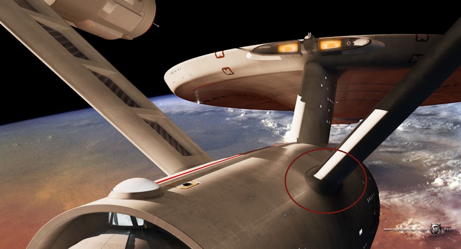
It seems to me that they are too "nice" looking. That strongback is supporting a tremendous amount of mass, and what I like about Probert's refit is that the strongback looks like the skin is made of a different material, or that there are structural supports just under the surface and lightly skinned on top. I think your would look more "real" if there were more of a suggestion of that.
That strongback is supporting a tremendous amount of mass,...
Mass in zero-G. And with an integrity field to boot.
Nice work on the lines, V.
deg

Agreed... that's the sort of thing I always talk about when I've talked about the original ship needing "polish" rather than "redesign." Detail that, if the ship was slightly out-of-focus, wouldn't be distinguishable from the original TV presentation. So we can see what we're seeing now as "how it really looked, but clearer than we were able to see it before."Those grid-lines look very good and they are subtle enough that they don't disturb the smoothness of the hull.
Similar threads
- Replies
- 35
- Views
- 15K
- Replies
- 16
- Views
- 626
- Replies
- 50
- Views
- 8K
- Replies
- 25
- Views
- 995
If you are not already a member then please register an account and join in the discussion!