-
Welcome! The TrekBBS is the number one place to chat about Star Trek with like-minded fans.
If you are not already a member then please register an account and join in the discussion!
You are using an out of date browser. It may not display this or other websites correctly.
You should upgrade or use an alternative browser.
You should upgrade or use an alternative browser.
Fennius' Ships and Images
- Thread starter Fennius
- Start date

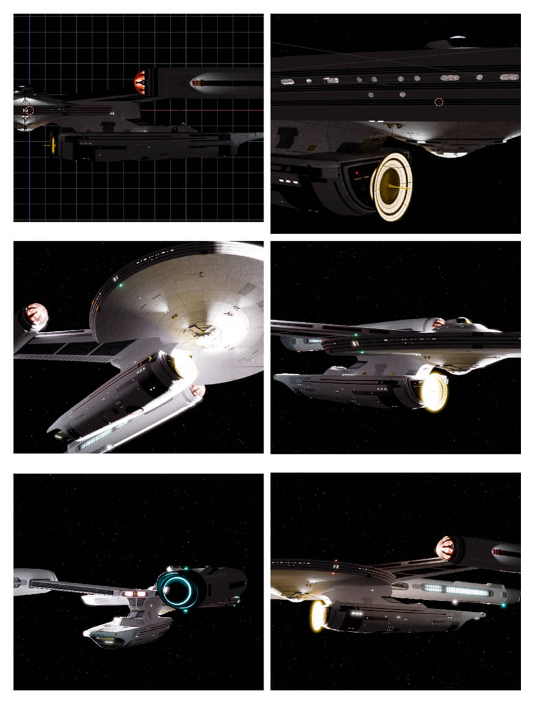
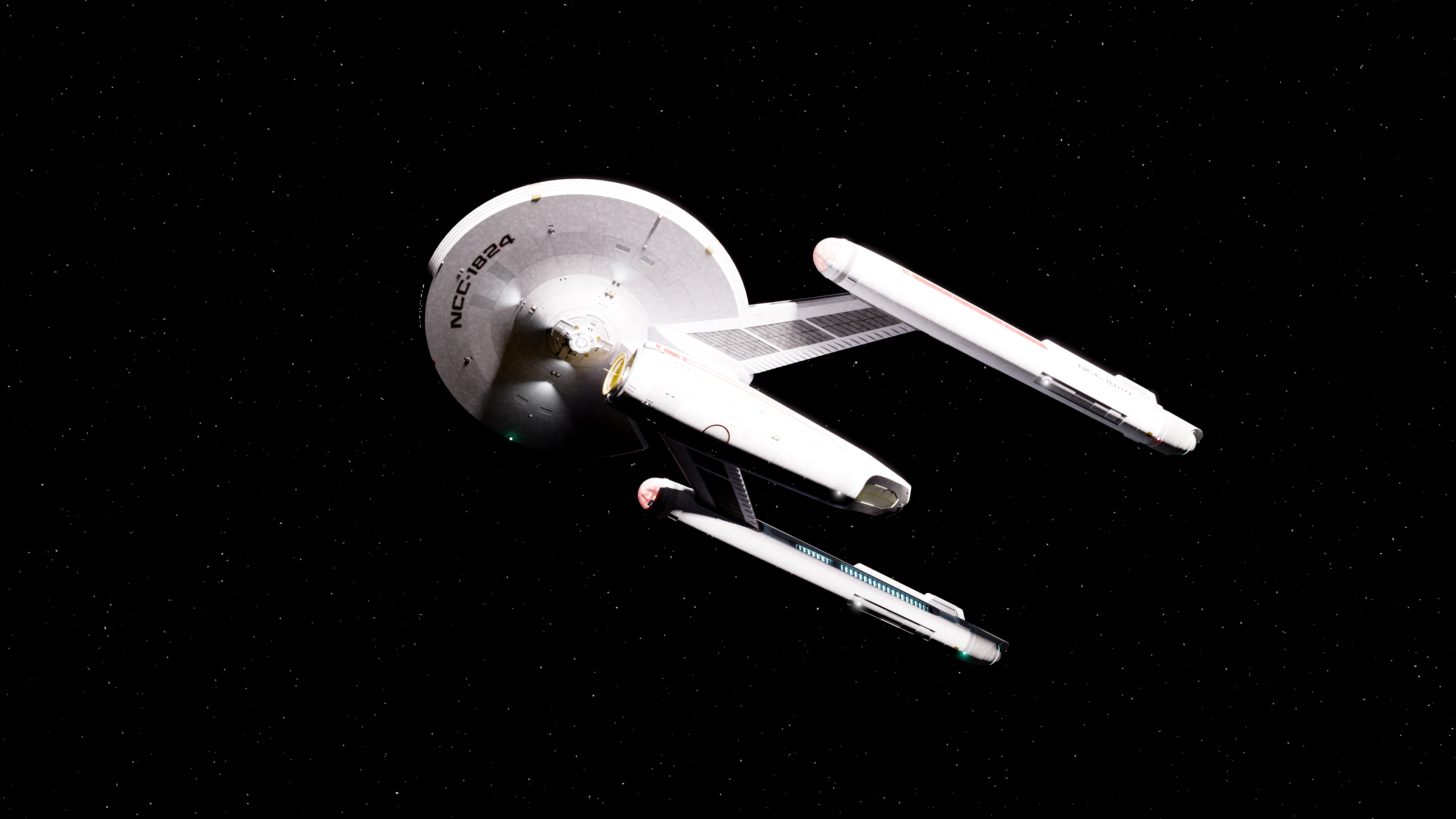
Some further tests, the darker hull patterns are coming out a bit too high contrast, I've worked out it's because the main hull is veer so slightly glowing.
It *shouldn't* be because only the interior back faces are glowing to give some of that depth in the windows, but when I turn everything else off there's that little bit of visibility
Which does lessen the high contrast I can get if I want to go for that realistic scene lighting, but I'm likely to only use that with certain images / styles.
So my fix I'm playing with has actually been to make the darker elements glow ever so slightly as well and it's making it feel more cohesive
I wonder how the interior back faces are illuminating the exterior faces... maybe the interior light is bouncing off something outside the model and reflected back?
Can't be, nothing in the scene for them to bounce off, and that would illuminate it equally.
I think it's more likely something about the complicated mix of nodes that I only half understand, having followed a tutorial, is not restricting it 100% to the back faces the way it should.
Possible even that's because it's an imported mesh and probably isn't very clean geometry
There were a couple of spots where the exterior started glowing with control surfaces though those seem to have largely resolved themselves as I play with settings
Ahh, yeah it sounds like something in the material since you can make it disappear by playing with the settings. Did you also set your scene's world background color to black? If you didn't then that could also be a source of lighting.
Ahh, yeah it sounds like something in the material since you can make it disappear by playing with the settings. Did you also set your scene's world background color to black? If you didn't then that could also be a source of lighting.
It's set to the starfield you see in this ebits, noise texture and colour ramp. But those settings haven't changed since before I was mucking with the windows like that, and in earlier shots it was almost pitch black except for the emissive surfaces
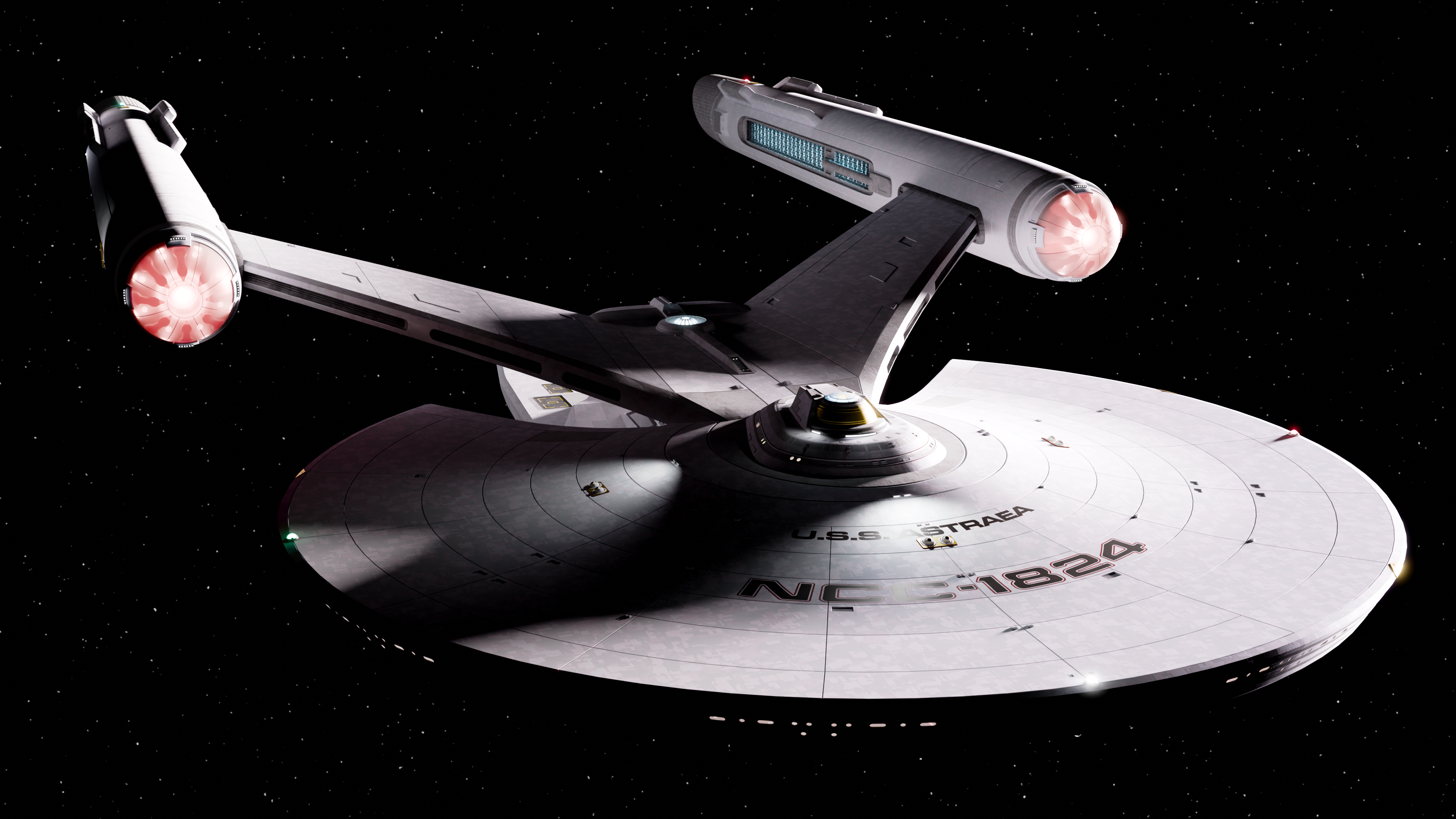
DONE
Sort of, there's a couple of errors I spotted I accidentally deleted prior to exporting to Blender I didn't even notice. There's supposed to be some exterior hatches at the base of the neck section and more importantly....actually I'll let people see if they can spot whats missing in the symmetry and has been in every test render as well but it took me until yesterday to realise
Similarly there is an issue with the registry plates that is currently bugginh me, but I can NOT be arsed to try and fix right now, so it will remain as is.
There's probably other incremental improvements I might make especially as I learn more of blender
Meanwhile, been toying with a number of names, and had almost settled on Excalibur last night but was already starting to decide against it this morning when by complete coincidence I found an interview of Bill Krause talking about HIS Excalibur (which is ALSO a TOS-TMP transitional ship )
I have settled for now on Astraea, though I don't think I like that as the class name, possibly Ravenna class but its to be decided.
I've actually disabled those nodes that were giving the hull its weird glow, it wasn't doing much to improve the windows anyway and I wanted the ability to actually have shadows, even if it worked well for a more studio lit looking model.
Sort of, there's a couple of errors I spotted I accidentally deleted prior to exporting to Blender I didn't even notice. There's supposed to be some exterior hatches at the base of the neck section and more importantly....actually I'll let people see if they can spot whats missing in the symmetry and has been in every test render as well but it took me until yesterday to realise
Similarly there is an issue with the registry plates that is currently bugginh me, but I can NOT be arsed to try and fix right now, so it will remain as is.
There's probably other incremental improvements I might make especially as I learn more of blender
Meanwhile, been toying with a number of names, and had almost settled on Excalibur last night but was already starting to decide against it this morning when by complete coincidence I found an interview of Bill Krause talking about HIS Excalibur (which is ALSO a TOS-TMP transitional ship
) I have settled for now on Astraea, though I don't think I like that as the class name, possibly Ravenna class but its to be decided.
I've actually disabled those nodes that were giving the hull its weird glow, it wasn't doing much to improve the windows anyway and I wanted the ability to actually have shadows, even if it worked well for a more studio lit looking model.
I can't really tell what hatches are missing so it seems to be well hidden ")
Curious, do you have fill lights illuminating the nacelles? The nacelle nearest to the key light should have a dark shadow on the opposite side like the nacelle furthest from the key light but it is very well lit.
Curious, do you have fill lights illuminating the nacelles? The nacelle nearest to the key light should have a dark shadow on the opposite side like the nacelle furthest from the key light but it is very well lit.
I can't really tell what hatches are missing so it seems to be well hidden
Curious, do you have fill lights illuminating the nacelles? The nacelle nearest to the key light should have a dark shadow on the opposite side like the nacelle furthest from the key light but it is very well lit.
Oh the hatches you can't see because they were just some add-ons placed on the surface which aren't there.
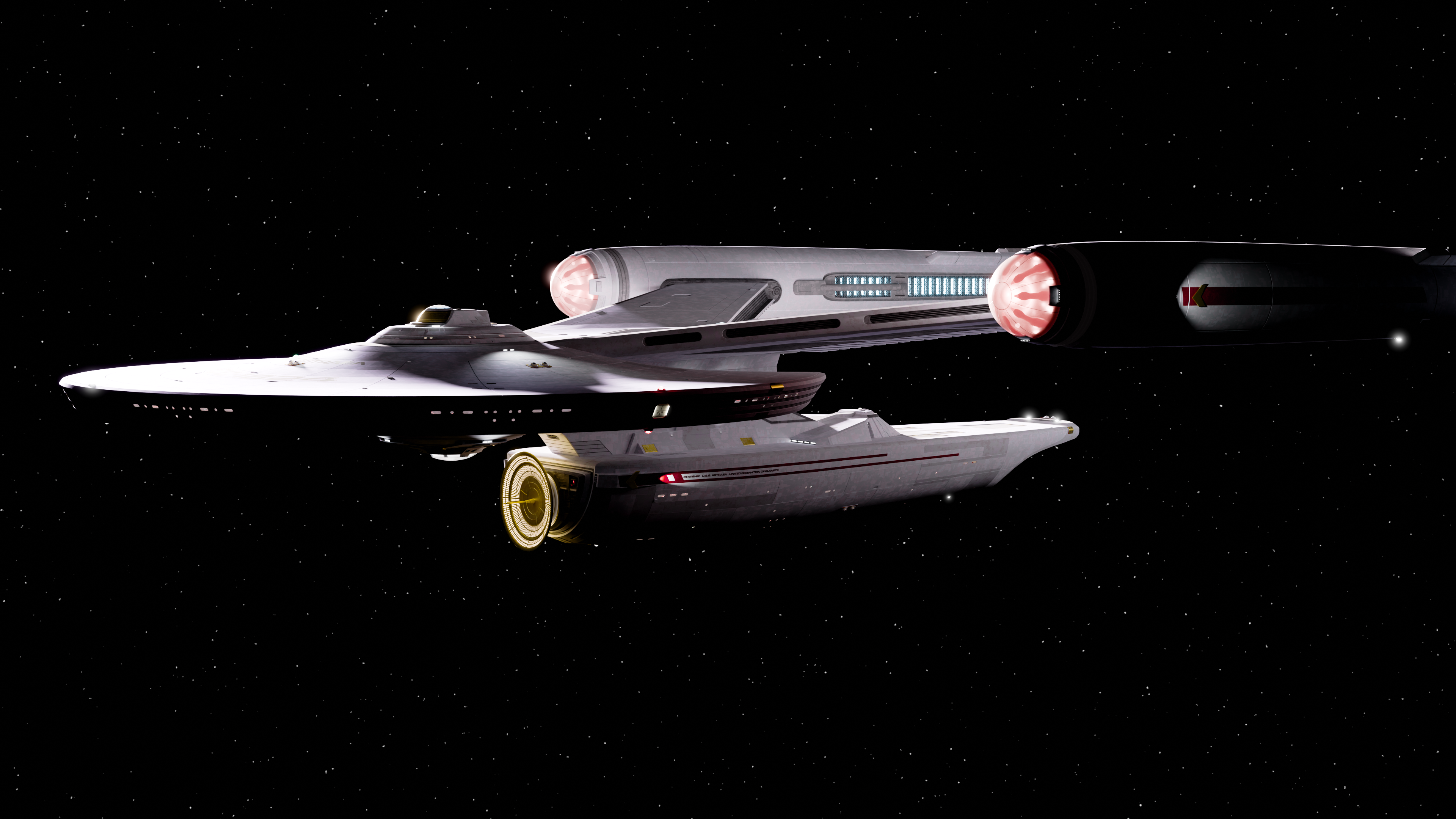
But you may have spotted the error with the nacelles - the port nacelle is missing two of the internal lights on the starboard edge.
HOW that happened I'm not sure, something to do with mirroring when I was working in wings
As for how they work, there are a series of physically modelled lights with emmissive surfaces around the edge and in the centre, as well as a single point light source in each to bump up the vibrancy a bit as it wasn't quite looking right. I've also actually given the vanes a faint red glow because when they were shadowing the lights they created too dark a contrast image on the glass. Hopefully it just reads as being illuminated by red light bouncing around inside the collector
And a quick little test I started last night and finished while I should have been working.
There's logic to the colours for the warp trails, going for a movie era style with the nacelle ones being pinkish purply, and the lower blue one there I think is meant to be due to the deflector light, so its switched to yellow here (and honestly the purple makes mroe sense here than in the movies as there's at least blue and red on the same object for the trail
) The effect itself is a quick 10 minute proof of concept with some stretched glowy cylinders and motion blur, rather than a proper light trail I'd need to look up how to do.
Slapped a 35mm retro filter on it while I put the sounds on too for good measure
The warp trail looks pretty good! I'm not sure if the camera rubberband/shake helps or hurts though.
Funnily enough it wasn't supposed to be there, I intended a very classic planning shot, but I'm not very familiar with keyframing camera motions and wanted a slight upwards view of the bussard and it ended up coming out in the post BSG style with the camera looking like it's buffeted by the sheer mass of the ship arriving.
I like it, but it's very modern cinematography rather than the Trek classic, so not something I'd want to have any more exaggerated than this.
Nice looking design
Well that's absolutely gorgeous.
I'll take your word on there being things not right, from someone who only dabbled in 3DS Max over two decades ago, this looks really awesome.
Thank you!
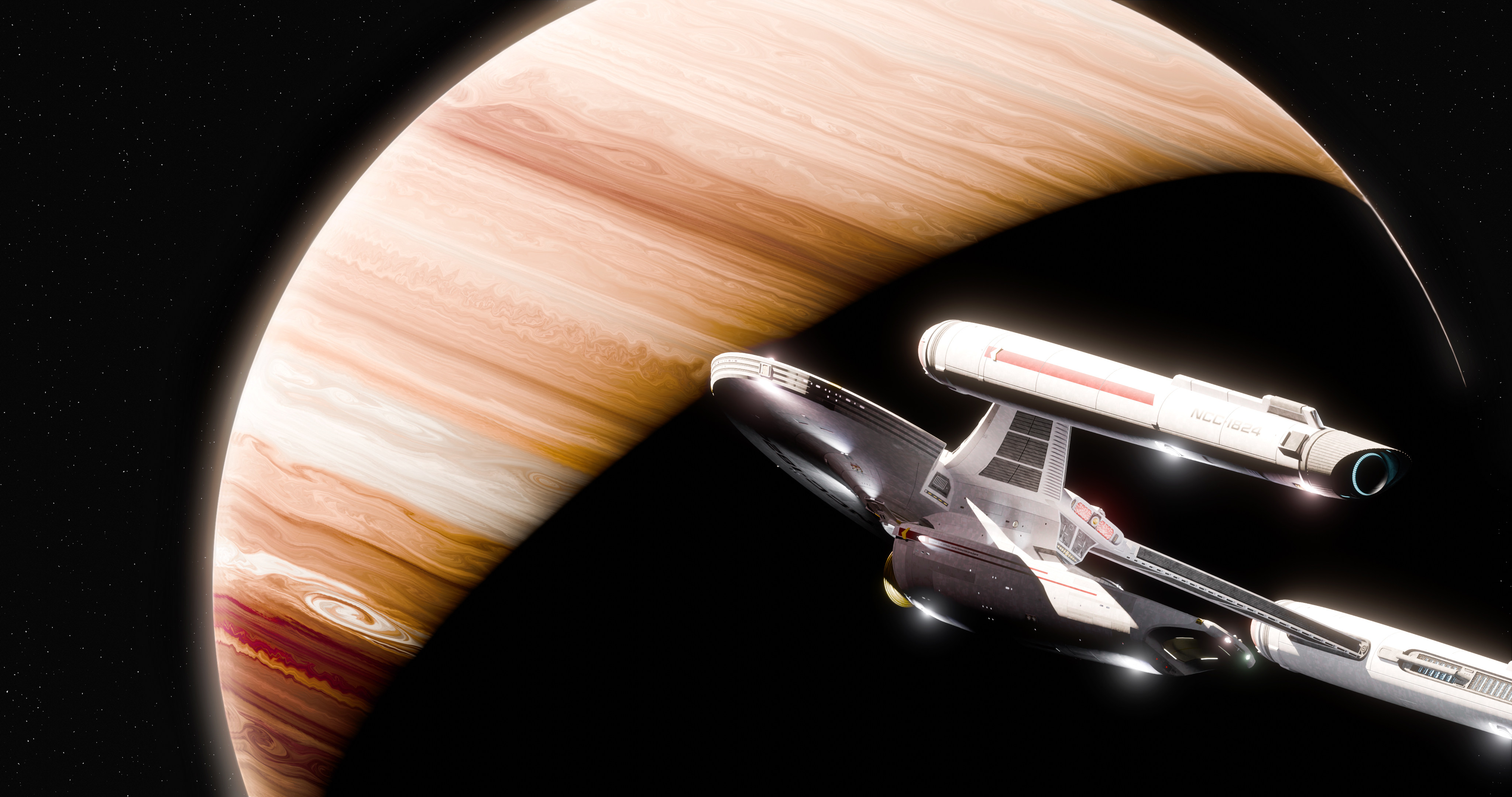
Followed a tutorial for a procedurally generated planet, little bit of touch up in photoshop but overall trying to get as much of this done in blender as possible. And my pc seems to be willing to render 4K wallpapers nicely, at least for scenes like this., I guess its easier than landscapes with atmosphere to bounce the light around.
The blinkies didn't scale down properly when I resized the ship which is why they're brighter and whiter, but I kinda liked the look for this particular image so I left them as is, just added subtle tints to some of them.
Last edited:
A breathtaking shot, @Fennius! This is coming along brilliantly.
Thank you! Its one of those things where I throw the initial composition together, think it looks great, and then after two days working on it and making tiny almost imperceptible changes all I see are the problems with

The original intent was I'd have this one, anothe rone from a different angle, and maybe be halfway through a third compeltely different image today. THAT didn't happen!
Grumble mumble
So I'm TRYING to make some blueprints for this thing which I vludes getting an idea of how big it is, but what I have discovered is that different pictures I can find of the Connie refit to scale it against, DO NOT MATCH
They're....significantly different saucer sizes depending on which image I use
I have a feeling the plans I originally scaled it off are the ones that are wrong, but that means either I scale this ship to match the bridge/windows/saucer size etc in which case it becomes too big for its intended role and seems to significantly put mass the Connie, or I have it be smaller as intended but with a bridge dome that looks extremely similar to the Connie's but is half the size.
Thso would be acceptable if I could be sure which version of the plans I'm looking at was actually correct!
Grumble mumble
So I'm TRYING to make some blueprints for this thing which I vludes getting an idea of how big it is, but what I have discovered is that different pictures I can find of the Connie refit to scale it against, DO NOT MATCH
They're....significantly different saucer sizes depending on which image I use
I have a feeling the plans I originally scaled it off are the ones that are wrong, but that means either I scale this ship to match the bridge/windows/saucer size etc in which case it becomes too big for its intended role and seems to significantly put mass the Connie, or I have it be smaller as intended but with a bridge dome that looks extremely similar to the Connie's but is half the size.
Thso would be acceptable if I could be sure which version of the plans I'm looking at was actually correct!
The Connie Refit from The Motion Picture is supposed to be 1,000'. The Connie 3 from Picard Season 3 is apparently twice the size. How big is your ship supposed to be?
Similar threads
- Replies
- 0
- Views
- 3K
- Replies
- 4
- Views
- 8K
- Replies
- 482
- Views
- 61K
If you are not already a member then please register an account and join in the discussion!