-
Welcome! The TrekBBS is the number one place to chat about Star Trek with like-minded fans.
If you are not already a member then please register an account and join in the discussion!
You are using an out of date browser. It may not display this or other websites correctly.
You should upgrade or use an alternative browser.
You should upgrade or use an alternative browser.
Another small, old ship...
- Thread starter judexavier
- Start date
Thanks guys. ")
I originally had the colors a little "whiter" like unfinished aluminum would be... but it was too light compared to Jude's sketches.
I'll texture up the saucer in the morning. All this free time recovering from surgery is paying off.
I originally had the colors a little "whiter" like unfinished aluminum would be... but it was too light compared to Jude's sketches.
I'll texture up the saucer in the morning. All this free time recovering from surgery is paying off.
1st wanted to say I got mixed up in the posts this morning, didn't read them right or something...pretty typical of meMajor update time!
I started on the textures. I had to rebuild them from scratch, of course... the only thing that came out of the original file is the blue stripe, and the little signs that are around different places.
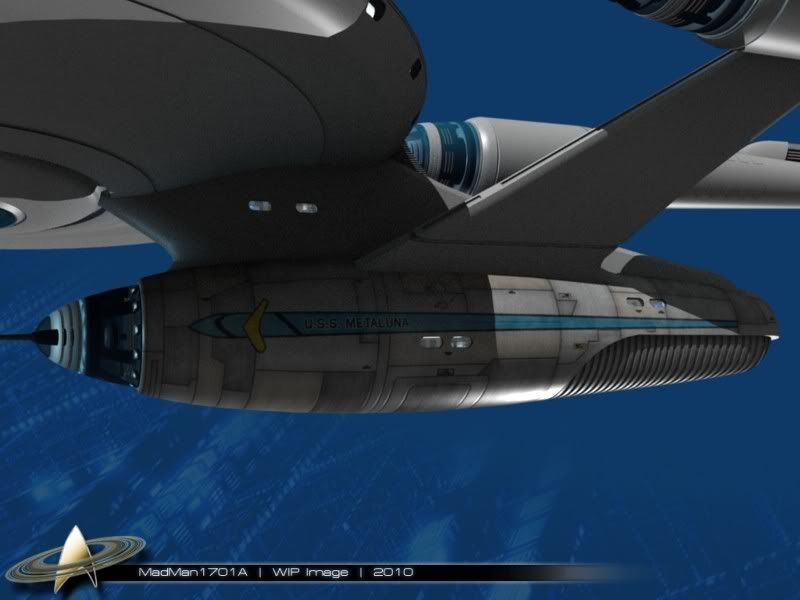
Judexavier, what do you think? I thought you would get a kick out of this. It's a combination of 3 layers... a color layer, a spec layer, and a bump map layer...
Possibly more later.
I'm old and I easily confuse myself.
Anyway...that is...great, awesome, etc. etc.
As neat as it was to see the ship as it was being built, now, with the textures...wow.Something I've been messing with for a while...
http://i248.photobucket.com/albums/gg178/judexavier/DSCN0894ExteriorMJupload02.jpg
http://i248.photobucket.com/albums/gg178/judexavier/DSCN0894Invupload-1.jpg
I really, really like this original drawing you came up with. OK, it's frakkin' brilliant. It caught my eyes (so to speak) in a way that few others have! But I'm not thrilled with where the model has ended up so far.
I think it's because the model isn't the drawing!
(OK, well, it IS. But it looks modern and has too much cool "sizzle.")
Do you think you could finish the model - which is actually, in all fairness, really very excellent - and then go back and make a second model and stay very close to your original drawing? I'm thinking, let it stay looking as close as it can to something that modelmakers in a 1950s prop shop would have crafted - then punch it up a bit (but not TOO much) with surface detailing.
Oh oh OK...sorry, I think I finally figured this out, sorry.
You're referring to that very first "brown" sketch.I'm kind of hoping he is inspired to morph it into all sorts of different things
Those sorts of experiments and variations I always find pretty fascinating.Glad you like it.
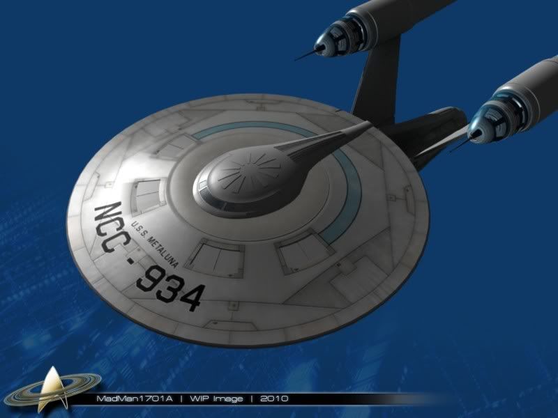
Worked on the saucer a while this morning...
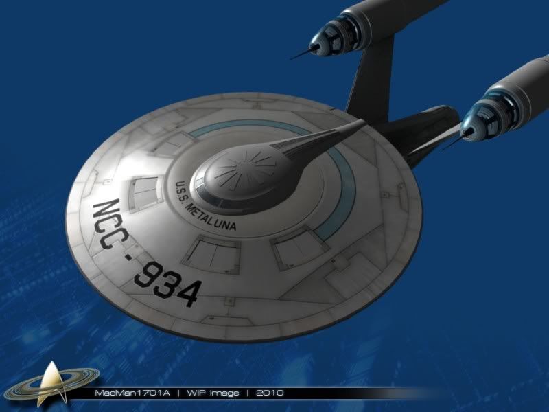
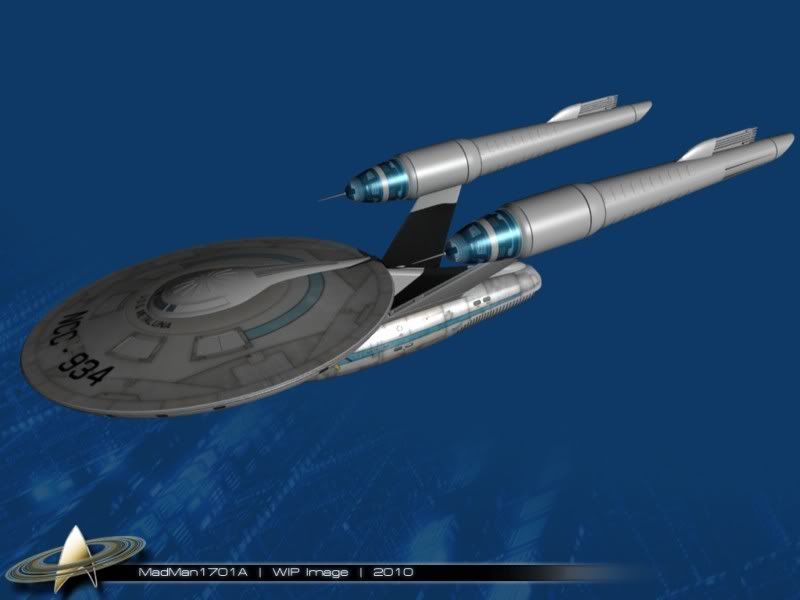
The lighting isn't great, but it give a good idea of how it'll look when finished. I am thinking about moving "USS Metaluna" down closer to the registry number, so I can put a spotlight on all of it.
JudeXavier wanted to deviate from the usual hull pattern style, so I went a little out there for inspiration... The hull pattern is very similar to the "Avrocar".
More in just a little while.
Edit:
Here's the registry moved down lower. Which is better? I can't decide.
Worked on the saucer a while this morning...
The lighting isn't great, but it give a good idea of how it'll look when finished. I am thinking about moving "USS Metaluna" down closer to the registry number, so I can put a spotlight on all of it.
JudeXavier wanted to deviate from the usual hull pattern style, so I went a little out there for inspiration... The hull pattern is very similar to the "Avrocar".
More in just a little while.
Edit:
Here's the registry moved down lower. Which is better? I can't decide.
Hmm... I'm not sure I understand... are you saying you preferred the original drawings over Judxavier's final one that's got the shiny gunmetal look? I'm just curious, because I'm trying to match his final drawing as close as I possibly can.I really, really like this original drawing you came up with. OK, it's frakkin' brilliant. It caught my eyes (so to speak) in a way that few others have! But I'm not thrilled with where the model has ended up so far.
I think it's because the model isn't the drawing!
(OK, well, it IS. But it looks modern and has too much cool "sizzle.")
Do you think you could finish the model - which is actually, in all fairness, really very excellent - and then go back and make a second model and stay very close to your original drawing? I'm thinking, let it stay looking as close as it can to something that modelmakers in a 1950s prop shop would have crafted - then punch it up a bit (but not TOO much) with surface detailing.
Something like that.
No, more like I like them BOTH - but they are so different. It's like I was expecting, based on the drawing, to get a tender and juicy bacon-wrapped Filet mignon steak, but got a succulent and delicious Maine Lobster with unsalted, pure creamery butter instead.
Maybe what I want is for the original drawing to be built as a model, but build that model as though it was meant to replicate "the original model that was built in the 1950s".
Edit:
Here's the registry moved down lower. Which is better? I can't decide.
How about making the registry number smaller? That way the name isn't lost as a result. Just a suggestion. YMMV.
Excuse me, but THAT is fucking cool!Glad you like it.
Worked on the saucer a while this morning...
The lighting isn't great, but it give a good idea of how it'll look when finished. I am thinking about moving "USS Metaluna" down closer to the registry number, so I can put a spotlight on all of it.
JudeXavier wanted to deviate from the usual hull pattern style, so I went a little out there for inspiration... The hull pattern is very similar to the "Avrocar".
More in just a little while.
Edit:
Here's the registry moved down lower. Which is better? I can't decide.

Tonight, I'll tweak the registry some more, and continue on to the neck...
Madman, I just am amazed how you can take something like this, from a few sketches, and really take it to an incredible level, all while you manage to keep the original "artistic" intent. (And I wasn't exactly sure just what my intent was You really should be creating things for big productions. I've never had any experience at it, but I'd think directors etc. would love working with you.
Anyway, I like the lower, straight name. (I always liked the straight TOS style rather than the text-on-curve look)
The saucer textures look great, in a way they could hint at the position of thrusters, etc. That blue stripe is nice too. Oh, and I noticed you added the intercooler tube-fin things...cool!
I wonder if this could be ported into a shapeways model? Maybe later In 6 months or a year the prices may be more affordable.
You really should be creating things for big productions. I've never had any experience at it, but I'd think directors etc. would love working with you.Anyway, I like the lower, straight name. (I always liked the straight TOS style rather than the text-on-curve look)
The saucer textures look great, in a way they could hint at the position of thrusters, etc. That blue stripe is nice too. Oh, and I noticed you added the intercooler tube-fin things...cool!
I wonder if this could be ported into a shapeways model? Maybe later
In 6 months or a year the prices may be more affordable.
Last edited:
I'm glad you like it.Madman, I just am amazed how you can take something like this, from a few sketches, and really take it to an incredible level, all while you manage to keep the original "artistic" intent. (And I wasn't exactly sure just what my intent was
Anyway, I like the lower, straight name. (I always liked the straight TOS style rather than the text-on-curve look)
The saucer textures look great, in a way they could hint at the position of thrusters, etc. That blue stripe is nice too. Oh, and I noticed you added the intercooler tube-fin things...cool!
I wonder if this could be ported into a shapeways model? Maybe later
I played with the registry a little more, and it's curved, but I think this fits a little better than what I had before.
I aim to finish this thing tomorrow.
You don't have any more sketches of your shuttle, do you? I left the shuttlebay open, so I can put it in there. I also made the doors openable. Yes, that registry is nice! The shuttle stalled for a bit, but I've been messing with it over the last few days. I'll try to make some better views and send them your way.
Slightly off topic, but I had been hearing these radio adds lately, so I followed the links...some interesting "vintage-future" imagery. (Yes, they sell stuff, I was interested in the look they were going after).
Almost kinda sorta what I had in the back of my mind when I was messing with that "50's proto-trek" Metaluna related stuff...perhaps inspiration for cool nacelle shapes and greebles...
If they were chrome plated, they would look a bit like the weapon props in MIB...
http://www.wetanz.com/
http://www.wetanz.com/holics/index.php?catid=4
That stuff is awesome! A little expensive, but I would love to have some of those.Slightly off topic, but I had been hearing these radio adds lately, so I followed the links...some interesting "vintage-future" imagery. (Yes, they sell stuff, I was interested in the look they were going after).
Almost kinda sorta what I had in the back of my mind when I was messing with that "50's proto-trek" Metaluna related stuff...perhaps inspiration for cool nacelle shapes and greebles...
If they were chrome plated, they would look a bit like the weapon props in MIB...
http://www.wetanz.com/
http://www.wetanz.com/holics/index.php?catid=4
I love it Mad its a Abramised Asia class from here http://www.starfleet-museum.org/asia.htm Which I happen to love the design.
Interesting. I remember seeing that around somewhere, but I never made the connection.
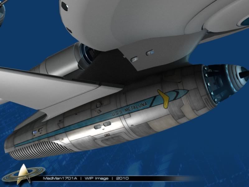
This morning's update... I got the bottom of the saucer textured. Same as before, 3 layers, color, spec, and bump.
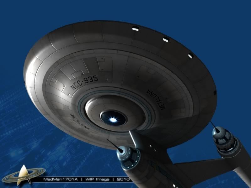
Moving on to the neck...
This morning's update... I got the bottom of the saucer textured. Same as before, 3 layers, color, spec, and bump.
Moving on to the neck...
Similar threads
- Replies
- 0
- Views
- 4K
If you are not already a member then please register an account and join in the discussion!