• Welcome! The TrekBBS is the number one place to chat about Star Trek with like-minded fans.
    If you are not already a member then please register an account and join in the discussion!

3D interiors in Blender

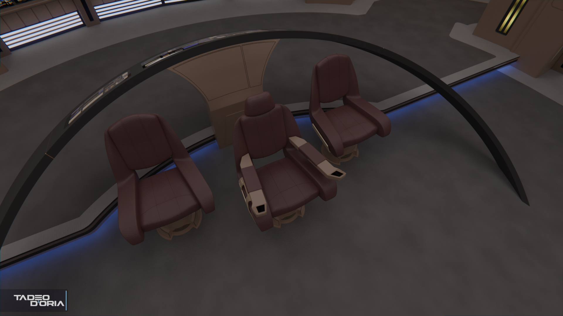
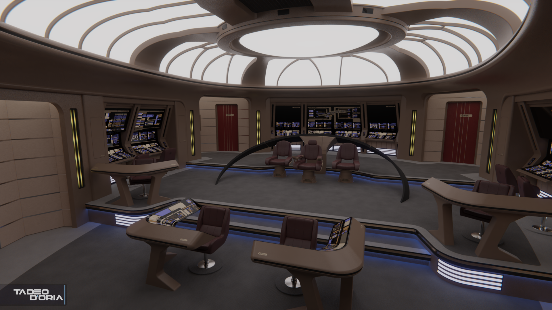
@Cjohnson1701: Thanks for the feedback! I'm not 100% sold on the leather material myself, I keep tweaking it bit by bit. One of the many reasons why I dislike making chairs. :lol:
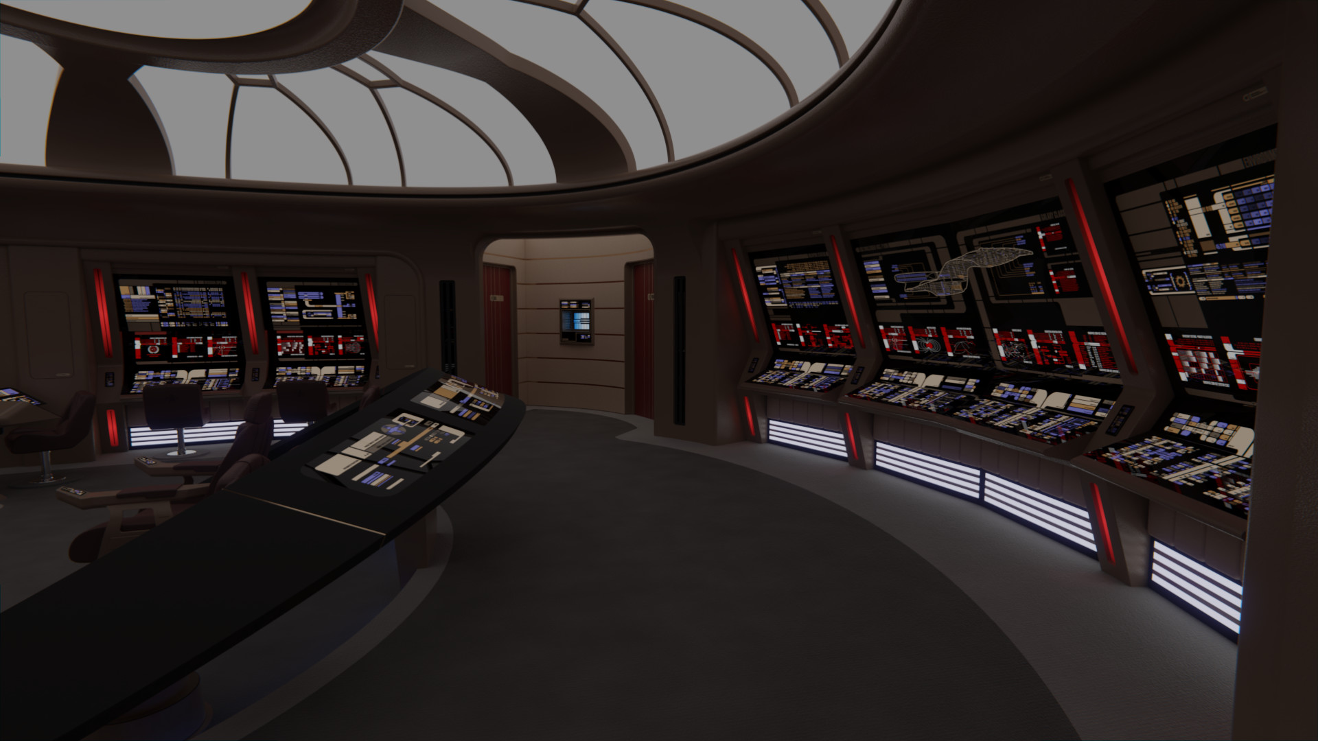
Regarding the pinching, it is there, though maybe it's a bit too subtle. And the bits taken from the Enterprise-D are smooth as they were there.
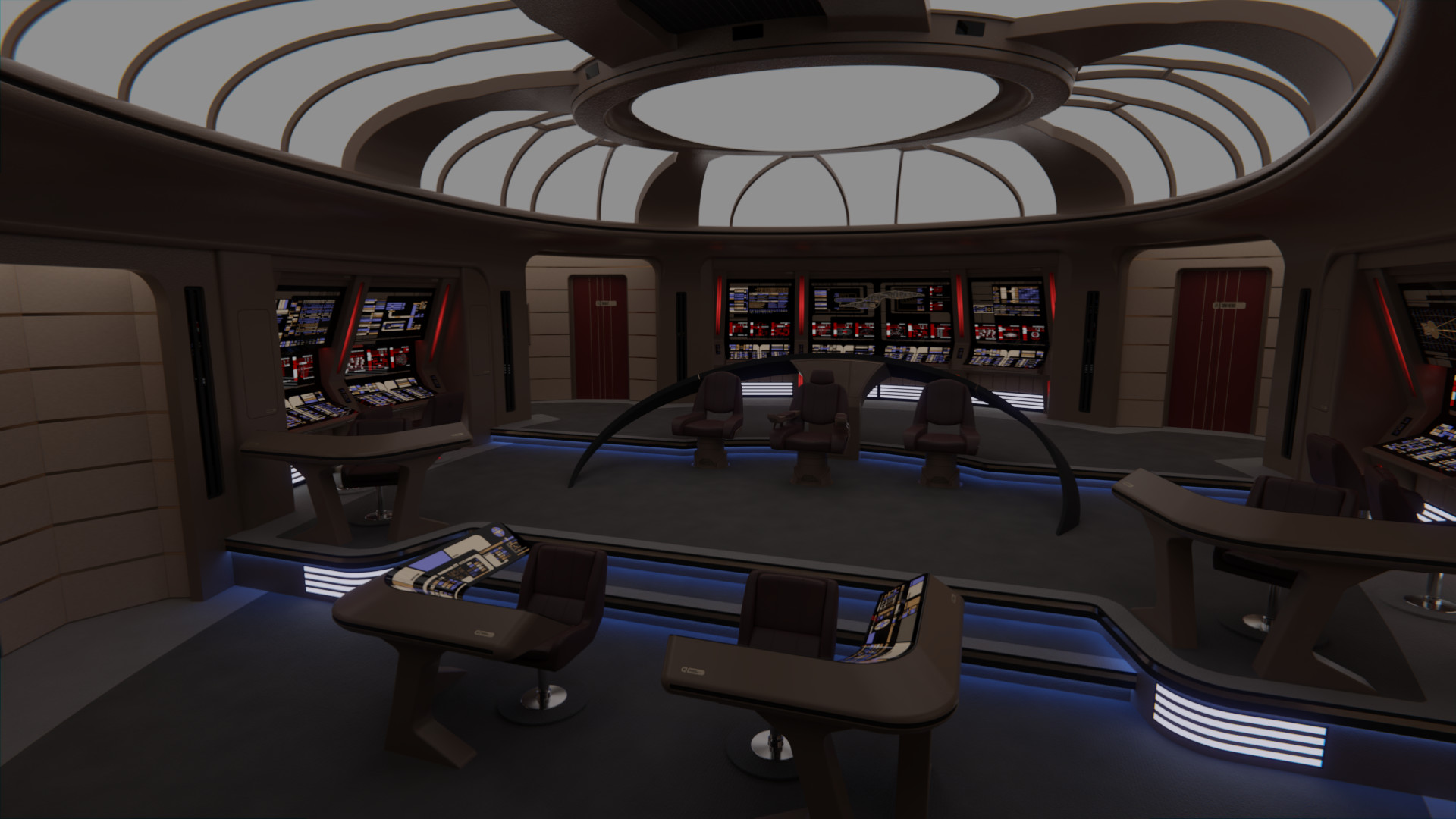
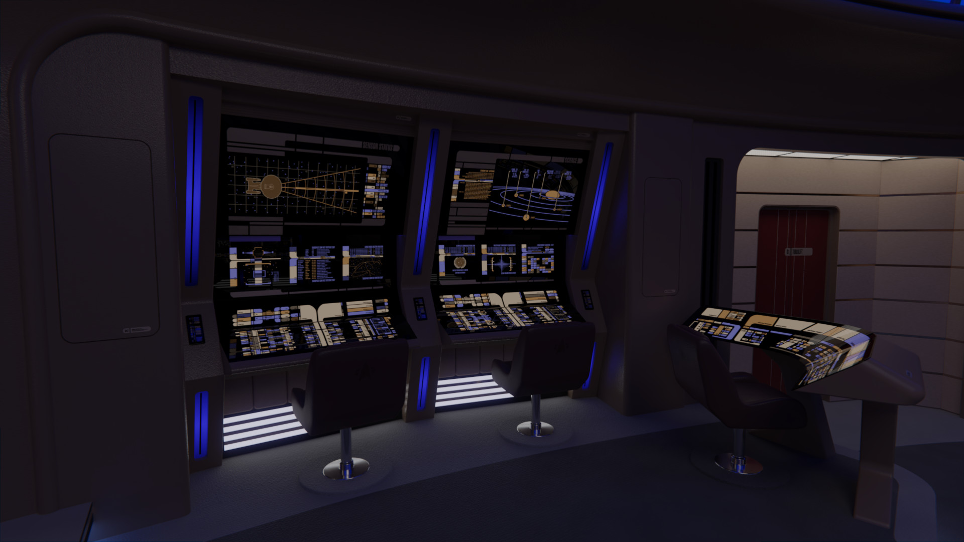
On 'inflating' the cushions, I actually deflated them bit when compared to the smaller console seats, as the command seats on the Ent-E nearly don't have any sort of cushion at all.

nemesishd0211_by_rekkert-dcq3p81.jpg

nemesishd0280_by_rekkert-dcq3p8c.jpg

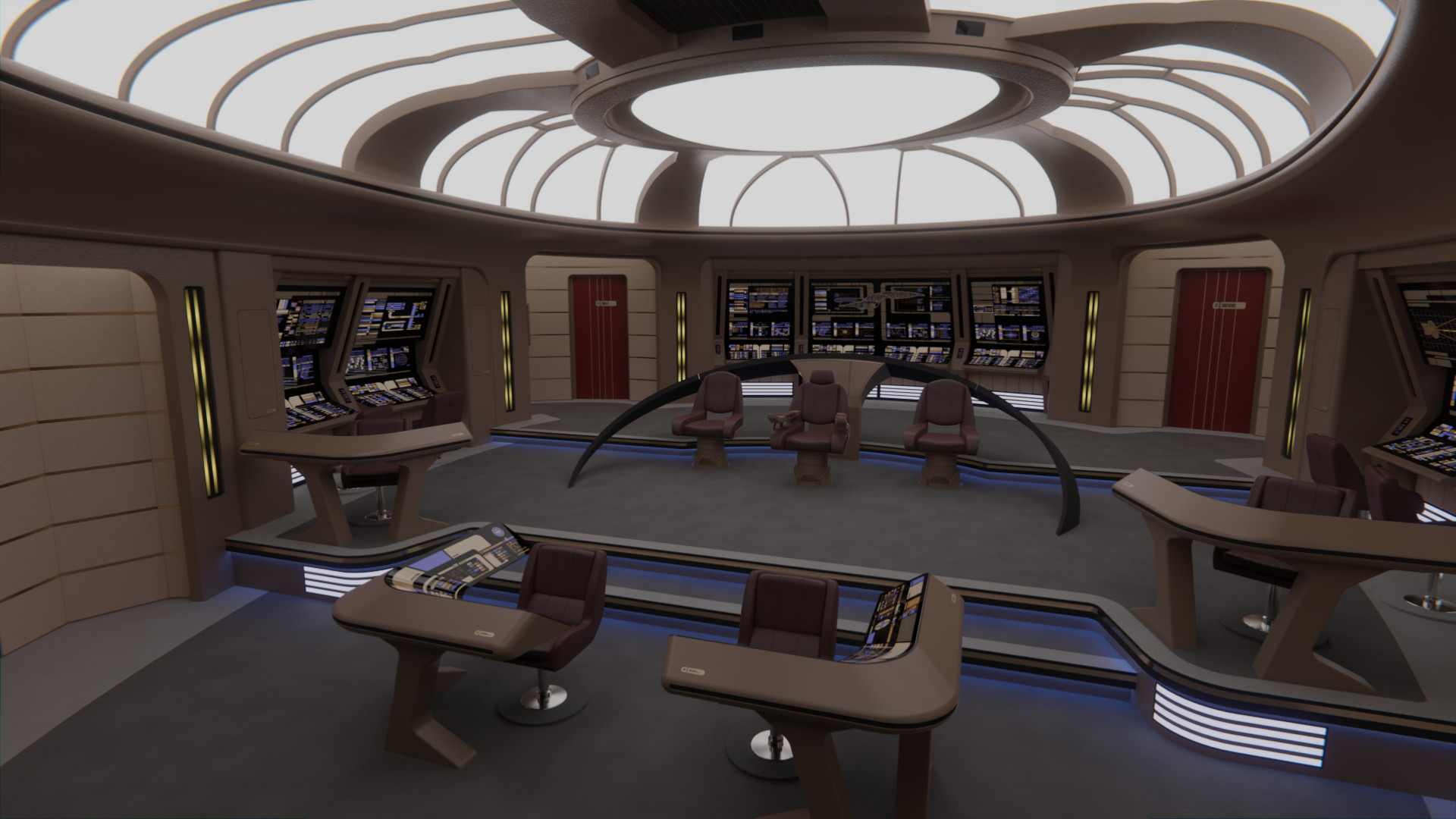
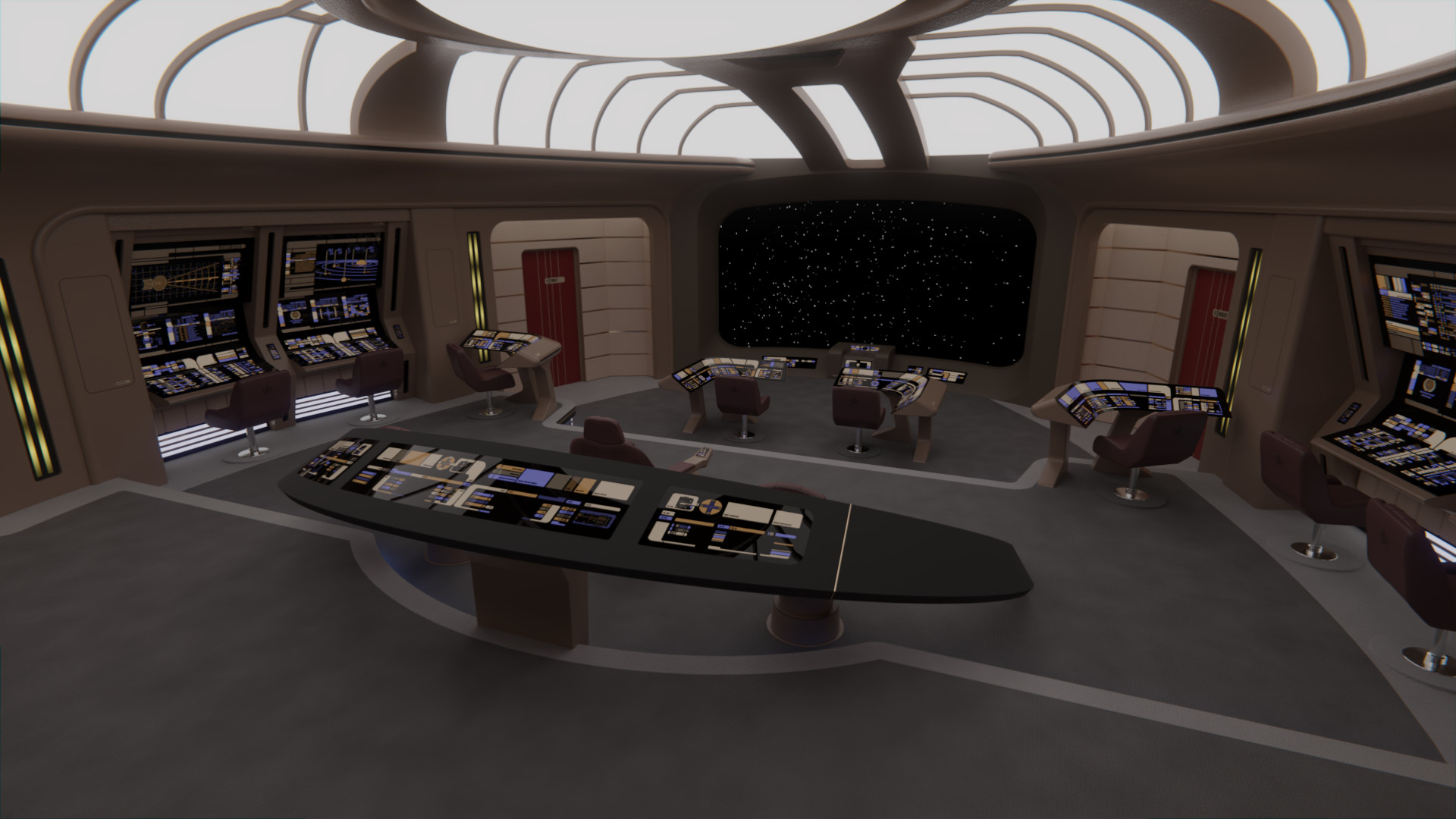
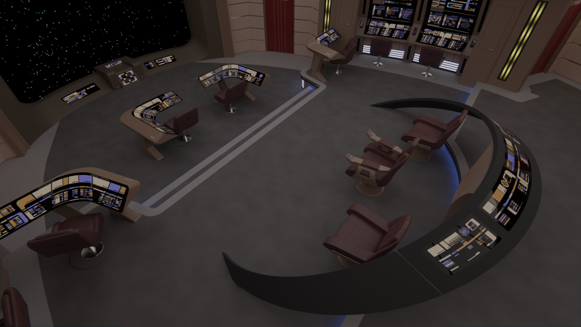
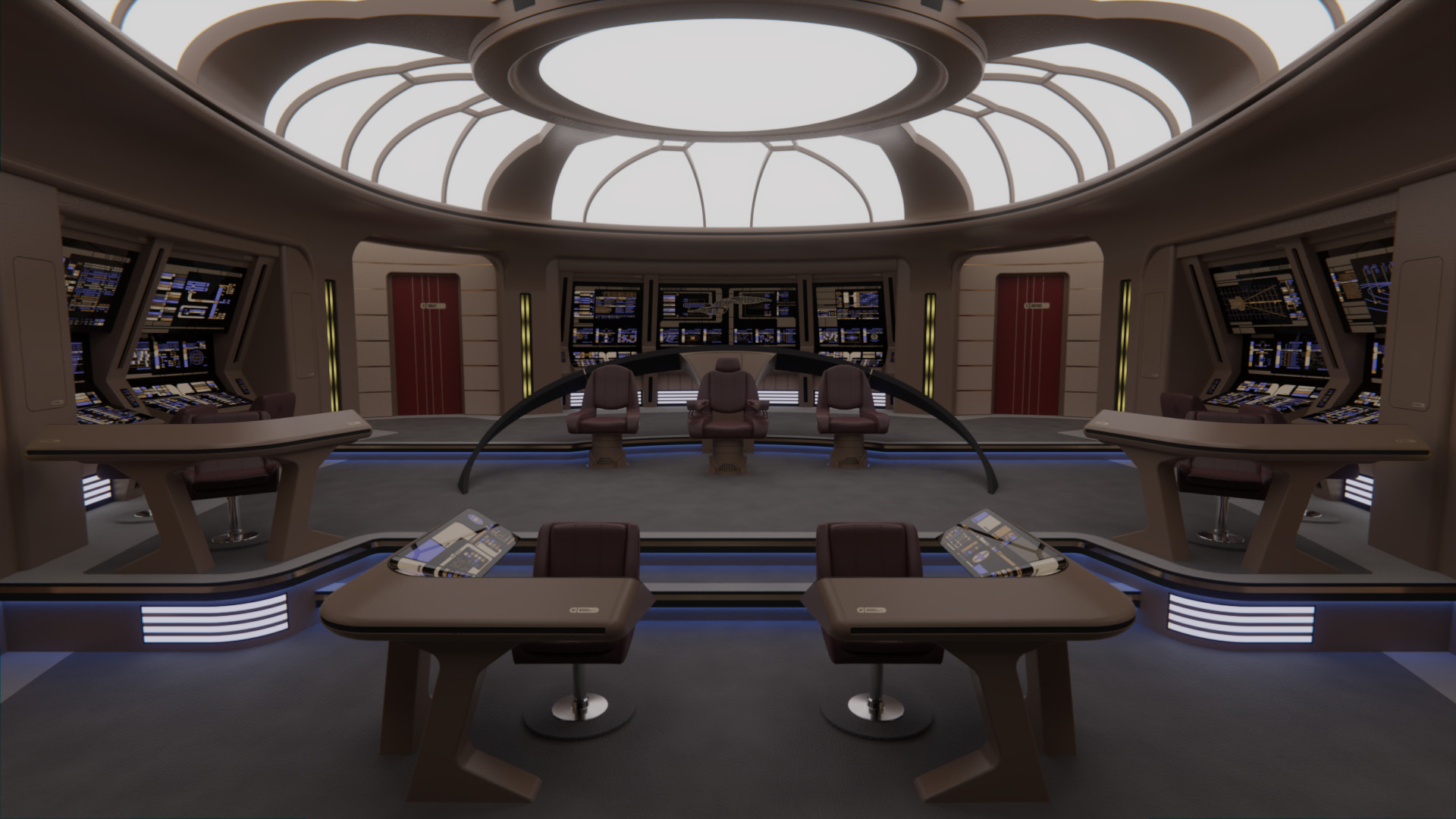
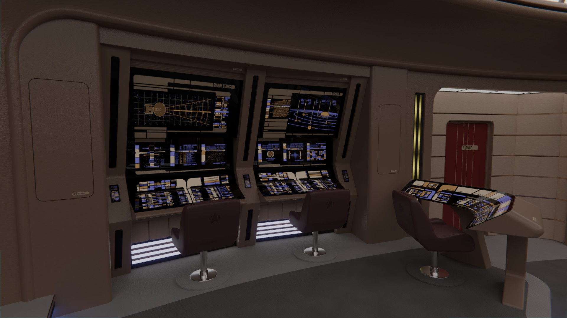
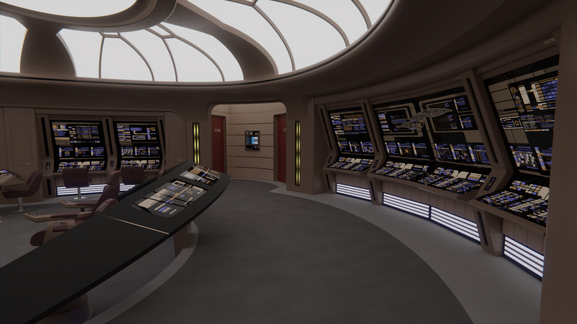
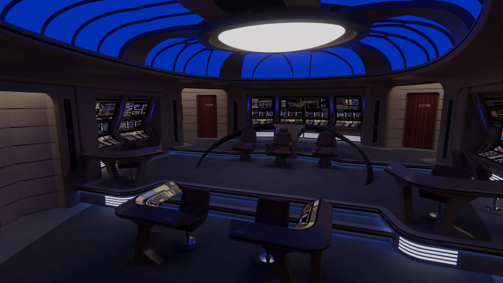
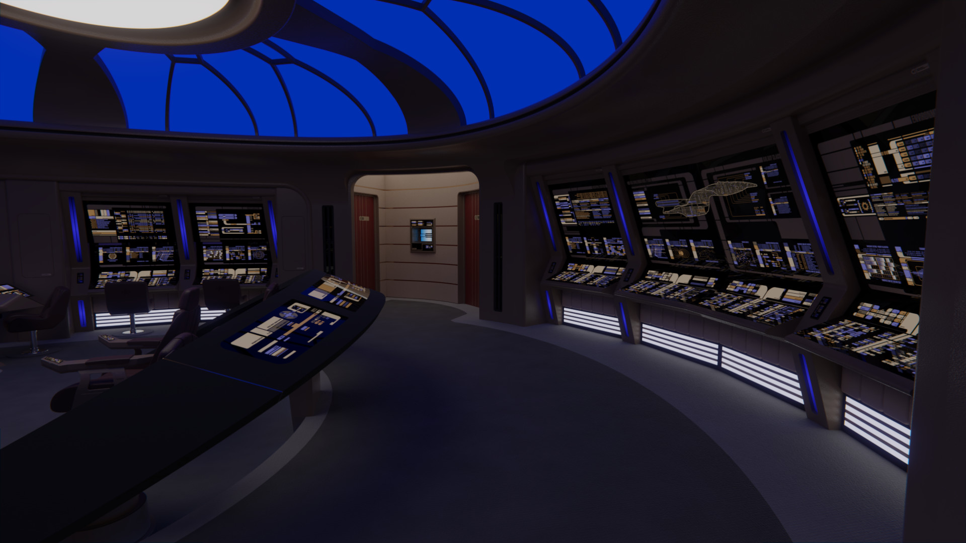
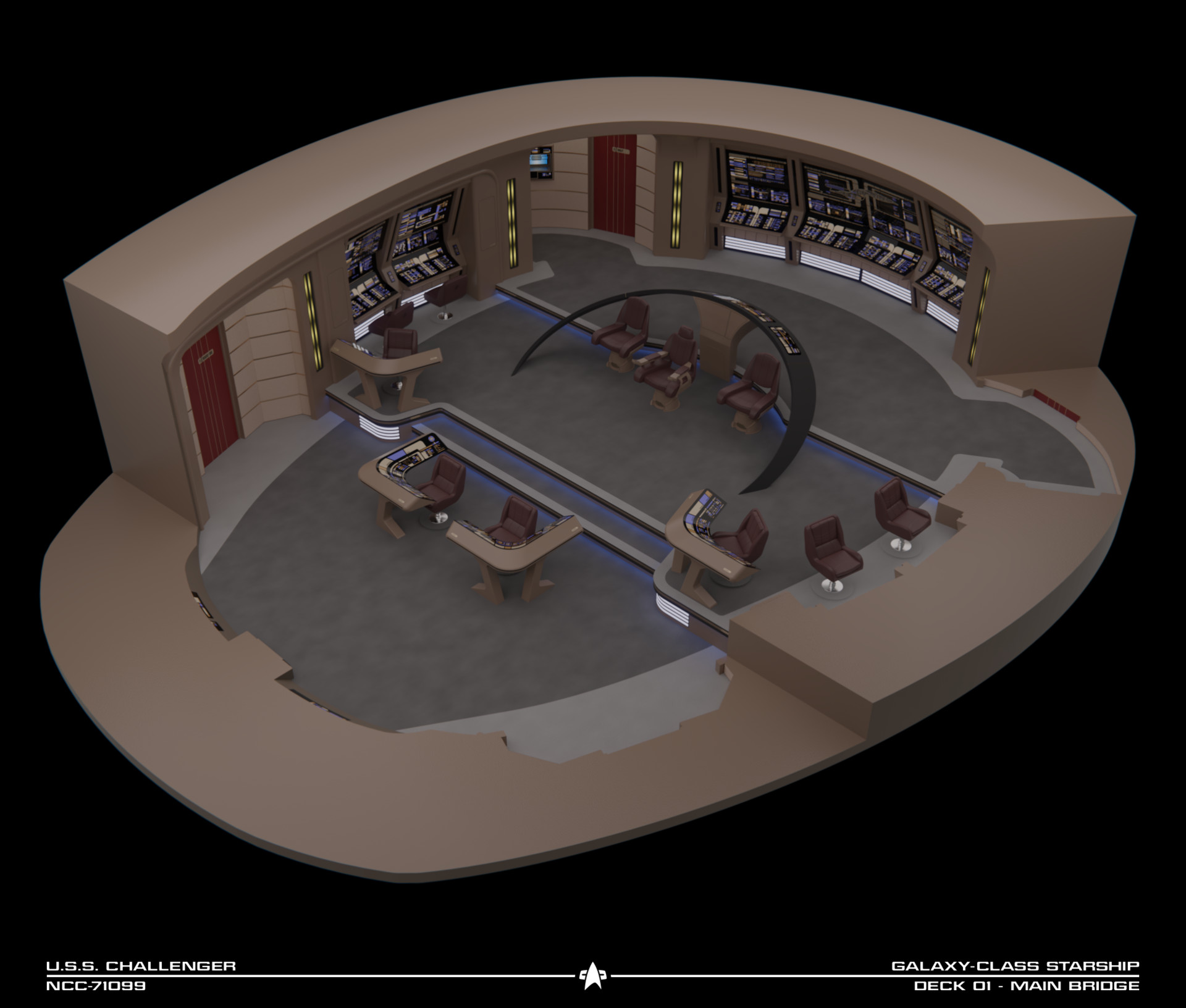
I've further tweaked the chairs, changing up the materials a bit and adding some more details on the supports, plus modifying the backrests and the Captain's headrest. Also, the lighting on the steps is now a deep blue, on the same style as on the Ent-E.

c1_23_by_rekkert-dcq3mh4.png

c1_22_by_rekkert-dcq3mgr.png

Love the blue light!
 
I feel sorry for Worf, for 7 years he had to stand up behind his horseshoe, while everyone else got to sit down, and then they finally gave him a chair in Generations, only for the bridge to be destroyed!
Then when he went back to the E and he's lost his chair, and it's back to standing again!
 
@Rekkert, the blue doesn't look bad, per se, but for reasons already stated, plus personal preference, I'm not sure I care for it. Which is odd, because blue is my favorite color.
 
It's one of those things that wasn't really my decision on this bridge, but I still like the blue light more than the original yellow. :)

From what I read of the design language used on the films, the blue isn't really intended as a visual aid for the crew, but rather as a break point to make the contrasting warm colors pop out more in screen. It gets the job done as far as showing where the steps are, plus highlights the reds and yellows a bit more.

I've finished the remaining LCARS panels.

c1_24_by_rekkert-dcq6x11.png

c1_25_by_rekkert-dcq6rl1.png
 
Now that the LCARS are done, it seems kind of weird that you didn't incorporate the overhang between the two rows of displays on that aft wall. You've got the natural break there, why not allow the overhang for the Red Alert flashers?
 
It's one of those things that wasn't really my decision on this bridge, but I still like the blue light more than the original yellow. :)

From what I read of the design language used on the films, the blue isn't really intended as a visual aid for the crew, but rather as a break point to make the contrasting warm colors pop out more in screen. It gets the job done as far as showing where the steps are, plus highlights the reds and yellows a bit more.

I've finished the remaining LCARS panels.

c1_24_by_rekkert-dcq6x11.png

c1_25_by_rekkert-dcq6rl1.png

Awesome!

As far as the blue, then I gotta say, turn up that intensity! :D
 
@Matthew Raymond: Thanks! :)

@cardinal biggles: As you can see on the renders below, the overhang is present only on the side consoles, I was specifically asked to remove it from the aft ones.

@Screamble: More blue? :bolian::bolian::bolian::bolian:

Here are some finished renders of the bridge:
tadeo-d-oria-c1-01.jpg

tadeo-d-oria-c1-02.jpg

tadeo-d-oria-c1-03.jpg

tadeo-d-oria-c1-04.jpg

tadeo-d-oria-c1-05.jpg

tadeo-d-oria-c1-06.jpg

tadeo-d-oria-c1-07.jpg


Under red alert:
tadeo-d-oria-c1-01r.jpg

tadeo-d-oria-c1-06r.jpg

tadeo-d-oria-c1-07r.jpg


Under blue alert:
tadeo-d-oria-c1-01b.jpg

tadeo-d-oria-c1-06b.jpg

tadeo-d-oria-c1-07b.jpg


And the style I've settled on for the new cutaway graphics, a lot simpler, but I think more elegant, than the old ones:
tadeo-d-oria-uss-challenger-bridge-cutaway.jpg
 
Last edited:
I think it's my fave too. The coloring is great and I like the layout for the side stations, which keep the crew in view of the captain without shoving him to the rear, and it still retains the key TNG elements from the shape of the bridge and the arch.
 
Thought I'd throw in here:

I want to walk around on this bridge. I want to push control surfaces and watch stuff happen. It's that good.
 
It's simply gorgeous (ignore my blue light comments, they were not a comment on your work).

It's also making me want to go back and finish that bridge I'd started earlier this year.
 
@FormerLurker: Hahaha, I want to do that as well. Maybe someday in the far future...

@Screamble: No problem regarding the blue lights mate, it's good feedback. :) Please do finish that bridge if you're willing and able to, we can never have enough original bridge designs! :)

Given that I spent an unhealthy amount of time looking at screencaps of the Ent-E bridge for the Challenger commission, I've compiled a list of all the changes it had during its appearances that I noticed: http://www.ex-astris-scientia.org/inconsistencies/enterprise-e-bridge.htm
 
Last edited:
Thanks for adding the noted changes to EAS as it's nice to see the side by side comparison. Like I've said in your thread on SFM, beautiful work.
 
If you are not already a member then please register an account and join in the discussion!

Sign up / Register


Back
Top