• Welcome! The TrekBBS is the number one place to chat about Star Trek with like-minded fans.
    If you are not already a member then please register an account and join in the discussion!

3D interiors in Blender

@Screamble: Ahh, I must have missed the fact that it was their design in your thread. :)

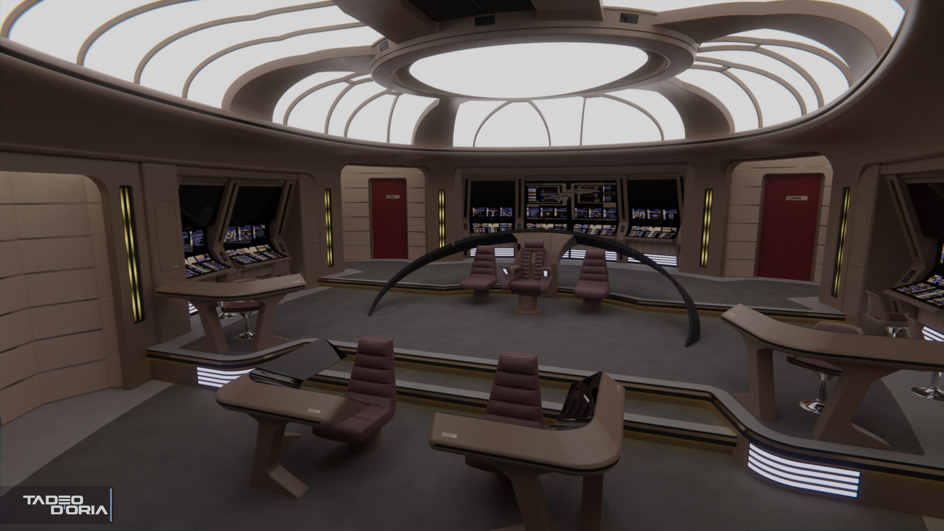
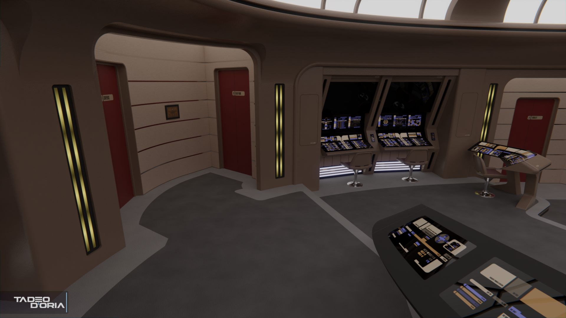
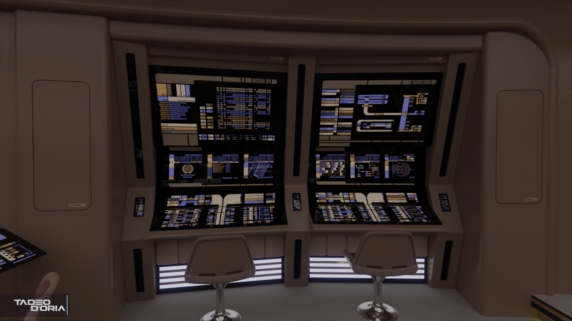
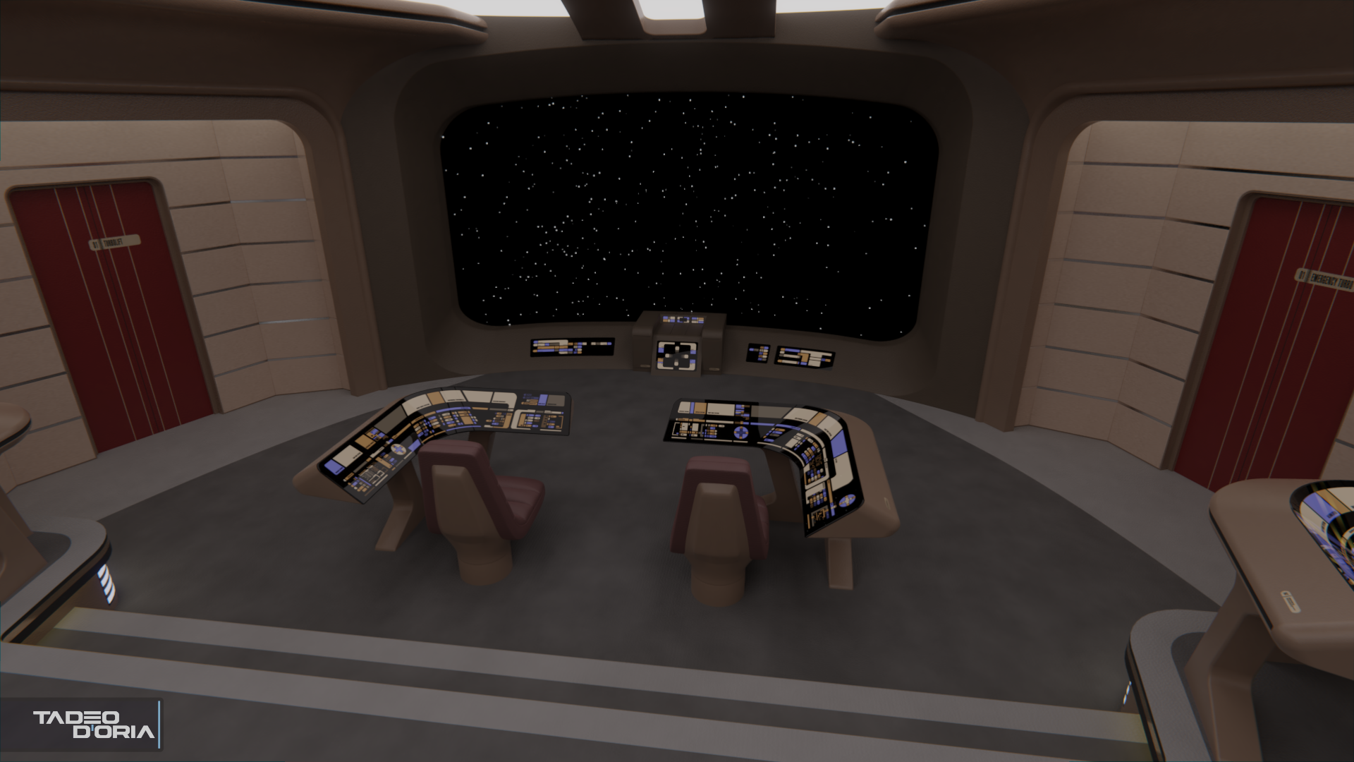
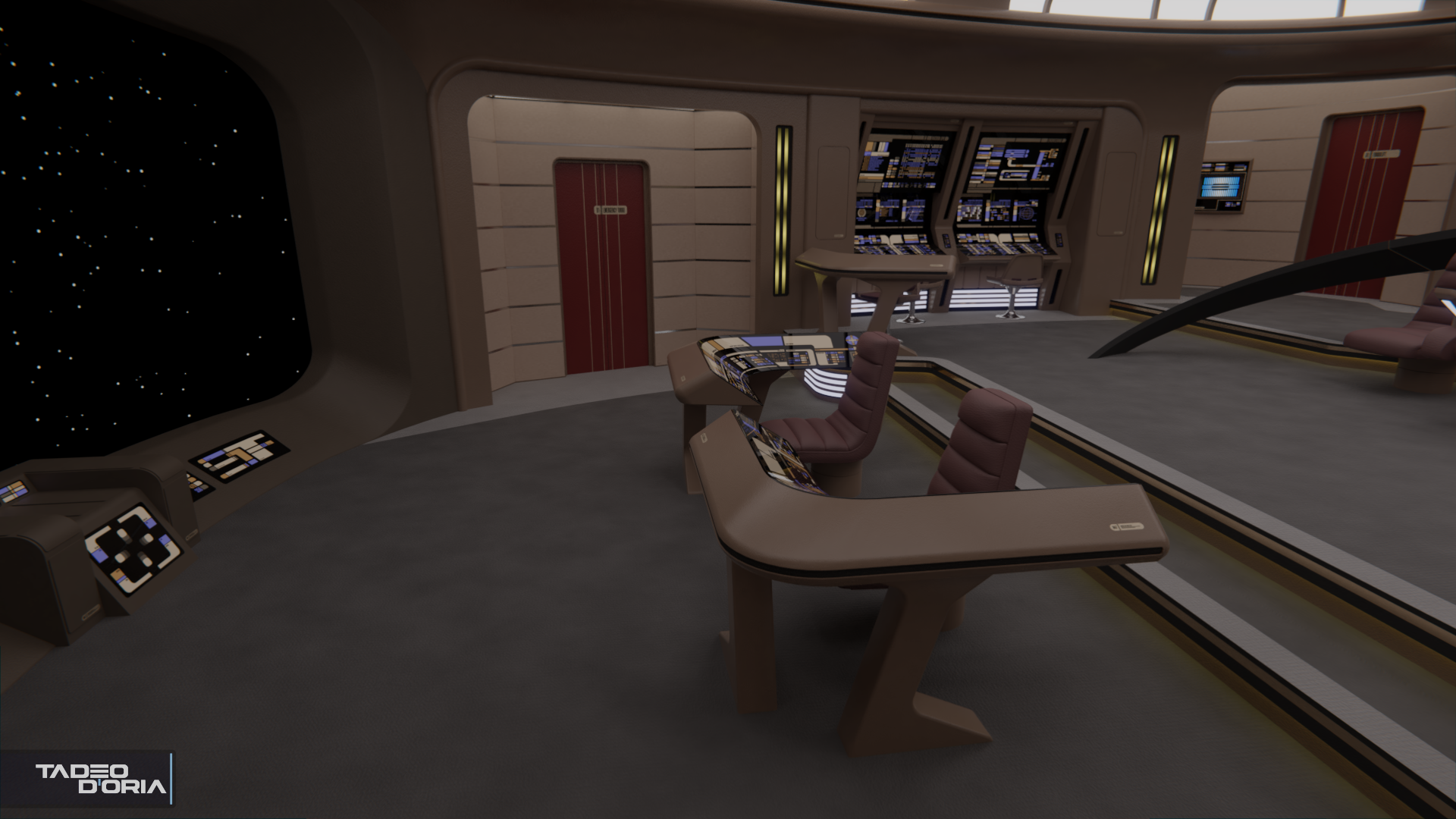
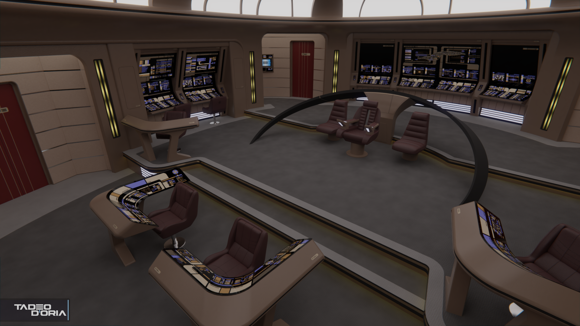
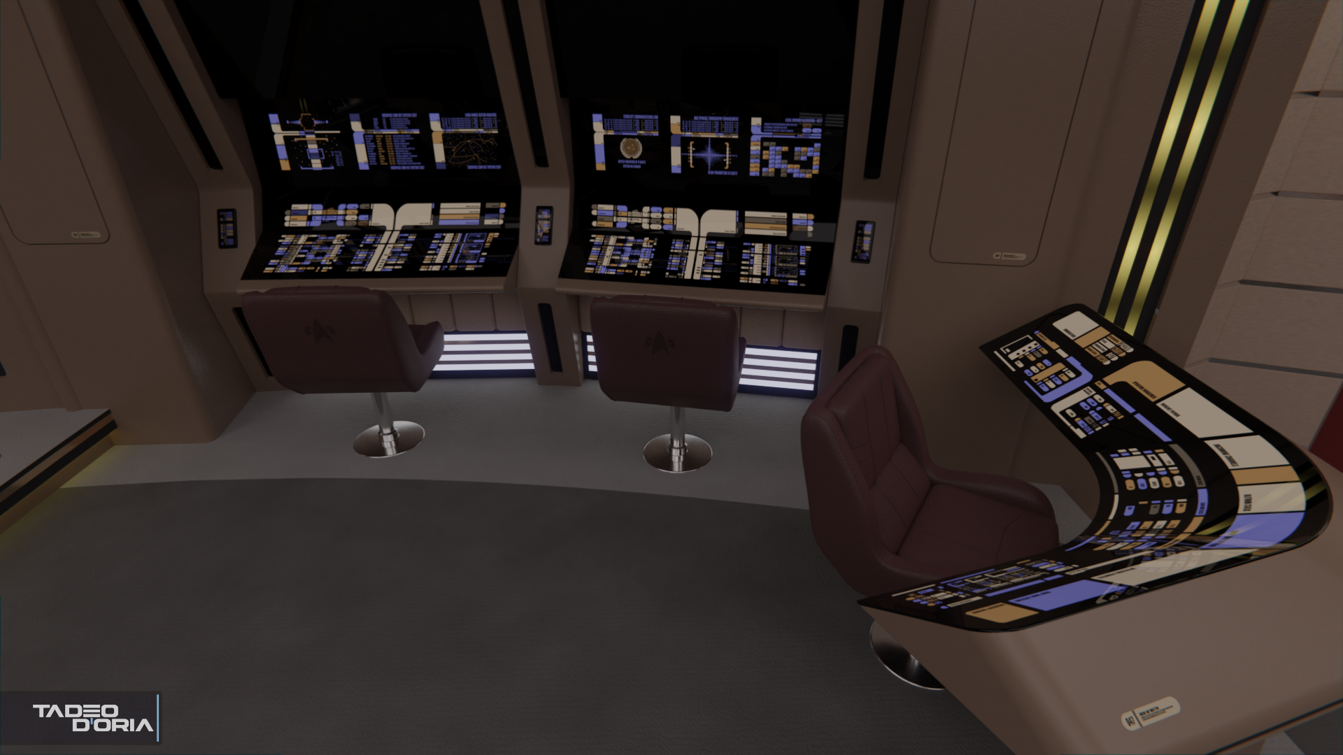
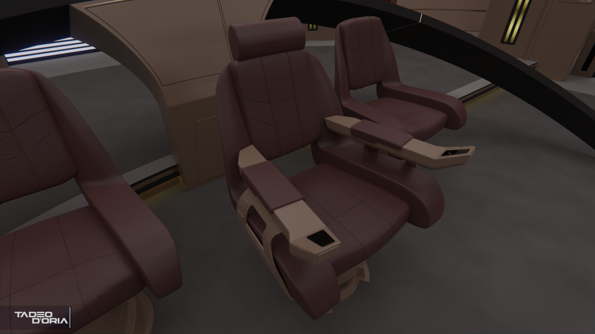
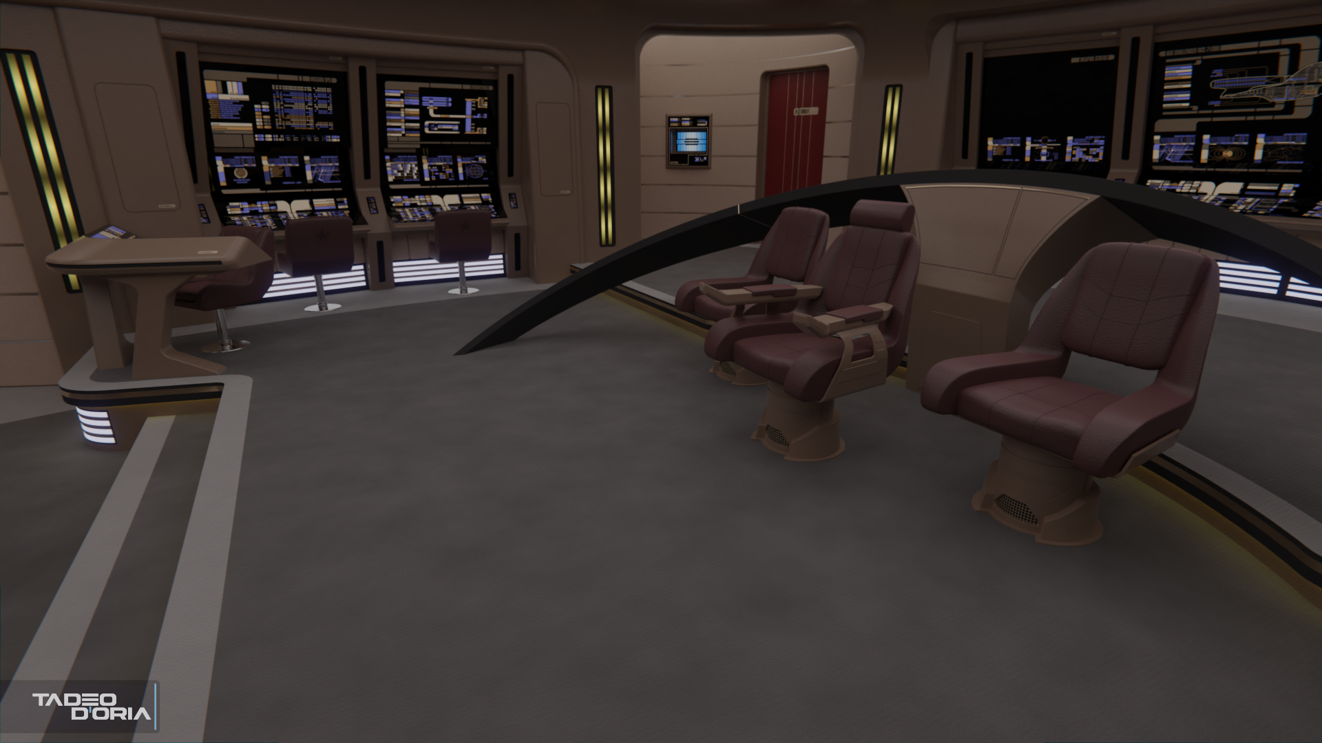
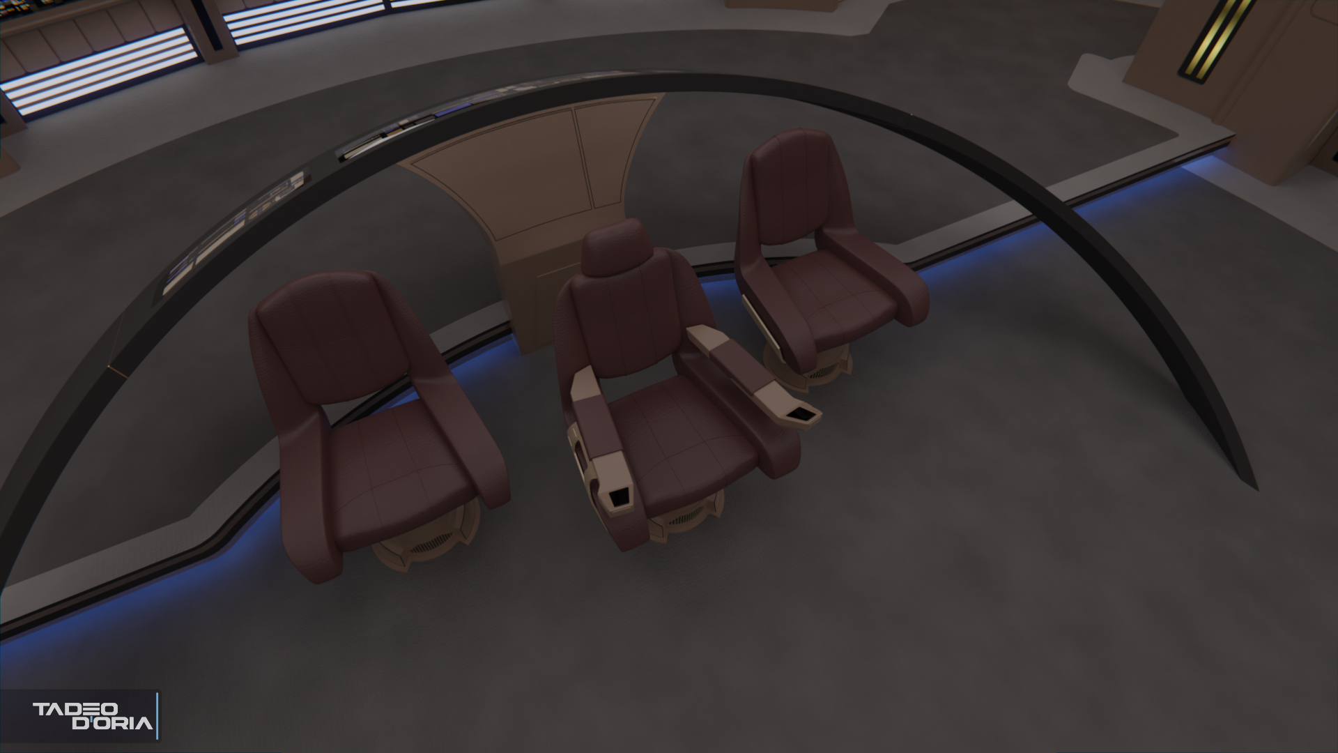
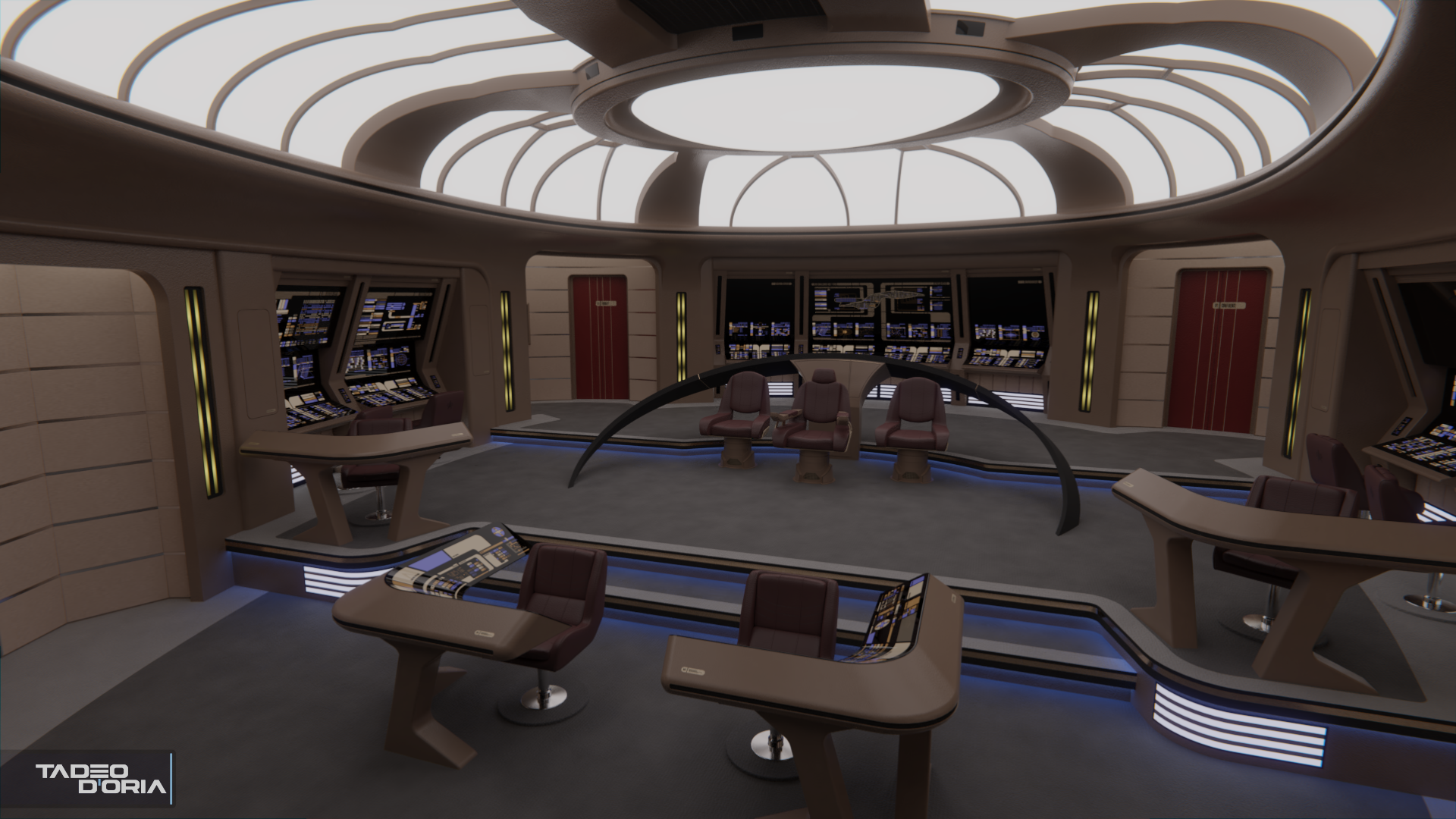
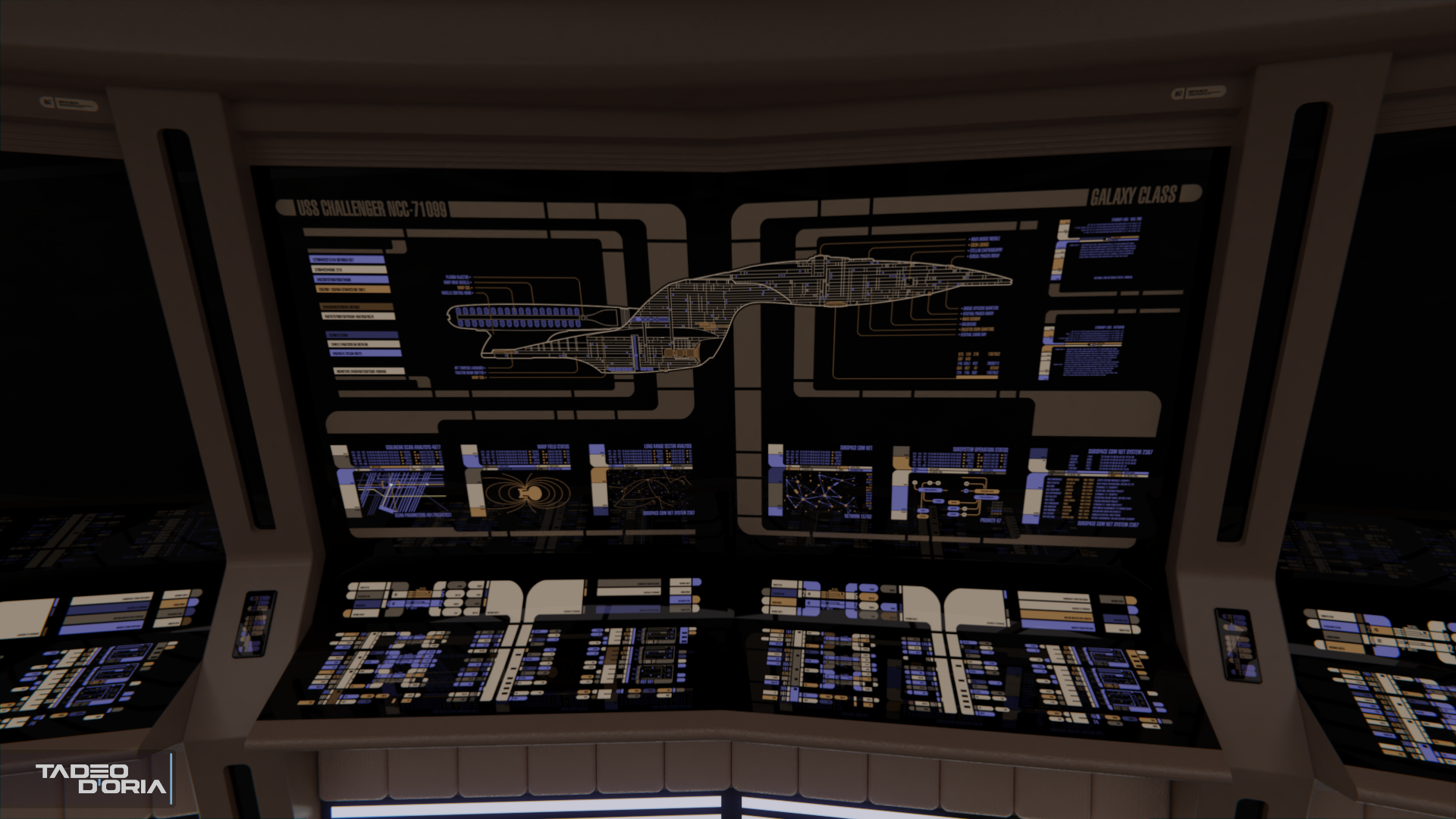
Finished the MSD area and changed up the colors somewhat.

c1_13_by_rekkert-dcpdwri.png
 
@Matthew Raymond: Hahaha, I wish! Both that the project was real and that I was involved in it. :p

I've been further adjusting the UVs so not much in the way of visible progress, but more LCARS were added, along with a new dome light similar to that on the Ent-E to add some more light to the bridge, and the dedication plaque was added near the Ready Room door.

c1_14_by_rekkert-dcpjgww.png

c1_15_by_rekkert-dcpjgxj.png
 
@scifieric: I'm glad you do!

I've done some more work on the LCARS, finishing up the panels for one side of the bridge.

c1_16_by_rekkert-dcpmyxj.png

Tangentially to the Challenger commission, I've been talking for a couple of days with my client about fleshing out the Parallels combadge style, and he commissioned me to create this showcase of all the ranks, as a little side project:
alternate_24th_century_starfleet_rank_insignias_by_rekkert-dcpkhdj.png
 
Last edited:
I really like your rank devices chart. Very well thought out. One recommendation: Your rank of "crewman" would be analogous to the Navy's "seaman" grade, of which there are 3 levels, "recruit", "apprentice" and full seaman, at the lowest enlisted levels (remember Crewman Dax in TUC?). It should be beneath your Petty Officers, which would be considered junior and senior NCO's. Other than that one thing, well done! :techman:
 
Yeah, had a hard time with the crewman insignia in particular because that one was seen in canon, but doesn't adhere to the logic behind the rest of the insignias. I've relocated it on the chart to better showcase where it should be.
 
@Matthew Raymond: Hahaha, I wish! Both that the project was real and that I was involved in it. :p

I've been further adjusting the UVs so not much in the way of visible progress, but more LCARS were added, along with a new dome light similar to that on the Ent-E to add some more light to the bridge, and the dedication plaque was added near the Ready Room door.

c1_14_by_rekkert-dcpjgww.png

c1_15_by_rekkert-dcpjgxj.png
I've gotta say, I absolutely love this bridge. It would have looked great onscreen in a TNG episode.
 
@Overlord: Thank you! It's a bit over budget for regular 90s TV Trek, but I would've loved to see something like this as well!

@JedGhost67: Thanks very much! :)

I've finished the replicator for the bridge, so the crew can get their coffee now, no need for a Starbucks on board. Should I add cup holders to the consoles?
toung.gif


I've also added in those little golden stripes on the doors that the Ent-E bridge had in Insurrection.

c1_17_by_rekkert-dcppdgc.png
 
One of my first criticisms of your bridges was about your chairs and how--un-cushion-like they were.

You've YUGELY improved those. They actually look comfortable now. ;)

I'm loving this bridge, possibly more than any other you've done (again, with those consoles I like so much).
 
Fantastic!
I always pictured the Galaxy class Excalibur, from the New Frontier books, as having darker tones than the Enterprise, and with more going on at the sides, and this is absolutely perfect!
 
@TOMFAN: Thank you very much! Yeah, I was kinda disappointed when the NF comics showed the Excalibur bridge as just the TNG bridge with a few colors swapped, I would've liked something more original (like what they showed for the original Excalibur in Double Time).

Here are the new command chairs, they're a mix of the TNG Captain's chair, the chairs I did yesterday, and that post-Nemesis Ent-E chair that then got reused on Enterprise's final season.

c1_22_by_rekkert-dcpyoql.png

c1_23_by_rekkert-dcpyor6.png
 
The colors are nice, but if I may.
The base leather texture seems too big, and the pinching in the corners are missing making it seem flake-y and plastic. Also I would inflate the leather sections a bit, very subtly though, they are meant to have cushion.
 
@Cjohnson1701: Thanks for the feedback! I'm not 100% sold on the leather material myself, I keep tweaking it bit by bit. One of the many reasons why I dislike making chairs. :lol:
Regarding the pinching, it is there, though maybe it's a bit too subtle. And the bits taken from the Enterprise-D are smooth as they were there.
On 'inflating' the cushions, I actually deflated them bit when compared to the smaller console seats, as the command seats on the Ent-E nearly don't have any sort of cushion at all.

nemesishd0211_by_rekkert-dcq3p81.jpg

nemesishd0280_by_rekkert-dcq3p8c.jpg

I've further tweaked the chairs, changing up the materials a bit and adding some more details on the supports, plus modifying the backrests and the Captain's headrest. Also, the lighting on the steps is now a deep blue, on the same style as on the Ent-E.

c1_23_by_rekkert-dcq3mh4.png

c1_22_by_rekkert-dcq3mgr.png
 
Last edited:
While blue is my favorite color and I love blue lights, it's my personal preference that they looked better white.

Not only that but in darker situations, blue is the most difficult light for human minds to interpret. Try reading a backlit blue sign at night...it can be tough.

I'm sure a lot more of you have a lot more experience riding in Mercedes vehicles, but I had to move a girlfriend's mother's Mercedes a long time ago and found those uncushiony seats to be some of the most uncomfortable seats I've ever sat in. That's kind of how I view the E-E's seats.

None of that is meant to take away from your great modeling and your eye for adapting designs.
 
If you are not already a member then please register an account and join in the discussion!

Sign up / Register


Back
Top