Can I make an argument for keeping the lighted columns? I like the updated touches you're putting in, but a few elements of the old design would also be nice.
-
Welcome! The TrekBBS is the number one place to chat about Star Trek with like-minded fans.
If you are not already a member then please register an account and join in the discussion!
You are using an out of date browser. It may not display this or other websites correctly.
You should upgrade or use an alternative browser.
You should upgrade or use an alternative browser.
3D interiors in Blender
- Thread starter Rekkert
- Start date
@Gibraltar: Thanks!
@The Librarian: Thank you!
@cardinal biggles: Honestly I quite like how they look myself. I'll pass your message along.
I've been working on the surgical area some more, adding the Voyager-style wall... design... things... I know it's a bit too orange at this point, but I'll be adding more lights there.
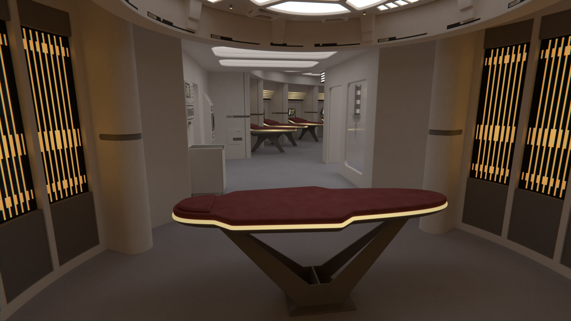
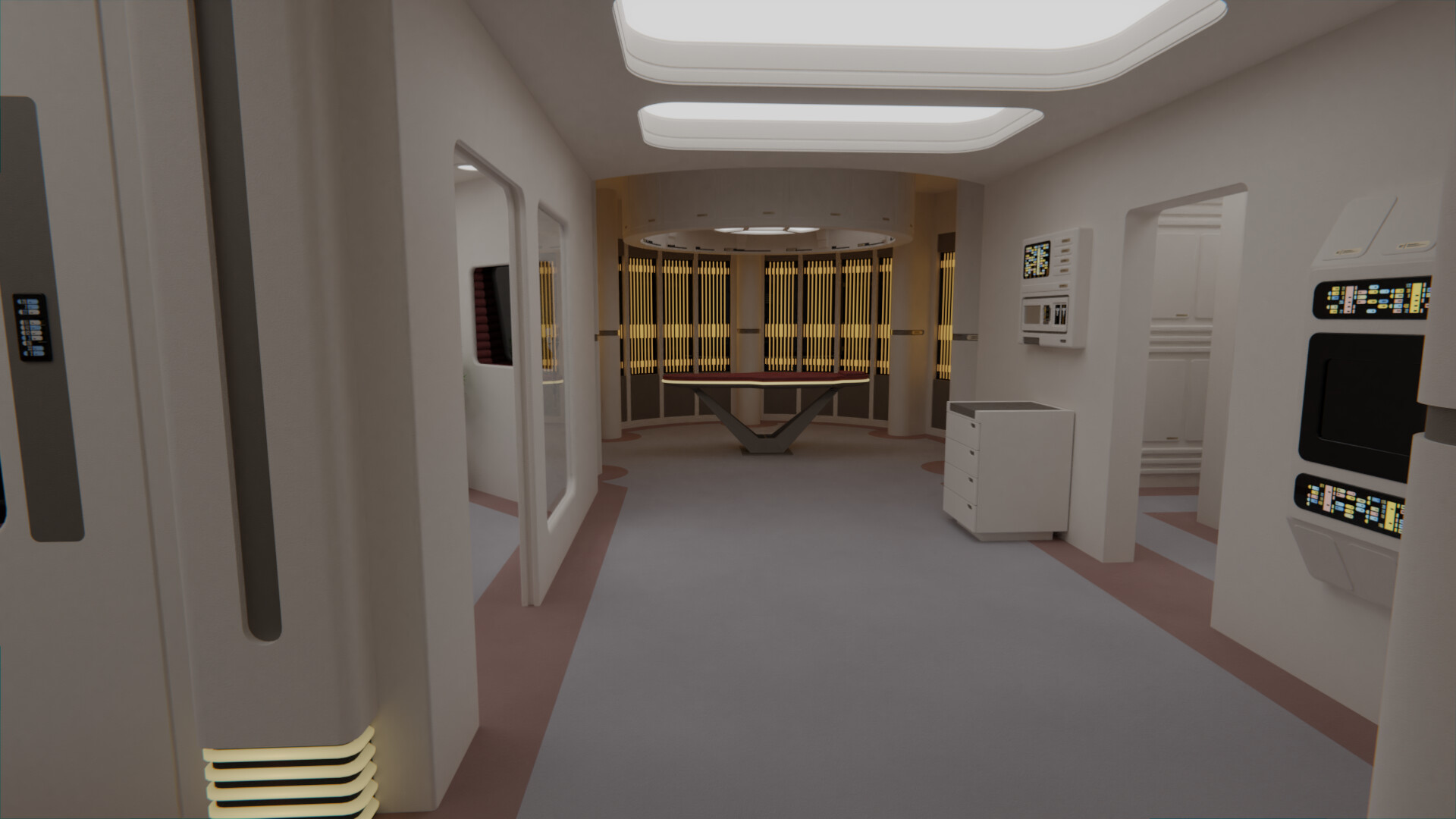
Also, the small corridor between said surgical area and the main ward is now 1/3 of a meter wider. Given it's connection to the rest of the medical deck and the CMO office, it should receive quite a bit of foot traffic; not to mention that one of these consoles has to fit in there.
@The Librarian: Thank you!
@cardinal biggles: Honestly I quite like how they look myself. I'll pass your message along.
I've been working on the surgical area some more, adding the Voyager-style wall... design... things... I know it's a bit too orange at this point, but I'll be adding more lights there.
Also, the small corridor between said surgical area and the main ward is now 1/3 of a meter wider. Given it's connection to the rest of the medical deck and the CMO office, it should receive quite a bit of foot traffic; not to mention that one of these consoles has to fit in there.
It's a very interesting design. It reminds me of how on the original voyager sickbay blueprints there was a corridor of sorts between the surgical area and another similar in shape area on the opposite side which later the idea was scrapped and they put consoles and the doors leading to the morgue.
Out of curiosity, in hopes of me trying to avoid the same thing you fixed in your modeling technique, what was causing the extra poly;s?
Out of curiosity, in hopes of me trying to avoid the same thing you fixed in your modeling technique, what was causing the extra poly;s?
Always good work, a treat to see.
Every time I look forward to your next work.
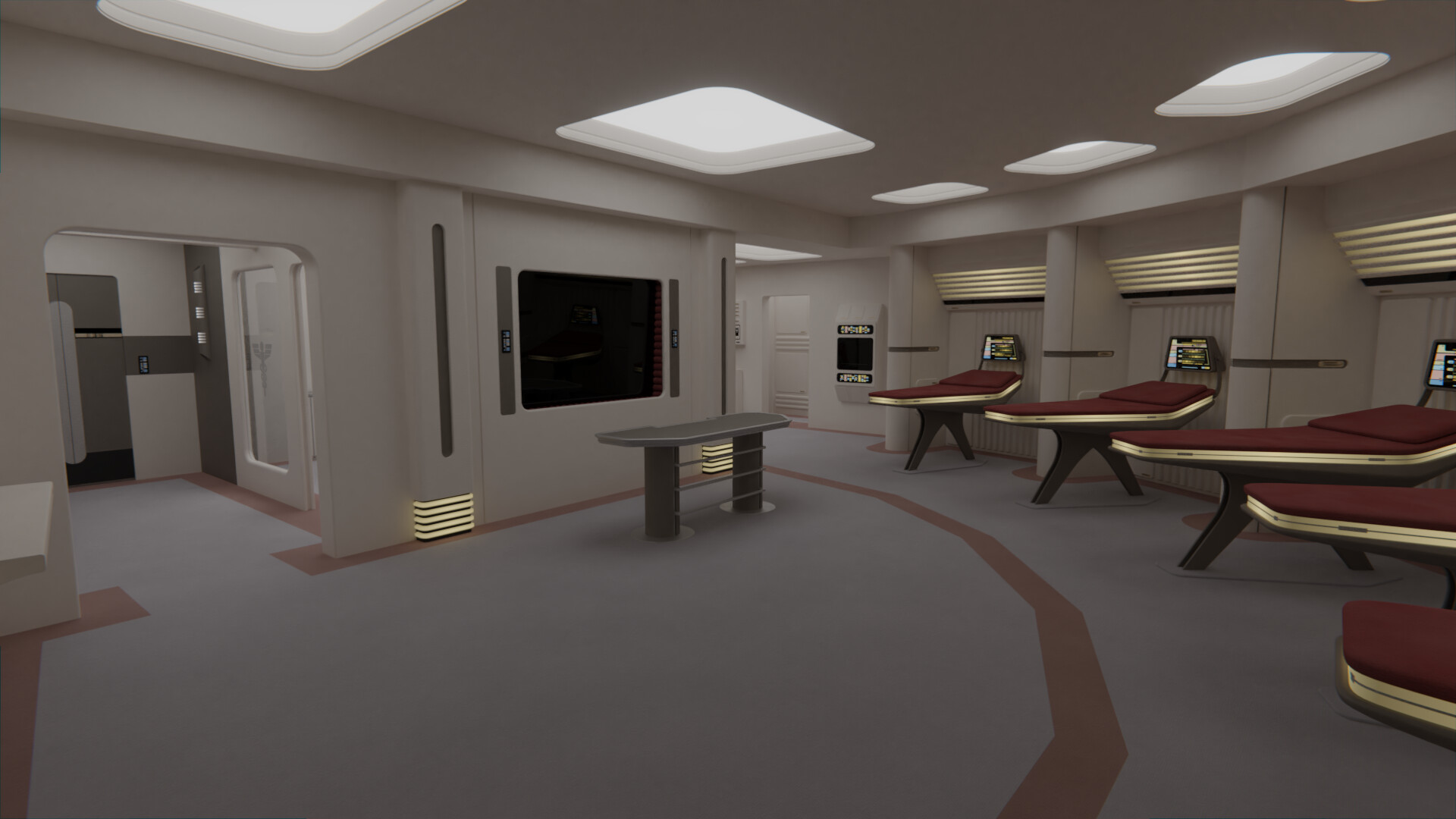
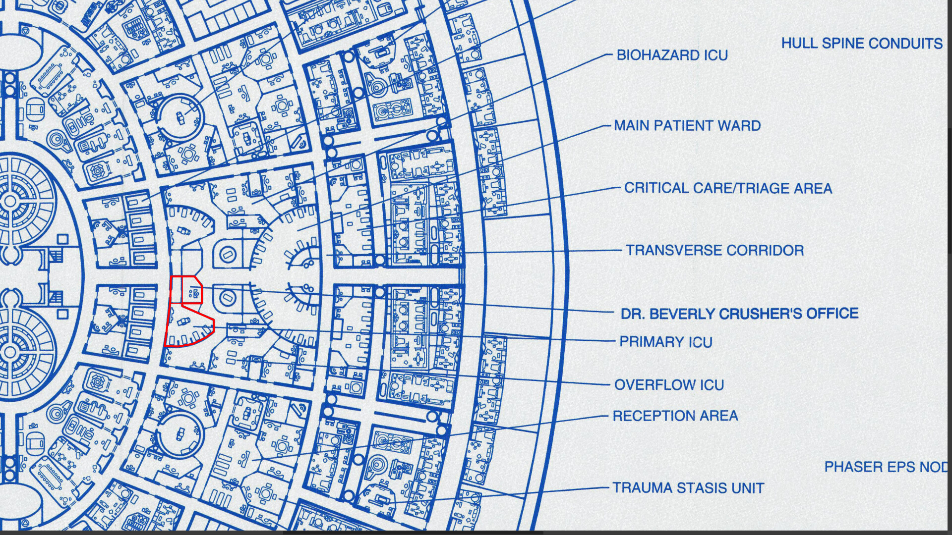
I really love the layout, especially having the surgical/exam bay seperate from the ICU ward. That provides patient privacy.
It also creates a separate, sterile area for the surgery to take place. I know, forcefields, redundant systems, yadda yadda yadda. Stuff breaks, systems fail, and small plastic rocks explode out of bulkheads.I really love the layout, especially having the surgical/exam bay seperate from the ICU ward. That provides patient privacy.
")
small plastic rocks explode out of bulkheads
I think we're supposed to assume the bulkhead has shattered, resulting in small pieces flying everywhere. Just stating the obvious.
I'm liking it!
Ever think of a room thats off to the side, or alcove to put that consoule? instead of in the middle of the Hallway that your thinking?
Also, Maybe a nurses station on the side of the Surgical Alcove? Just a table, maybe a small replicator?
Ever think of a room thats off to the side, or alcove to put that consoule? instead of in the middle of the Hallway that your thinking?
Also, Maybe a nurses station on the side of the Surgical Alcove? Just a table, maybe a small replicator?
Private? Like Yes Mr. Riker you have the Andorian Clap, and the Beatleguisean Rash... and I don't know how you could have gotten the Tholian Leak... 
I'm happy you're all liking this one! I love the layout we're using, it was an amazing idea by my client to extend the TNG sickbay in this manner.
@batboy853: The extra polys was due to me overdoing every single aspect of modeling back then. A small bevel was needed? Better add in 12 segments, just to be sure it looks good!
There was also the lack of an easy way to do face-weighted normals in Blender, something that was added and made super easy for 2.8. That meant that 45º chamfers would look awful, while now I mostly do just those, and it looks as good as a 4 segments chamfer used to look before, while obviously having far less polys.
Of course for bevels that are noticeable I do add a couple more segments, just to make sure it looks good if I zoom in, but still it's a lot lower number than I did before.

Another thing I do now which I didn't used to do back then is to use multiple instances of the same object. Before each biobed was its own model, now they're all instances of the same model, making the file size (and the render time) a lot lower. Same with the chairs, and any other repeated model.
@valkyrie013: The corridor is as wide as it is precisely to house that console, otherwise there's a lot of wasted space in there. And there is a replicator there, it's the wall mounted rectangular console with the LCARS above and below the tray area.")
@TOMFAN: Agree! My head canon is that there is a holographic glass door in there, which can be activated and made opaque, as well as the windows. We know sickbay is full of holo-emitters after all.
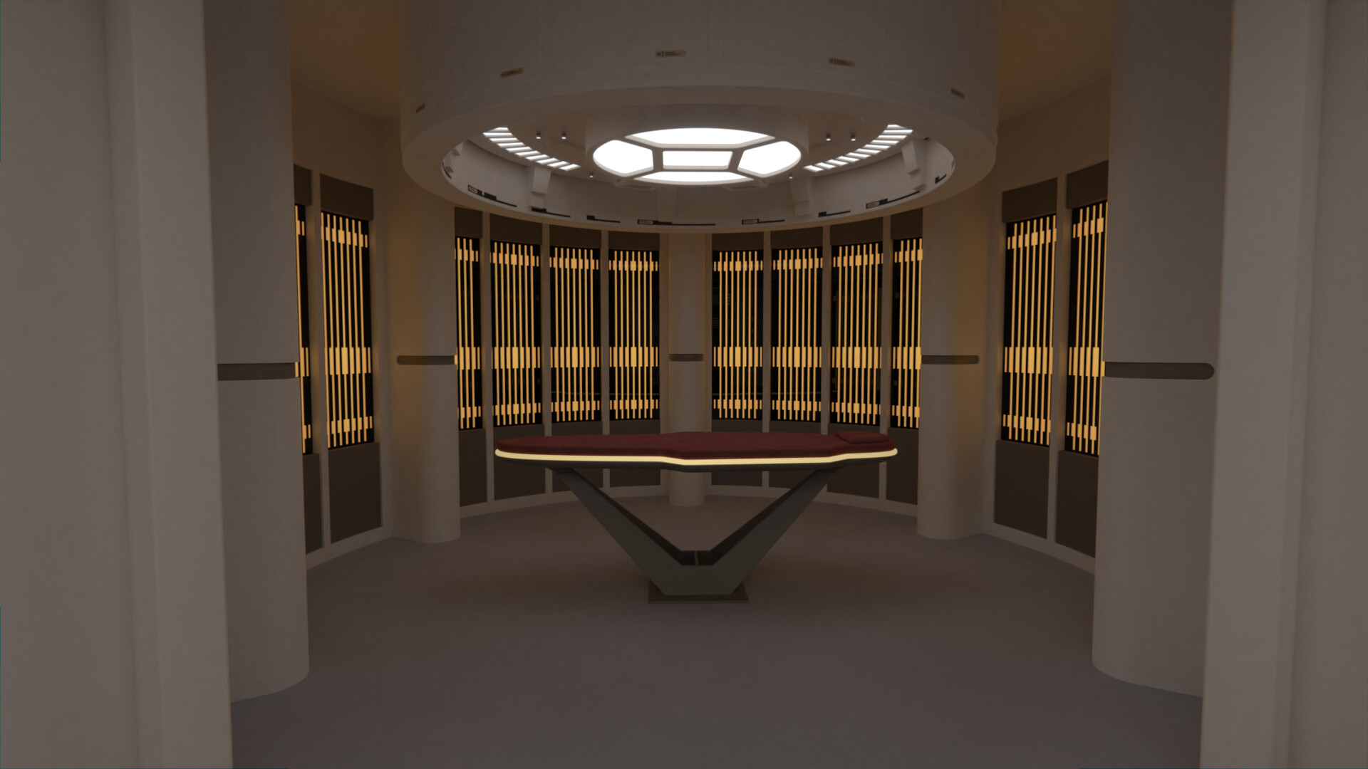
I've finished the walls behind the biobeds. These are based on the similar patterns from the sickbay of Nemesis. The new Voyager-style columns are in place as well, as are the details on the exit corridor walls.
There's also a two-tone carpet now, with a Defiant-style line crossing in front of the biobeds (following the exact same pattern as the back wall), to add some sort of cut to the otherwise large open area that is the main ward.
@batboy853: The extra polys was due to me overdoing every single aspect of modeling back then. A small bevel was needed? Better add in 12 segments, just to be sure it looks good!
There was also the lack of an easy way to do face-weighted normals in Blender, something that was added and made super easy for 2.8. That meant that 45º chamfers would look awful, while now I mostly do just those, and it looks as good as a 4 segments chamfer used to look before, while obviously having far less polys.
Of course for bevels that are noticeable I do add a couple more segments, just to make sure it looks good if I zoom in, but still it's a lot lower number than I did before.
Another thing I do now which I didn't used to do back then is to use multiple instances of the same object. Before each biobed was its own model, now they're all instances of the same model, making the file size (and the render time) a lot lower. Same with the chairs, and any other repeated model.
@valkyrie013: The corridor is as wide as it is precisely to house that console, otherwise there's a lot of wasted space in there. And there is a replicator there, it's the wall mounted rectangular console with the LCARS above and below the tray area.
@TOMFAN: Agree! My head canon is that there is a holographic glass door in there, which can be activated and made opaque, as well as the windows. We know sickbay is full of holo-emitters after all.
I've finished the walls behind the biobeds. These are based on the similar patterns from the sickbay of Nemesis. The new Voyager-style columns are in place as well, as are the details on the exit corridor walls.
There's also a two-tone carpet now, with a Defiant-style line crossing in front of the biobeds (following the exact same pattern as the back wall), to add some sort of cut to the otherwise large open area that is the main ward.
Bathroom,with the 3 seashells! maybe storage for medicines, band aids, equipment probably!
Yeah, old job, done 3d interiors, alot of the time I used downloaded stuff like couches, plants etc. and they were NEVER poly optimized.. A couch was like 100,000 polys..
So when I could I remade the stuff, taking a 100,000 poly couch to maybe 5,000..
Instancing works quite well for plants and stuff. Done some exteriors, and even an aboritum for one of my ships.. and Instancing saved my life.. like 50 million polys if I didnt!
Turning out great!
I think Rekkert said upthread that it would connect this suite of sickbay facilities to another one.Bottom pic, alcove opening to the right: bathroom?
 Thanks!
@Henoch: Like @cardinal biggles said, it's an open corridor that leads to the rest of the medical deck, similar to those on the Prometheus sickbay. According to the Enterprise-D blueprints, the door at the back of sickbay on that ship served the same purpose, the only difference is that here it is open.
I've spent most of the day working on the HÅG Capisco chair for the nurse station. This was one of the few prominent chairs from Trek interiors I had yet to do, and while it's not exactly easy to spot here behind the massive desk, it'll also be used on the bridge of the Venture whenever that gets done.
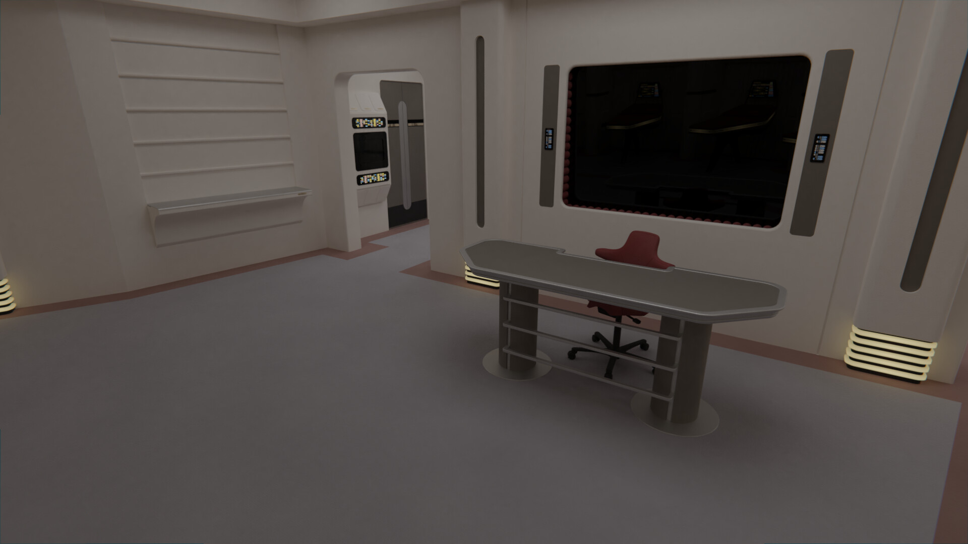
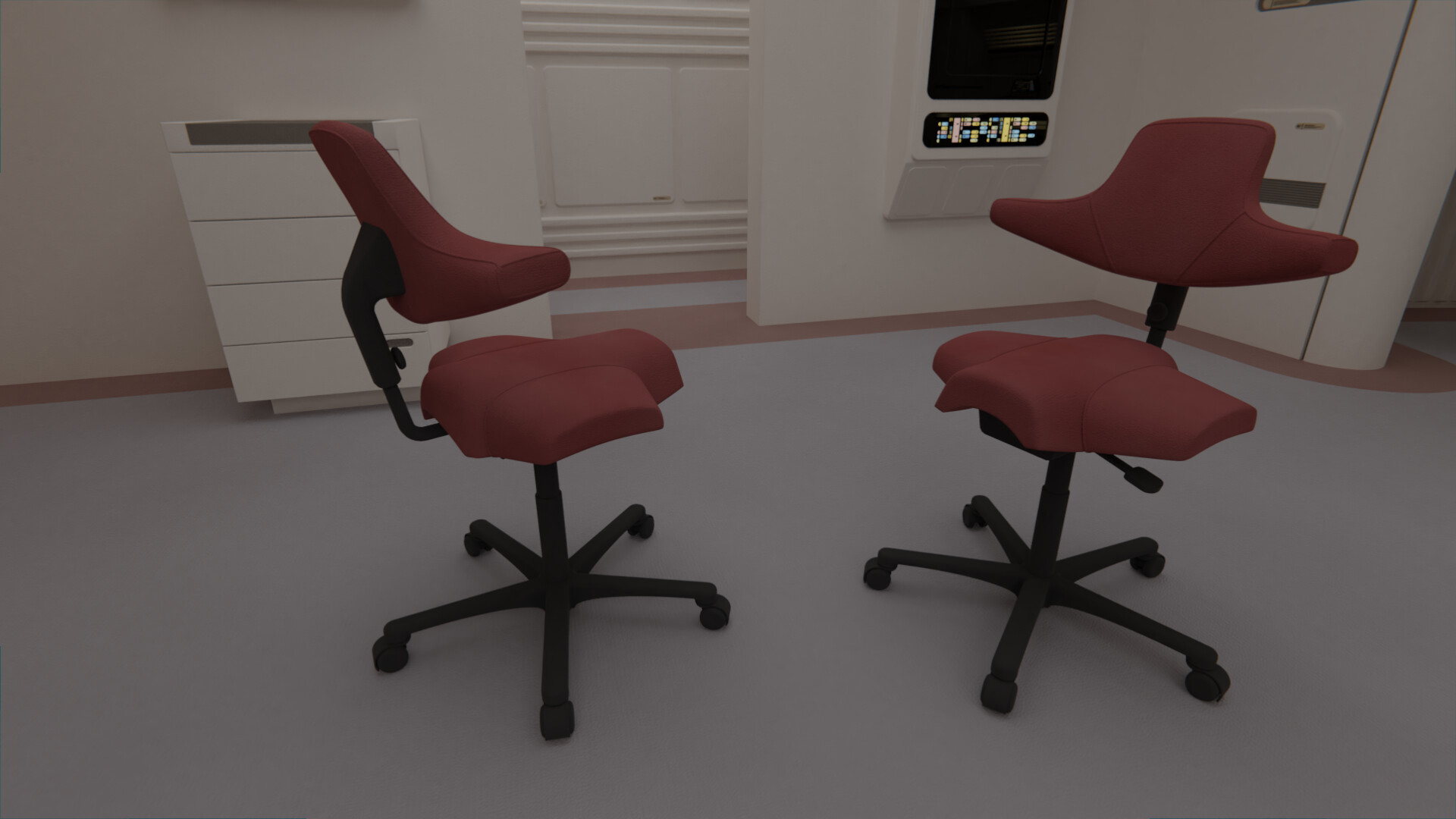
I've spent most of the day working on the HÅG Capisco chair for the nurse station. This was one of the few prominent chairs from Trek interiors I had yet to do, and while it's not exactly easy to spot here behind the massive desk, it'll also be used on the bridge of the Venture whenever that gets done.
Similar threads
- Replies
- 482
- Views
- 60K
- Replies
- 7
- Views
- 691
If you are not already a member then please register an account and join in the discussion!