@ashefivekay: Haha, yeah. I guess it's a consequence of replacing Probert, who loved curves, with Sternbach, who loved straight lines. It certainly creates a clear contrast with the sets created for season 1 vs those created for late TNG.
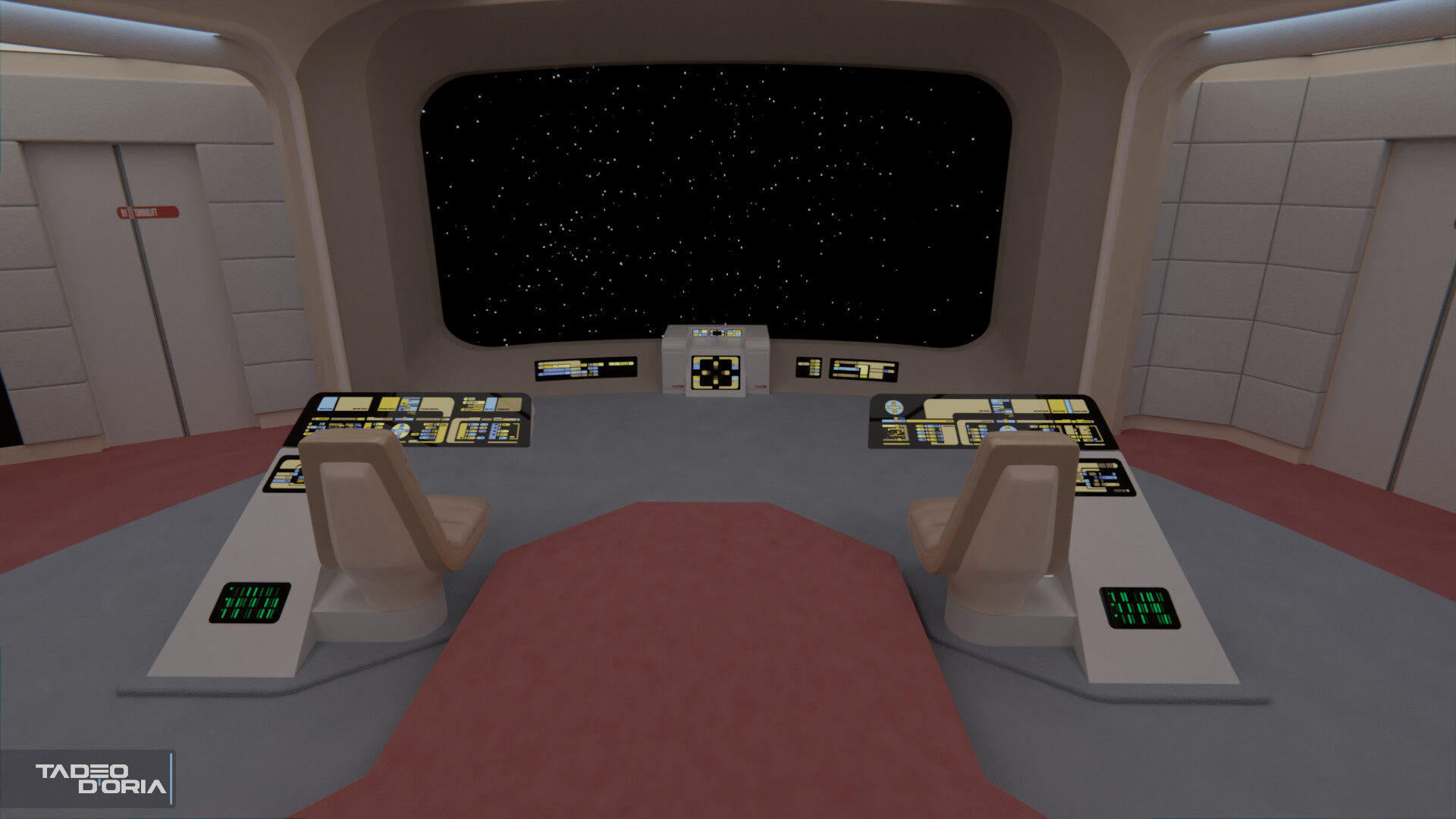
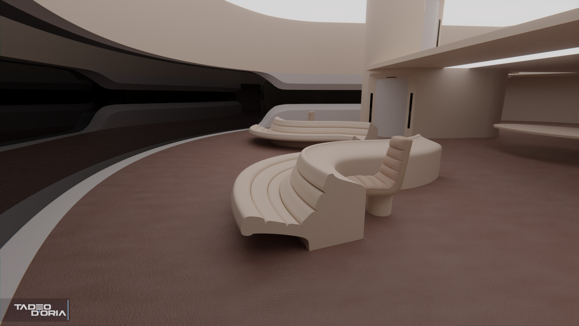
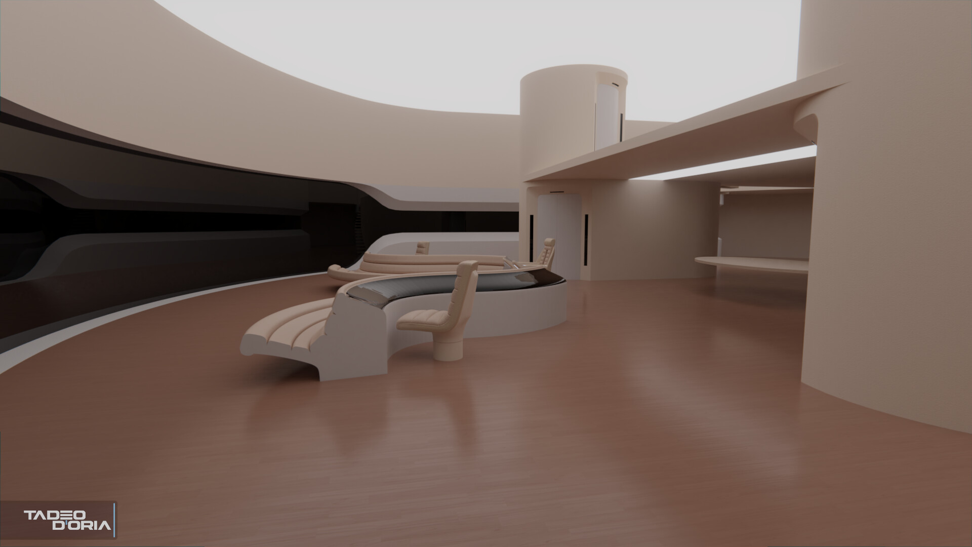
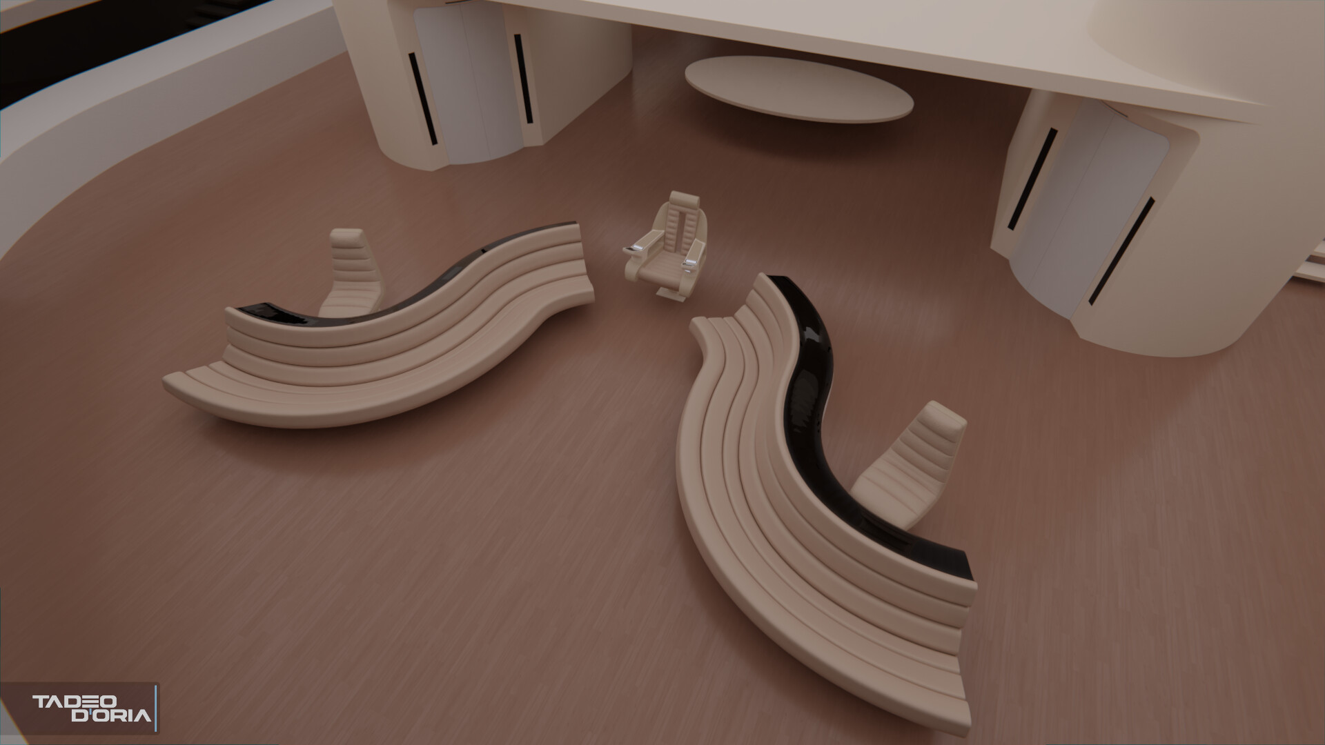
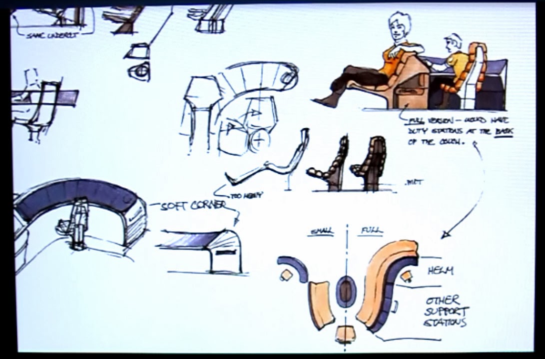
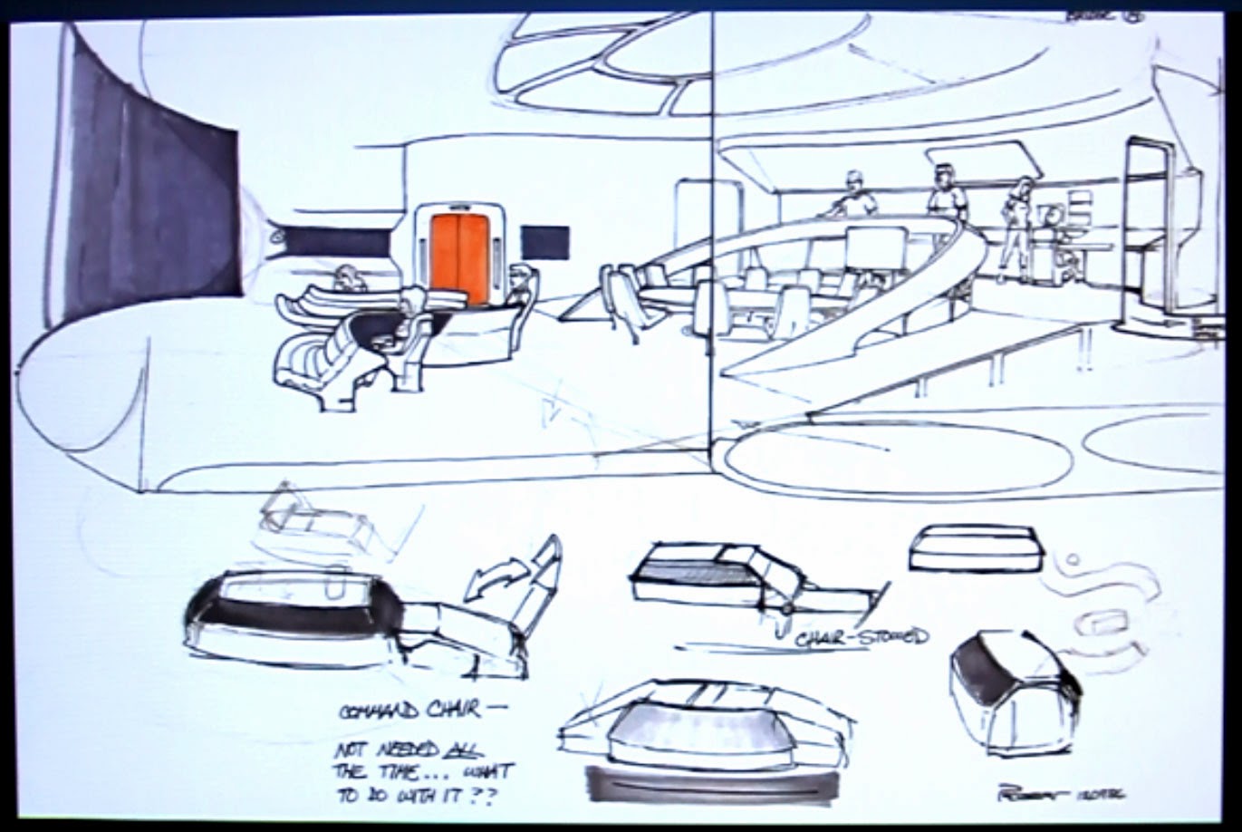
@valkyrie013: Interesting thought! It would certainly make sense if it's all one console, but as seen on the concepts above, only the front section of the conn/ops, the back has two separate consoles with their own extendable chair.
")
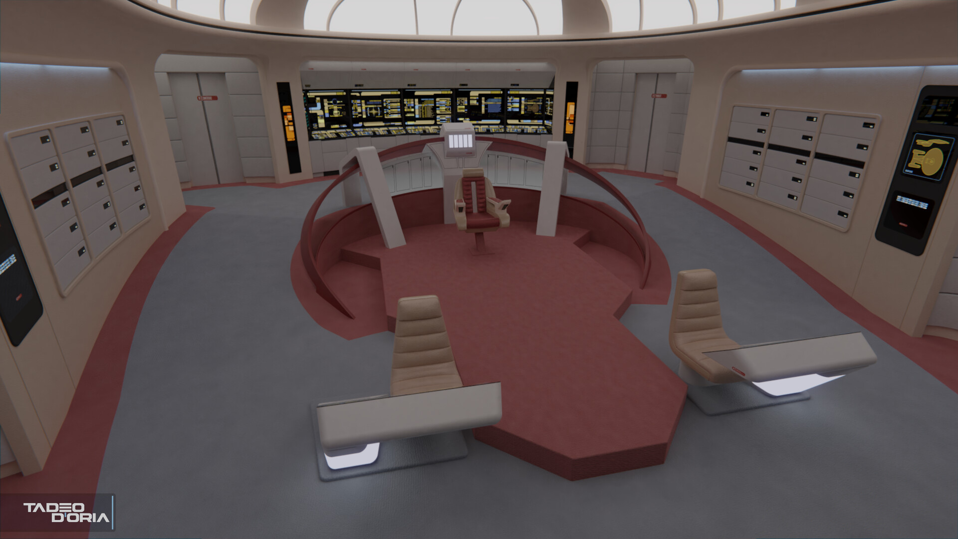
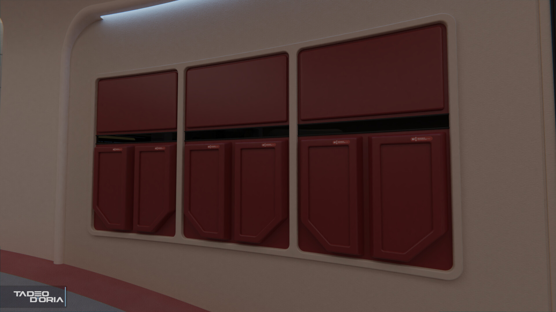
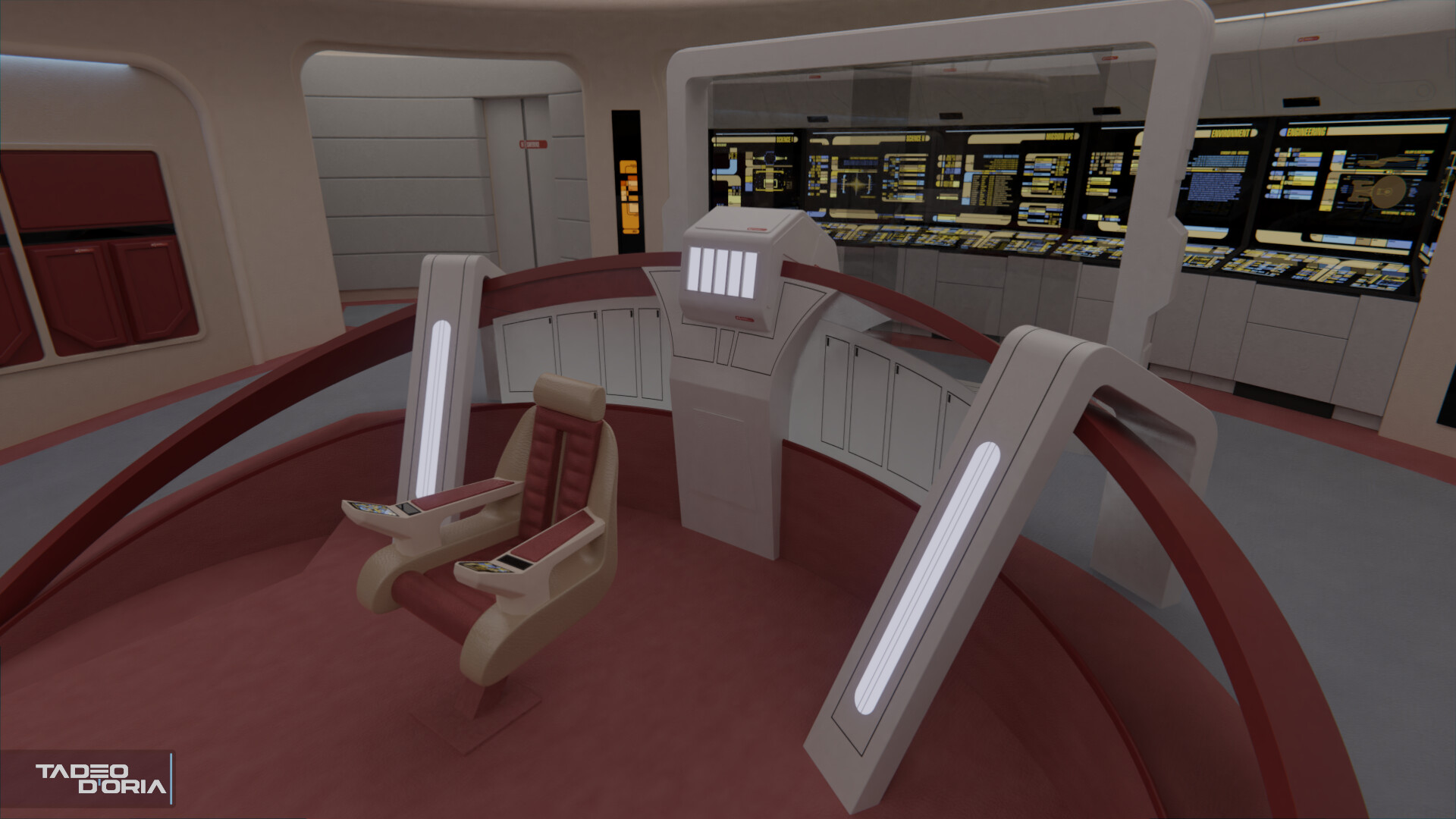
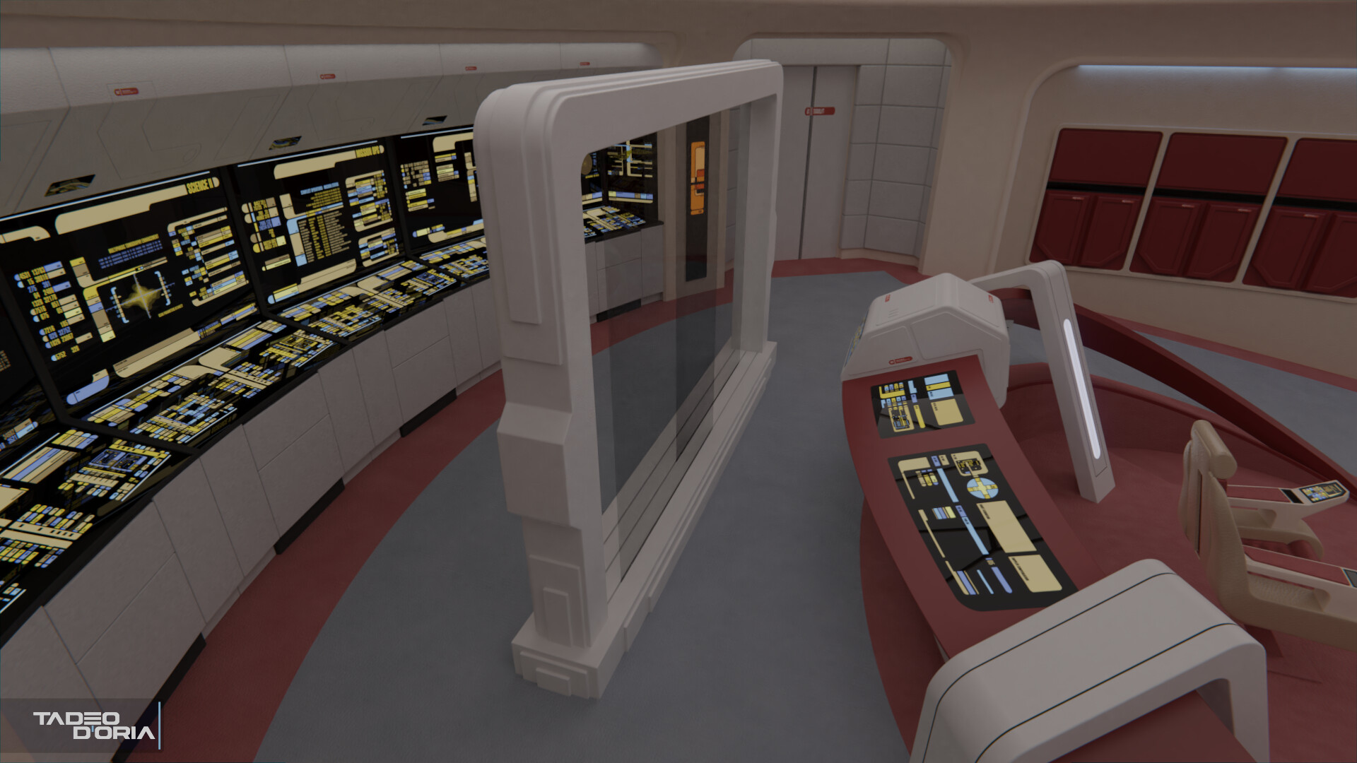
I've modeled the new circuitry access panels, which while similar to the 'Future Imperfect' have the bottom details inverted, with the 45° angled elements swapped to the outside of each panel. I've also finished the command area and tweaked the material for the frosted glass panels.
The changes to the whole command area are very weird, but it makes sense I guess as they wanted to make it blatantly obvious that it was a different Enterprise. The captain's chair moved a good half a meter forward (and with the stand mounted backwards) is very... unique.
Finally, I've started work on the MSD thing. Most of the details and more importantly its size were easy to find out given the other uses of this panel. Specifically the ones on 'The Quality of Life'; and as the Ent-A engineering on 'Star Trek VI'. This last one shows the panel being nearly as tall as the engineering set, so knowing how tall that is, makes it easy to scale the prop to its real size.
The prop itself has three rails for the glass panels to fit in, but the three were only used concurrently on the original appearence of the prop, 'Booby Trap'. The two forward rails had movable graphics, while the one on the back had a static darkned glass. As far as I can see, this wasn't used afterwards, so only two panels are percent on Parallels. Their shape is really cool and intricate though, so it'll be fun to do.
Anyway, here are the renders of the new bits:


")