-
Welcome! The TrekBBS is the number one place to chat about Star Trek with like-minded fans.
If you are not already a member then please register an account and join in the discussion!
You are using an out of date browser. It may not display this or other websites correctly.
You should upgrade or use an alternative browser.
You should upgrade or use an alternative browser.
3D interiors in Blender
- Thread starter Rekkert
- Start date
Finished tweaking the website design, and added another page with all the ships one after the other in chronological order, so that if you want you can see them all together. Because of this, I decided to eventually convert all my personal projects into this format eventually, even those with only one interior (and you can see I already did this for the Lalo). My original fear was that having dedicated pages for ships with only one interior was a chore to navigate through for folks who just quickly wanted to check all there was; this new chronological page solves this: https://tadeodoria.com/pages/chrono-list
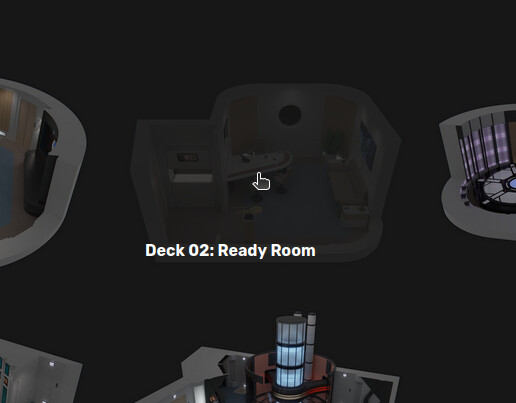
I also changed the naming convention I use for each interior page, given there's no need to repeat the ship name I now have the deck listed. For example, 'USS Potemkin Ready Room' became 'Deck 02: Ready Room' on the USS Potemkin album. This now means that hovering over an interior in the ship view displays more relevant info, as you can see:
There's still some stuff I'd like to change, but I'm up against the limit of what ArtStation's portfolio builder is able to do. I'd love to have the cutaways shown centered rather than starting from the left; for the text utilize more of the page rather than being confined to a small portion on the center; to be able to change the font, color and placement on that 'Deck 02: Ready Room' text; but this will do for now. Tomorrow it'll be back to 3D interiors instead of website design.
Last edited:
It also fits with the hidden compartment in the bridge floor that Spock accesses during the battle in Star Trek VI.Still not sold on the idea of the 'H' floor, but I did iterate on the idea with a small rectangular cutout on the floor right in front of the control alcove, where machinery would be hidden. This is my interpretation of a middle-step between the exposed elements from TMP and the totally flat floor of TNG. Thoughts?
Finished tweaking the website design, and added another page with all the ships one after the other in chronological order, so that if you want you can see them all together. Because of this, I decided to eventually convert all my personal projects into this format eventually, even those with only one interior (and you can see I already did this for the Lalo). My original fear was that having dedicated pages for ships with only one interior was a chore to navigate through for folks who just quickly wanted to check all there was; this new chronological page solves this: https://tadeodoria.com/pages/chrono-list
I also changed the naming convention I use for each interior page, given there's no need to repeat the ship name I now have the deck listed. For example, 'USS Potemkin Ready Room' became 'Deck 02: Ready Room' on the USS Potemkin album. This now means that hovering over an interior in the ship view displays more relevant info, as you can see:
There's still some stuff I'd like to change, but I'm up against the limit of what ArtStation's portfolio builder is able to do. I'd love to have the cutaways shown centered rather than starting from the left; for the text utilize more of the page rather than being confined to a small portion on the center; to be able to change the font, color and placement on that 'Deck 02: Ready Room' text; but this will do for now. Tomorrow it'll be back to 3D interiors instead of website design.
I like the new layout! FYI though the title of the linked page is misspelled. "Full Chrolonolgical List" --> Chronological
@cardinal biggles: Yep, that's where I got the idea from, I'll likely also detail it further as those bridge compartments.
@The Librarian: Dang it, thanks for the correction! There's likely a lot more misspells in there.
Kept working on the website on and off this week, learnt a bit of CSS to get some stuff more like I wanted to, and now and all the interiors of the listed ships have in-universe (if a little brief and formulaic) descriptions. Part of me wishes to give it a proper in-universe name kinda like the Starfleet Museum or ASDB sites have, but I can't come up with anything so at least for now it still has my name even if that's a bit awkward IMO.
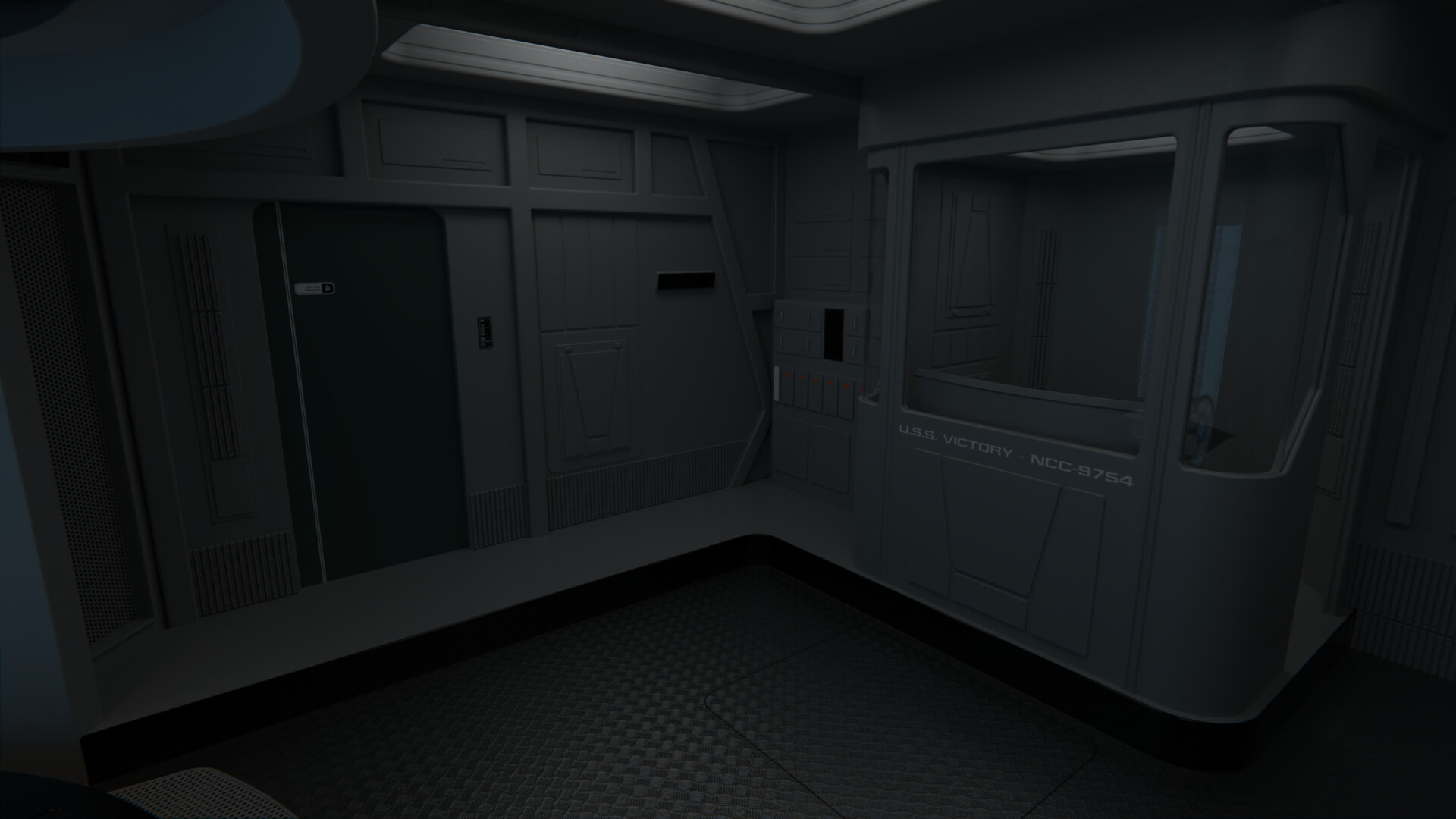
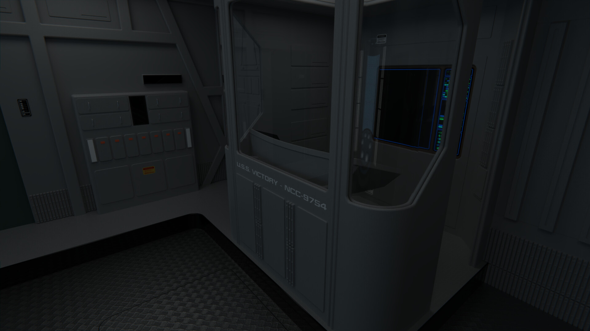
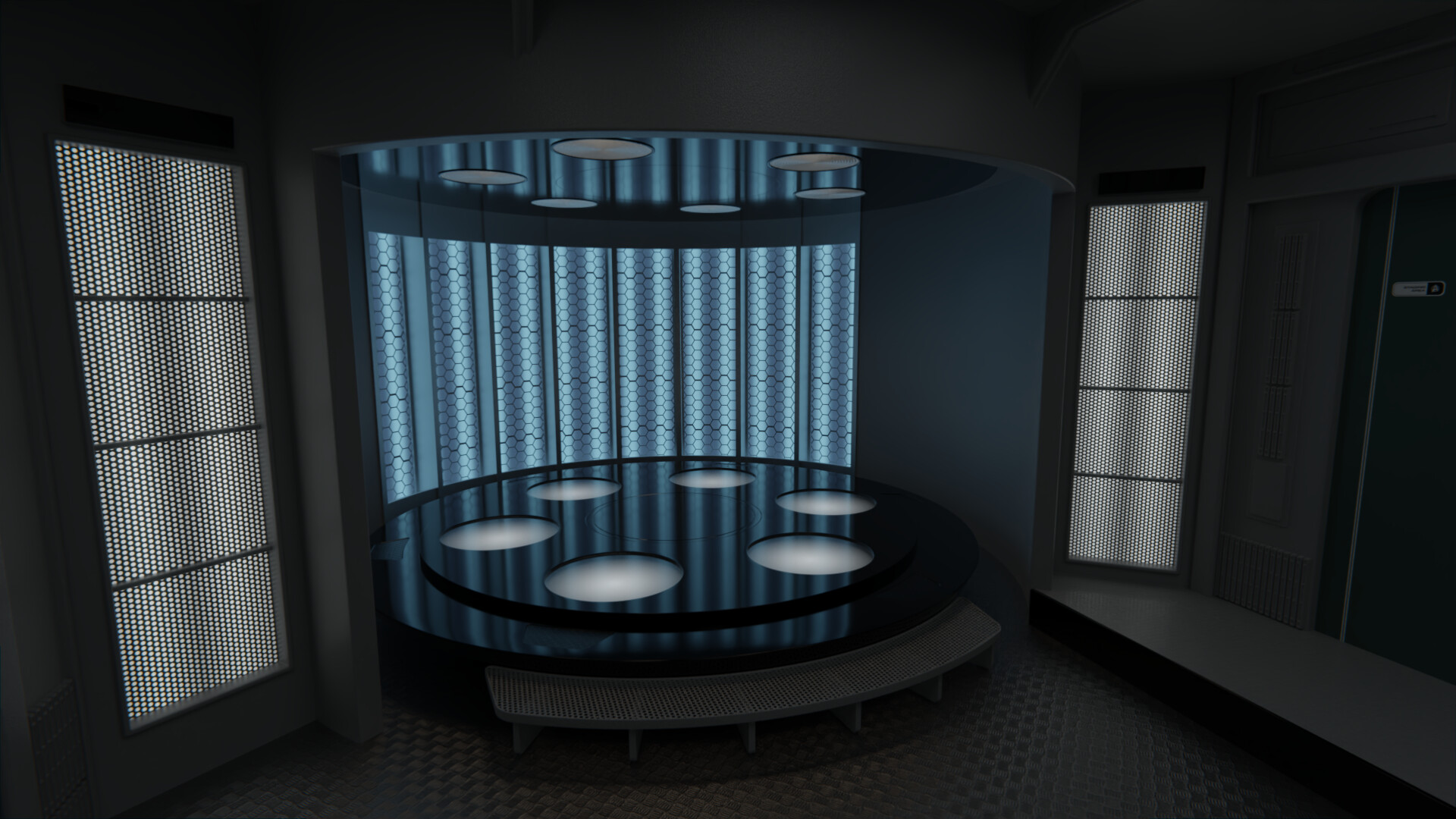
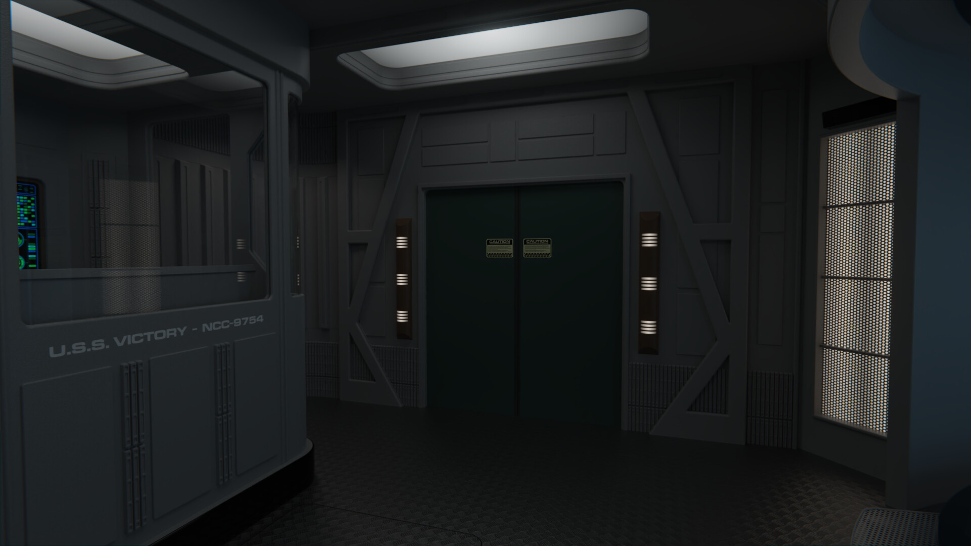
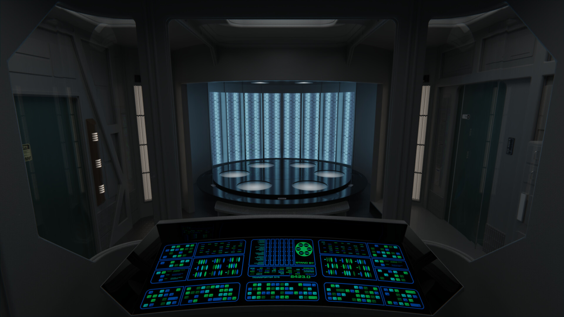
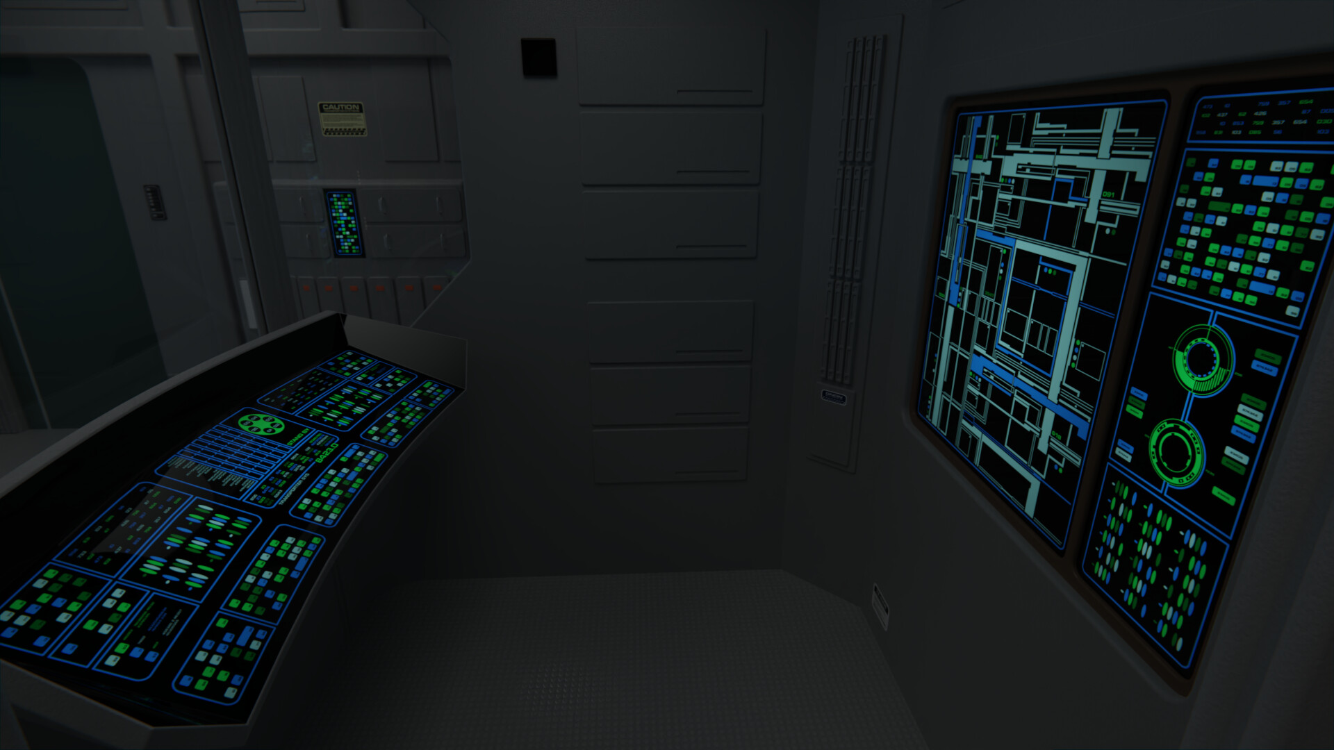
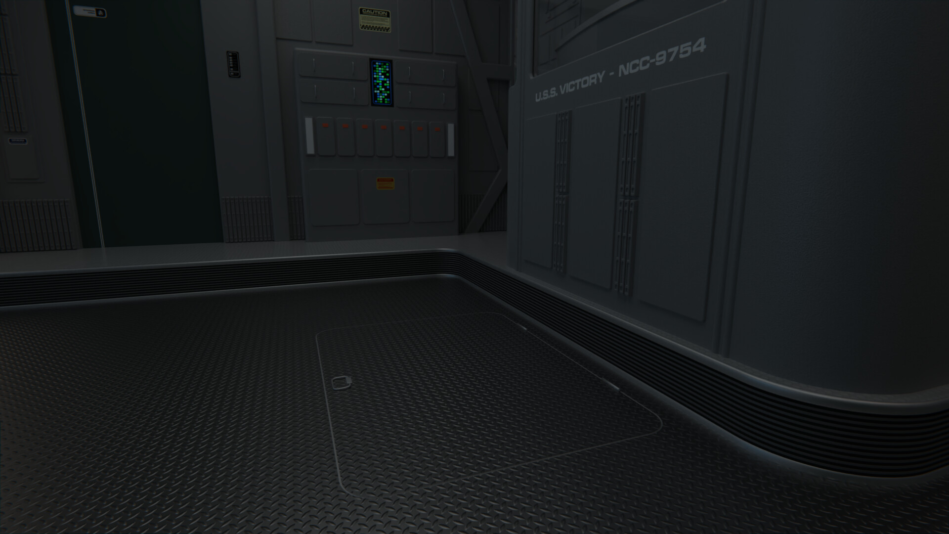
Anyway, more progress on the Victory transporter room. I've shifted things around a little, and reworked the control alcove somewhat. There's now different detailing on the walls, a segmented display panel on the back, and different detailing at the front below the "USS Victory" text, as I didn't like the previous paneling there.
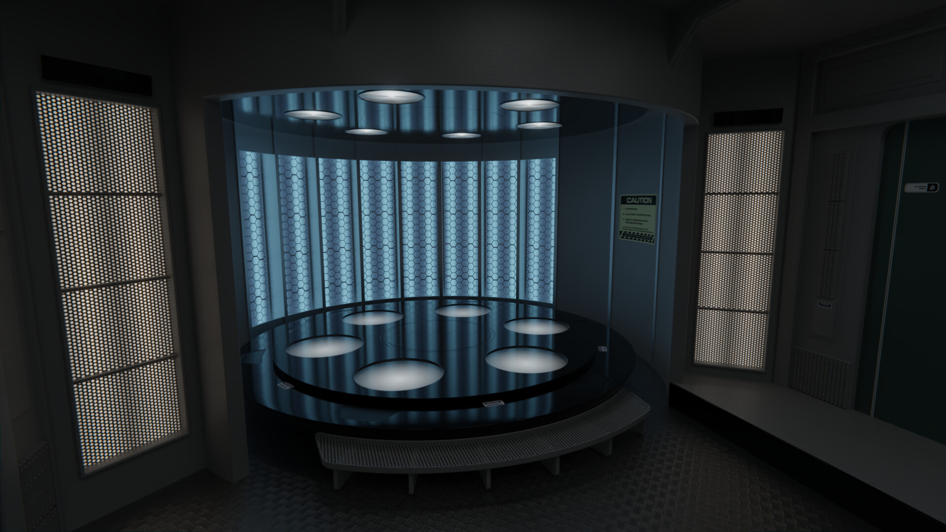
On the transporter pad itself, I designed a new top platform to try and bridge the gap between the TWoK and TNG transporter platforms, it now has 6 individual spotlights beneath semi-translucent platforms similar to the TMP-era ones, but sunken instead of elevated. I also turned the vertical lights at the sides back on, to add more light into the room.
@The Librarian: Dang it, thanks for the correction! There's likely a lot more misspells in there.
Kept working on the website on and off this week, learnt a bit of CSS to get some stuff more like I wanted to, and now and all the interiors of the listed ships have in-universe (if a little brief and formulaic) descriptions. Part of me wishes to give it a proper in-universe name kinda like the Starfleet Museum or ASDB sites have, but I can't come up with anything so at least for now it still has my name even if that's a bit awkward IMO.
Anyway, more progress on the Victory transporter room. I've shifted things around a little, and reworked the control alcove somewhat. There's now different detailing on the walls, a segmented display panel on the back, and different detailing at the front below the "USS Victory" text, as I didn't like the previous paneling there.
On the transporter pad itself, I designed a new top platform to try and bridge the gap between the TWoK and TNG transporter platforms, it now has 6 individual spotlights beneath semi-translucent platforms similar to the TMP-era ones, but sunken instead of elevated. I also turned the vertical lights at the sides back on, to add more light into the room.
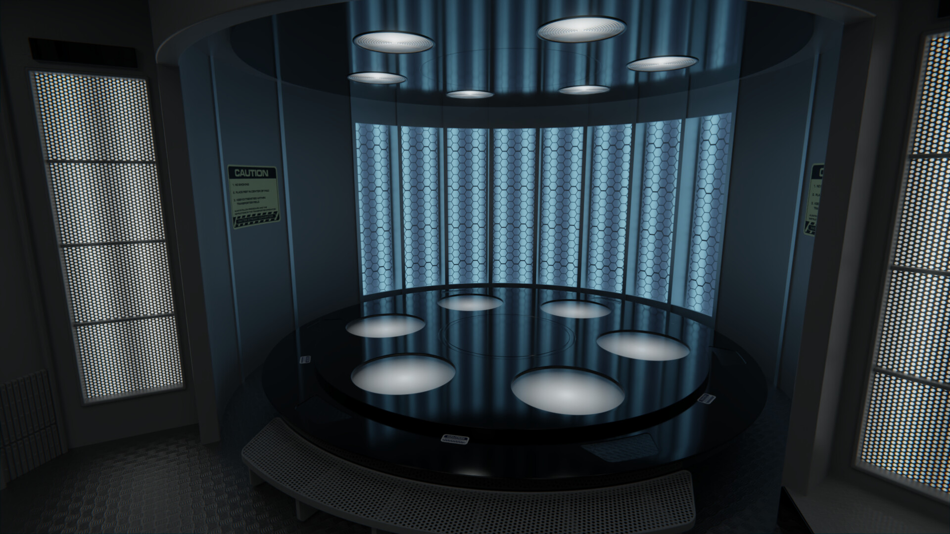
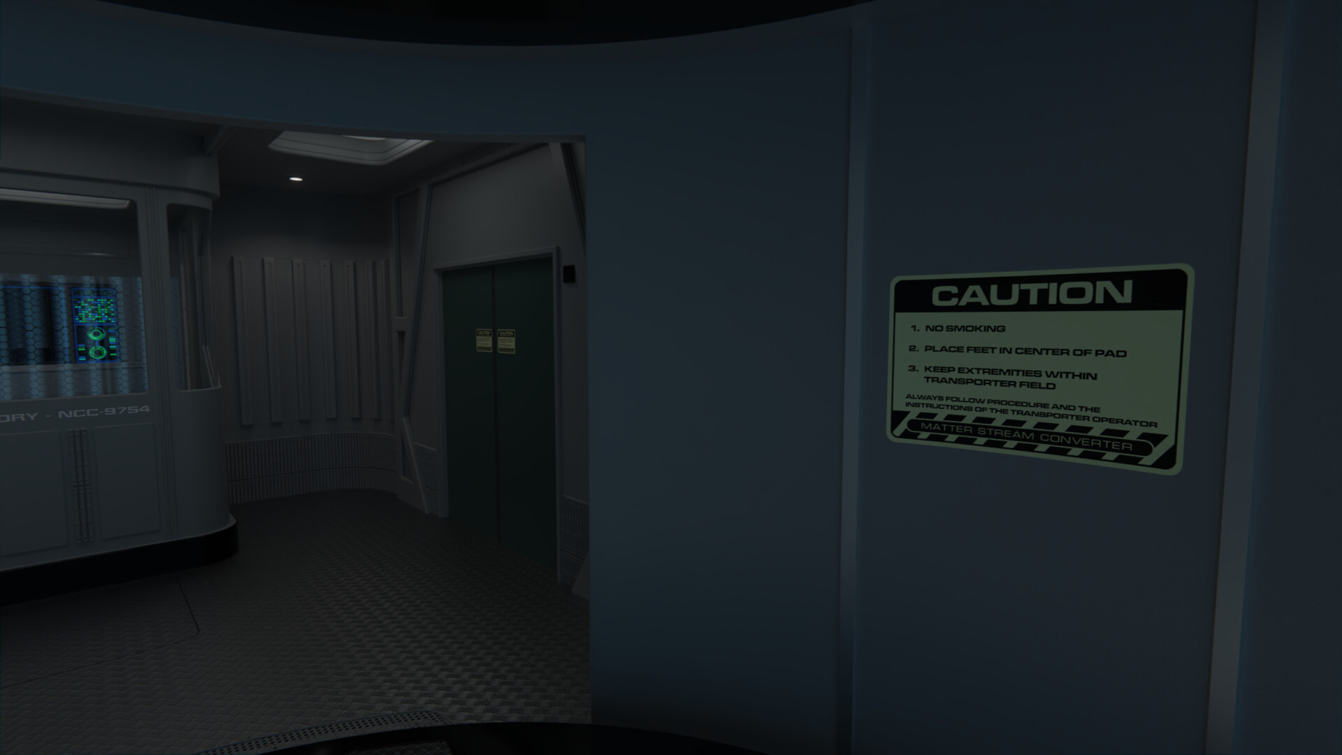
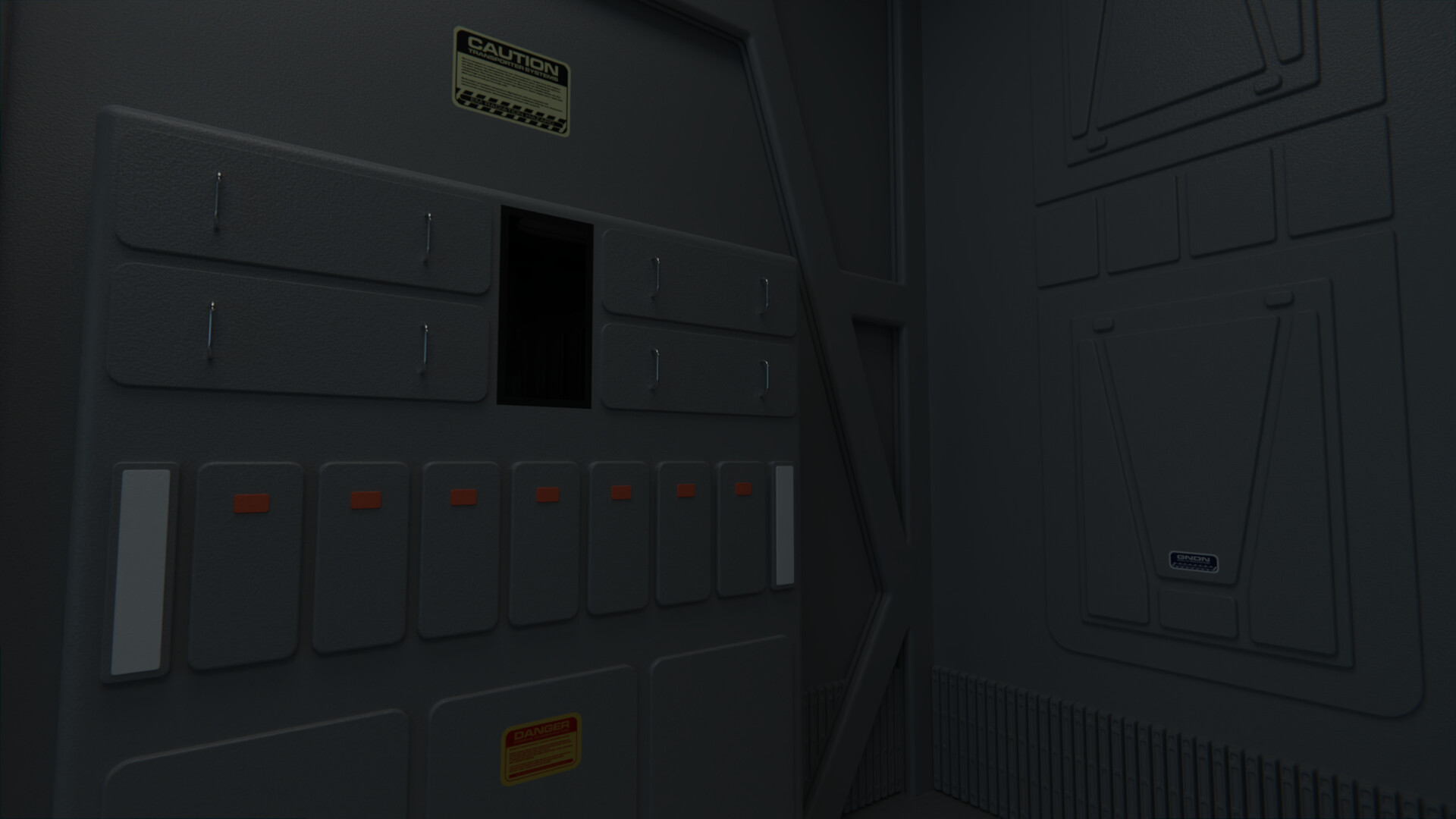
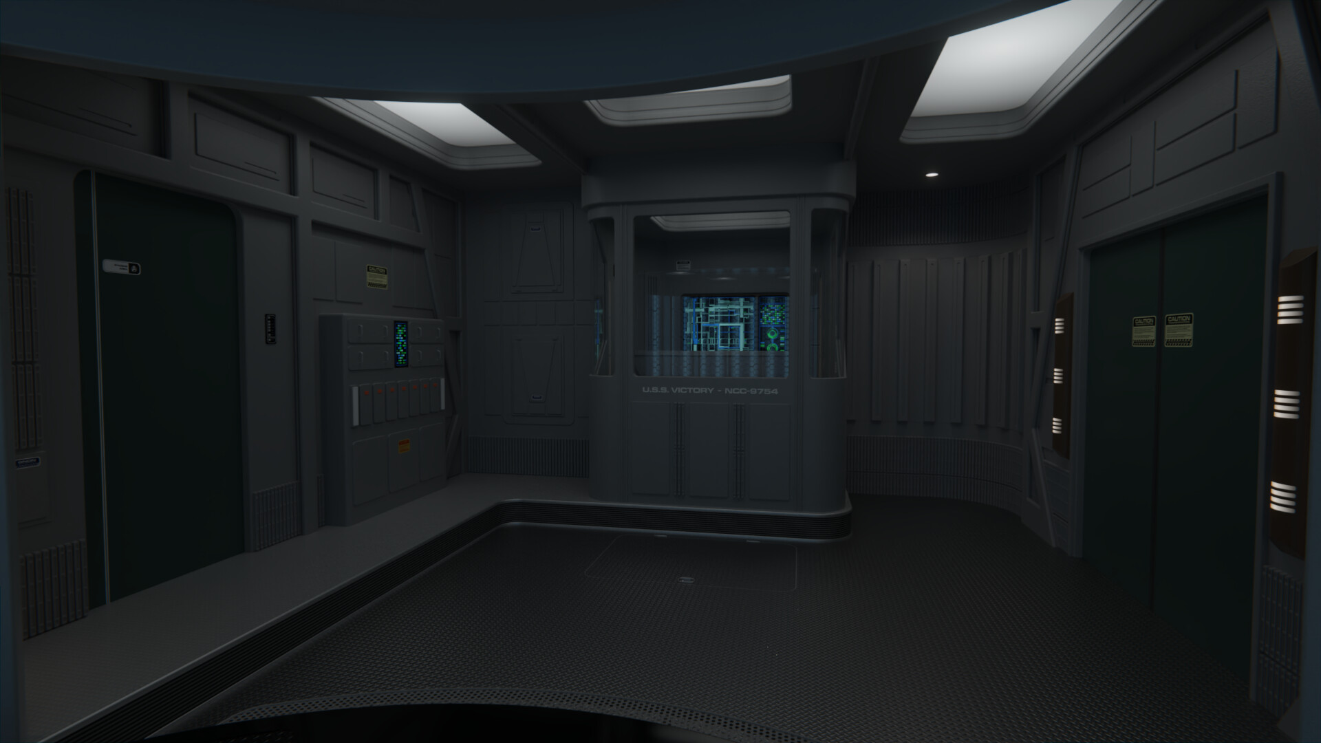
Added a lot of new labels all over the room, and in fact took the chance to completely redo my existing TUC-era labels as well to make them more accurate.
I also changed the way top elements of the transporter (the 6 circle-things with the wavy lines above the pads) worked. These are now proper glass wafers with thickness, so the light behind them can be more natural and doesn't bleed into the room so much.
I also changed the way top elements of the transporter (the 6 circle-things with the wavy lines above the pads) worked. These are now proper glass wafers with thickness, so the light behind them can be more natural and doesn't bleed into the room so much.
It's just simple changes, but you pulled off what the TFF/TUC team didn't have the budget to do
@ashleytinger: Thanks! Yeah it's tricky to try and balance the "right amount" of changes while leaving the room in a state where it could realistically then be returned to the TNG state. I would've liked to place the door differently as it was on TMP, for instance, but that would've been too much.
Added miscellaneous stuff, like more paneling on the walls, the transporter control graphic on the console, and some light sconces on the walls. I wanted to break up all the grey but I didn't like how coloring any of the existing elements looked like, I think the sconces work instead.
@Donny suggested some tweaks to me as well, and I decided to go with his suggestion to warm up the vertical lights at each side of the transporter pad, as it better balances all the cold lighting coming up from that area.
Beautiful as always. Just wants to suck you right into it. I want to live there.

[Fancy website talk]
Dude... that's pretty awesome. I like the presentation a lot. Reminds me of a project I did for uni as my portfolio. Nice and tidy and keeps everything organized!
Glad you're all liking the updates!
@BorgMan: Thanks mate, happy you like the new site!
Not much time to work on this today, but I finished the displays, plus tweaked their coloring and lighting a bit, to make them more accurate. I also did new textures on Inkscape for the floors, creating more accurate patterns to both the metal floor from the Ent-B bridge and the rubber floor from the TNG transporter room, both of which I'm using here. I also finished doing the access panel on the floor and added details on the step into the side area. I won't be adding a carpet in the end, I did some test patterns but there's not much space for one without it looking awkward IMO.
I think this is finished now? Am I missing something obvious? Have so much on my head I honestly can't remember so help me out hahah
Gonna call the transporter room finished, did some very minor tweaks the other day but that's it. I'll render the final images when I have time during the weekend.
Meanwhile, I've been tweaking the other Victory interiors given the modifications I've done to my resources for the 2290's. The bridge, briefing room, and sickbay all got the new floor texture, updated labels and okudagrams, and a general detailing pass.
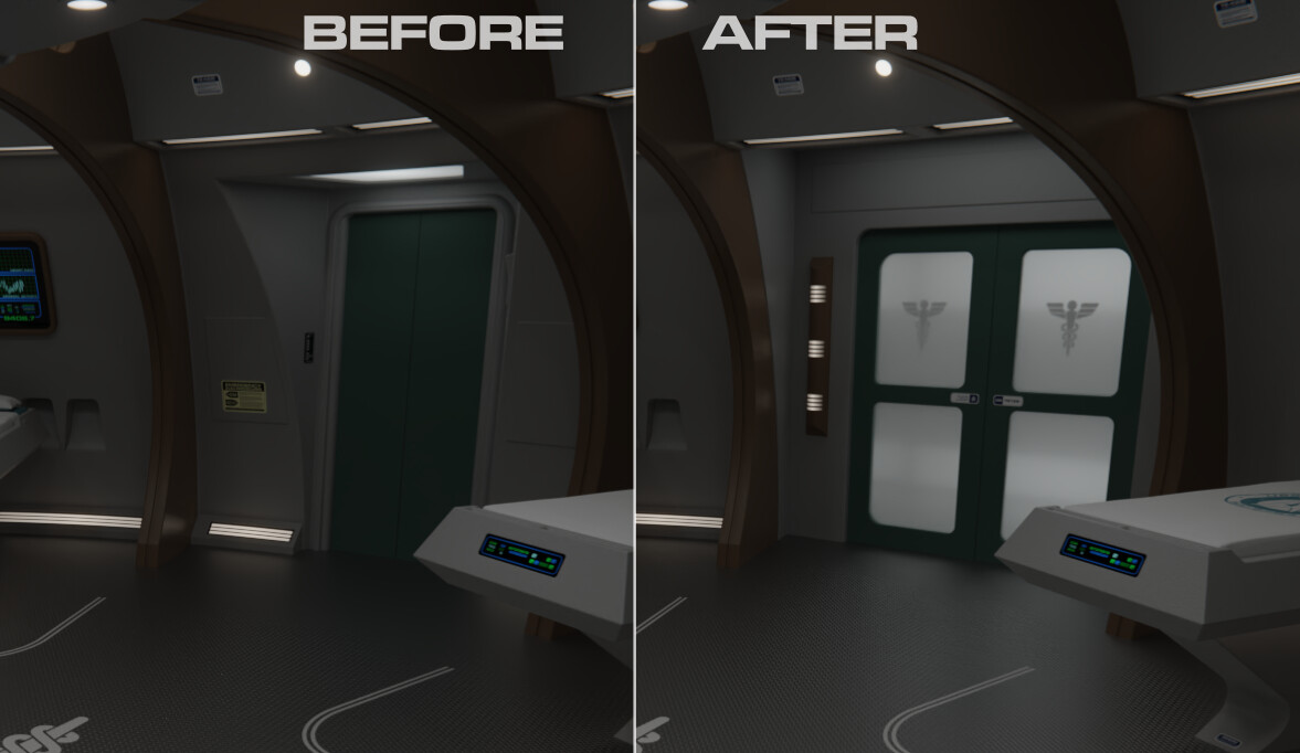
The briefing room in particular got a new carpet below the table and sconces at each side of the door, plus a slightly redesigned Starfleet Command flag. Sickbay got the most changes; with a brand new main entrance door inspired on the Enterprise-B sickbay door rather than the awkward turbolift alcove it had before; a modified ship patch for the beds; a carpeted area for the CMO's office, among smaller stuff like extra labels all over the room. Feel free to go through the links above to see all the new renders.
Meanwhile, I've been tweaking the other Victory interiors given the modifications I've done to my resources for the 2290's. The bridge, briefing room, and sickbay all got the new floor texture, updated labels and okudagrams, and a general detailing pass.
The briefing room in particular got a new carpet below the table and sconces at each side of the door, plus a slightly redesigned Starfleet Command flag. Sickbay got the most changes; with a brand new main entrance door inspired on the Enterprise-B sickbay door rather than the awkward turbolift alcove it had before; a modified ship patch for the beds; a carpeted area for the CMO's office, among smaller stuff like extra labels all over the room. Feel free to go through the links above to see all the new renders.
The updates are amazing. 
If it's possible, could you share legible versions of the cranial picture hanging in the doctor's office, and the engineering report from the briefing room? I love little details like those.
If it's possible, could you share legible versions of the cranial picture hanging in the doctor's office, and the engineering report from the briefing room? I love little details like those.
The updates are amazing.
If it's possible, could you share legible versions of the cranial picture hanging in the doctor's office, and the engineering report from the briefing room? I love little details like those.
The cranial picture, as all the other hanging on the office, are from the Star Fleet Medical Reference Manual. Here they are (page 68 is the cranial drawing): https://www.cygnus-x1.net/links/lcars/star-fleet-medical-reference-manual.php
As for the engineering report, the text is just lorem ipsum. You've discovered me as a fraud


Similar threads
- Replies
- 479
- Views
- 23K
If you are not already a member then please register an account and join in the discussion!