Astra, I love your work. I hope this constructive criticism is taken as such, and I promise no offense is intended.
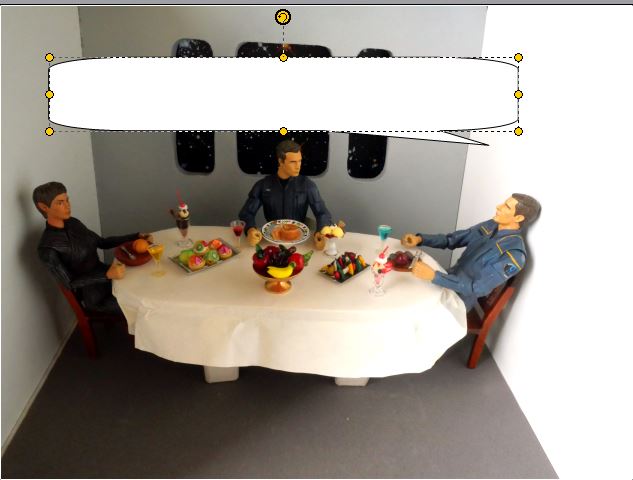
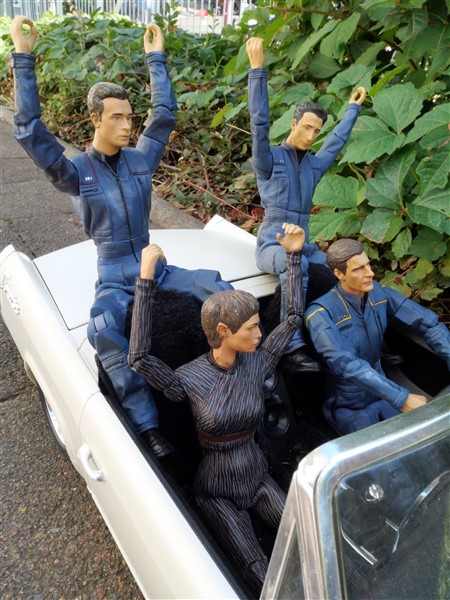
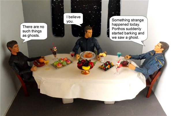
Best reading is created when the word balloons make it clearer what order they should be read in. Left to right first, with some indicators from top to bottom when needed.
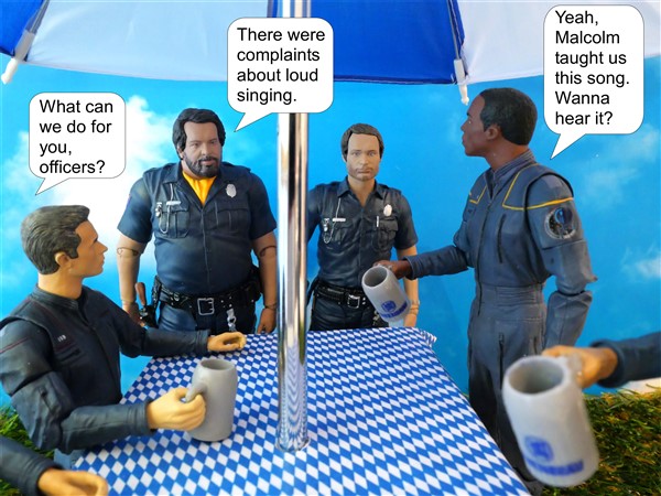
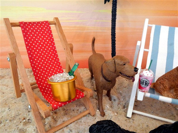
This is a pretty ugly example, but you'll see what I mean.
First, I am pretty easy going and always happy to learn, so feel free to shoot away! No worries!
I have a friend who knows a lot about photography and has given me hints and tips (about focus and blurry background and such) and I feel that my pictures have become much better because of it. I also once in a while am happy to give concrit when reading a fanfiction, when I feel the author might appreciate it.
A while ago somebody already told me about the speech bubbles and I have tried to heed this advice ever since.
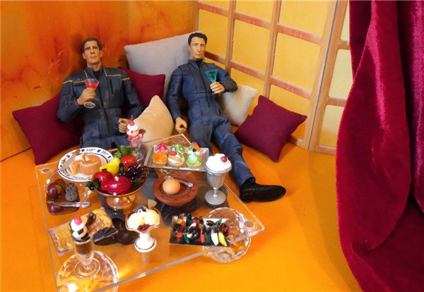
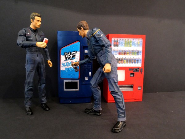
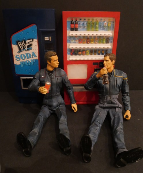
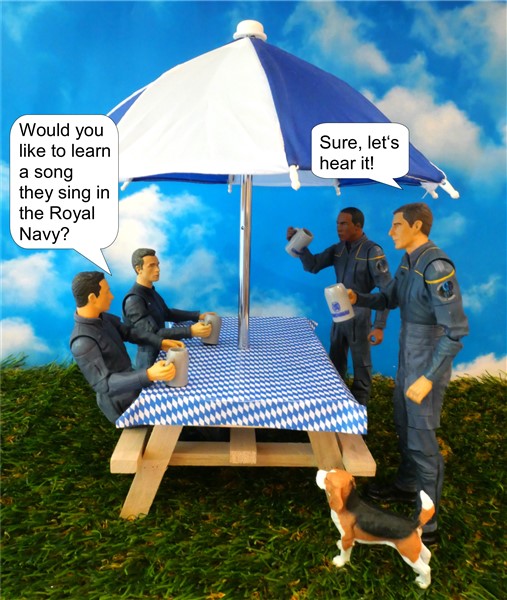
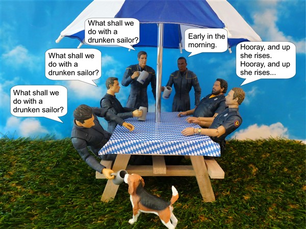
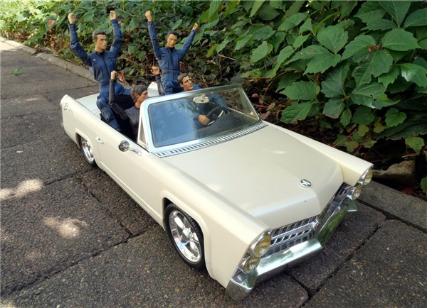
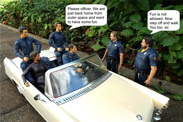
Unfortunately I am limited by two things. I first and foremost do my pictures for Twitter. The arrangement there is either one portrait and two landscape, or four landscape. I try to think what I want to say beforehand, and arrange the figures in a way from left to right so it falls naturally.
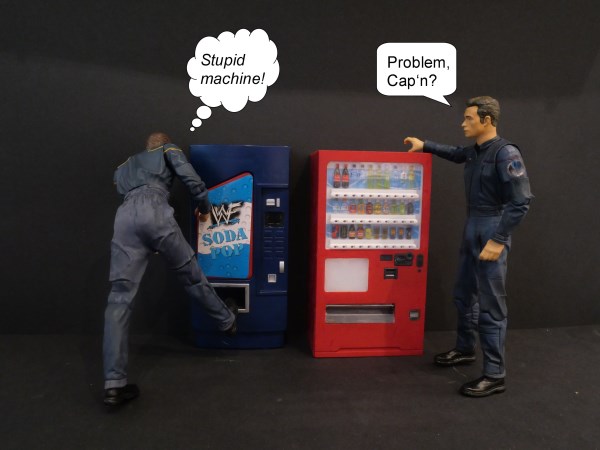
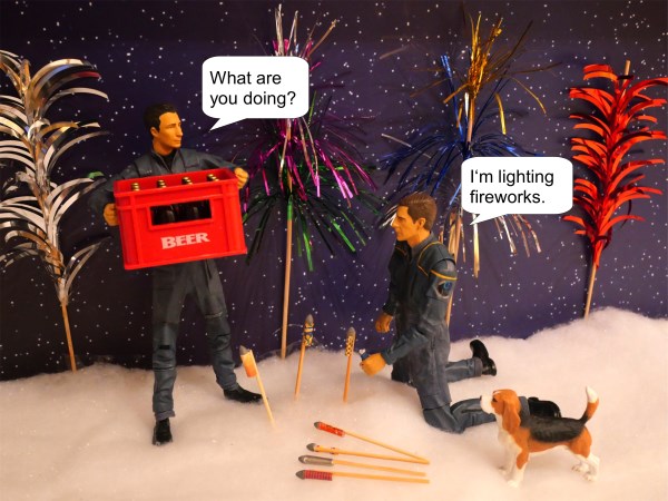
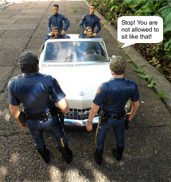
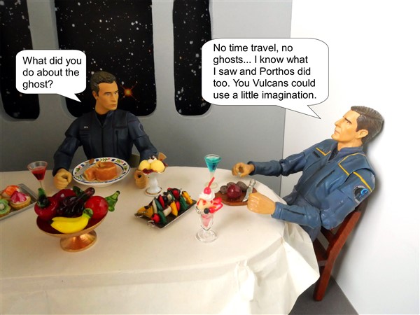
Sadly that was not possible this time as we all know the captain always sits right. It would have felt odd to have him at the left side.
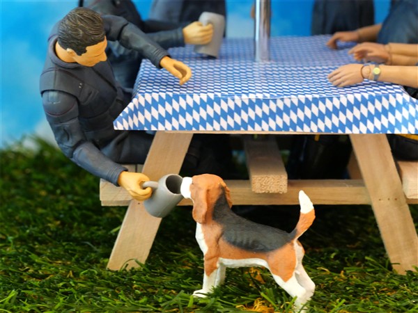
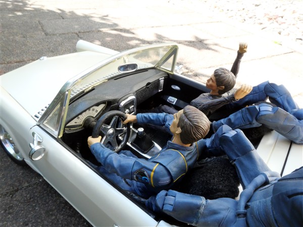
I also could have done more panels, like doing another picture in between with Trip's question and I sometimes do that for my personal Livejournal but again I limited myself with the four pictures.
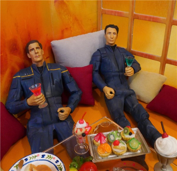
And because of the way the Twitter landscape pictures are long and thin (they used to be square like Instagram so many of my old photos don't fit the new frame now anymore) there was also a limit of having the bubbles coming from the top to the bottom. What looks like empty space here in the first picture and the captain bubble could have been set a bit higher as first, on Twitter would not be visible. Yes, people can click on the picture to open it in a new window, but I prefer having everything visible on first glance. Which resulted in this kinda squished together way.
I hoped that this once while I knew it wasn't perfect, I would get away with it and after a short confusion people would figure out what was meant.
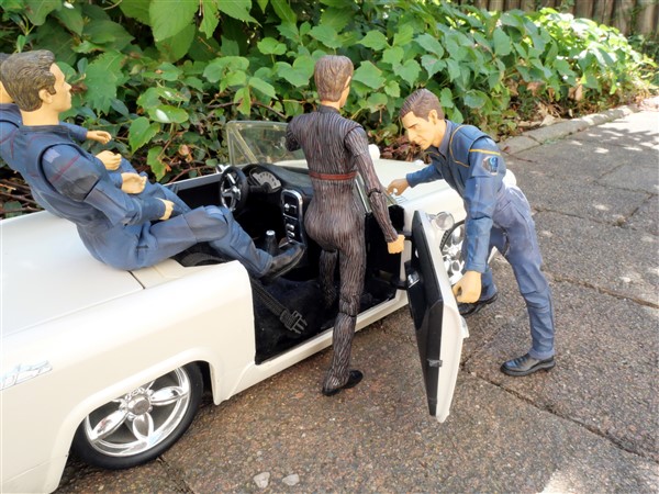
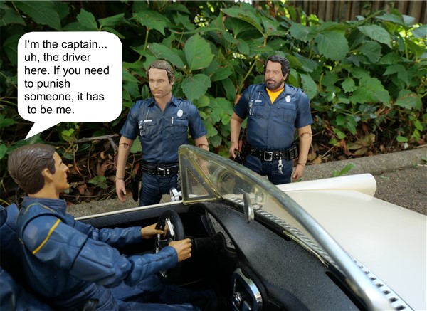
The way you did it, by having that long line added, is a very interesting way and makes it look indeed like a real comic (of which I have not read many I must admit as I don't really like them). Unfortunately I use a very basic photo edit program where I can only choose to have the little arrow at the bottom left and right or up and down. Not sideways or more in the middle, which often has frustrated me also. And also not possible to draw it over to the side that long. All I get is a bigger longer bubble.
So, those were my reasonings!
I think arranging the figures in the right way is the best solution for the future. But definitely thank you for your input!
 The creative juices are a high unlike any other.
") )
)


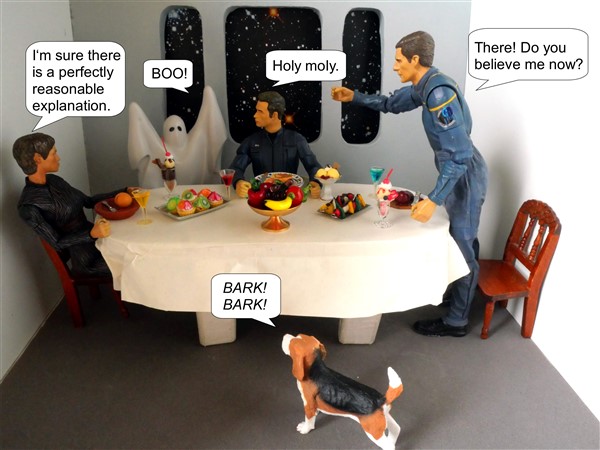
 A nice treat for the spooky season! *applause*