Going back to the base, unmodified TNG bridge after so long really highlighted to me the problems the mesh has. It's understandable, I guess, as it was the very first canon bridge reproduction I did, originally as the USS Quasar bridge; and I had only been using Blender for half a year at that point.
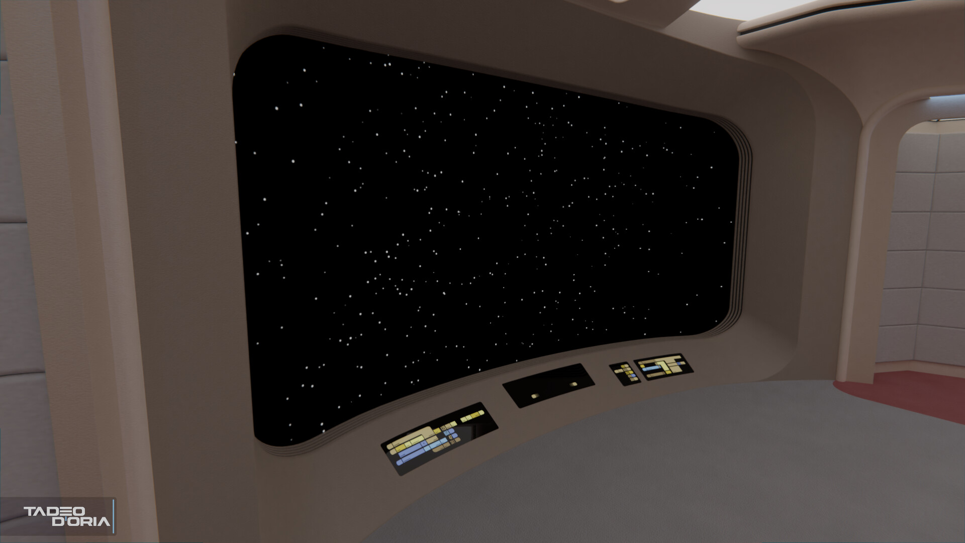
Some areas are very much under-segmented (the viewscreen most notably), while some others are insanely overdone with a ton of vertices that aren't even visible. The season 7 Ent-D bridge .blend file is almost 150MB in size. For comparison, newer models I do with better techniques like the Ross, Cerberus and Constellation (NX-1974) bridges are all around 10MB, as are their myriad redresses.
So for the Yamato bridge I was very tempted to solve some of these issues, cleaning up the topology and simplifying the meshes when they were overdone. But being obsessive as I am, I knew I couldn't just do it to this new bridge and leave the previous canon bridges alone, no, I had to go in and change those as well. It was all or nothing.
Compounding to that, ever since the Stage 9 days
@Nays (fellow S9 dev who did wonders with the Unreal Engine lighting, and who probably did more research into the TNG sets than the rest of us combined, seriously he could've easily walked the sets blindfolded), highlighted to me that the door frames on the bridge should be further recessed by about 10cm.
A small issue for some, but he made sure I remembered it every time I worked on a Galaxy-class bridge, it's been something of a running joke between us, as I've been resistant to change it due to... well being OCD and then having to modify all my existing bridges. Still, given that I was already tempted to rework the canon bridges this time... I decided to finally do it.
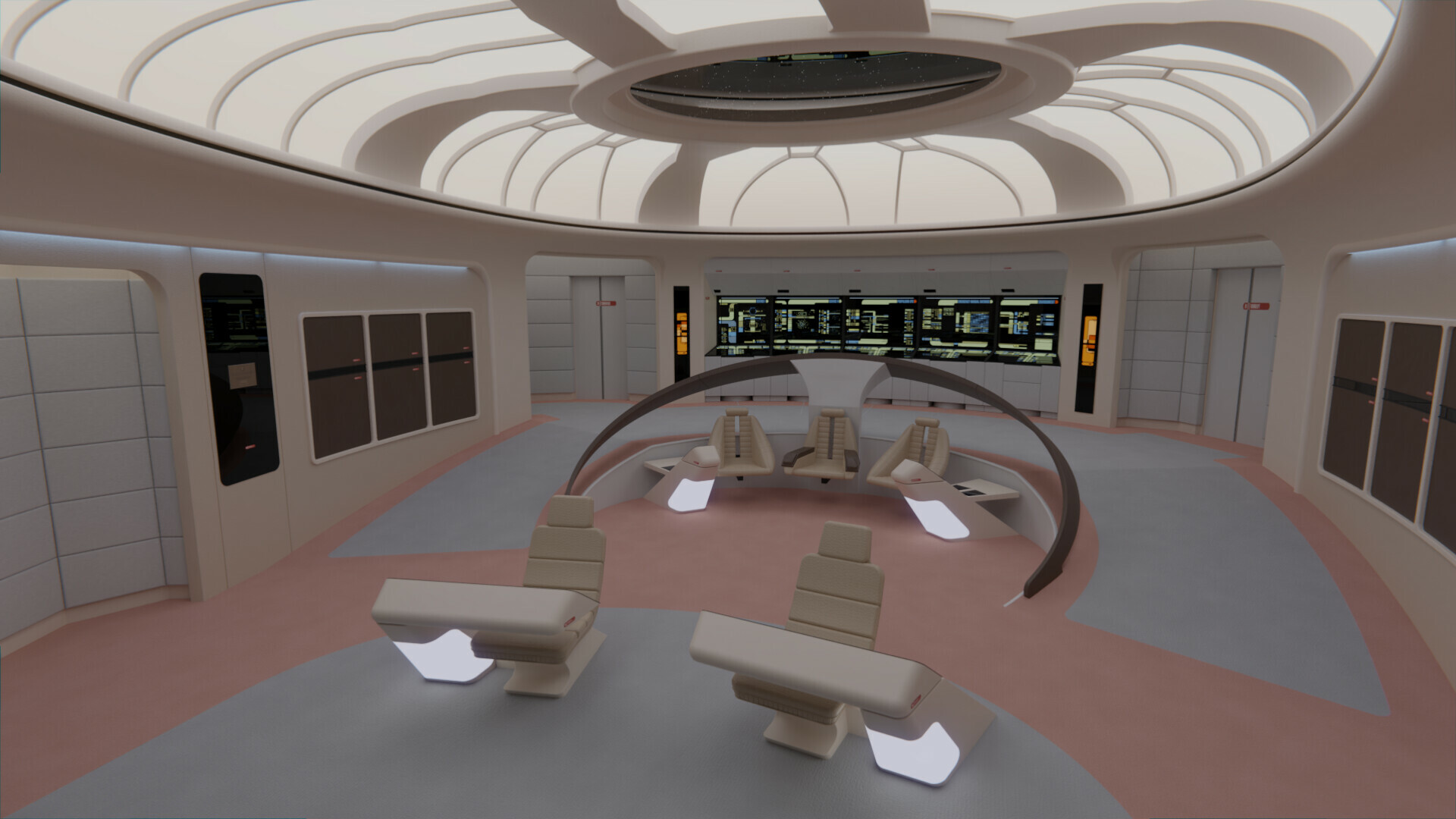
So, I've taken today to work on my Enterprise-D bridges again. One thing lead to another, and I ended up not only correcting these issues, but also completely redoing the lighting, and doing some further accuracy work.
All the light emitting materials were replaced with gradients to better achieve the look of the neons used on the set. The rest of the materials were likewise revised in some way or another to bring them up to par with the ones I use today. I've also moved the conn/ops consoles slightly forward in both versions. Besides that, there were some changes specific to each version:
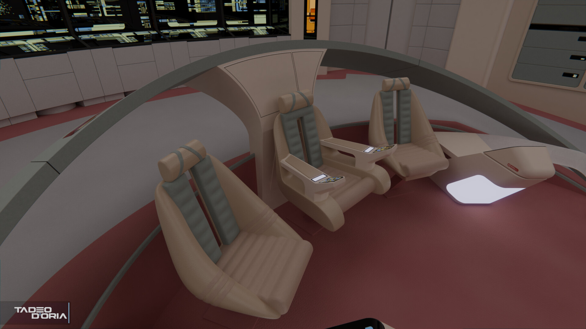
On the season 1 bridge, the Captain's chair was replaced by a newer model I did last year, as were the conn/ops chairs. I've also added the replicator cutouts below the dedication plaque and the ship graphic opposite it (something else that
@Nays pointed out to me, I had no idea those were there!)
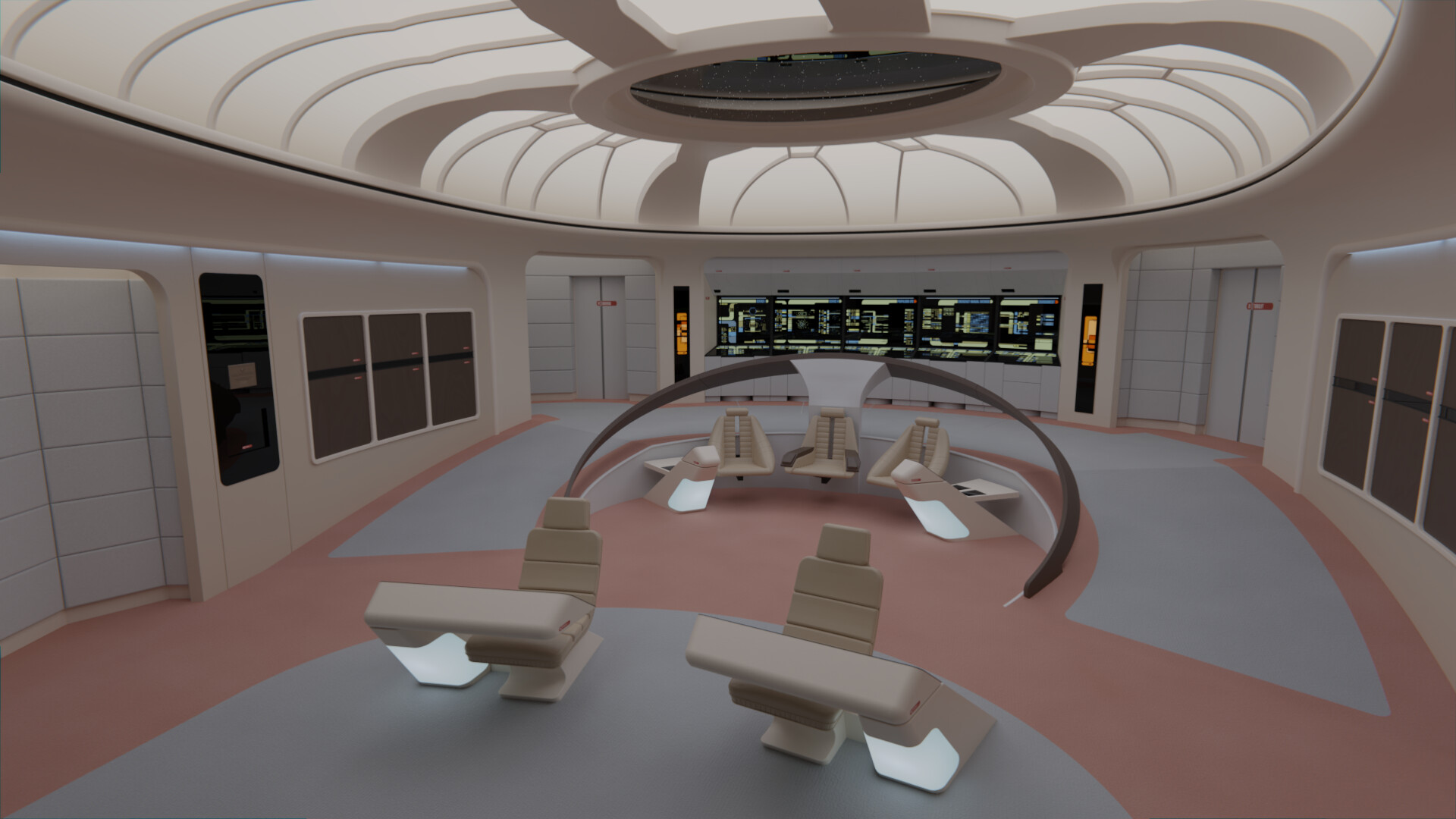
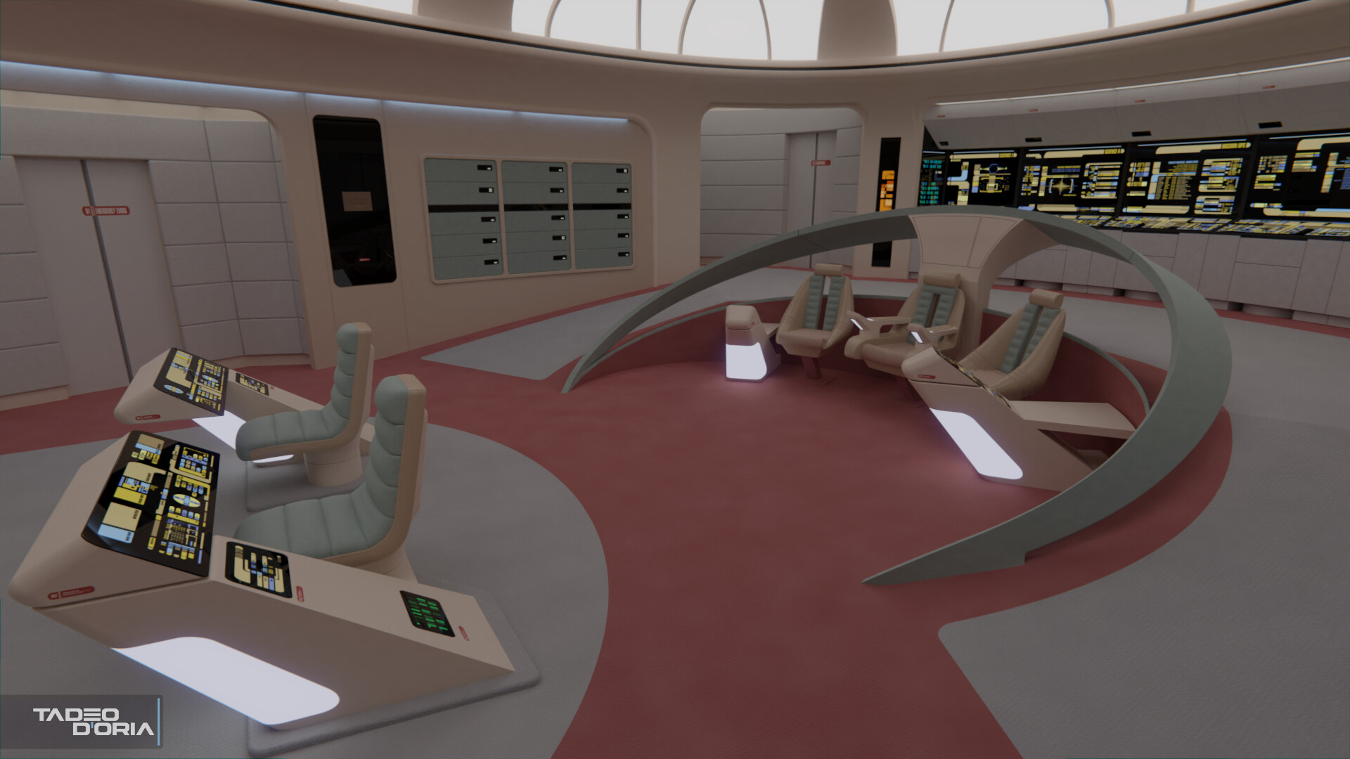
Old s1 bridge:
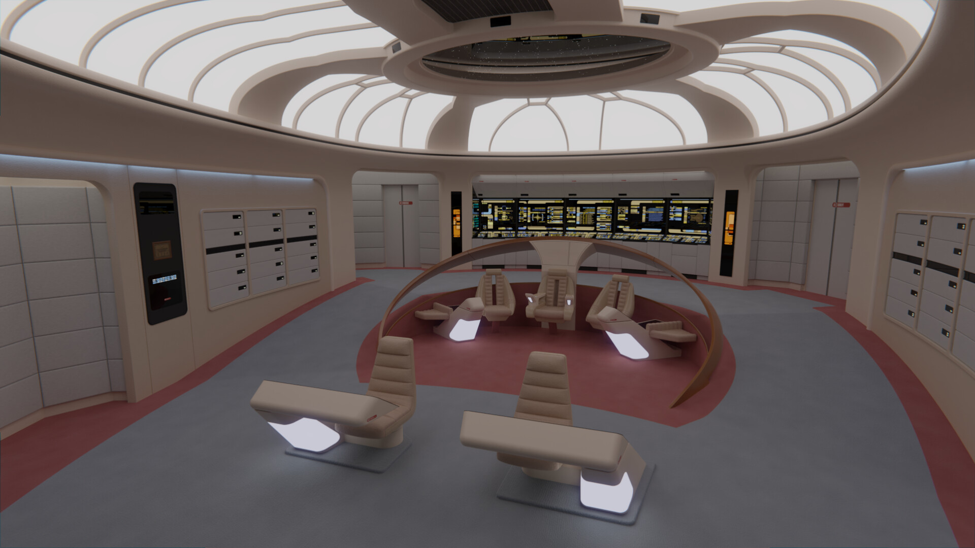
New s1 bridge (
more renders here):
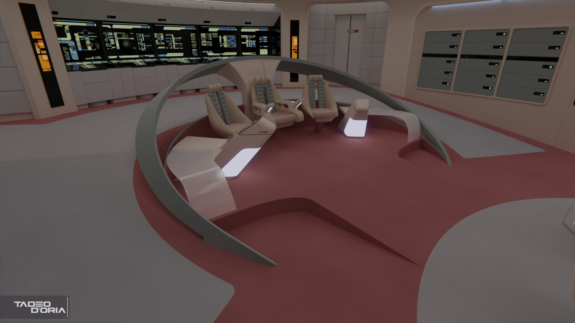
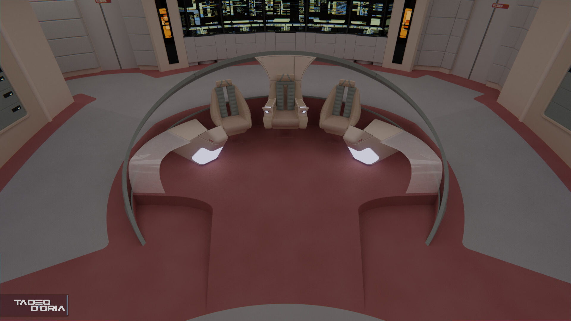
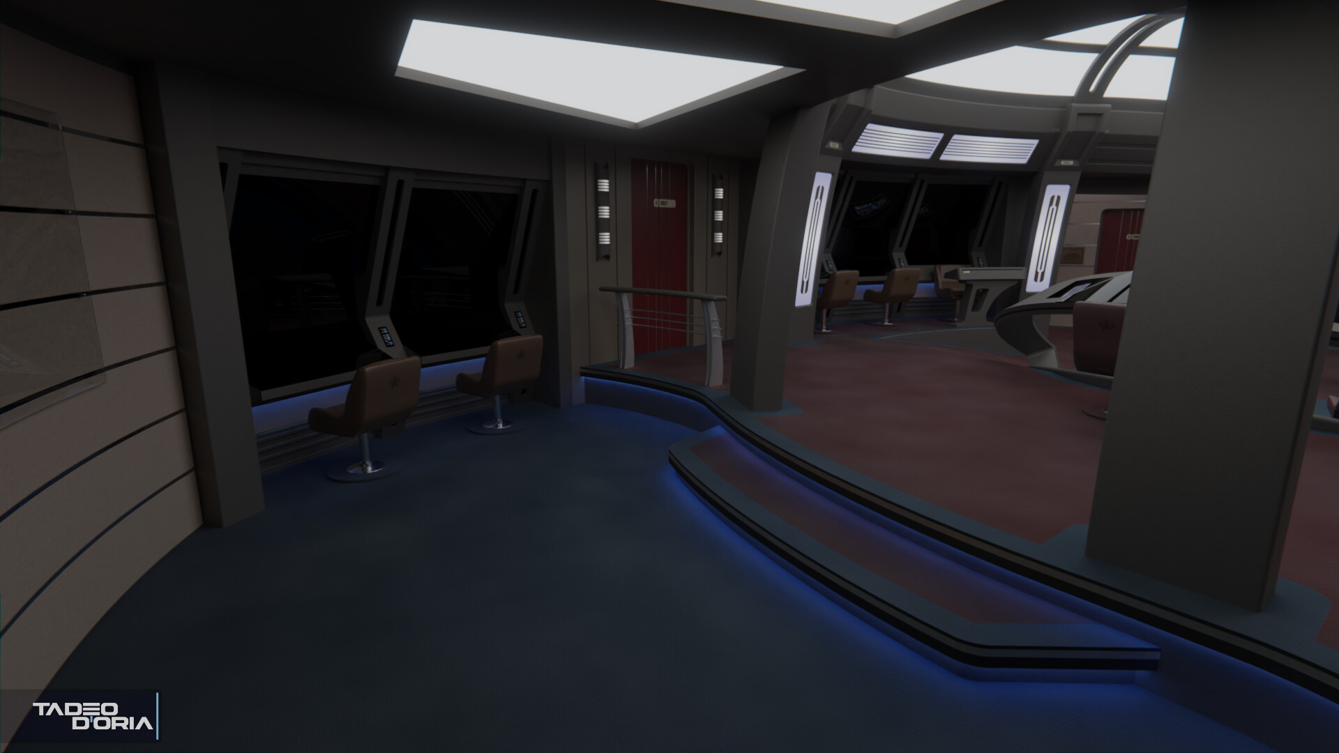
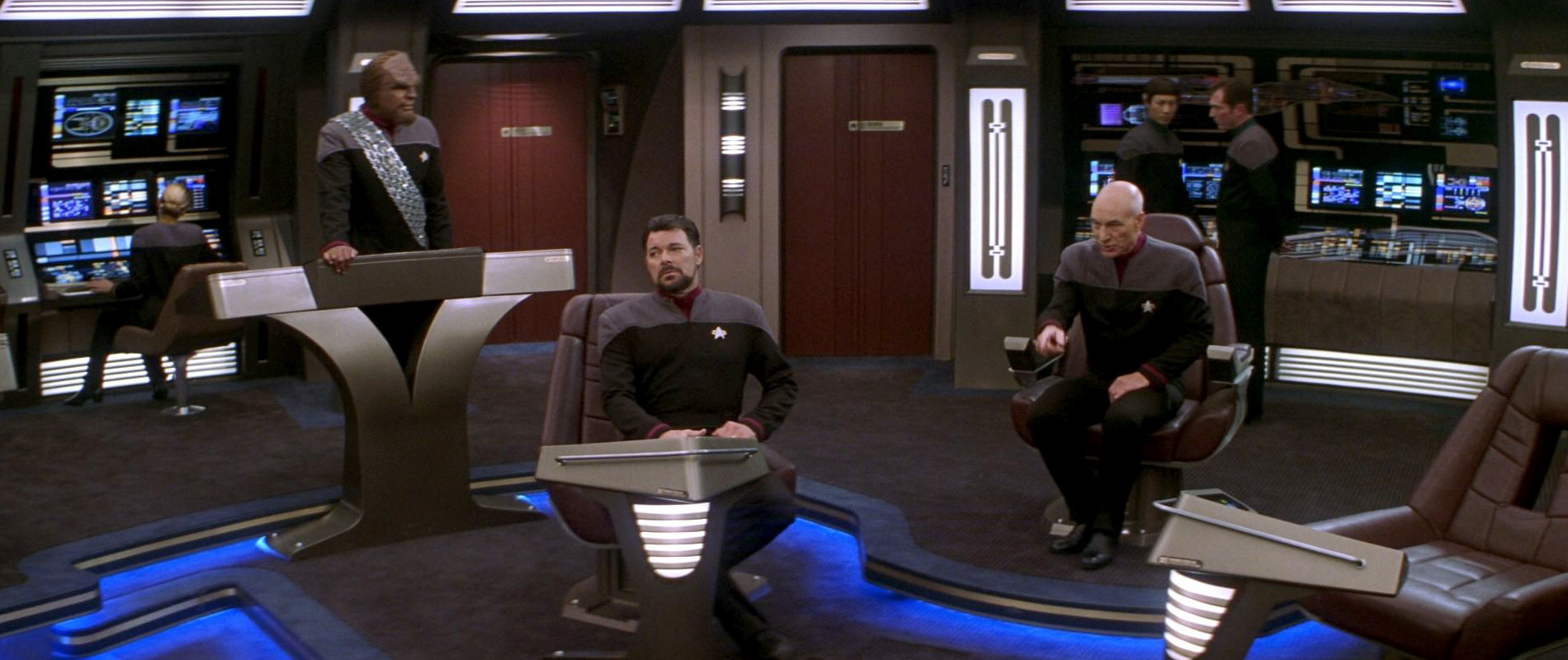
On the season 7 bridge, I shut down the Engineering station at the back of the bridge, to replicate the look it had on the bridge most of the time. I've also tweaked the color management options on the renderer, to better mimic that oversaturated look that late TNG sometimes had.
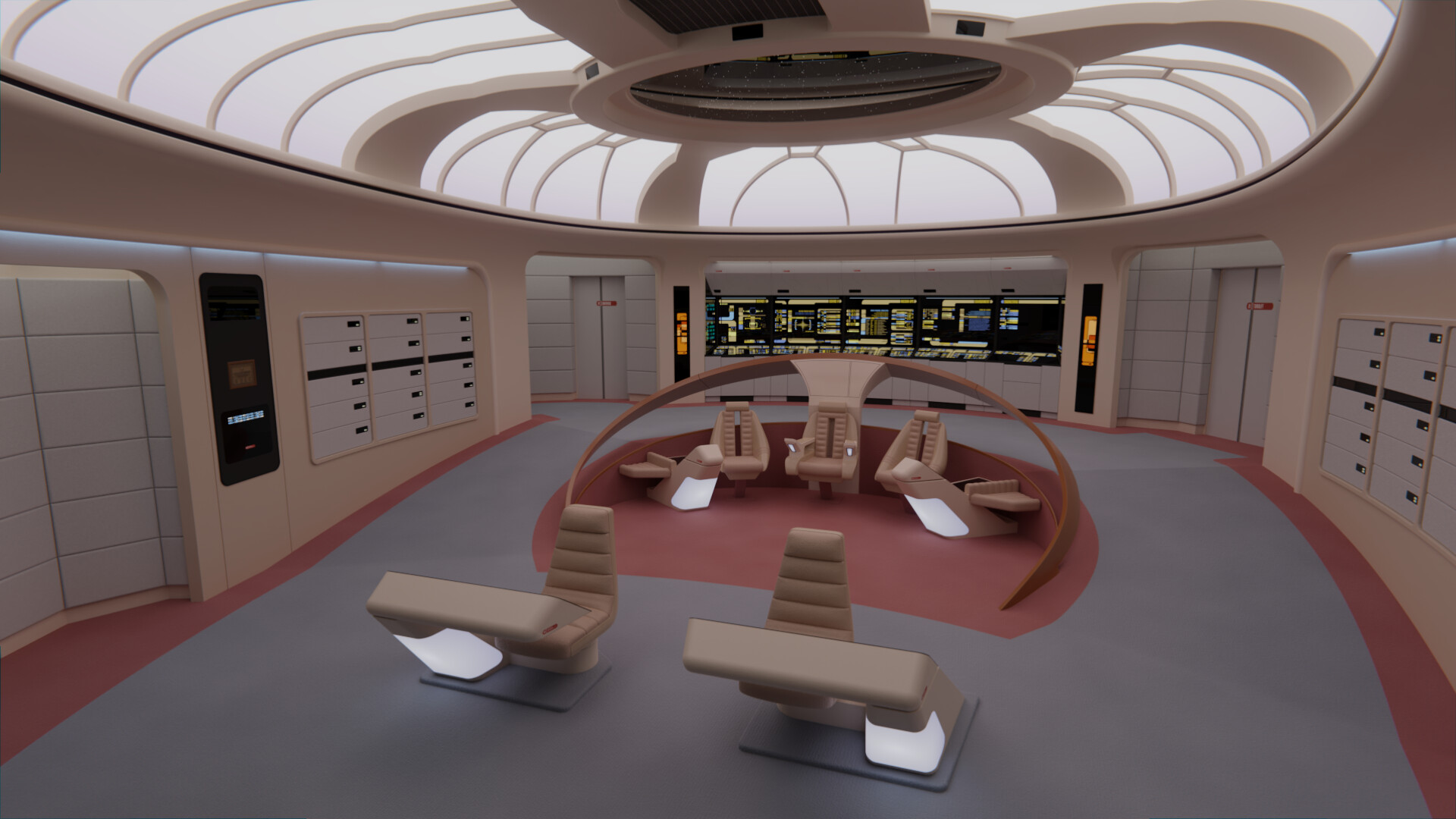
Old s7 bridge:
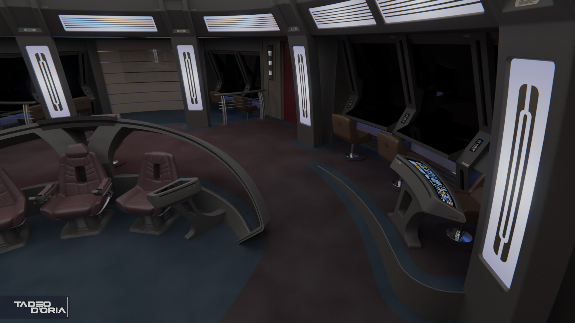
New s7 bridge (
more renders here):
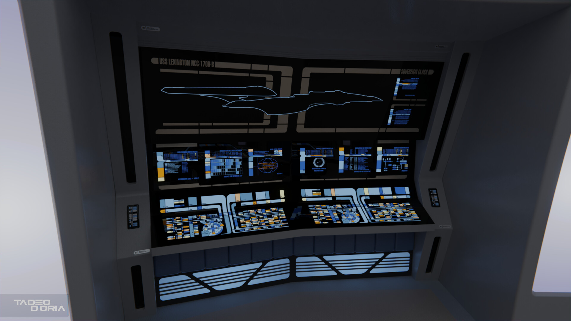
In the end the new versions of the bridge are less than 70MB in size, which I'm quite happy with given the originally insane sizes. I'll do the same treatment to the Parallels bridge during the week, but first I'm gonna go ahead and finish the Yamato commission.


")


")