-
Welcome! The TrekBBS is the number one place to chat about Star Trek with like-minded fans.
If you are not already a member then please register an account and join in the discussion!
You are using an out of date browser. It may not display this or other websites correctly.
You should upgrade or use an alternative browser.
You should upgrade or use an alternative browser.
USS Enterprise (eventually) on Discovery?
- Thread starter EJD1984
- Start date
Let's face it. None of the ships in any iteration of Trek have looked anything like the conceptual designs that actual space agencies have proposed for interstellar travel. Everything in Trek is laughable as future tech.
Indeed. Moreover, everything in Trek (or elsewhere in television or imagination today) is laughable as future anything - it's not from the future for real, and odds are that the future will be different.
Why should this be relevant? Because the desire to be "more plausible to today's audiences" is doomed to fail regardless of the effort expended. It just doesn't pay off.
Better to stick to one's guns and keep doing 1970s mullets and moustaches in Star Wars because that is Star Wars.
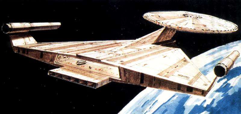
Even so, the original 1701 had the virtue of being grounded in real-world aeronautical engineering design concepts and breaking the mold of being just another rocket ship.
Bullshit. It's a stupid flying saucer with bits glued on. And it couldn't fly any better than something based on the best design traditions of garden tooling would.
Timo Saloniemi
I don't think this has been mentioned, but the Sutherland's bridge was redressed from the Enterprise A's galley. Hopefully they never try something like that again.
Intriguing. I always thought it was just a mish mash of whatever spare parts they had; walls chucked together haphazardly.
Not with those design forms. No way any designer would guess the connie as newer. Her design forms next to those of the NX are cruder and far more primative
Thats partly why Discovery is growing on me; Shenzhou has the clutter, Disco has cleaner lines (Enterprise obviously even cleaner). Shows a nice progression inside and out.
The assumption is based on what was seen also on Federation starbases at the time. At least for technology. However the argument here is not that other ship can look different. That's not it at all. We want more ships for this era because all we have are Constitutions in TOS. The argument is that if Discovery uses a Constitution, specifically that class of ship, it should look like it did back then. At least externally. Internally it should look at least passingly similar due to all the ships of that class that were seen have the same basic interior designer (redress of the TOS Enterprise sets for Exeter, Defiant, Lexington, and Constellation.) Other ships can look however they like....but this class of ship is a known quality that was respected in all previous shows up to the end of Star Trek: Enterprise.
Fair enough. Though to be honest, I think the TOS design could technically survive for a one off appearance. Internally the shae of the corridors aren't far off what we've seen so far in the Discovery trailers; rebuild them with a slightly different paint job, more detailing on all the little bits and pieces (such as pipes etc - basically building for modern HD) and give it some harsher lighting (never the purple/pink/greens!) and it'd look good enough.
The interiors on other ships were all the same ships, really. So that's not a big issue. Just give it some minor tweaks, light it differently and we're done.
Bridge and exteriors a different story, but the TOS style always came back for a bit of nostalgia; if they wanted to bring it back, they could easily get by on the nostalgia card while upgrading the sets in places.
Simple shapes work in space.
It's not in space. It's on TV.
It's not in space. It's on TV.
Simple shapes work on TV as well. It is just a rectangle after all.

There are two, possibly three schools of thought going on around the old USS Enterprise.
1. The strictly production end school where it is about business, camera work, sets, and costumes.
2,. Designers who see things as dated and want to toss it.
3. People who want fiction to be relatively consistent with in its own fictional setting.
(4. "What do you mean its not real?")
Last edited:
To each his own. I personally thought the 1701 looked sleeker/faster/newer than the NX-01.
Agreed. The NX-01 is cluttered with surface junk. It obviously preceded the more smooth and advanced 1701.
Take your irrefutable logic (and your obvious good taste) elsewhere! It's frowned upon here!

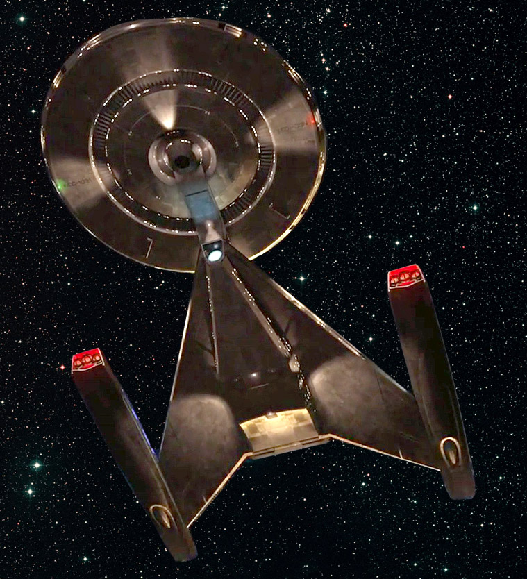
If one takes a close look, those "simple shapes" of the original 1701 aren't quite as simple as some folks here are claiming. I know I'm biased, but I still think the 1701 is the best looking ship the franchise has ever produced. But, I also think a '64 Mustang is better looking than any of the cars that came after it that carry the name.
And yet Discovery's shapes are just as simple, maybe even simpler. Seriously, are you blind, look at that secondary hull. It is crude and boxy.You try to explain this to folks and they simply do not get it. You simply can not change the design forms by dressing it up with textures. The connie is the design they are all based off of and its just so obverse with its primitive and simplistic shapes.
I promise you the 1701 will look different if it shows up. Still unmistakably the Enterprise, but it won't look like the 1960s. I'm fine with that if it's a beautiful redesign. Change isn't bad. Bad changes are bad.
I agree with you in principle but I have zero, absolutely zero, faith in modern artists to be able to modernize Trek that doesn't wind up taking it down a hopelessly garish and gaudy direction, especially if you're limiting the art pool to people who worked on the Kelvin-verse (which is the team on Discovery with their 3D printer and HR Giger fetish, etc...).
The subtle addition of plating on the TOS Remasters was probably the last gasp of restraint we'll see in this area.
The NX gets compared to a p-38. And if that is so then design wise the Connie is a Sopwith. You can't get around the more primitive and simplistic design. No way is the NX not decades newer and sleeker.


You try to explain this to folks and they simply do not get it. You simply can not change the design forms by dressing it up with textures. The connie is the design they are all based off of and its just so obverse with its primitive and simplistic shapes.
I beg to differ. I think texture, shadows & lighting have a lot to do with it. Not to mention hull colour. Nobody is suggesting the AMT model kit ship from the original 60s show should appear. But a CGI rendered version with sufficient detailing can.

I have to be honest, you sound like this guy:
The USS Discovery is basically the SIr Ken Adam/Ralph McQuarrie Enterprise from one of the abortive Star Trek films of the mid-70s, just with the warp nacelles elongated and backward.And yet Discovery's shapes are just as simple, maybe even simpler. Seriously, are you blind, look at that secondary hull. It is crude and boxy.
Last edited:
And yet Discovery's shapes are just as simple, maybe even simpler. Seriously, are you blind, look at that secondary hull. It is crude and boxy.
No, its not. It has many sweeping forms and a factor more design elemensts than the connie. The Discovery is far more detailed and advanced in shape styling than the connie
I beg to differ. I think texture, shadows & lighting have a lot to do with it. Not to mention hull colour. Nobody is suggesting the AMT model kit ship from the original 60s show should appear. But a CGI rendered version with sufficient detailing can.
I have to be honest, you sound like this guy:
The USS Discovery is basically the SIr Ken Adam/Ralph McQuarrie Enterprise from one of the abortive Star Trek films of the mid-70s, just with the warp nacelles elongated and backward.
Once more, this has zero to do with textures and lighting. Its shapes and design styling. You guys are so caught up in the forest, you are missing the trees
And your images are wrong
No, its not. It has many sweeping forms and a factor more design elemensts than the connie. The Discovery is far more detailed and advanced in shape styling than the connie
And your doctorate in design and architecture comes from?
And your doctorate in design and architecture comes from?
Its a communiy college degree. But I am aiming at a higher level degree at the moment.
This stuff is plan as day man. Its not hard to spot. Anyone with any training in the area should easily spot the issue
Sweeping form, my ass. That secondary hull is a fucking box. As for details, that's the only part you're right about, but you can add details on Connie without changing the overall shape.No, its not. It has many sweeping forms and a factor more design elemensts than the connie. The Discovery is far more detailed and advanced in shape styling than the connie
Indeed. And obviously a modernist building by Wright or van der Rohe is much more primitive than a gothic cathedral because the shapes are simpler.And your doctorate in design and architecture comes from?

Kor
Sweeping form, my ass. That secondary hull is a fucking box. As for details, that's the only part you're right about, but you can add details on Connie without changing the overall shape.
You are looking at the wrong image. That is not the discovery we have. And even the old version had more design complexity than the connie. It simply does.
If you do not change the connie shape, it still will look older than the NX, because design wise it us and it shows like a supernova. The redesign in TMP is fone, as it fits, but the TOS forms are just super simple and primative
Indeed. And obviously a modernist building by Wright or van der Rohe is much more primitive than a gothic cathedral because the shapes are simpler.
Kor
The issue here is design linage. You guys want to ignore it because you want a TOS nod, not because a clearly more primative and date d design fits
You guys want to ignore it because you want a TOS nod...
Since the show takes place in the TOS timeframe, why wouldn't I want a TOS nod? I'm not ashamed of the show like some here seem to be.
You are looking at the wrong image. That is not the discovery we have. And even the old version had more design complexity than the connie. It simply does.
If you do not change the connie shape, it still will look older than the NX, because design wise it us and it shows like a supernova. The redesign in TMP is fone, as it fits, but the TOS forms are just super simple and primative
Other then the nacelles, the TMP Connie is basically the same shape.
It is the 'texture' of the ship that gives most of the detail.
Similar threads
- Replies
- 24
- Views
- 614
- Replies
- 223
- Views
- 18K
- Replies
- 9
- Views
- 6K
- Replies
- 65
- Views
- 7K
If you are not already a member then please register an account and join in the discussion!