• Welcome! The TrekBBS is the number one place to chat about Star Trek with like-minded fans.
    If you are not already a member then please register an account and join in the discussion!

Your Favourite Font

Miss Chicken

Little three legged cat with attitude
Admiral
I have just began reading the book Just My Type: a book about fonts by Simmon Garfield which I hope I will find interesting.

I thought I might ask people here about their favourite fonts and also if there are any fonts they really hate.

In the introduction the author tells us there are 100,000 fonts in the world which is reason enough for me not to even attempt a poll in this thread.
 
. . . In the introduction the author tells us there are 100,000 fonts in the world which is reason enough for me not to even attempt a poll in this thread.
That’s in the Latin alphabet, of course. For Greek, Cyrillic, Hebrew, Arabic and other scripts, the number of available fonts is considerably smaller.

The typographer’s cliché is “Never set anything in Times or Helvetica.” Actually, though, you can compose a nice-looking page using different weights and varieties of Helvetica. Or Univers, or any similar sans-serif font.

I’m partial to classic and neo-classic serif fonts — Goudy Oldstyle, Garamond, Berkeley, Weiss. Romic is pretty but doesn’t seem to get used much.

Fonts I hate:

Park Avenue. It’s ugly, malproportioned, and hard to read.

Zapf Chancery. One of those fonts that look like a machine trying to imitate handwritten calligraphy.

Comic Sans. Doesn’t everybody hate Comic Sans?
 
The first chapter of the book looked at Comic Sans (its creation and its use).

A couple, Holly and David Combs, started the internet Comic San hate campaign. In the book Holly Combs says that she was in a doctor's office and she found a brochure written in Comic Sans which describing irritable bowel syndrome, which is not topic suitable for the Comic Sans font.
 
Last edited:
I don't think there are any fonts that I hate, just fonts that I wouldn't use. I also don't mind Comic Sans MS because I tend to use it with, um, comic book stuff (to underscore an illustration, but never for the standard text in a document). I will also use a stretched out version of Stop for the title of some space fanfics.

Tahoma and Verdana are fonts that I use for technical reports (not together, though!). I've used Times Roman, Book Antiqua, Garamond, and Bell MT for various fanfic manuscripts. Courier New, however, I reserve for formal/business letters.

One font I've always had a soft spot for (but don't find any opportunities to use) is Starfleet Bold Extended (the lettering used for the hull registries of most Star Trek ships from the first movie onwards).
 
Courier New, however, I reserve for formal/business letters.
I can understand using Courier as a display/headline font, or for certain typographic effects — but is there some advantage in making a business letter look as if it was typed on an IBM Selectric circa 1970?
 
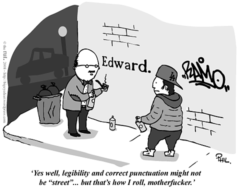
street1.png


enhanced-buzz-21448-1291152053-23.jpg
 
I use Arial Black a lot at work, for making labels that can be read from far away.

The 2 I made into fonts a long time ago are kinda my favorites:
rnef_945_u9a07.jpg


1cjt_2ac_u9a07.jpg
 
Courier New, however, I reserve for formal/business letters.
I can understand using Courier as a display/headline font, or for certain typographic effects — but is there some advantage in making a business letter look as if it was typed on an IBM Selectric circa 1970?
Courier New is a traditional easy-to-read type of font that's ideal for addressing things of a serious manner on paper.
 
Being something of a living cliche, two fonts I love are:

bauhaus
Bauhaus-1.gif


And Avant Garde
AvantGarde.gif


Fonts I hate are too numerous to list. So I won't. But what I hate most is when some sans serif font that was obviously designed for titles and headlines is used as the body of text. Good grief, how am I supposed to read that?
 
I used Times New Roman for most things in school, and it's still my go-to font. I've recently discovered Garamond, though, and I like it better. For a sans-serif font, I really like Calibri, which is what I use for my work emails. It's clean and easy to read. I dislike Arial, though I think I'm in the minority on that.

The only font I truly hate with a passion is Courier New. I had a professor who insisted that every paper in his class was to be in that font (13 point, no less!). It's the most hideous looking non-joke font I've ever seen, and it hurts my eyes to read it. I would have to write my papers in another font and then change just before turning the paper in, otherwise I wouldn't have been able to proofread.
 
I use Times New Roman. That's how adventurous and confident I am with computers. :lol: I don't think I've used anything other than that or Calibri.
 
Courier New is a traditional easy-to-read type of font that's ideal for addressing things of a serious manner on paper.
Courier is a legible but ugly monospaced font (all characters occupy the same width) that's a relic of the typewriter age. If I need a clear, easy-to-read font for serious correspondence, I'd use Times Roman, Century Schoolbook or Palatino.

Any Palatino is a pal o' mine. :)
 
My font tastes change over time. Right now I'm into Futura, Gill Sans MT, and Calibri. I also like a font specific to the institution I work for that we use on all of our correspondence.
 
If you are not already a member then please register an account and join in the discussion!

Sign up / Register


Back
Top