Any pics? I haven't seen any good images of the Discovery consoles sadly.Discovery's consoles have buttons that either look exactly like that, or similar.
-
Welcome! The TrekBBS is the number one place to chat about Star Trek with like-minded fans.
If you are not already a member then please register an account and join in the discussion!
You are using an out of date browser. It may not display this or other websites correctly.
You should upgrade or use an alternative browser.
You should upgrade or use an alternative browser.
USS Enterprise (eventually) on Discovery?
- Thread starter EJD1984
- Start date
No. And no.Tos literally looked like models hanging on strings. Cos it was
They've already invalidated Voyager and DS9 by having holoprojectors all over the ship and they retired the spore drive with no good reason whatsoever not to use it again. A window is the least of the problems here.Instead we get a window we can't turn off and invalidates The Battle of the Mutara Nebula. Hope the crew don't encounter HAL9000.
This. How Kirk and Company got to the center of the galaxy in twenty minutes.
So the "A" was transwarp!
")
Any pics? I haven't seen any good images of the Discovery consoles sadly.
If you go to YouTube and search Discovery bridge tour or something like that, there is a video that shows consoles up close.
Thanks!If you go to YouTube and search Discovery bridge tour or something like that, there is a video that shows consoles up close.
They've already invalidated Voyager and DS9 by having holoprojectors all over the ship and they retired the spore drive with no good reason whatsoever not to use it again. A window is the least of the problems here.
They’re not the same thing. Holograms in Voyager can punch you on the nose, but in Discovery, they’re just a projected image, and not always aligned with the room.
Not only can they punch you, they can perform major surgery to repair the resulting internal bleeding. That's not something which appears within the scope of Discovery's holocoms.They’re not the same thing. Holograms in Voyager can punch you on the nose, but in Discovery, they’re just a projected image, and not always aligned with the room.
They don't bother me in the slightest - the Enterprise-D's viewscreen was supposed to be a deep holographic display, it just wasn't readily apparent because eighties budgets couldn't deliver that on a weekly basis.
That was always clear through the use side angles on face-to-face communication, e.g. when Picard and an alien commander were facing each other but the POV was from the side.the Enterprise-D's viewscreen was supposed to be a deep holographic display, it just wasn't readily apparent because eighties budgets couldn't deliver that on a weekly basis.
Outdated Like SpaceX Falcon rockets?
It’s all personal opinion and I do love you bro and I love most of your posts but here we are in 2018 and Werner Von Braun’s same basic design still rules the modern space age.
Cigar shaped atomic age rockets might be around for a while.
Personally the Hilton garden inn with extraneous blue neon sets of the next gen era look far more outdated than Jeffries original aeronautically engineered designs (minus the building materials and displays of course)
And frankly I do miss the days when actual scientists and military engineers consulted on sci-fi concept rather than caffeine and vape amped up slacker millennial baristas who think Everything should look like halo and Destiny
In my opinion
Great post, couldn't have said it better.

There is a group of people who think the basic rocket shape is somehow dated, even though it's qualities have persisted from the 1930s to the present, and the latest highly precision engineered rockets of SpaceX, like the Falcon Heavy, still look like smooth tubes. The tube is a fundamentally sound engineering shape. I wish people would actually consider things from a scientific/military engineering perspective, because the shapes of the later TNG era ships are actually no more "advanced" than TOS shapes, in principle.
Not really. It used the same techniques as just about anything else that films with models, just a bit more crudely.
Yeah, some people don't seem to understand what TOS was going for; the smooth surfacing was deliberate, as Jefferies reasoned that as machining technology advanced, there would be less need for unclean lines, and most access features would be on the inside. I don't think the original unadorned model is perfect for a modern show, but it's close enough that adding surfacing details would make it fine.

I think TMP's Enterprise, or the Kelvin, are the best expression of Trek design; fairly utilitarian smooth shapes, but with a bit of added panneling which gives audiences a bit more detailing. I've grown quite bored of some of the late era designs like the Sovereign and Akira, even though at the time they were interesting.
This new Enterprise essentially has TMP style detailing, which abandoned Jefferies' intent with the original smooth Enterprise.
Yet no-one is upset with that. There is a reason why the Connie Refit is more detailed then the original. It didn't work in a higher budget movie.
Yet no-one is upset with that. There is a reason why the Connie Refit is more detailed then the original. It didn't work in a higher budget movie.
Indeed, although they used that very sporadically as time went on, and by the time we got to Voyager and the Defiant, it did just look like a big TV screen at the front of the bridge. Voyager did try to show that with the astrometrics lab, as CGI was becoming cheap enough and good enough to do that on a regular basis.That was always clear through the use side angles on face-to-face communication, e.g. when Picard and an alien commander were facing each other but the POV was from the side.
It's just a primitive shape is all. Note that I'm not saying it's a bad design, no, not at all. It was revolutionary, but compared to modern design aesthetics for TV/film, it's dated. Star Wars is not an apt comparison, because some of those designs are still timeless, at least for now. TIE fighters for example. X-wings look kinda 70ish, and the Falcon also kinda sorta, but no Star Wars design comes remotely close to looking as dated as the TOS Enterprise.
If I have to point to specifics, there are 6 things that date the TOS Enterprise.
1. The deflector dish is the biggest offender. Hilariously outdated, and I scoffed that they actually left it pretty much untouched on the DSC version...lol. It screams 60s pop scifi.
2. The saucer shape. Hard to describe this one, but the general shape of the saucer, the curves it has, reminds of 60s furniture and sculpture.
3. Along those lines, the teardrop shaped bridge superstructure is overly simple and calls back to flying saucer simpleness in other 40s/50s scifi.
4. The neck is just odd. it's larger at the top and skinnier at the bottom which just makes a weird visual angle. It's also a crazy simplistic rectangle with no interesting shapes. Same for the nacelle pylons.
5. No surface detail. I get the Jefferies thought a sleek hull denoted advanced tech, and to a point I agree. But even smooth hulls need some kind of panel break up to convey scale and just to have visual interest.
6. The Christmas lights in the bussards with fans in front of them look just like what they are. Not future engine tech.
Clearly the Enterprise designers on TMP agreed, because this is pretty much what they changed. Heh.
I only agree with point 5; panelling helps scale things for audiences. I see nothing wrong with the deflector; modern radio telescopes still use that shape, the reason being that the radio dish has fundamental physics properties, relating to how waves reflect, and can be gathered, that will never change with time, and is fundamental to the laws of the universe. The saucer is a solid engineering shape, that distributes internal space along an equidistant grid. It does not need complicating with artistic abstraction, that make some later Starfleet vessels look like they should be sitting in the Tate Art Gallery. The neck is fine. The bussards are fine.
Respectfully I disagree with the premise that the shape can be periodised the same way as a car, or iPhone. Military vehicles operate along very different principles to commercial goods. They do whatever works.

For example, in modern video games, alien space ships are often given highly detailed fractal shapes that emit glowing light everywhere, like a crystal from a New Age shop. Why? I suspect largely because a production designer thought that looked visually cool, out of context.

But there would be no need on a military vehicle for anything to glow, it would be a detriment to it's stealth profile. Greeblies, as military engineers have known since medieval times, are points of weakness to a blast, and give the blast purchase to tear parts off. Areas of a ship that are clearly internally inaccessible, and clearly have no purpose, look really silly at times, but are a favourite of non-engineer artists. The tube, the arch, the dome, are all more structurally sound to right angles, because they distribute force, a Newtonian impact on a dome is unlikely to collapse it.... hence why the Hiroshima Peace Memorial survived a direct nuclear blast above it, while the rest of the city was demolished. But most importantly of all, Star Trek has a unique aesthetic, which is rendered more dilute, the more ships become generic art student fantasies.
Last edited:
What it doesn't have (or need) is pointless cutouts interfering with the curve of the saucer, or visible weapons turrets, or superfluous multiple struts, or ship parts that are not plausibly connected or accessible from within, or extraneous layers added to hulls and nacelles just because, or any number of other quixotic details that have been added to various latter-day Starfleet ships in the name of making them "modern." It definitely doesn't have one big overly complicated curvy blob blending together into a vaguely aerodynamic shape that only looks good from very specific angles, like, say, the frankly hideous Enterprise-E. But YMMV, of course.
Precisely. A lot of modern detailing does not actually make sense, and looks quite silly the more you look at it from an engineering perspective. Why break up the saucer with pointless cutouts, as some designs do? What conceivable purpose do they serve? Quixotic details is exactly right. If there is a good reason, like a cutout is a shuttle bay, its alight, but at times, they are apparently just art features, like a public fountain.
I think the Kelvin design was really very good, a utilitarian engineering hull attached to a saucer for habitation, and a single almost Large Hardon Collider looking nacelle, with a bit of surface detailing akin to The Motion Picture.
I loved the Kelvin. It totally made sense as a pre-TOS ship, albeit one that had been built for the less forgiving glare of the huge cinema screen rather than a 1960s black and white TV.
This debate about surface detailing was settled back in 1978 when Gene Roddenberry produced The Motion Picture and agreed the redesigned Enterprise would have all of the surface detailing that the original ship did not have. It's heavily implied that the TOS Enterprise was "really" more detailed than we could see on our TV sets.
The Klingon ships were redesigned in exactly the same manner.
No Trek ship since TOS has gone for the smooth hull look, which to my mind makes the Discovery retcon a very acceptable modern interpretation of what the original Enterprise "really" looked like.
When/where?It's heavily implied that the TOS Enterprise was "really" more detailed than we could see on our TV sets.
G
Gonzo
Guest
Doubtful as the Enterprise D was created in the digital age and as such doesn't suffer from the same issues as the original Enterprise 1701 like low resolution, minimal detailing and a very "look what I can make out of household items" feel to it.This thread has been a real eye opener. Will Enterprise-D ever suffer this same level of revulsion? Maybe in twenty years.
Yeah, it's never been implied in canon, we just have some behind the scenes quote from Roddenberry regarding TMP.
So anyway, for those of us who follow the old definition of canon, as canon stands now, the ship goes through three refits.
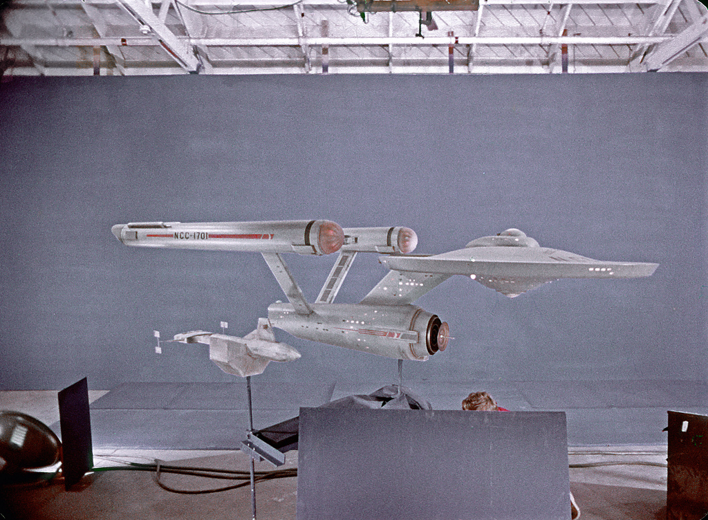
This ship in 2254:

Becomes this by 2256:

Then becomes this by 2266:

Then finally becomes this in 2270:

I guess it's possible. I just wish they had kept the nacelle pylons straight, then it would have been pretty much perfectly acceptable with a bit of head justification. As it stands now, they replaced the entire warp engines twice, with the second refit going back to straight pylons.
So anyway, for those of us who follow the old definition of canon, as canon stands now, the ship goes through three refits.
This ship in 2254:
Becomes this by 2256:
Then becomes this by 2266:
Then finally becomes this in 2270:
I guess it's possible. I just wish they had kept the nacelle pylons straight, then it would have been pretty much perfectly acceptable with a bit of head justification. As it stands now, they replaced the entire warp engines twice, with the second refit going back to straight pylons.
As I said in another thread (or this one, I don't know any more) certain amount of retro elements can actually make the design more interesting. We can see it in this new Connie design. It has modern level of detaining whilst still retaining many of the 60's stylings. I know you don't like than, whilst I absolutely love them. If everyone just tries to chase the same 'modern futuristic' look, then everything just ends up looking samey.It may also be because I work "in the biz" I'm more attuned to modern design trends that are accepted by audiences, but really anyone who watches modern TV shows and movies should have their sense of "futuristic" tuned along with the decades.
Same with fashion. You can easily make convincing and appealing future fashion whilst still making it retro. It probably will date far less quickly than trying to make it what's hip in 2018.
Similar threads
- Replies
- 24
- Views
- 605
- Replies
- 223
- Views
- 18K
- Replies
- 9
- Views
- 6K
- Replies
- 65
- Views
- 7K
If you are not already a member then please register an account and join in the discussion!