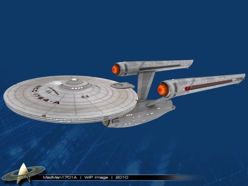
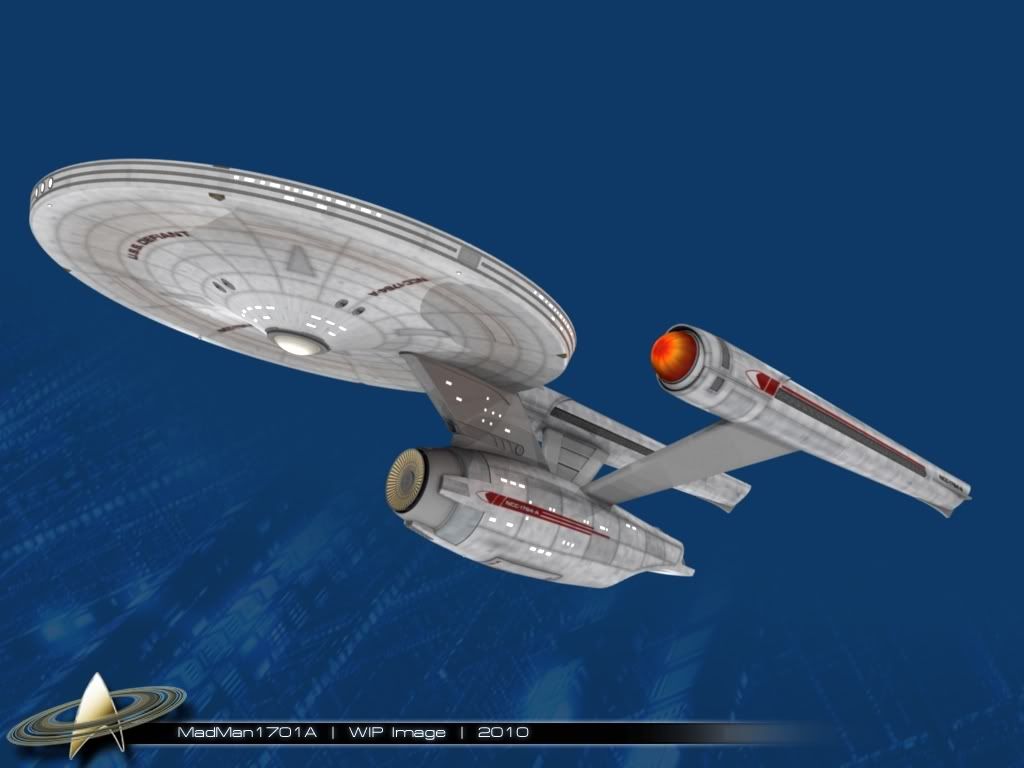
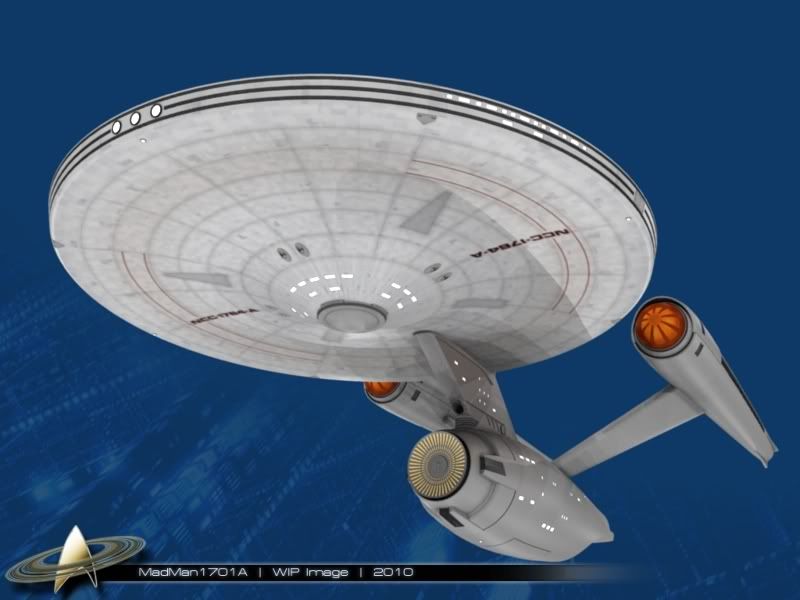
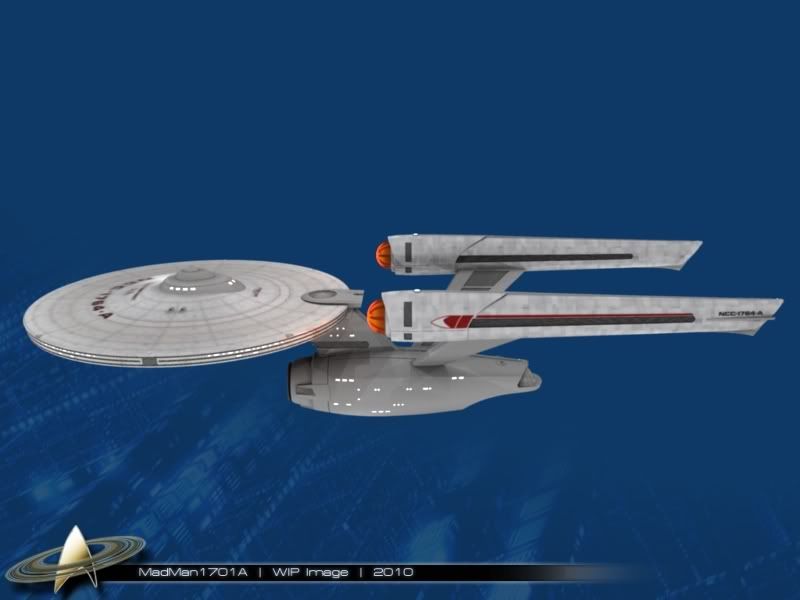
OK, I like where you're going with the nacelles and the cowlings. Much more refined and tastefully done and more believable than the JJprise.
But I'm still not buying into them yet. I need to believe that they DO something, like make more room for powerful machinery or something.
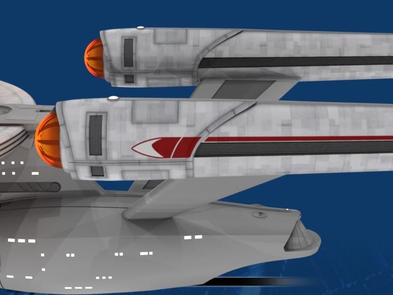
Assuming that the ship is "unpainted," I think the entire cowling's surface texture should NOT match the nacelle. It should look like it's made of a different material, say, to better withstand the cosmic forces of the whatever it is that's under there.
A. The leading edge should look different somehow, it should stand out from the material that makes up the cowling.
B. I sketched that because I like bulges. (No, I do NOT put a sock in my jeans... no need to...) I like things that tend to suggest the engineers had to make compromises for function over pure form. Too pure, too perfect looks unreal. Think of airplanes where they take a nice shape but have to have doors and steps and bulges to make room to wedge in upgraded turbofan engines.
Maybe something under that cowling required the bulge so everything would fit. Maybe it is a turbocharger.
I think that the strip running alongside the nacelle disappears under the cowling too abruptly or just too simply. The bulge was just my first impulse to address that.
C. The edges of the cowling in general seem too sharp and thin. I recommend rounding the leading and trailing edges ever so subtly, to give them a sense of thickness and mass. (But don't go all JJprise!) Here also, as with the leading edge, the trailing edge should be of a different material.
D. Those slots are placed perfectly but they
look too random, like they were cut out. I recommend outlining them, as though they were prefab units dropped into place and astro-welded or something into the cowlings.
")


")