• Welcome! The TrekBBS is the number one place to chat about Star Trek with like-minded fans.
    If you are not already a member then please register an account and join in the discussion!

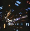
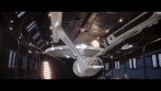
News TOMY Star Trek Diecast Ship Replicas

Hard to tell, but I think it’s the paint job. One has the light lavender/sea foam green finish and the other looks flat gray. The photography lighting washes it out quite a bit.
 
Looks like the next TOMY model will be a 1/350th TOS-style Klingon D7.


So happy they went with it. I absolutely did not want an out of scale D. I'm more excited about this one than the TMP Enterprise.
 
It's hard for me to tell the difference between the two. What are said differences?

The biggest one seems to be the grill on the leading edge of the aft hull is missing for the "on-screen" version. Based on the detail photos, the "concept" version has lighting in the nacelles that isn't on the on-screen version, but I don't think the original model was lit at all, so I don't know if that would mean the "on-screen" version also lacks window lights. It probably does have those lights, since the "on-screen" version has an entire invented shuttlebay.

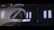
That doesn't appear to be a dash. It looks like another little reddish mark as also exists above and to the left of it. See also the seeming absence of an actual dash in stills of the model.

Do you have a shot of a matching mark or dash on the starboard side?

The resolution is low, but I can see the dash in the linked photo, as well.

I think I can see a matching "-" on the starboard side in this image:
103265935_3071976966220227_1619958066356331799_o.jpg

And the starboard marking is definitely visible in the 4k DE:
Star Trek- The Motion Picture.DE2-0004.jpgStar Trek- The Motion Picture.DE2-0005.jpg

It is hard to tell if they're black (and, thus, text) or very dark red or brown, but there's definitely a matching pair in the movie.

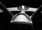
But the black and white photos of the model from after TMP was finished show only one on the port. Which might explain why it was (or they were) removed in TWOK, if that decal/transfer had already come off during production or while the model was in storage and removing the matching detail was the quickest way to keep the model symmetrical.
10405472_894741297277149_1294044791765070462_n.jpg
 
It is hard to tell if they're black (and, thus, text) or very dark red or brown, but there's definitely a matching pair in the movie.

True! I wouldn't call it a dash intended as part of the name, but it's definitely a mark or feature on the hull akin to many others, most especially the same or very similar reddish-block-and-whitish-block mark flipped upside-down a few feet away to the left, as easily seen in your second 4K image:

View attachment 47612

That is to say, while those hull marks make it look like . . .

-ENTERPRISE-

. . . a shorter ship name would make it clearly not intended as such, e.g.:

- TI-HO -

Nice observation, especially about the starboard mark, in any event.
 
So happy they went with it. I absolutely did not want an out of scale D. I'm more excited about this one than the TMP Enterprise.
There is a photo of an interesting, scratch-built D-7 (or D-30 K’ Teremny?) by Peter Carsillo featured in this book set to drop this coming Tuesday:
To view this content we will need your consent to set third party cookies.
For more detailed information, see our cookies page.
 
I love how they charge hundreds of dollars for a model (which is nice, fair enough) but won’t throw in something as simple as a USB C Cable.
If it helps keep the price down even a little bit I'm okay with that... these things are expensive enough! Though I still say the price to quality ratio is the best around when talking large scale Star Trek models.
 
If it helps keep the price down even a little bit I'm okay with that... these things are expensive enough! Though I still say the price to quality ratio is the best around when talking large scale Star Trek models.

They are lovely models.

However, maybe it's just me, but including the thing which powers the model should be more than a courtesy. I could spend less on a video game console and be assured I'd receive the relevant power supply with it for example.

Also, it's not like it would add that much in terms of cost.
 
There's also the e-waste aspect. Now that phones, tablets, and even computers have switched to USB-C for power, people are likely to have an increasing amount of spare cords already, and which one you need also depends on your display set-up. If they throw in a three-foot cord, you'll have to buy another one anyway if you want to put the model up somewhere that isn't directly above a wall outlet.
 
Hard to tell, but I think it’s the paint job. One has the light lavender/sea foam green finish and the other looks flat gray. The photography lighting washes it out quite a bit.
Yeah, I guess they decided some people would be “wtf?” regarding the original filming model’s lavender/greenish grey two-tone scheme, so are also making a “what most people assumed” paint job. I sort of wonder what the split will be?

Honestly, if they’re adding fantastic elements like light up nacelles and made-up Klingon shuttlecraft and landing bay, I’m not sure they really needed to bother with the two-tone version, but I guess it doesn’t really add anything to the cost.
 
Exactly. Repaints have been a staple in the collectibles industry for years. Minimal cost for extra revenue generation, focused largely on collectors with a particular flavor of OCD.

Collectors such as myself, dammit! :D

I'm honestly surprised they didn't do the two pilot variants of the TOS Enterprise. I guess that would have required bridge, nav deflector and bussard swap-out's in addition to repaints, so maybe not as cost-effective for them as a strait repaint, particularly since it was their first outing with this line of models and they weren't sure how popular it would be. Maybe for the 60th...
 
If you are not already a member then please register an account and join in the discussion!

Sign up / Register


Back
Top