-
Welcome! The TrekBBS is the number one place to chat about Star Trek with like-minded fans.
If you are not already a member then please register an account and join in the discussion!
You are using an out of date browser. It may not display this or other websites correctly.
You should upgrade or use an alternative browser.
You should upgrade or use an alternative browser.
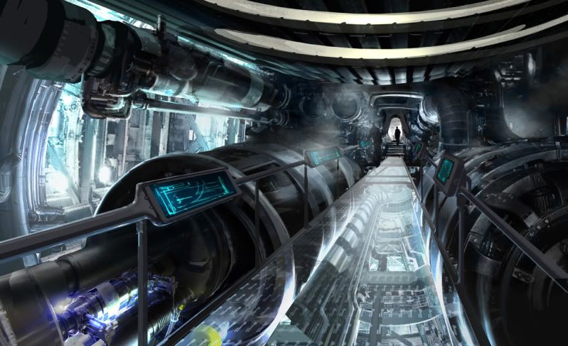
THIS was the design for the NEW engine room???
- Thread starter RAMA
- Start date
Plecostomus
Commodore
Yes but how the hell do you eject that?
Too artsy not practical enough to build or CGI in a believable way. Nice as a WIP though.
Too artsy not practical enough to build or CGI in a believable way. Nice as a WIP though.
Yes the boiler room/brewery that we got in the film was my one major complaint. This - hell ANYTHING else - would have been a better choice. I hope there's a throwaway line in the next movie with Scotty saying something like "...and we finally got around to reconfiguring the warp core..."
Check out the bridge concept art!
http://www.ryanchurch.com/images/startrek11/images/ENTERPRISEbridge.jpg
That's stunning. Just getting rid of all of those damned lights would be the difference of a really bright day and night.
http://www.ryanchurch.com/images/startrek11/images/ENTERPRISEbridge.jpg
That's stunning. Just getting rid of all of those damned lights would be the difference of a really bright day and night.
Check out the bridge concept art!
http://www.ryanchurch.com/images/startrek11/images/ENTERPRISEbridge.jpg
That's stunning. Just getting rid of all of those damned lights would be the difference of a really bright day and night.
don't like the HUD on the bridge...it's the USS. Enterprise not an Airbus.
Yes the boiler room/brewery that we got in the film was my one major complaint. This - hell ANYTHING else - would have been a better choice. I hope there's a throwaway line in the next movie with Scotty saying something like "...and we finally got around to reconfiguring the warp core..."
Ditto. I had some issues with the science but the engineering sections and the sad "warp brewery" they through at us just sucked me right out of the movie.
And I love that concept art. It feels like it could be part of the ship and flows with the rest of the interiors. It also appears to be "high-tech" enough to fit into the time period but dirty enough to feel realistic. Gorgeous!
And just for the record, that concept art could have been realized in a number of ways on screen. It could have been done as a practical gantry with bulk of the set and machinery realized as a composite of miniature and CGI. ILM made that kind of work a benchmark in the Star Wars prequels. Most people would be hard pressed to figure out what was real and what wasn't when those elements are mixed correctly.

Plecostomus
Commodore
I too would like to see something different next time. Don't get me wrong. I liked the one we saw on screen but next time they could do a bit better.
There are several ways to justify such an extensive internal change.
There are several ways to justify such an extensive internal change.
Yeah. One way I can think of is the area we saw was the fuel/coolant tank area. Nothing in the area looked as if it related to warp technologyI too would like to see something different next time. Don't get me wrong. I liked the one we saw on screen but next time they could do a bit better.
There are several ways to justify such an extensive internal change.
It's not very big, is it?
It's not very big, is it?
Well, it's long. And possibly multi-tiered, if the transparent floor is any indication.

Check out the bridge concept art!
http://www.ryanchurch.com/images/startrek11/images/ENTERPRISEbridge.jpg
That's stunning. Just getting rid of all of those damned lights would be the difference of a really bright day and night.
don't like the HUD on the bridge...it's the USS. Enterprise not an Airbus.
The hud got on the airbus by first being military tech. Its actually a pretty good idea to have vital information easily viewable on the view screen.
I really like that section of engine room.
It's not very big, is it?
Well, it's long. And possibly multi-tiered, if the transparent floor is any indication.
Eh. Make the turbines or whatever about four times that size and they'd begin to have something, there.
^ I just assumed that those were intercoolers or injectors and the core was the large curved thing above the gantry.
Similar threads
- Replies
- 192
- Views
- 28K
- Poll
- Replies
- 4
- Views
- 2K
If you are not already a member then please register an account and join in the discussion!