• Welcome! The TrekBBS is the number one place to chat about Star Trek with like-minded fans.
    If you are not already a member then please register an account and join in the discussion!

The STXI Enterprise... REFIT!

Thanks for all the compliments, guys. :) Let's not devolve into a hater thread, though. :)

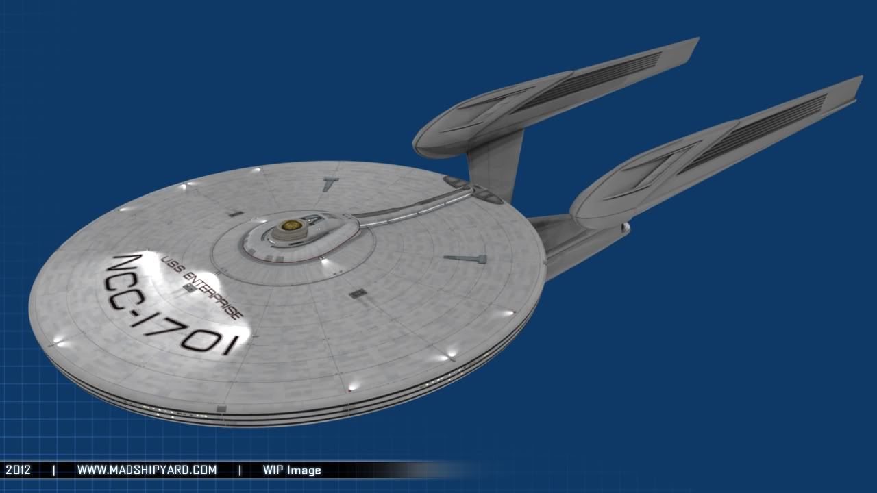
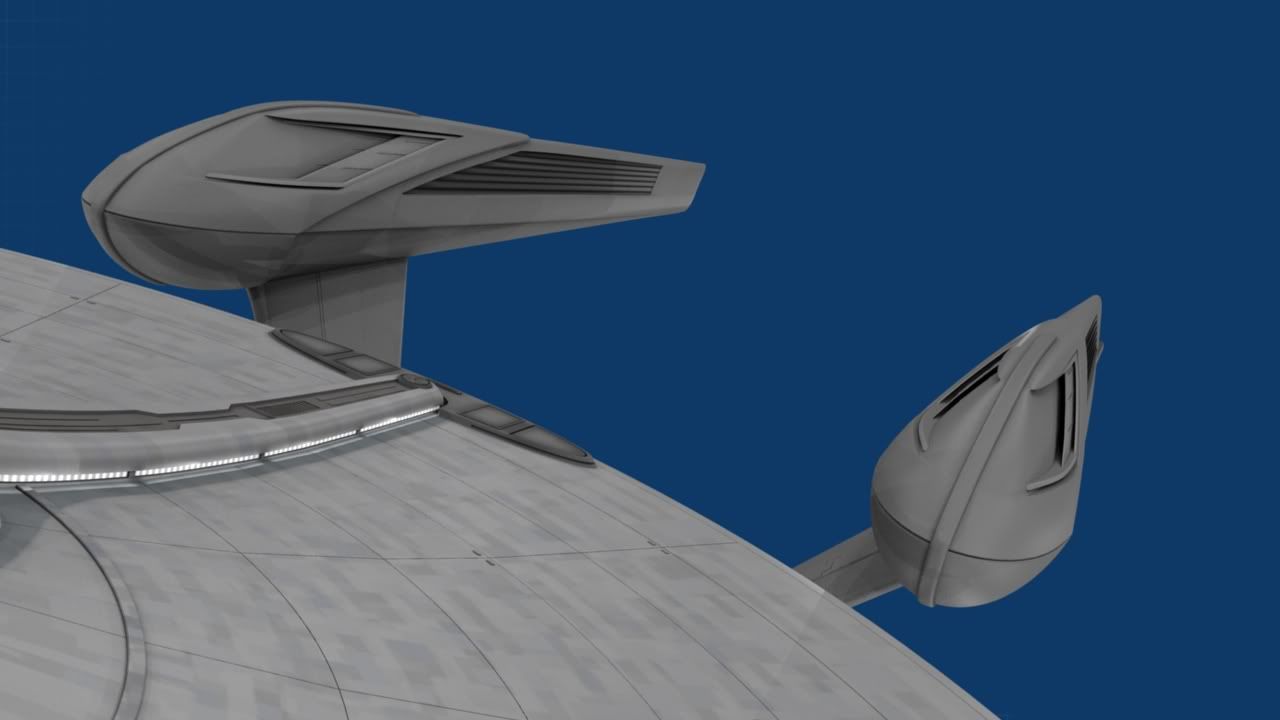
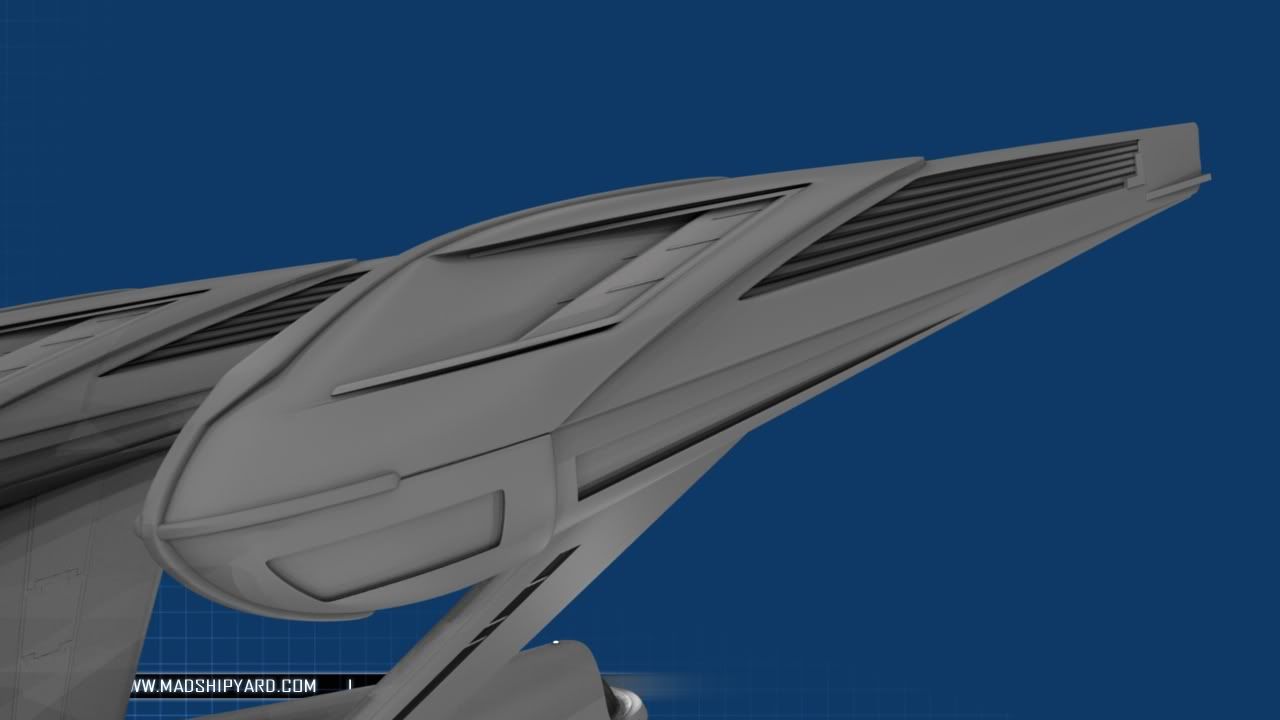
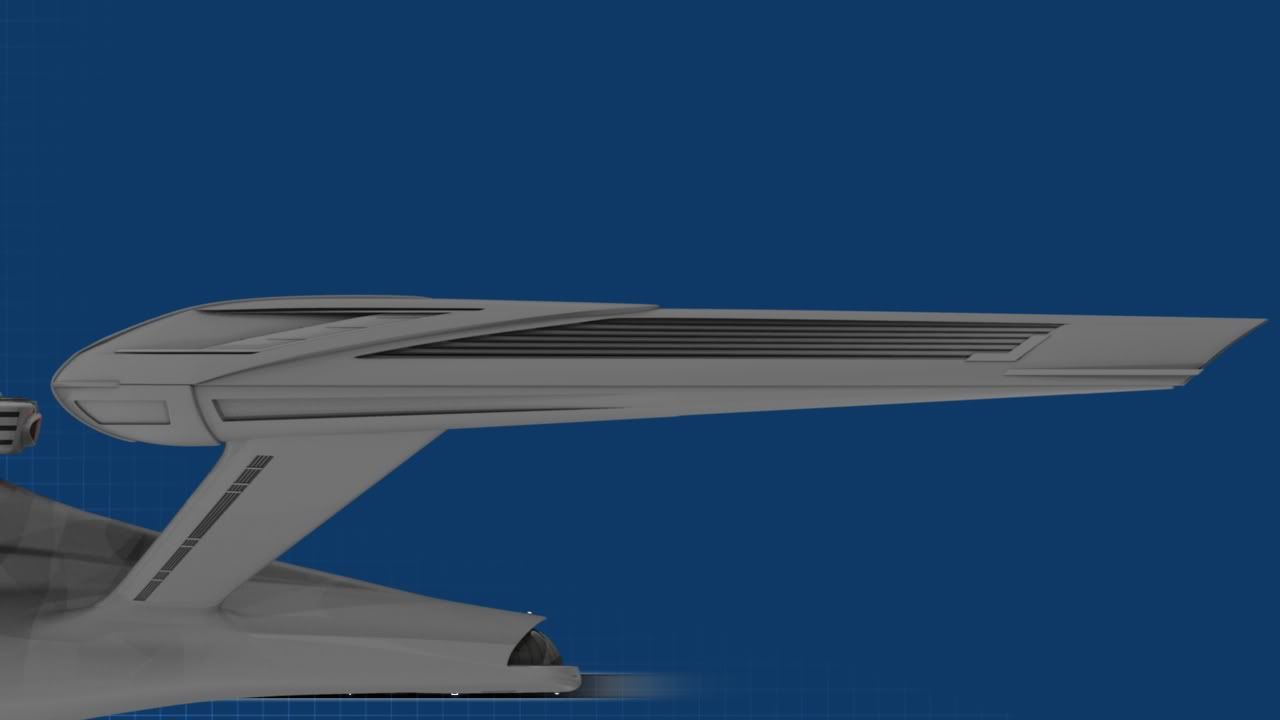
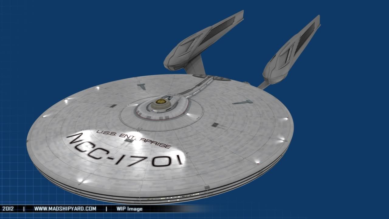
I cleaned up the nacelles some last night, in preparation for more detail. Maybe I'll have pics by the weekend... if I didn't have to work, maybe I could finish this thing. :D

-Ricky
 
Hey guys... actually got some work done on the Nacelle intakes. :)

WIP041.jpg


WIP042.jpg


In the very back of the intakes, there will be some kind of red or blue glow... not really sure yet. I'm leaning towards red, with the vents on the side having the same gold color as the deflector dish.

What do you guys think?

-Ricky :)
 
Thanks, guys. :)

I didn't really think about it looking like a fish head, but I guess they kind of do. :) When I drew the original sketches, I was kind of thinking of the way my pet Veiled Chameleon's head was shaped. :)

More soon, I hope. :)

-Ricky
 
The detail on the nacelles is a bit top-heavy. The bottom looks positively spartan by comparison, If you extended the details to the midline it might help, but i think shrinking down the bottom side would help more. If you leave the details in the same area, I would recommend curving the intake to follow the nose line or add a second smaller 'intake' below it to fill that empty space. Possibly both.
 
The detail on the nacelles is a bit top-heavy. The bottom looks positively spartan by comparison, If you extended the details to the midline it might help, but i think shrinking down the bottom side would help more. If you leave the details in the same area, I would recommend curving the intake to follow the nose line or add a second smaller 'intake' below it to fill that empty space. Possibly both.
I agree. I think the new details are awesome, but the bottom half of the nacelles look pretty bland compared to the top.
 
The detail on the nacelles is a bit top-heavy. The bottom looks positively spartan by comparison, If you extended the details to the midline it might help, but i think shrinking down the bottom side would help more. If you leave the details in the same area, I would recommend curving the intake to follow the nose line or add a second smaller 'intake' below it to fill that empty space. Possibly both.

The detail on the nacelles is a bit top-heavy. The bottom looks positively spartan by comparison, If you extended the details to the midline it might help, but i think shrinking down the bottom side would help more. If you leave the details in the same area, I would recommend curving the intake to follow the nose line or add a second smaller 'intake' below it to fill that empty space. Possibly both.
I agree. I think the new details are awesome, but the bottom half of the nacelles look pretty bland compared to the top.

I agree with both of you, because I havent done anything to them yet. :) I'm actually having a little bit of a block... I want to put another intake down there in front, but the saucer blocks it from the front. Any ideas? :)

-Ricky
 
The detail on the nacelles is a bit top-heavy. The bottom looks positively spartan by comparison, If you extended the details to the midline it might help, but i think shrinking down the bottom side would help more. If you leave the details in the same area, I would recommend curving the intake to follow the nose line or add a second smaller 'intake' below it to fill that empty space. Possibly both.

The detail on the nacelles is a bit top-heavy. The bottom looks positively spartan by comparison, If you extended the details to the midline it might help, but i think shrinking down the bottom side would help more. If you leave the details in the same area, I would recommend curving the intake to follow the nose line or add a second smaller 'intake' below it to fill that empty space. Possibly both.
I agree. I think the new details are awesome, but the bottom half of the nacelles look pretty bland compared to the top.

I agree with both of you, because I havent done anything to them yet. :) I'm actually having a little bit of a block... I want to put another intake down there in front, but the saucer blocks it from the front. Any ideas? :)

-Ricky

Who says the intake has to be on the very front of the nacelle? How about a cooling vent or smaller auxiliary intake on the outboard side of each nacelle in that area?

Just a thought.

Cheers,
-CM-
 
Hey guys, finally got some more time to work on this. :) The front of the engines are starting to remind me of a T-Rex skull, but I think that's a good thing, right?

Anyway, lots of pics tonight...

WIP043.jpg


WIP044.jpg


WIP045.jpg


WIP046.jpg


WIP047.jpg


What do you guys think? More soon, I hope. :)
 
I love the details, but... I just don't dig the profile on the nose of the nacelle. It just doesn't do it for me. Also, what's up with the "dent" on the bridge of the nose?
 
yeah, I kinda have to agree. I really don't want to sound like I'm bagging out your work, because it really is awesome, but that forward profile just really irks me for some reason. to illustrate, here's something I quickly threw together to demonstrate a profile more like the tmp enterprise, which I think balances the nacelle a bit better visually.
madman.png

I dunno, maybe I'm just going blind... and it is after all your project, so who gives a rat's what I think anyway ;)
 
First of all, I have to applaud you, once again, for your beautiful work, MadMan. Very nice touches that, IMHO, are most definitely improvements on the original JJPrise.

Personally, I very much like the direction you're going with the nacelles. But, I have to confess that, by basically flipping that bottom 1/3(ish) element of your latest design up to the top of the structure as WinstonSmith has suggested, the nacelles do (again, IMHO) seem to take on even more of a TMP/refit feel, rather than the somewhat more Sovereign-ish aesthetic they originally had (for me, at least.) It also seems to lend the design somewhat more of an "aggressive" and powerful appearance, I think.

For what it's worth.

Regardless, I'm very much enjoying watching your development of this refit design, and look forward to seeing where you take it.
:bolian:
yeah, I kinda have to agree. I really don't want to sound like I'm bagging out your work, because it really is awesome, but that forward profile just really irks me for some reason. to illustrate, here's something I quickly threw together to demonstrate a profile more like the tmp enterprise, which I think balances the nacelle a bit better visually.
madman.png

I dunno, maybe I'm just going blind... and it is after all your project, so who gives a rat's what I think anyway ;)
 
There is a nice echo of the curve of the neck with the nacelle flipped, but it also makes the whole nacelle look bowed upwards. If you went with that basic shape but tweaked it to fix that problem I think you have a winner.
 
MadMan, let me just commend you for being such a good sport about all the constructive criticism. You're not just an artist, you're an inspiration.

Sojourner, I saw that dent too, but I don't think it's really there. I think the way that forward strip temporarily widens as it goes from top to bottom tricks the eye into thinking there's a dent. Maybe if the "points" on the wide part were made separate pieces with a seam between them and the strip it wouldn't look like there's a dent any longer. Personally, I preferred that strip before it got the wide bit.
 
Hey guys... I think I've got replies for everybody. :)

I love the details, but... I just don't dig the profile on the nose of the nacelle. It just doesn't do it for me. Also, what's up with the "dent" on the bridge of the nose?

Hmm, I agree with you about the "nose dent"... I'll probably get rid of it. Just trying out an idea. :)

When you say the profile, do you mean the whole shape of the front, or just that ridge that runs down the middle?

yeah, I kinda have to agree. I really don't want to sound like I'm bagging out your work, because it really is awesome, but that forward profile just really irks me for some reason. to illustrate, here's something I quickly threw together to demonstrate a profile more like the tmp enterprise, which I think balances the nacelle a bit better visually.
I dunno, maybe I'm just going blind... and it is after all your project, so who gives a rat's what I think anyway ;)

No problem. :) I'm OK with the fact that the nacelle has a different profile that the "Real" TMP E... :)

First of all, I have to applaud you, once again, for your beautiful work, MadMan. Very nice touches that, IMHO, are most definitely improvements on the original JJPrise.

Personally, I very much like the direction you're going with the nacelles. But, I have to confess that, by basically flipping that bottom 1/3(ish) element of your latest design up to the top of the structure as WinstonSmith has suggested, the nacelles do (again, IMHO) seem to take on even more of a TMP/refit feel, rather than the somewhat more Sovereign-ish aesthetic they originally had (for me, at least.) It also seems to lend the design somewhat more of an "aggressive" and powerful appearance, I think.

For what it's worth.

Regardless, I'm very much enjoying watching your development of this refit design, and look forward to seeing where you take it.
:bolian:

I see what you guys are saying, but think the ship looks "faster" with the swept back pylons and nacelles... I've also been thinking of re-designing parts of the saucer, too, so that might help bring everything together more. :)

MadMan, let me just commend you for being such a good sport about all the constructive criticism. You're not just an artist, you're an inspiration.

Sojourner, I saw that dent too, but I don't think it's really there. I think the way that forward strip temporarily widens as it goes from top to bottom tricks the eye into thinking there's a dent. Maybe if the "points" on the wide part were made separate pieces with a seam between them and the strip it wouldn't look like there's a dent any longer. Personally, I preferred that strip before it got the wide bit.

Thanks. :) I know not everyone is going to like the same thing... everything would be awfully boring it they did, wouldn't it? :) I'm just glad you guys like what I'm doing enough to critique it. :)

And yeah, I like the thinner strip too... maybe I'll go even farther and separate the top from the bottom, there.

Updates later this week... maybe. :) We find out tomorrow whether we're having a boy or a girl, so I might be working on the nursery. :D

-Ricky
 
Hey guys... I think I've got replies for everybody. :)

I love the details, but... I just don't dig the profile on the nose of the nacelle. It just doesn't do it for me. Also, what's up with the "dent" on the bridge of the nose?

Hmm, I agree with you about the "nose dent"... I'll probably get rid of it. Just trying out an idea. :)

When you say the profile, do you mean the whole shape of the front, or just that ridge that runs down the middle?
The actual profile of the nacelle side view. It just doesn't match the ship. I would square it off more like the tmp enterprise.
 
If you are not already a member then please register an account and join in the discussion!

Sign up / Register


Back
Top