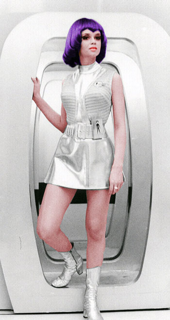
Like someone just transferred over from Moonbase Alpha
I never knew just how similar TMP looked to Space: 1999 until I watched the first episode (I'd never seen the show before.)
Like someone just transferred over from Moonbase Alpha

Still waiting...you all misspelled "awesome".
you all misspelled "awesome".

Shapeless? That thing is tailored AF.God, that bland, shapeless, beige t-shirt with the huge belt buckle practically screams "I was designed in the 1970s!!!" to me.
I think we just inadvertently got the TFF alternate uniform via Strange New Worlds. They showed a TOS movie era uniform with touches of the commando sweater.

Yeah- the maroon uniforms haven't aged well. I thought the new look updated them nicely.Opinions........everyone has them. None are wrong.....I quite like the update.
I don't think it's the command sweater, but touches of the Discovery uniforms. Those stupid shoulders....

(right click open in new window for huge version)
Seriously, how do you screw up the Monster Maroons that badly?
which is? Not trying to be polemic, I’m really curious.I also understand why it was changed for SNW
To be honest, that is pretty much the reason why it was changed. To put a modern spin on it, but also to tie it closer to the SNW uniforms with the tiny deltas on the sleeves and I think the same kind of tall boots, although I'm not really certain about that last part.which is? Not trying to be polemic, I’m really curious.
While I like the new design I liked the original better and the only reason to change it I can see is that nowadays they seem to like changing stuff just to change stuff.
It seems like they wanted to carry over the patterned area on the sleeves/shoulder from the SNW uniforms for visual continuity. The flap then was angled down more so that it was parallel with the shoulder detail, because of that it probably would looked odd if they kept the same angle as the TWOK uniform.which is? Not trying to be polemic, I’m really curious.
While I like the new design I liked the original better and the only reason to change it I can see is that nowadays they seem to like changing stuff just to change stuff.
That's what artists do. They want to explore and create within the parameters set. This is a historical recreation but an opportunity to explore it with different materials.While I like the new design I liked the original better and the only reason to change it I can see is that nowadays they seem to like changing stuff just to change stuff.
I was a kid at the time, so it probably wasn't until TVH that I figured out the rank pins and saw the subtle nods the commander and captain pins had towards the corresponding rank stripes in TOS.Regardless, while I have always liked the idea behind the maroons, I hate how overstylized they are in terms of rank insignia...
Today’s modern is tomorrow’s dated, though. For me TOS had it right: simple t-shirts never age.To be honest, that is pretty much the reason why it was changed. To put a modern spin on it
Indeed. And yes, unfortunately the camera work makes difficult to make out many details.but also to tie it closer to the SNW uniforms with the tiny deltas on the sleeves and I think the same kind of tall boots, although I'm not really certain about that last part.
Agreed. The TNG ranks system was the best for me: easy to read and understand.Regardless, while I have always liked the idea behind the maroons, I hate how overstylized they are in terms of rank insignia
We use essential cookies to make this site work, and optional cookies to enhance your experience.
