In spite of the COUNTLESS times I have seen every TOS episode, tonight I noticed something I hadn't ever noticed before.
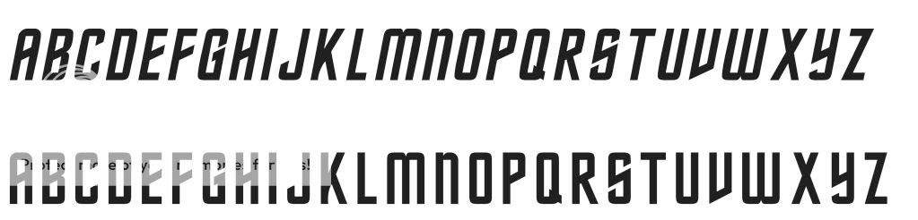
The Classic TOS font has a tendency for it's components to slant upwards to the right (if you know what I mean). For example the crossbar on the letter "H" is not horizontal, but slants upwards to the right.
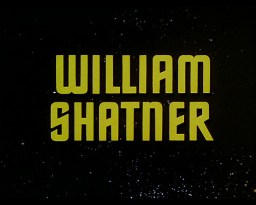
However, the only time it does not, is in William Shatner's opening titles credit.*
The "H" in Shatner is perfectly horizontal, while every other time the font is used (closing credits in the 2nd and 3rd season etc.) it slopes up to the right.
I have no idea why, and I'm sure someone will pop in here and let me know that this is common knowledge and point me to 12 different websites on the topic, but for me, I was still surprised to see something "new" after all these years.
* Note that this has been "corrected" in the HD versions
The Classic TOS font has a tendency for it's components to slant upwards to the right (if you know what I mean). For example the crossbar on the letter "H" is not horizontal, but slants upwards to the right.
However, the only time it does not, is in William Shatner's opening titles credit.*
The "H" in Shatner is perfectly horizontal, while every other time the font is used (closing credits in the 2nd and 3rd season etc.) it slopes up to the right.
I have no idea why, and I'm sure someone will pop in here and let me know that this is common knowledge and point me to 12 different websites on the topic,
but for me, I was still surprised to see something "new" after all these years.* Note that this has been "corrected" in the HD versions