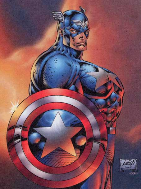
But there's no question that he's more skilled than Liefeld, based on anatomy alone.
He's possibly gotten better but when Jae Lee worked on Transformers/GI Joe Crossover, it was quiet possibly one of the worst pieces I've ever seen. Was it colorful? Sure, but...well...You can't tell which characters are which. His use of lighting and shadows is absolutely horrendous in the Crossover.
Oh God yeah - I was trying to place where I'd heard that name before. I have the tpb of that, its quite a cool idea for a story, a WW2 era crossover, but I'm damned if I can follow the art.