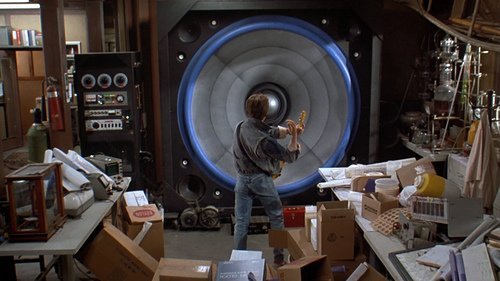
I don't think we can accurately know how it fits until we see it in action. I like the black and yellow checker pattern but hate the huge "speaker" looking things
-
Welcome! The TrekBBS is the number one place to chat about Star Trek with like-minded fans.
If you are not already a member then please register an account and join in the discussion!
You are using an out of date browser. It may not display this or other websites correctly.
You should upgrade or use an alternative browser.
You should upgrade or use an alternative browser.
Reveal: New transporter design!
- Thread starter Balok's Decoy
- Start date
I think my signature from now on will simply be "#reckless speculation"
The whole space ship USS Shenzhou, was designed and built by a drunken Pakled.
The bridge is the wrong way round and full-glassed.
The transporter room was also built around the wrong way.
Reminds of the architect of Numerobis, whose temples were also built around the wrong way. I was interested in everything that was still in the wrong way .....
The bridge is the wrong way round and full-glassed.
The transporter room was also built around the wrong way.
Reminds of the architect of Numerobis, whose temples were also built around the wrong way. I was interested in everything that was still in the wrong way .....
Phaser is a fine name...real world phasers phase different things. In Trek, the phaser phases energy....it's an energy weapon. Real world use of the same word doesn't negate it in the way Lasers did. Laser was too specific. Is Laser even used in the Menagerie (only bit of the cage that is actually canon after all.)
The hand weapons are specified as lasers two in The Menagerie Part II.
The same tow laser references are in The Cage.
Phaser is first mentioned in Where No Man Has Gone Before in reference to the rifle. No description, laser or phaser, is given for the hand weapons; though they are nearly visually identical to the ones in The Cage and The Menagerie.
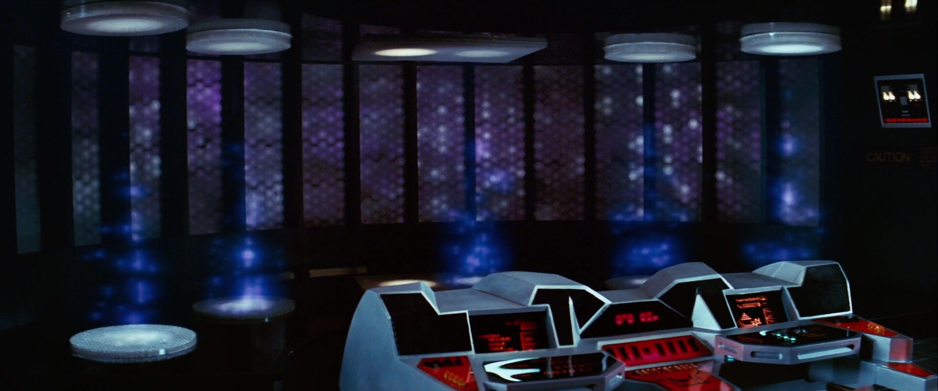
I do not get the transporter room design, even if an older ship. Looks nothing like an NX transporter room or a Pike era one.
What bothers me more then the spinning thing, are the crooked yellow squares that look like a 3 year old cut them out.

I realize that is intentional in a Hundertwasser straight lines must be avoided at all cost sort of way, but I just hate the look.
All in all I can see this as being a pre-TOS Transporter room, less as being a post-Enterprise Transporter room. To be fair I do think the Transporter is something that Enterprise depicted as to advanced. Someone here wrote that an Enterprise era Transporter should have looked like one is stepping into a particle accelerator. I agree.
By the way, are those black things floor mats?I guess it really could be that the Transporter room was damaged as some here have suggested.
That is...sooo...damn.....sloppy. It's like bad asphalt shingles. WTF???????? Even classic Doctor Who in the 70s put together better-looking sets.
Not only that, the overall effect of the room is "busy" in an ugly sort of way. Too much random sh*t going all different directions at once. All sound and fury signifying nothing.
As a piece of speculative technology, it sucks having those dishes behind rather than above/below. As a piece of architectural art, it sucks rocks, which is my problem with much of modern production design that we've witnessed since Trek 09 onwards. I think the art departments in Hollywood have a serious talent shortage these days.
Put this right up there with the JJ-Prise brewery engine-room and the shuttle bay with "obstacle course" obstructions as far as stupid and ugly.
What bothers me more then the spinning thing, are the crooked yellow squares that look like a 3 year old cut them out.
That is...sooo...damn.....sloppy. It's like bad asphalt shingles. WTF????????
TOS timeline confirmed!

It's... different - but I'll wait and see where they are going with this.
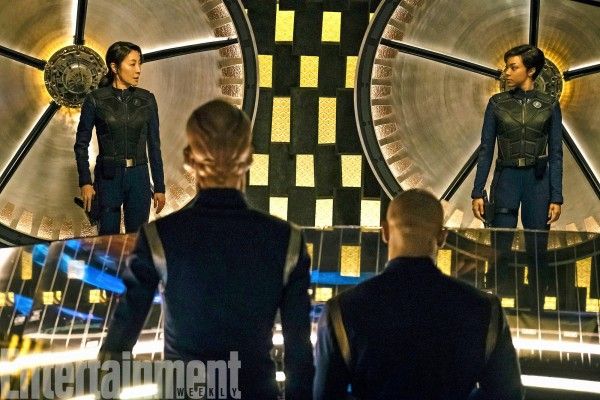
And when it's NOT being used to sling people across the far reaches of space...
After seeing how slick the bridge is, I'm really curious as to how... THIS... set happened. Not that it looks like a sloppy concept, but the execution really needed a second look before they rolled cameras. Unless there's some reason it looks like the set was slapped together and then covered with some sort of futuristic cargo netting?
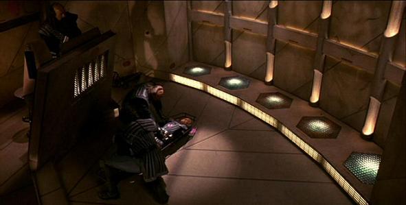
To be fair though, it did remind me of another couple transporter rooms that had people line up against a wall:
Mark
After seeing how slick the bridge is, I'm really curious as to how... THIS... set happened. Not that it looks like a sloppy concept, but the execution really needed a second look before they rolled cameras. Unless there's some reason it looks like the set was slapped together and then covered with some sort of futuristic cargo netting?
To be fair though, it did remind me of another couple transporter rooms that had people line up against a wall:
Mark
That was exactly my first thought, too. "Oh, look, they can beam through space *and time*!"
Well, remember: as we learned in The Cage, they've broken the "time barrier"! It was mentioned, ergo it MUST be canon. See, and everyone thought Discovery would retcon TOS.

I don't think I'd say they're showing things off "so early", it's taken them forever to start to reveal anything about the show.Trek is about mind and idea expansion for me. This is definitely doing it. Can't wait to see engineering and weapons fire. They are really making this different. I like what I'm seeing so far and seems like they are proud of it to show it off so early. September 24 can't come soon enough.
Looks like DJ Saru's Dance Party
It seems like change for the sake of change. Not transitional between Enterprise and TOS.
Could possibly be explained as "experimental".
Could possibly be explained as "experimental".
I don't think I'd say they're showing things off "so early", it's taken them forever to start to reveal anything about the show.
I took another look at that shingle background and I have to hope that this is not a still from the show but from behind the scenes before they finished the set. It looks like those black things are meant to come off and the background would be a seamless gold pattern. That would at least improve it, but not by much.
I took another look at that shingle background and I have to hope that this is not a still from the show but from behind the scenes before they finished the set. It looks like those black things are meant to come off and the background would be a seamless gold pattern. That would at least improve it, but not by much.
It could be a patch or just meant to be do old its became slack. I have seen such things IRL, that with age and use become loose and sloopy looking.
If that is the case, I am fine with it.
in relation to the cage and lasers etc from that episode, might the cage not be prime universe or other way round cage is prime while tos is just another of many mirror universes
That's why I hate the "prime universe" crap. There's four TV series, and ten movies. Anything that runs counter to those isn't Star trek. See how much simpler that is than trying to figure out if somethings in the so-called "prime," JJ, 3rd, or kerfuful universes.
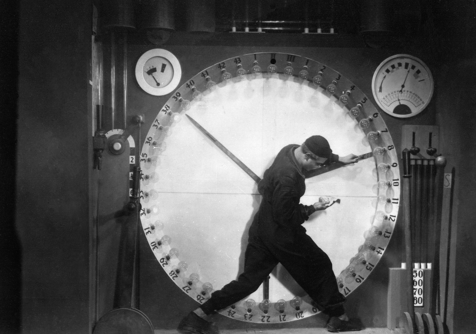
Metropolis (1927)
"No audience could ever stand something that looks old," they said.
"No TV producers would be so stupid," they said.
No, it looks like Discovery era, because that's what it is.I do not get the transporter room design, even if an older ship. Looks nothing like an NX transporter room or a Pike era one.
")
The design is weird and that's why I like it. They certainly seem to approach this without preconceived notions about some of Star Trek's established aspects. I really respect that. I dig the idea that that's what it actually looks like behind the regular transporter wall. And as @{ Emilia } noted, at least it isn't blue.
The crooked tiles are odd, but I'm sure if you scrutinize stills from hit shows like Game of Thrones or The Expanse you will also notice all sorts of gaffes, like people wearing regular wrist watches or other wardrobe malfunctions.
The vests are cool and remind me of the body armor in Dredd.
.
"No audience could ever stand something that looks old," they said.
"No TV producers would be so stupid," they said.
And they would have been correct. Rhe two images are not the sane, the only thing tghet have in common is the prop has a circle in the center.
Similar threads
- Replies
- 3
- Views
- 248
- Replies
- 482
- Views
- 61K
If you are not already a member then please register an account and join in the discussion!