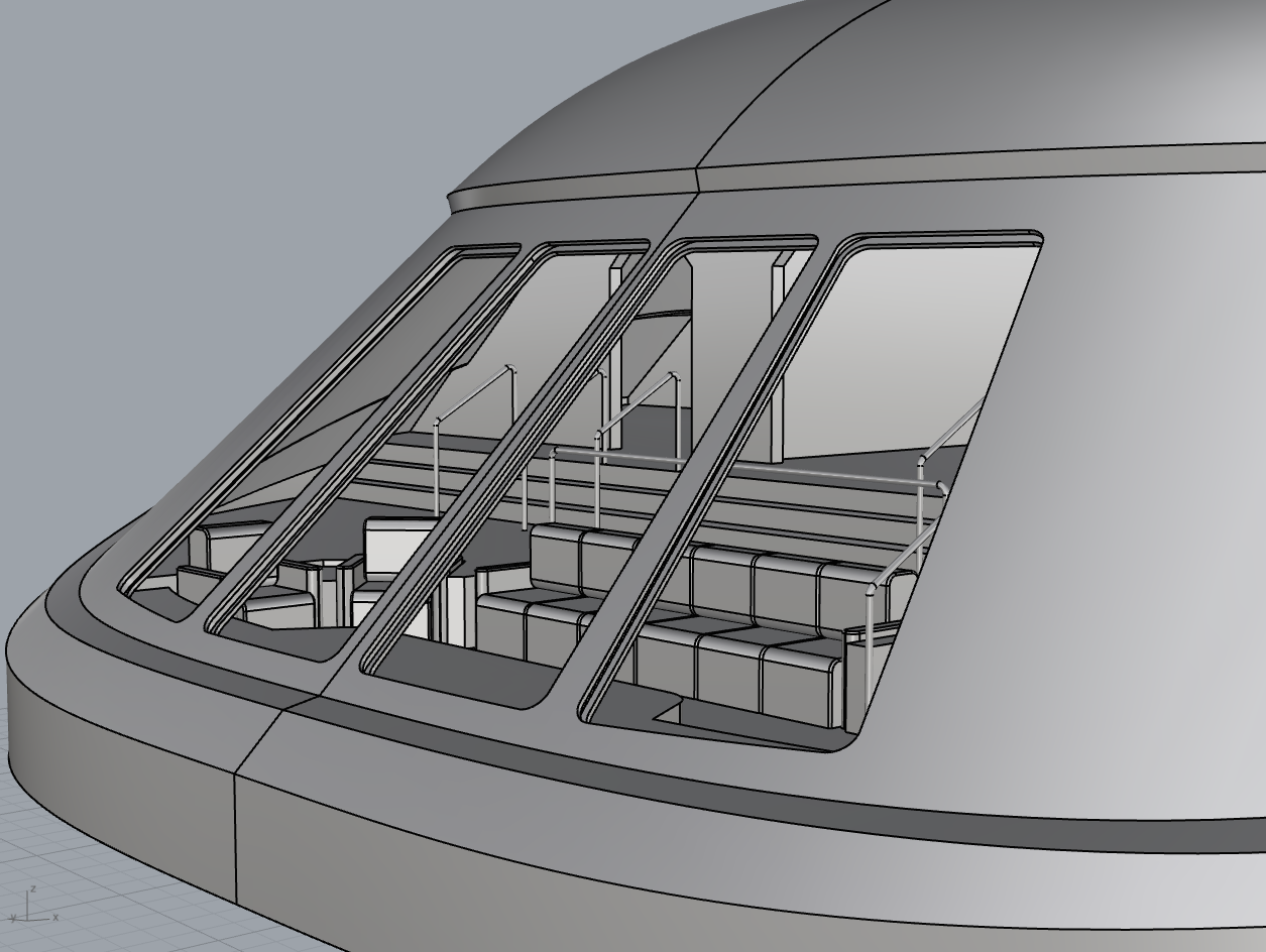
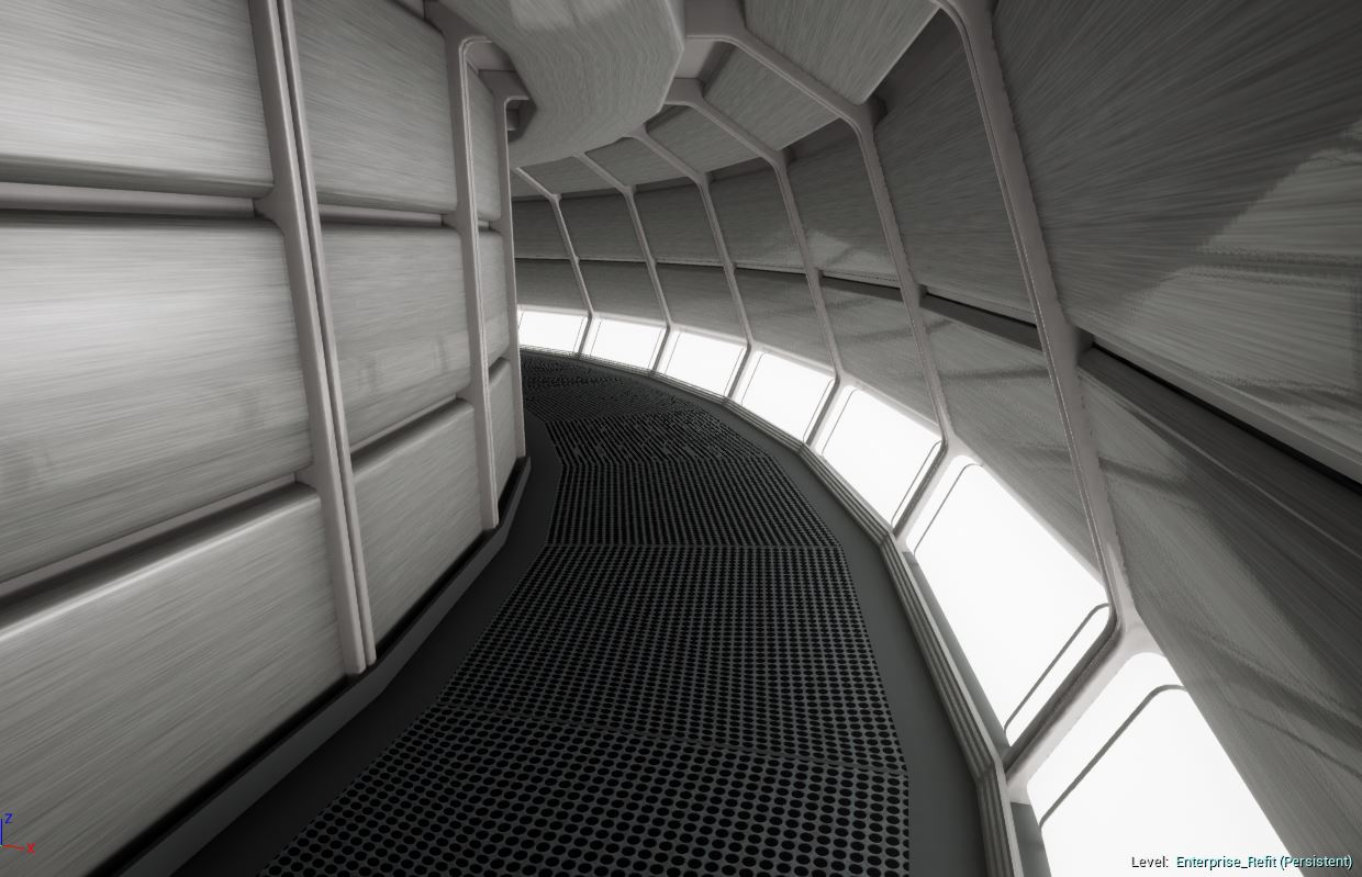
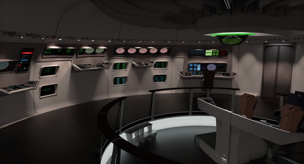
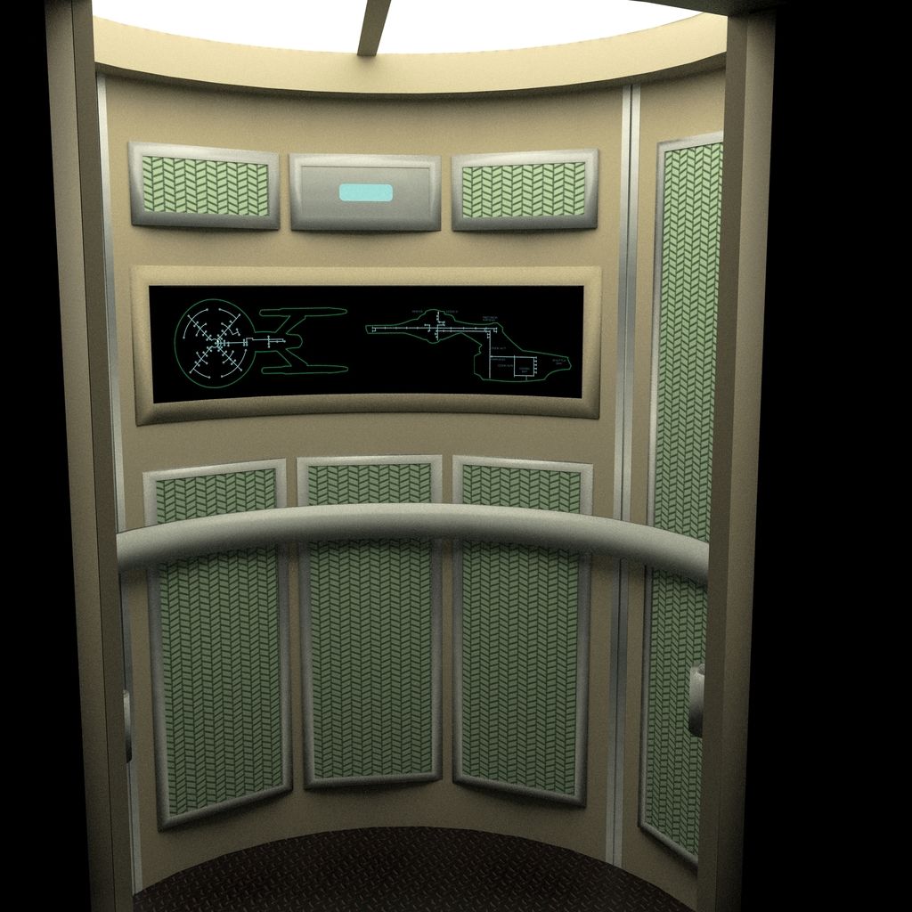
Getting a little further along on the officer's lounger window frames. These are some work-in-progress models I have been working on for a while now.
It is based on a myriad sources and a key one for this part are the miniature blueprints drawn up by
Leslie Ekker, for
Astra Image for construction of the miniature "set" interior used for filming the approach of the Vulcan shuttle in
TMP, the initial side-elevation sketch Ekker did which was sold to me by
Lora Johnson, who was the author of
Mr. Scott’s Guide to the Enterprise. and extensive photo analysis of the filming miniature.
These are idealized and reconciled with the exterior filming miniature and are worked out at the scale level of "in-universe" down-to-the-milimeter. Still have a long way to go, but finally have a hyper accurate baseline on some of the key shapes.
This will allow me to begin to work backwards, along the lines of what you have been doing Dan, and begin to build out the
longeron, stringers,
spars and
ribs, for the underlying structure of a presumed 23rd century take on
semi-monocoque construction of the
Enterprise-refit.

")


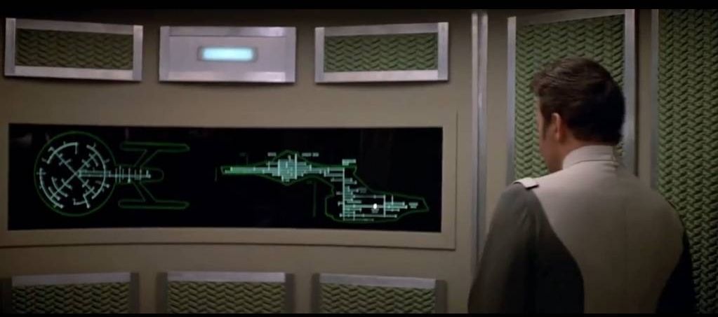
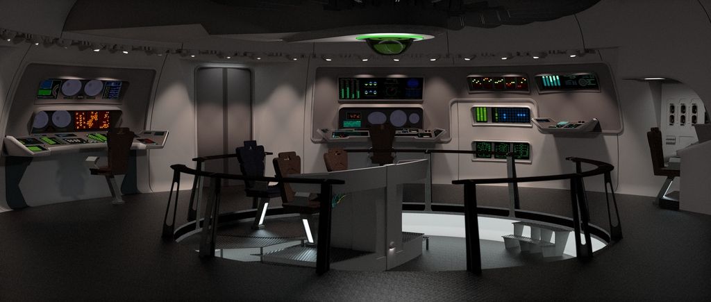

") Cutaway artist Dave Kimble thankfully had more time to flesh out the ship interior for his big poster. - Rick
Cutaway artist Dave Kimble thankfully had more time to flesh out the ship interior for his big poster. - Rick