-
Welcome! The TrekBBS is the number one place to chat about Star Trek with like-minded fans.
If you are not already a member then please register an account and join in the discussion!
You are using an out of date browser. It may not display this or other websites correctly.
You should upgrade or use an alternative browser.
You should upgrade or use an alternative browser.
Planet of the Titans U.S.S. Enterprise
- Thread starter LordSarvain
- Start date
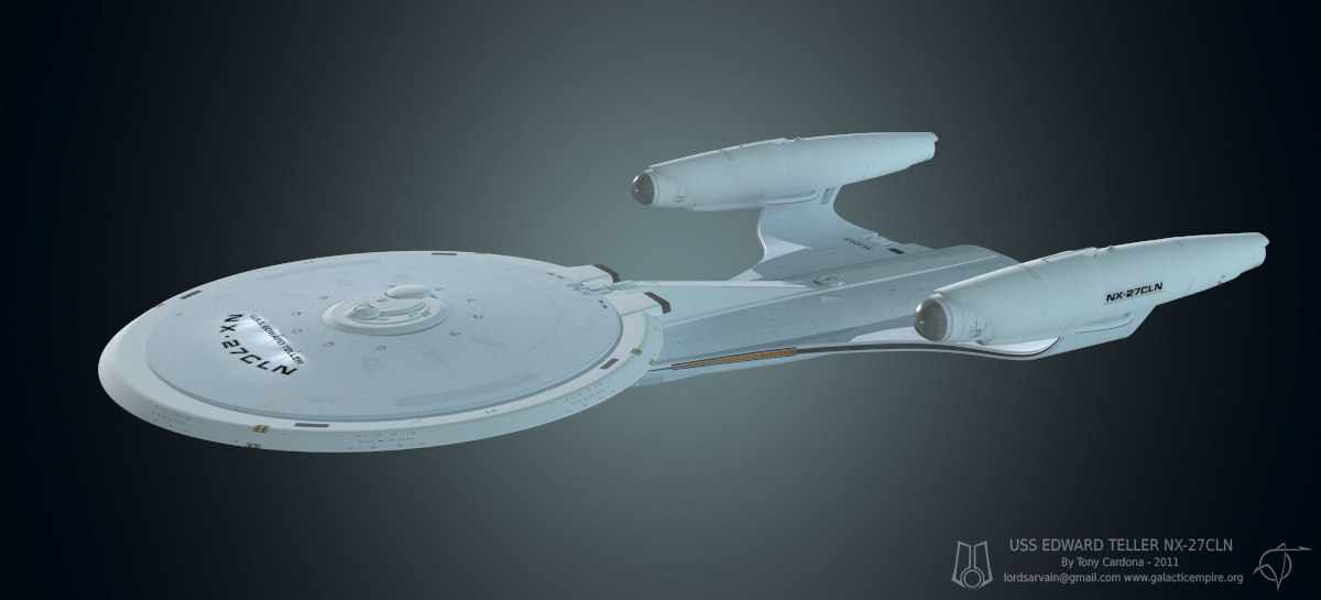
Well the Bluefin and Sineus are more developed because I'm going to build those out and texture them. The Oscar and John models are just going to be "concept" work for a development poster for the Edward Teller. Although, I do like that double warp engine on the John so I might try an experimental set up on a Constitution.
And speaking of the Edward Teller, got some more texture work done. Still trying to keep it subtle and yet have something there to break up the expanse of the primary hull. I'm going to add in some hatches here and there but I don't plan on any grid lines, at this time... I never really much cared for the view of the ship from the front, but this second pic here doesn't look half bad.
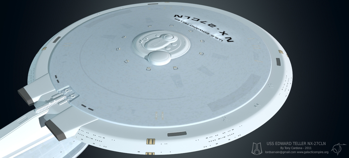
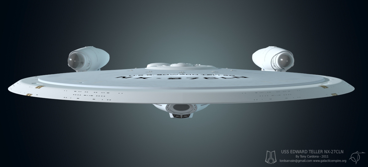

And speaking of the Edward Teller, got some more texture work done. Still trying to keep it subtle and yet have something there to break up the expanse of the primary hull. I'm going to add in some hatches here and there but I don't plan on any grid lines, at this time... I never really much cared for the view of the ship from the front, but this second pic here doesn't look half bad.
Nice... I'm liking the subtle details that pop when you get up close and personal. It keeps it clean and sleek looking from afar! Damned nice!
")
Beautifull, especially that second rendering. Therefore, I suggest you to make the torp launcher integrated into the sec hull´s belly, under the deflector. The way it is now, looks like a kitbash, or like the feds just used this version as a testbed of a future weapon integration. ")
Beautifull, especially that second rendering. Therefore, I suggest you to make the torp launcher integrated into the sec hull´s belly, under the deflector. The way it is now, looks like a kitbash, or like the feds just used this version as a testbed of a future weapon integration.
Well a while back I did actually put the torpedo launchers inside the secondary hull but it just didn't do it for me. I guess I could try and give some curve to the launcher. I do like the look of it sticking out of the bottom though, and without it there, the secondary hull looks like it needs something there...
It's kind of styled like an automotive scoop, I think. Implies a bit of power for that slim engineering hull. But I agree that it's a bit prominent. Very Pontiac, if you will.
Well a while back I did actually put the torpedo launchers inside the secondary hull but it just didn't do it for me. I guess I could try and give some curve to the launcher. I do like the look of it sticking out of the bottom though, and without it there, the secondary hull looks like it needs something there...
I believe that some curve can make it to look more... natural.
 The ship has elegant and smoothed lines, rounded in general. Just the torp is in the square direction, and it breaks the design flow.
 Here was a physical model attempt of the McQuarrie/Adam concept
http://www.starshipmodeler.us/gallery14/bb_100511_endurance.html
http://www.starshipmodeler.us/gallery14/bb_100511_endurance.html

LordSarvain, your ship has a real Concorde vibe.
Well put - just like Concorde, this design has a real beauty about it. It's nicely balanced and I like the white hull.
Can't wait to see this rendered in a proper space environment (i.e. Earth orbit).
S.O.
Hardly. It's a kludge based around McQuarrie's paintings, but not an attempt to model what he painted.Here was a physical model attempt of the McQuarrie/Adam concept
http://www.starshipmodeler.us/gallery14/bb_100511_endurance.html
In my opinion, this design, and especially your rendition of it, is far more convincing than any other Federation-based ship in Star Trek lore, canon or otherwise. I can totally see this as a real ship some time in the future.
That's a nice design.
Although I don't understand the need for the dish on the primary hull next to the bridge.
I actually like the dish. It seems out-of-place yet doesn't.
Hardly. It's a kludge based around McQuarrie's paintings, but not an attempt to model what he painted.Here was a physical model attempt of the McQuarrie/Adam concept
http://www.starshipmodeler.us/gallery14/bb_100511_endurance.html
It's a kit based on those cardboard study models.
LordSarvain, your ship has a real Concorde vibe.
Let's hope it won't be as disastrous as that one was.

Nerdgasm. Don't make the surface too busy and no windows. The Ent has electronic viewing ports, no window washers. It also had some sleek lines painted on. Check out Vector's designs. The reason why it was never used? GREED.. There's something seriously wrong with the universe if it's never used and you're not paid handsomely for your work with McQuarry's designs. Congrads. Different in this case is always better, especially with the deflector dish. Very nice touch. Much better.. the best of both worlds. It's much better with the curved pylons but the the saucer seems a little too flat and/or the space station is too cramped. The saucer head needs alot of space above it for no other reason than because it does. Either that or the saucer has to be bulkier or thicker. There were two phase two ships. A elongated version and a shorter one with stockier nacelles. You picked the one I always loved luckily and the better one - the longer one. Though the other one could still be used as a smaller model version. There was also the round saucer ship seen in All Good Things as the medical vessel that I liked alot. Ironically I think that can have alot of windows for some aesthetic reason, and please don't tell me aesthetics have nothing to do with it. Nice job.
Similar threads
- Replies
- 25
- Views
- 2K
- Replies
- 10
- Views
- 948
- Replies
- 4
- Views
- 8K
If you are not already a member then please register an account and join in the discussion!