I've been in school for 4 years now. I don't need somebody on a forum to "make me face the facts." I value the opinions of everyone here but if you start taking the holier-than-thou arrogant attitude, that's a quick way for your advice to be quickly thrown out the door. If you want to give someone advice, give some thought as to how you give it, or it may end up falling on deaf ears.
If you don't want my advice, just say so. Really, it's no problem; I'll withhold it. I'm certainly not into forcing my views upon someone. However, you do misunderstand me: What I mean with 'trying to face facts' is a simple response to you assumption that I was trying to be "snarky"; it almost sounds as if you're a bit quick to be offended. I understand; a logo is like your baby; especially if it's your own logo. But you should be a bit hard on yourself in order to maximize it's potential. Especially concerning your own stuff. Clients will be hard on you as well.
As I already said...you guys aren't my clients...and I've been through 4 years of school and working with clients. I know what it's like, and am well aware of what goes into a designer-client relationship. Honestly, you sound mildly bitter about your previous experiences with clients...
Bitter? Nah.

More a bit sarcastic. However, if you feel clients are going to be all friendly and subtle, you're in for a bit of a shock; clients at school are quite a bit different then clients in the real world. For one, they know you're a student and treat you accordingly. Two, usually, these are non-profit clients, or clients who don't want to spend money on the product you make for them. As such, they don't really have high expectations and are easy to please.
So it doesn't look clean, modern, precise or consistent to you? I'm trying to be open here, but I fail to see how you don't see that.
Because what I associate with those terms might not necessarily be the same things you associate with them. That's always the crux in designing logo's: you can put all sorts of meaning in them, but most people won't see it. All you can do is pick one or two and take an obvious way of representing it.
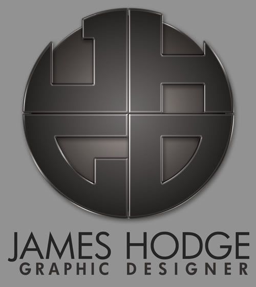
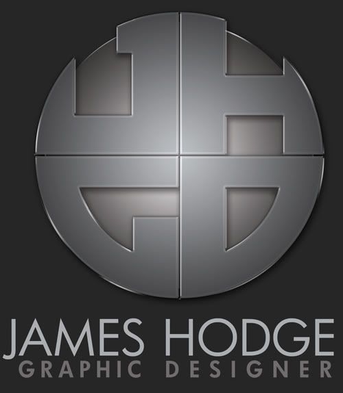
The basic logo is, yes. The stylized version was created in Photoshop.
Then it might be best if you made the stylized version in a vector program as well; fortunately, the effects you've used are very easy to do in Illustrator (with a bit of gradients, transparencies and effects). Besides, a Photoshop logo isn't useful at all; no matter how small you scale it; the anti-alias algorithms will always make it somewhat blurry. Not something you'd want in a Logo.
First of all, there is color in both versions. There is a slight bronze hue to both stylized versions. It's not a slate grey, because yes that would be very sterile.
The bronze hue isn't very clear to me. Even so, it would still be a sterile, bronze medallion of some sort; still a bit on the safe side, if you ask me. Why not try something different, something daring? You are trying to stand out of the crowd, aren't you?
I'm not saying you should paint it electric blue with lens flares. However, usually, when designing a logo, there's a design phase with a lot of sketches, a lot of tryouts. You're only presenting a single logo here; have you not fleshed out other possibilities?
Second...it's supposed to look geometric. As I said, my design strengths center around being precise and detailed and design uses a lot of geometry. SO I also fail to see the problem with a designer's logo looking geometric.
Using correct geometry is one of the basic steps in a design, true. However, your logo isn't meant to represent yourself to other graphic designers, it's meant to represent yourself to possible clients. They don't associate geometric shapes with design; they associate other things, like creativity, practicality or perhaps cost. Just a few things off the top of my head; it could be a lot of things, actually. The most important thing is not what you think about your logo, but what your possible clients think about your logo; the impression it makes on them.
Well, it just so happens that I also have photography experience...although I am having trouble seeing a camera lens anywhere in my logo. And please, please explain to me how any graphic designer's logo would *say* that they're specifically a graphic designer by just the logo alone and without a word mark. You do realize that word marks are commonly a part of a logo, yes?
It's not a resemblance of a camera I implied, it's the feeling I got when I looked at it. Very geometrical, some sort of iris, made of metal or black plastic. Just an impression.
Of course word marks are commonly a part of a logo, but a logo should usually also stand firm alone. Perhaps not at first, but certainly when the brand has become known. A logo doesn't have to resemble a physical object, but it if it does make the same impression as something that has no connection to the brand itself, that has to be a conscious decision, not a mistake. You can only break the rules if you know how to apply them correctly, you know.
")
This is where you completely lose me. Blurry and unclean? Where? Maybe you need a new monitor, because you're having trouble seeing color and lines look blurry. I could show you the vector file with the guides lined up...everything is lined up, nothing is messy or unclean.
It probably looks blurry to me because it's been edited in Photoshop. Try to re-create the effects in Illustrator and then set them side by side; you'll probably see the difference. Or perhaps it's just the use of dropshadows and bevels and such that makes it look less 'clean' and 'clear-cut' then it could've been.
Also..it has a bevel AND a drop shadow. What exactly is wrong with both? The idea is to make it look like a real 3D object...
It's quite trendy, at the moment, to make a logo into a 3D object; so there's nothing wrong with that. However, it doesn't really do it for me; it doesn't really look 3D. Perhaps you could try playing with the settings, strokes, spaces, lighting etc?
I've considered a spherical approach, basically wrapping it around a ball, but have never fully fleshed that idea out.
Why not? If you're going to make a logo, try to flesh out ideas like these. They don't have to be perfect, they don't have to be correct down to the pixel, but they should give you a rough idea if it'll work or not. I do see a lot of potential in this logo, but it hasn't reached it, yet.
As for the lines becoming blurred...why would they? Most logos have a minimum size they're allowed to be printed. That's part of any brand standards manual. They impose that size restriction for that very purpose...to keep the logo from getting too small.
Yes, but as your logo stands now, the size you've shown us is about the smallest size you'll be able to get without the white space becoming indistinct. Not exactly practical, is it?
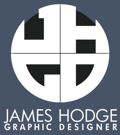
Which is exactly what the "basic B&W logo" I posted in the original post is for...
Yes, but the basic B&W logo is so completely different from your "full-color" one (that difference could be less, even keeping it black and white -- try changing the sphere to an outline, for example), that it might as well have been a different, similar looking logo all together.
Again, the basic logo would be used for any faxing or stationery. The stylized version would be used for web and larger format printing. Both logos word just fine on other backgrounds. That's why there's a dark and a light version...depending on the lightness level of the background.
Not everything is grey. How does it work on a white background? Black? Color, perhaps?
Stationery. Stationary is when something isn't moving.
My point still stands.
This is where you lose me. I'm a student and don't have a ton of cash to spend on materials, but I have never, ever had a problem with being able to afford quality paper and/or printing. What sort of paper do you print on that you have such bad results?
It's not the paper; it's the printing process. Even if you design a logo in vector format (instead of Photoshop, as you have done), the gradients will become a dot pattern; that's the basics of printing, you know that. Usually doesn't look very good in a logo, unless you take specific steps to combat the problem.
I'm not trying to reject any constructive criticism. I've actually implimented a change from something you mentioned that I hadn't noticed. But I'm having a hard time finding any real rationale for some of the things you're asking and suggesting, nor do I see any reason for the attitude you've presented here.
Try to show your logo to more non-designer people, see how they react. Don't say anything, even show the logo without the text. What do they see? What do they feel? What does it look like? Etc.
And, as stated above, I'm simply trying to give advice, but I'm not going to be all cushy and fluffy on you while giving it. I don't see why you would expect me to. I'm not standing here on a soap box trying to explain to you how the world works; you should know that already, at least for a bit. All my posts are IMO, unless I state something to be a fact. As far as I can tell, it works that way with most people.
")
 See? inexperience at work here.