• Welcome! The TrekBBS is the number one place to chat about Star Trek with like-minded fans.
    If you are not already a member then please register an account and join in the discussion!

OT: Personal Promotion Logo Design

Tiberius Jim

Vice Admiral
Admiral
Well, I'm nearing the beginning of the end at The Art Institute, so I've decided to use my 3 week summer break to get everything in order for the 11 weeks of hell that await me. By the end of it I'll have my entire portfolio of work compiled, designed and bound into some form of book, as well as my resume, business cards and anything else I'll need to wow the industry people I'm hoping will hire me.

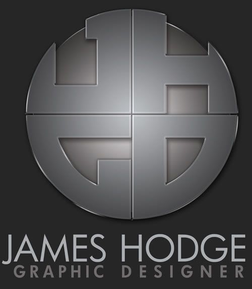
I'd been trying to come up with a logo that really fit me as a designer and a few months back I thought I was onto something but it wasn't quite there yet. I posted it here and got varied opinions, and went back to work on it. I think I've figured out what was missing, and this is what I've come up with.

Light Background Version
Dark.jpg


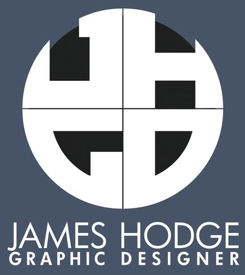
Dark Background Version
Light.jpg


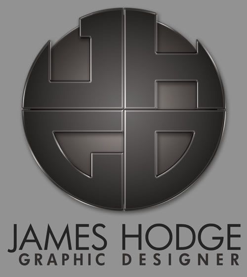
Basic B&W Version
Basic.jpg


I think ti incorporates everything a logo should; it's recognizable even when reduced to its basic elements, and iconic and (I hope) memorable. I couldn't decide which version I liked better between the light and the dark, but I'm bound to find a use for both in the future.

Let me know what you all think, and I'm completely open to suggestions.
 
I like the dark much better than the light. Somehow those edge glints on the light version don't look right. I also really like the B&W version.
 
All I can see are four letters on a circle. So, what are the ideas behind it that I'm so obviously missing? What's the concept? If you are planning on marketing your name as a brand (otherwise you wouldn't need a logo), then what's the idea behind your brand? Your philosophy? What makes you stand out from the rest?
 
Is it just me, or could there have been a more pleasant and cordial way of asking that question? It seemed needlessly snippy to me...

Anyway, to answer the question, the logo represents my key strengths as a designer, which I have found are simplicity, precision, consistency and attention to detail. Nothing is more simple or consistent than a circle. The basic shapes of the letters are lined up to exact measurements, down to the pixels. Each element of each letter lines up to the other 3 in some way. I am also known within the design community at my school for having very bold, clean and modern designs, as a lot of my inspiration is science fiction, specifically Trek. I feel this logo is a great way to incorporate that style without being too blatantly futuristic.

Does that answer the question?
 
I LOVE the second version... VERY corporate-looking. I can imagine it looming large on the wall of a large business skyscraper's lobby, behind the front desk. :)
 
Is it just me, or could there have been a more pleasant and cordial way of asking that question? It seemed needlessly snippy to me...

If you're going to make a career in graphic design, the only thing I can tell you is to get used to it. Clients are not going to be shy about telling you when things suck, nor are you going to be thrilled implementing many of the changes they'll want done to otherwise outstanding work. A thick skin is a real must.

As I mentioned in your previous thread, context is everything. A logo does very little in its own right. It can be cool as hell, but if it doesn't work in the context of stationery packages, ad campaigns, web banners, brochures, case studies, pens, apparel, hats, and etc, then it doesn't work at all.

How do you envision this logo being used? What does the James Hodge brand look like?

Also, you may want to draw up some basic versions for use on small collateral materials. Your renderings are fantastic, but I wonder how well the beveled edges will scale.

But, my post isn't without compliment: I think the work is extremely well rendered, and indicates a level of technical skill that will serve you quite well in the future. Good luck!
 
It is done well, but the logo looks very... authoritarian. It looks like something I expect to see on the side of a government building in 1984 or belonging to some other Orwellian or fascist regime.
 
Is it just me, or could there have been a more pleasant and cordial way of asking that question? It seemed needlessly snippy to me...
Perhaps.

But then I'm not trying to be pleasant, I'm trying to make you face facts. If you go for a personal brand identity, it has to be good, very good. That, and the fact that any clients you might get aren't going to be pleasant either is also a factor. Oh, they're going to be cordial enough, right up to the point where they'll 'suggest' to use Comic Sans, a combination of purple, red, green, yellow and blue colors, decide that they'd rather like the logo to be 10 times bigger and, after a few days worth of work, decide they like your first sketch better and refuse to pay for everything you've done since.

More often then not, you won't really like your clients. They won't really like you. And you'd rather hit them in the face with a shovel in order to try and slap some sense into them. But you can't; you'll simply do business with them. While most of the times you can't actually call them on it, they are inclined to think they can do it better then you, even though they're hiring you, not the other way around. Not only that, but while you're busy working your ass off, your client will pass your work on to his colleagues. And his boss. Who all pee on it, trying to mark their territory. And then it'll get passed along (and peed upon) further. In the end, all you're left with is a horrible distortion of what you really intended. Thus, you need to be good, if you want your work (and any messages behind the designs) to survive all that.

All right, so I'm exaggerating a little bit. Doesn't mean it's not true. As somebody already said, a thick skin is mandatory in this business.

Anyway, to answer the question, the logo represents my key strengths as a designer, which I have found are simplicity, precision, consistency and attention to detail. Nothing is more simple or consistent than a circle. The basic shapes of the letters are lined up to exact measurements, down to the pixels. Each element of each letter lines up to the other 3 in some way. I am also known within the design community at my school for having very bold, clean and modern designs, as a lot of my inspiration is science fiction, specifically Trek. I feel this logo is a great way to incorporate that style without being too blatantly futuristic.

I'm not really seeing your strengths represented here. Simplicity, perhaps, if you did away with all the light effects.

And down to the pixels? I do hope this is a vector logo?

There are some nitpicks I have with the thing. First off, it lacks color. As such, it becomes very sterile. You might want to eject more life into it; you're not a corporation after all. It's also very geometric; it lacks personality, especially with the Futura font you're using. The letter spacing seems a bit off to me. The "J" is too large if you're going all-caps; its tail conflicts with the line under it. It also doesn't really indicate to me what it is that you do. Somehow it looks like a camera lens to me, making me think you're a photographer instead of a graphic designer; and the fact that it says 'graphic designer' doesn't matter -- a logo should be good enough on it's own.

There also seems to be something off about the execution; it's blurry and unclean in several areas; it looks like you haven't really made up your mind if you want it to have a drop shadow or a metallic bevel; some areas look like they might be both. The whole thing is also quite static; you might want to inject some energy into it; rotate it a bit, make it into a perspective ball or something. The black/white version also raises serious questions; the lines between letters become very blurred at small sizes and I can't see how it looks on black or white; is there going to be an outline? How thick will it be?

Have you thought about different media? It's increasingly common nowadays to make the main logo a "full-color" one, but you'll still need adaptations for different media. How will your logo look on a fax, for example? Does the black/white version have enough simple, thick lines that it'll hold up in such a low resolution? How does the "full-color" version look on different backgrounds, not just light and dark grey? How robust is it? Does it have enough creative options for stationary? How will it look, printed on paper? Gradients are notoriously horrible when printed in cheap fashion and you're not expected to have the funds for high-quality materials if you're just beginning.

I can see on your website that this logo is clearly very similar to what you're already using. Perhaps it's a good idea not to try and 'better' the old one by filling up the square, but starting a new. I'm not saying this logo is unusable, however, it's usually not that bad to try and start something fresh. You never know; perhaps inspiration will strike you and you'll get an epiphany. Or perhaps you'll find the perfect solution for this one.
 
Is it just me, or could there have been a more pleasant and cordial way of asking that question? It seemed needlessly snippy to me...

If you're going to make a career in graphic design, the only thing I can tell you is to get used to it. Clients are not going to be shy about telling you when things suck, nor are you going to be thrilled implementing many of the changes they'll want done to otherwise outstanding work. A thick skin is a real must.

And I agree. I've worked with clients already. I know how they can be, trust me. However, you guys aren't my clients. I'm all for constructive crits, but there's no need to get snarky. We're all friends here.

As I mentioned in your previous thread, context is everything. A logo does very little in its own right. It can be cool as hell, but if it doesn't work in the context of stationery packages, ad campaigns, web banners, brochures, case studies, pens, apparel, hats, and etc, then it doesn't work at all.

How do you envision this logo being used? What does the James Hodge brand look like?

Also, you may want to draw up some basic versions for use on small collateral materials. Your renderings are fantastic, but I wonder how well the beveled edges will scale.


I agree that a logo must work in context. If you notice these days, a lot of logos only work if they have their accompanying word mark along with them...until they become well known. If Nike was invented right this very day, and someone showed you the swoosh logo by itself, would you know it was affiliated with a sports apparel company. Probably not. Marketing and advertisement has a lot to do with a logo becoming recognizable. Not all logos necessarily need to be in-you-face obvious about what they are.

As for scaling down, that's where the vector version comes in, which is represented upthread in the black and white version. The stylized version would only be used in much larger functions, while the basic logo would be used when its been reduced in size, printed on stationery, etc.

But, my post isn't without compliment: I think the work is extremely well rendered, and indicates a level of technical skill that will serve you quite well in the future. Good luck!
Thank you!


Is it just me, or could there have been a more pleasant and cordial way of asking that question? It seemed needlessly snippy to me...
Perhaps.

But then I'm not trying to be pleasant, I'm trying to make you face facts.

I've been in school for 4 years now. I don't need somebody on a forum to "make me face the facts." I value the opinions of everyone here but if you start taking the holier-than-thou arrogant attitude, that's a quick way for your advice to be quickly thrown out the door. If you want to give someone advice, give some thought as to how you give it, or it may end up falling on deaf ears.

If you go for a personal brand identity, it has to be good, very good. That, and the fact that any clients you might get aren't going to be pleasant either is also a factor. Oh, they're going to be cordial enough, right up to the point where they'll 'suggest' to use Comic Sans, a combination of purple, red, green, yellow and blue colors, decide that they'd rather like the logo to be 10 times bigger and, after a few days worth of work, decide they like your first sketch better and refuse to pay for everything you've done since.

More often then not, you won't really like your clients. They won't really like you. And you'd rather hit them in the face with a shovel in order to try and slap some sense into them. But you can't; you'll simply do business with them. While most of the times you can't actually call them on it, they are inclined to think they can do it better then you, even though they're hiring you, not the other way around. Not only that, but while you're busy working your ass off, your client will pass your work on to his colleagues. And his boss. Who all pee on it, trying to mark their territory. And then it'll get passed along (and peed upon) further. In the end, all you're left with is a horrible distortion of what you really intended. Thus, you need to be good, if you want your work (and any messages behind the designs) to survive all that.

All right, so I'm exaggerating a little bit. Doesn't mean it's not true. As somebody already said, a thick skin is mandatory in this business.

As I already said...you guys aren't my clients...and I've been through 4 years of school and working with clients. I know what it's like, and am well aware of what goes into a designer-client relationship. Honestly, you sound mildly bitter about your previous experiences with clients...


Anyway, to answer the question, the logo represents my key strengths as a designer, which I have found are simplicity, precision, consistency and attention to detail. Nothing is more simple or consistent than a circle. The basic shapes of the letters are lined up to exact measurements, down to the pixels. Each element of each letter lines up to the other 3 in some way. I am also known within the design community at my school for having very bold, clean and modern designs, as a lot of my inspiration is science fiction, specifically Trek. I feel this logo is a great way to incorporate that style without being too blatantly futuristic.

I'm not really seeing your strengths represented here. Simplicity, perhaps, if you did away with all the light effects.[/quote]

So it doesn't look clean, modern, precise or consistent to you? I'm trying to be open here, but I fail to see how you don't see that.

And down to the pixels? I do hope this is a vector logo?

The basic logo is, yes. The stylized version was created in Photoshop.

There are some nitpicks I have with the thing. First off, it lacks color. As such, it becomes very sterile. You might want to eject more life into it; you're not a corporation after all. It's also very geometric; it lacks personality, especially with the Futura font you're using.

First of all, there is color in both versions. There is a slight bronze hue to both stylized versions. It's not a slate grey, because yes that would be very sterile.

Second...it's supposed to look geometric. As I said, my design strengths center around being precise and detailed and design uses a lot of geometry. SO I also fail to see the problem with a designer's logo looking geometric.

The letter spacing seems a bit off to me. The "J" is too large if you're going all-caps; its tail conflicts with the line under it.

This I did notice, and have resolved. Updated versions have been uploaded.

It also doesn't really indicate to me what it is that you do. Somehow it looks like a camera lens to me, making me think you're a photographer instead of a graphic designer; and the fact that it says 'graphic designer' doesn't matter -- a logo should be good enough on it's own.

Well, it just so happens that I also have photography experience...although I am having trouble seeing a camera lens anywhere in my logo. And please, please explain to me how any graphic designer's logo would *say* that they're specifically a graphic designer by just the logo alone and without a word mark. You do realize that word marks are commonly a part of a logo, yes?

There also seems to be something off about the execution; it's blurry and unclean in several areas; it looks like you haven't really made up your mind if you want it to have a drop shadow or a metallic bevel; some areas look like they might be both.

This is where you completely lose me. Blurry and unclean? Where? Maybe you need a new monitor, because you're having trouble seeing color and lines look blurry. I could show you the vector file with the guides lined up...everything is lined up, nothing is messy or unclean.

Also..it has a bevel AND a drop shadow. What exactly is wrong with both? The idea is to make it look like a real 3D object...

The whole thing is also quite static; you might want to inject some energy into it; rotate it a bit, make it into a perspective ball or something. The black/white version also raises serious questions; the lines between letters become very blurred at small sizes and I can't see how it looks on black or white; is there going to be an outline? How thick will it be?

I've considered a spherical approach, basically wrapping it around a ball, but have never fully fleshed that idea out.

As for the lines becoming blurred...why would they? Most logos have a minimum size they're allowed to be printed. That's part of any brand standards manual. They impose that size restriction for that very purpose...to keep the logo from getting too small.

Have you thought about different media? It's increasingly common nowadays to make the main logo a "full-color" one, but you'll still need adaptations for different media.

Which is exactly what the "basic B&W logo" I posted in the original post is for...

How will your logo look on a fax, for example? Does the black/white version have enough simple, thick lines that it'll hold up in such a low resolution? How does the "full-color" version look on different backgrounds, not just light and dark grey? How robust is it?

Again, the basic logo would be used for any faxing or stationery. The stylized version would be used for web and larger format printing. Both logos word just fine on other backgrounds. Thats why theres a dark and a light version...depending on the lightness level of the background.

Does it have enough creative options for stationary?

Stationery. Stationary is when something isn't moving.

How will it look, printed on paper? Gradients are notoriously horrible when printed in cheap fashion and you're not expected to have the funds for high-quality materials if you're just beginning.

This is where you lose me. I'm a student and don't have a ton of cash to spend on materials, but I have never, ever had a problem with being able to afford quality paper and/or printing. What sort of paper do you print on that you have such bad results?

I can see on your website that this logo is clearly very similar to what you're already using. Perhaps it's a good idea not to try and 'better' the old one by filling up the square, but starting a new. I'm not saying this logo is unusable, however, it's usually not that bad to try and start something fresh. You never know; perhaps inspiration will strike you and you'll get an epiphany. Or perhaps you'll find the perfect solution for this one.

The logo on my website is indeed an older version. I've decided to brand myself not as a company (James Hodge Design) but as an individual (James Hodge - Graphic Designer) for a number of reasons. I also felt that the "filling up the square" balanced the logo out much better.

I'm not trying to reject any constructive criticism. I've actually implimented a change from something you mentioned that I hadn't noticed. But I'm having a hard time finding any real rationale for some of the things you're asking and suggesting, nor do I see any reason for the attitude you've presented here.
 
I've been in school for 4 years now. I don't need somebody on a forum to "make me face the facts." I value the opinions of everyone here but if you start taking the holier-than-thou arrogant attitude, that's a quick way for your advice to be quickly thrown out the door. If you want to give someone advice, give some thought as to how you give it, or it may end up falling on deaf ears.

If you don't want my advice, just say so. Really, it's no problem; I'll withhold it. I'm certainly not into forcing my views upon someone. However, you do misunderstand me: What I mean with 'trying to face facts' is a simple response to you assumption that I was trying to be "snarky"; it almost sounds as if you're a bit quick to be offended. I understand; a logo is like your baby; especially if it's your own logo. But you should be a bit hard on yourself in order to maximize it's potential. Especially concerning your own stuff. Clients will be hard on you as well.

As I already said...you guys aren't my clients...and I've been through 4 years of school and working with clients. I know what it's like, and am well aware of what goes into a designer-client relationship. Honestly, you sound mildly bitter about your previous experiences with clients...
Bitter? Nah. :D More a bit sarcastic. However, if you feel clients are going to be all friendly and subtle, you're in for a bit of a shock; clients at school are quite a bit different then clients in the real world. For one, they know you're a student and treat you accordingly. Two, usually, these are non-profit clients, or clients who don't want to spend money on the product you make for them. As such, they don't really have high expectations and are easy to please.

So it doesn't look clean, modern, precise or consistent to you? I'm trying to be open here, but I fail to see how you don't see that.
Because what I associate with those terms might not necessarily be the same things you associate with them. That's always the crux in designing logo's: you can put all sorts of meaning in them, but most people won't see it. All you can do is pick one or two and take an obvious way of representing it.

The basic logo is, yes. The stylized version was created in Photoshop.
Then it might be best if you made the stylized version in a vector program as well; fortunately, the effects you've used are very easy to do in Illustrator (with a bit of gradients, transparencies and effects). Besides, a Photoshop logo isn't useful at all; no matter how small you scale it; the anti-alias algorithms will always make it somewhat blurry. Not something you'd want in a Logo.

First of all, there is color in both versions. There is a slight bronze hue to both stylized versions. It's not a slate grey, because yes that would be very sterile.
The bronze hue isn't very clear to me. Even so, it would still be a sterile, bronze medallion of some sort; still a bit on the safe side, if you ask me. Why not try something different, something daring? You are trying to stand out of the crowd, aren't you?

I'm not saying you should paint it electric blue with lens flares. However, usually, when designing a logo, there's a design phase with a lot of sketches, a lot of tryouts. You're only presenting a single logo here; have you not fleshed out other possibilities?

Second...it's supposed to look geometric. As I said, my design strengths center around being precise and detailed and design uses a lot of geometry. SO I also fail to see the problem with a designer's logo looking geometric.
Using correct geometry is one of the basic steps in a design, true. However, your logo isn't meant to represent yourself to other graphic designers, it's meant to represent yourself to possible clients. They don't associate geometric shapes with design; they associate other things, like creativity, practicality or perhaps cost. Just a few things off the top of my head; it could be a lot of things, actually. The most important thing is not what you think about your logo, but what your possible clients think about your logo; the impression it makes on them.

Well, it just so happens that I also have photography experience...although I am having trouble seeing a camera lens anywhere in my logo. And please, please explain to me how any graphic designer's logo would *say* that they're specifically a graphic designer by just the logo alone and without a word mark. You do realize that word marks are commonly a part of a logo, yes?
It's not a resemblance of a camera I implied, it's the feeling I got when I looked at it. Very geometrical, some sort of iris, made of metal or black plastic. Just an impression.

Of course word marks are commonly a part of a logo, but a logo should usually also stand firm alone. Perhaps not at first, but certainly when the brand has become known. A logo doesn't have to resemble a physical object, but it if it does make the same impression as something that has no connection to the brand itself, that has to be a conscious decision, not a mistake. You can only break the rules if you know how to apply them correctly, you know. ;)

This is where you completely lose me. Blurry and unclean? Where? Maybe you need a new monitor, because you're having trouble seeing color and lines look blurry. I could show you the vector file with the guides lined up...everything is lined up, nothing is messy or unclean.
It probably looks blurry to me because it's been edited in Photoshop. Try to re-create the effects in Illustrator and then set them side by side; you'll probably see the difference. Or perhaps it's just the use of dropshadows and bevels and such that makes it look less 'clean' and 'clear-cut' then it could've been.

Also..it has a bevel AND a drop shadow. What exactly is wrong with both? The idea is to make it look like a real 3D object...
It's quite trendy, at the moment, to make a logo into a 3D object; so there's nothing wrong with that. However, it doesn't really do it for me; it doesn't really look 3D. Perhaps you could try playing with the settings, strokes, spaces, lighting etc?

I've considered a spherical approach, basically wrapping it around a ball, but have never fully fleshed that idea out.
Why not? If you're going to make a logo, try to flesh out ideas like these. They don't have to be perfect, they don't have to be correct down to the pixel, but they should give you a rough idea if it'll work or not. I do see a lot of potential in this logo, but it hasn't reached it, yet.

As for the lines becoming blurred...why would they? Most logos have a minimum size they're allowed to be printed. That's part of any brand standards manual. They impose that size restriction for that very purpose...to keep the logo from getting too small.
Yes, but as your logo stands now, the size you've shown us is about the smallest size you'll be able to get without the white space becoming indistinct. Not exactly practical, is it?

Which is exactly what the "basic B&W logo" I posted in the original post is for...
Yes, but the basic B&W logo is so completely different from your "full-color" one (that difference could be less, even keeping it black and white -- try changing the sphere to an outline, for example), that it might as well have been a different, similar looking logo all together.

Again, the basic logo would be used for any faxing or stationery. The stylized version would be used for web and larger format printing. Both logos word just fine on other backgrounds. That's why there's a dark and a light version...depending on the lightness level of the background.
Not everything is grey. How does it work on a white background? Black? Color, perhaps?

Stationery. Stationary is when something isn't moving.
My point still stands.

This is where you lose me. I'm a student and don't have a ton of cash to spend on materials, but I have never, ever had a problem with being able to afford quality paper and/or printing. What sort of paper do you print on that you have such bad results?
It's not the paper; it's the printing process. Even if you design a logo in vector format (instead of Photoshop, as you have done), the gradients will become a dot pattern; that's the basics of printing, you know that. Usually doesn't look very good in a logo, unless you take specific steps to combat the problem.

I'm not trying to reject any constructive criticism. I've actually implimented a change from something you mentioned that I hadn't noticed. But I'm having a hard time finding any real rationale for some of the things you're asking and suggesting, nor do I see any reason for the attitude you've presented here.
Try to show your logo to more non-designer people, see how they react. Don't say anything, even show the logo without the text. What do they see? What do they feel? What does it look like? Etc.

And, as stated above, I'm simply trying to give advice, but I'm not going to be all cushy and fluffy on you while giving it. I don't see why you would expect me to. I'm not standing here on a soap box trying to explain to you how the world works; you should know that already, at least for a bit. All my posts are IMO, unless I state something to be a fact. As far as I can tell, it works that way with most people.
 
Last edited:
DiSiLLUSiON, I'm sorry but you do come across as very prick-ish. That arrogant superiority complex you're sporting is going to do wonders for any of your clients wanting to work with you.

Considering where Flux Capacitor is at on his career path (just out of school, new business) his quality is ahead of most other at that same point in time. You steam-roll this guy like he was some 40 yr art design veteran designing a logo for a multi-million dollar company. Would you bitch out a 5 yr old for not painting like a Van Gogh?

We are colleagues here not clients. We are here to support each other and lift each other up a level. Sure, many of your crits are true, but your tone flat sucks. God, I hope you don't talk to your clients that way. Being a good advisor and being diplomatic is 50% of landing and keeping clients, skill is the other 50%.

It's not what you say but how you say it.
 
DiSiLLUSiON, I'm sorry but you do come across as very prick-ish. That arrogant superiority complex you're sporting is going to do wonders for any of your clients wanting to work with you.

Considering where Flux Capacitor is at on his career path (just out of school, new business) his quality is ahead of most other at that same point in time. You steam-roll this guy like he was some 40 yr art design veteran designing a logo for a multi-million dollar company. Would you bitch out a 5 yr old for not painting like a Van Gogh?
I'm sorry; why do you believe I have an arrogant superiority complex? Do I have to say "I believe" in front of every sentence? As I said; all my post are my honest opinions; no arrogance there. I don't know it all, and I never pretended I do! All I can do is show what I do know. By laying it out in clear terms, it's easy to spot the areas where I don't know everything; that way, it's easy to spot what advice is good and what is not, when you're more experienced then me.

I'm at the same path in life he is, just graduated some time ago, first job etc. just not the exact same area of expertise. I just try my damned best to give some good advice where I can. Of course I'm bound to have some things wrong; but I do hope that it's enough for the TS to get something good out of. And I don't think I'm that hard on him; I'm just seeing a bit of "well, here's my logo, I haven't tried much else but ta-da". If he had posted more tryouts and/or concepts, I would have approached a lot differently; I'm just not seeing a lot of the process that usually accompanies the creation of a logo/identity. Still, I'm a lot harder on myself; you can't expect to thrive in this business without trying your best. And until proven otherwise, I believe everybody wants to strive to be the best they can be.

We are colleagues here not clients. We are here to support each other and lift each other up a level. Sure, many of your crits are true, but your tone flat sucks. God, I hope you don't talk to your clients that way. Being a good advisor and being diplomatic is 50% of landing and keeping clients, skill is the other 50%.
Of course I don't talk to clients this way; why would I? They're not asking me about my opinion, they're giving me a job; that's something completely different.

It's not what you say but how you say it.
I do lack in communication skills, that's true. :D And, people have often told me my posts on forums do sound different, less friendly then in real life.

But I try, I just don't believe in diplomacy all that much, especially among colleagues. They should be able to be honest to each other; to learn from each other. If I ask a colleague for advice on a project, I surely don't want it sugarcoated with a cherry on top; that'll serve nothing except to straighten ruffled feathers and stroke my ego. If it's complete rubbish, I want to hear it's complete rubbish. If a colleague asks my advice, I expect that person to value my honest opinion, limited in experience as it may be compared to himself. If not, why ask it in the first place? If that something is rubbish in my eyes, I'll say that and state the reasons. Of course, due to his personal opinion and/or experience he might not even agree with 99% of what I say. But at least I'm honest, even though I do show my inexperience plainly that way.

Anyhow, I do apologize if I come off as arrogant or simply a dick. I simply want to help the TS to have the best logo he could have -- I try to give the best advice I can; I'll understand if it's not good enough, or if I could have phrased it better.

Let's start over. :D

Hi, good logo, bit on the blurry side. Could you show us some concepts you did, other avenues you've taken?
 
Last edited:
It's basic psychology here. If you beat a guy over the head with a laundry list of crits, he is going to bristle up like a porcupine, get defensive and not listen to you. Your goal of 'helping' someone out has now completely backfired.

Just dial it back a bit ok? lol
 
It's basic psychology here. If you beat a guy over the head with a laundry list of crits, he is going to bristle up like a porcupine, get defensive and not listen to you. Your goal of 'helping' someone out has now completely backfired.

Just dial it back a bit ok? lol
That's true; didn't really think about it in that way. :o See? inexperience at work here. ;)

All right, I'll try.

I'm sorry I beat you over the head with a crit-list, Flux Capacitor. If you still like some pointers (on how to recreate the effects in Illustrator, perhaps?) I'd be more then willing to help.
 
Last edited:
Like I said, the logo itself exists in Illustrator but the effects were done in Photoshop. Since the stylized logo with effects won't even be reduced very far in size, if it's ever printed on any stationery at all, I see no reason to create a stylized version in Illustrator. In my experience Photoshop is much better for effects and stylized renderings. It could just be that I'm about a million times more proficient in PS than I am in Illustrator. I'm always open to learn new things about Illustrator though so a walk through or a write up would be appreciated.

Something I might not have mentioned or gone into detail...this isn't for a business. I'm not starting my own graphic design company (at least not yet) This is strictly my identity to use on my design portfolio and my booth at the portfolio show I'll be in at the end of school...so it will only be used on a few things, specifically my book itself, the poster on my booth showing who I am, and on my resume, business cards and give away items.
 
Last edited:
If you are not already a member then please register an account and join in the discussion!

Sign up / Register


Back
Top