• Welcome! The TrekBBS is the number one place to chat about Star Trek with like-minded fans.
    If you are not already a member then please register an account and join in the discussion!

Spoilers New season 3 badges

Can we not get personal and derail this thread? I know the urge is strong but after 3 years of Discovery no ones mind will be changed. Discovery hatred is rampant and best just move on.

And I need to listen too.
 
Last edited:
I don't care one way or the other until I can see it better..........it's kinda like upgrading your phone if you jumped 1000 years ahead. If they want to communicate with folks on the new 5000G network they needed new hardware.
 
I would hope they would also invent 5000 SPF sunblock to protect people from the radiation coming out of that thing as well. :lol:
 
4biv1SM.jpg


Reminds me of the 30th anniversary logos.
StarTrek+Logo_linda_frost_design.jpg

star-trek-generations-tc.jpg
Couldn't remember what it was reminding me of but this is it thanks. I thought that that generations crest was gonna be the badge when the movie posters came out and was disappointed so if they use them now :bolian:

Could be similar to PIC visitor badge too.(sorry can't do pics from my phone)
 
This is nonsense. The DS9/VOY combadge didn't exactly have "personality" if you want to look at it like that. It was what it was. The TNG combadge was okay. In 30 years of being a fan, I never really thought about it.

You're reaching. And everyone knows it.
I met the Voyager combadge once in a pub. She was a real arsehole had a terrible personality where as the TOS combadge was a real gent at the conventions and always hung round after to chat to the kids
 
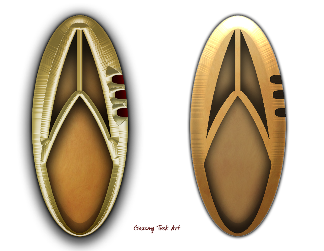
I guess, for me, the thing that's most noticeable with these badges (or rather noticeable because it's not noticeable...) is the Starfleet arrowhead / delta symbol: it very much looks like it will be all but completely lost against the background ellipse when seen from anything other than pretty close-up or, just possibly, when seen from exactly the right angle for the light to catch the various polished and matt surfaces of the new badge

All the other variants have pretty much maintained and emphasised the primacy of the arrowhead emblem as the main feature of the badge, regardless of the shape or features of the background.

Again, there may be a specific plot point here... maybe they're deliberately trying to downplay the overt "Starfleet" look of the badge in response to whatever the new political reality is in the future they have entered; it may be that these actually are the Starfleet badges from that time period. We just won't know this for sure until season three plays-out.

So far, we have seen Burnham wearing what appears to be a gold badge on her blue/silver Sciences uniform and Culber and Pollard wearing silver badges on their white/silver Medical uniforms. I'd be curious to see if they choose to use the full range of gold / silver / copper badges to match the department / branch colours they have previously established for the Discovery-era uniforms.

To expand on my last sketch, here's a quick image to give some idea of what the broader range of badges *might* look like...

pmWbTYA.png
Very nice! These look cool, but I'm actually seeing them a little differently. Will be interesting when we'll get a clear look and see who's less wrong. :lol:

jujEEOj.png
 
You could well be right! :D
It certainly looks like a relatively tall, slim badge with a much longer vertical axis compared to the horizontal.

I've been compensating slightly for the fact that the only pics so far are from relatively oblique side angles, which will distort the true shape somewhat. I have a feeling that when we see them properly "face-on" the overall shape will have a slightly fuller width -- but it's all just extrapolation and guesswork at this stage.

Like the original Disco badges, they seem to have a mix of matt (or at least "satin") and polished surfaces. Looking again at the Burnham pic, I suspect that I have over-emphasised the 3D depth of the arrowhead relative to the background. Indeed, it may even be that the symbol is just etched surface on an otherwise plain, polished, slightly domed ellipse (and the same etching for the rank marks). Looking closely at Pollard's badge, there's just a hint of a protrusion beyond the rim of the ellipse, suggesting that end of the longer limb of the delta does indeed stand slightly proud of the edge of the background, whereas the views of Culber's and Burnham's badges (seen from the other side) have a smooth edge to the ellipse, suggesting that the short limb of the delta ends at or within the rim of the background.

We'll see... :hugegrin:

It could be that we're only seeing it from the side so far and it appears to be a longer oval ;)

Hell, from First Contact I thought the Enterprise E saucer was round from certain angles. We didn't have the depth of knowledge and images on the internet that we do now. I though AMT got the model so wrong.
 
Very nice! These look cool, but I'm actually seeing them a little differently. Will be interesting when we'll get a clear look and see who's less wrong. :lol:

jujEEOj.png


That’s nicely done.
Yes, they could easily look more like this.
I suspect you are right in that the delta component is probably offset to one side. I *think* the tip of the longer leg of the delta just protrudes beyond the edge of the ellipse.

However, I like the fact that you think of it in terms of who is “less wrong”...! :hugegrin: I’m sure my attempts aren’t all that close!

I can’t say I’m particularly taken with what I have seen so far but then neither am I particularly bothered by it and I’m certainly not going to lose any sleep over it! :angel:

It’s just a bit bland and I think it’ll simply look like a gold or silver ellipse when seen from any distance. I hope they prove me wrong!

I’m hoping we get some better images soon although I wouldn’t be entirely surprised if they deliberately keep these a bit vague until Season 3 is actually released.

I wonder if the logo for Generations really was at least part of the inspiration for this badge — it would be a pretty big coincidence if it wasn’t!
 
Last edited:
See, to me, that area under the arrowhead looks painted black, like the one pip on Culber's, but then not so much on Pollard's, but again on Burnham's.

This madness must end!
 
There are two darker areas that are quite obvious on the badge in the Burnham pic; these are the lower part of the oval and, above it, the slightly triangular, recessed part of the arrowhead (which is, presumably, continuous with the rest of the oval).

I suspect what you are seeing is the shadows on the polished part caused by the very directional studio lighting for the promo stills, whereas some of the other areas are catching and reflecting that light.

My best guess is that the surface of the background ellipse is polished (including the debossed section inside the “cut-out” part of the Disco-style arrowhead. The main surface of the arrowhead, including the rim around the cut-out, is matt/satin finish, as are the rank marks down the side of the oval.

Does that make sense...?
:shrug:
 
I’d personally make the center dividing line off-center to the right, but that’s just me. Seems to be a recurring theme in all post-Berman Trek uniform design.
 
Not to be negative, but if you are going to update the badges, why not change out the uniform too? I assume its budget driven, but I would not have missed the navy blue uniforms...
 
If you are not already a member then please register an account and join in the discussion!

Sign up / Register


Back
Top