• Welcome! The TrekBBS is the number one place to chat about Star Trek with like-minded fans.
    If you are not already a member then please register an account and join in the discussion!

New Logo

^Definitely reminds me of the opening titles in Iron Man, especially after Salvor colored it gold.

I wish, I really wish someone could take the Star Trek logo and do it in the style of Star Wars.

Is this possible? Are there people here with the dark art skills necessary to do such a deed?

Of course - it's needs 'JJ Abrams Presents" just above it.

;)

daveyNY -- Those are very nice :techman:...

However, I am more of a traditionalist:
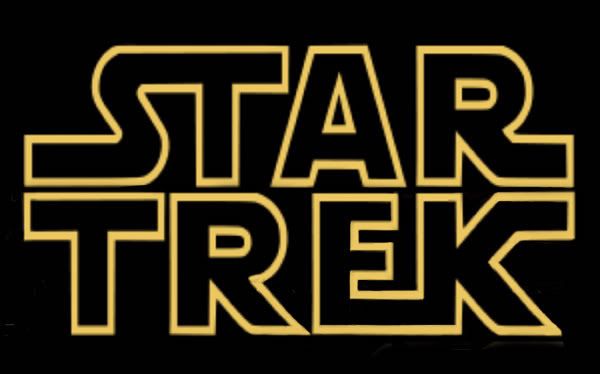
ST_SW-3_smaller_JPG.jpg
 
Last edited:
If people flip out about this, then they really need to get out more.

This is the internet, flipping out over stuff like this goes with the territory.

So, it seems, does flipping out over people flipping out before anyone has actually flipped out.

BAM! took the words out of my mouth!

Though I have to warn people that Plumster is not to be taken too seriously, I mean that in a good way.
 
^Definitely reminds me of the opening titles in Iron Man, especially after Salvor colored it gold.

I wish, I really wish someone could take the Star Trek logo and do it in the style of Star Wars.

Is this possible? Are there people here with the dark art skills necessary to do such a deed?

Of course - it's needs 'JJ Abrams Presents" just above it.

;)

daveyNY -- Those are very nice :techman:...

However, I am more of a traditionalist:

ST_SW-3_smaller_JPG.jpg

Very Nice...

I started out with something like that, but it seemed too much like a Cartoon Version.

That's why I altered mine a bit for Trek, just like JJ and Gang are doing.

I just wish someone at the studio had a wicked sense of humour and had put that out rather than what they did put out.

Thank you for all your efforts - can someone add 'A Bad Robot Production' and a 'JJ Abrams' film please?
 
Can't say that I dig the new metallic look. Its cold and lacks depth (despite the extra dimension).

I thought the previous logo font was just fine...stylish and had a Trek feel.

This new font also reminds me of "The Transformers". I liked that movie, but they are supposed to be different franchises.
 
Last edited:
That takes e back to the opening scene of the first film - the narrative scrolls up the screen, the camera pans down toward a sandy planet, the Federation shuttle zooming overhead firing back at something and this seemingly unending, massive Klingon Star Destroyer flying overhead. Best opening to a Star Trek movie ever.
 
^ in the logo, the letters are too far apart, ergo, too much kerning.
But as I understand kerning, it's the adjustment of space between problematic letter combinations to make it look proportional. Like the combinations S, T and A or T and R. The mere space between the letters is called tracking. Looking at it in that way, the kerning is done rather good. There's less space between the S and the T than there is between the A and the R, which accounts for the space left and right of the T.

But all nit-picking aside, I agree with your sentiment, there's too much space between the individual letters. This classic font works better without them, in my humble opinion. :)
 
Still the same letter font.
It still uses the classic font, after all!

Nope. It looks like it was done with one of the knock-off TrueType "Trek" fonts that never get the upper left corner of the "E" rounded off as it should be.

Looks like the nuBSG text logo - using metal instead of solids. Nice.

:confused: Aren't most metals solid?

In general, I have to agree - the spacing overwhelms the text - it doesn't have the presence of the stacked and tightly-spaced design. It would be okay across the screen in the opening credits, but as a logo, it's pretty weak.
 
The TrueType fonts floating around out there almost universally mess up the proportions and stroke widths of the characters; this logo gets them right (I just finished building a custom font for the "Exeter" end titles; we got by with a few custom Lightwave objects for the opening). The rounded "E" appeared in the italicized Trek logo but rarely in any use of the normal version of the font on the original series (which is probably why the Truetype fonts miss it).
 
Not very distinctive or iconic. It looks too much like plain block letters now.

But it does have a similar font, so that's nice.
 
It looks kind of like Ben Hur to me. I liked the ones from the trailer and the Superbowl commercial pretty damn great. But whatever.
 
If you are not already a member then please register an account and join in the discussion!

Sign up / Register


Back
Top