-
Welcome! The TrekBBS is the number one place to chat about Star Trek with like-minded fans.
If you are not already a member then please register an account and join in the discussion!
You are using an out of date browser. It may not display this or other websites correctly.
You should upgrade or use an alternative browser.
You should upgrade or use an alternative browser.
Never seen TOS scenes...again....
- Thread starter Warped9
- Start date
CaptainHawk1
Commodore
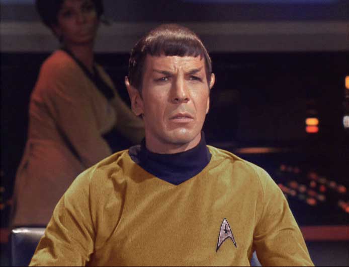
Ah, Michael Ansara. No wonder the face looked familiar.
I thought it was Edward James Olmos.

Yep, very cool. Wow, the comparison really shows off just how much work you put into it. So essentially you used the base uniforms and changed color/insignia. How did you change the color hue so closely?You mean something like this?
{snip}
But yeah... I was watching Squire of Gothos earlier today and thought it would work nicely as a foundation.
") I know Photoshop has a couple of hue adjusters, but I've not quite figured out how to make best use of them yet. Did it involve color sampling as well?
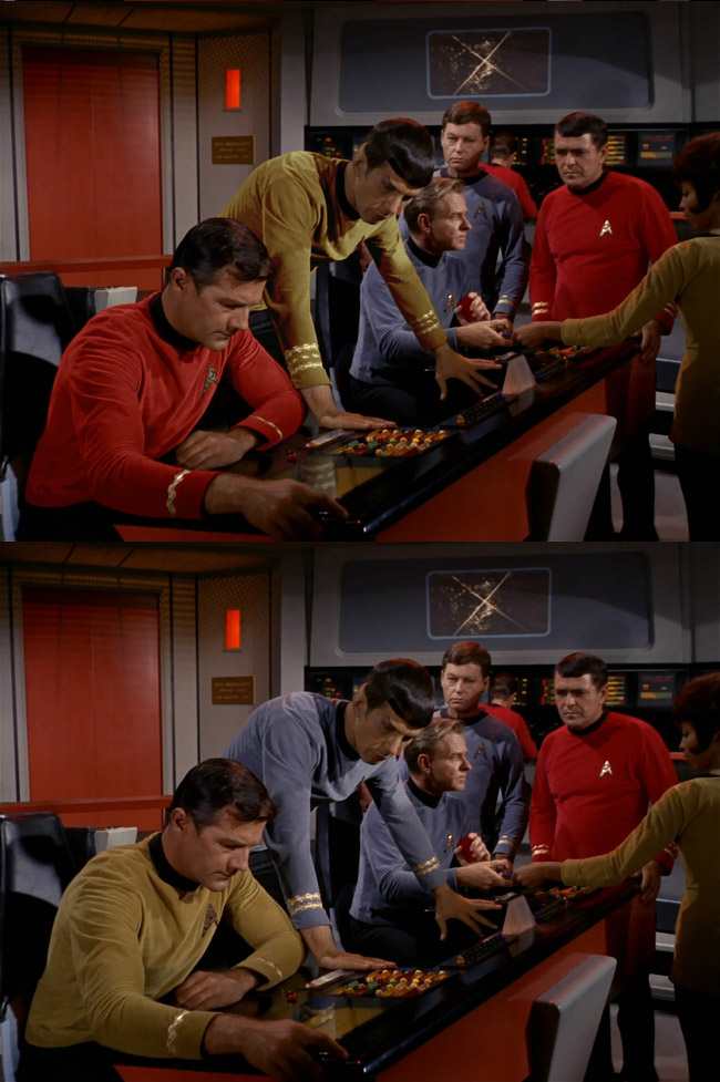
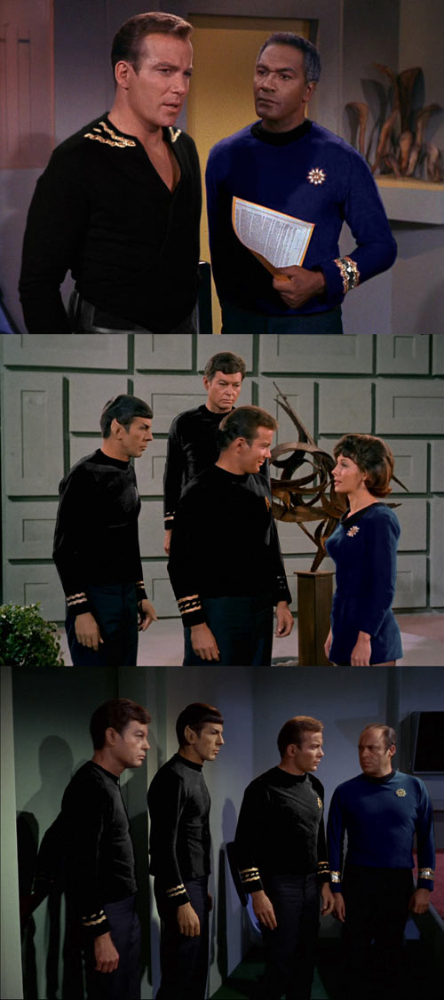
I know Photoshop has a couple of hue adjusters, but I've not quite figured out how to make best use of them yet. Did it involve color sampling as well?The base uniform colors all desaturate to the same shade of gray... the reason for this was so that people watching the show on Black & White televisions wouldn't know that the uniforms were different colors while watching, making the experience of seeing the show on a color television that much more pronounced.
This means that once desaturated, I can bring any uniform back to any other color if I want. What is nice is that it preserves the shading/shadows of the original uniform.
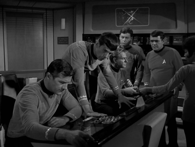
This is the original shot fully desaturated.
Basically all I do is create a new layer, desaturate it, crop out everything else but the uniform, then work to bring the color back to which ever branch I want (though it helps if someone else in the shot has that color for me to match up with). So the two main tools are Color Balance and Hue/Saturation. More often than not, I don't get the exact color I want in Color Balance and end up making adjustments in Hue/Saturation.
This is an example I did a while back.
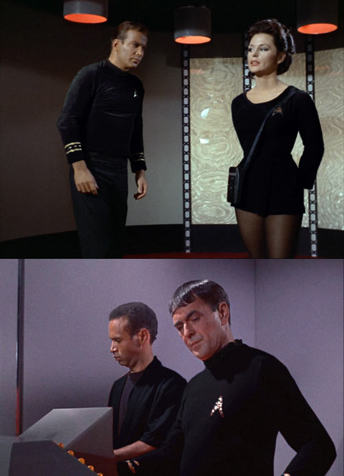
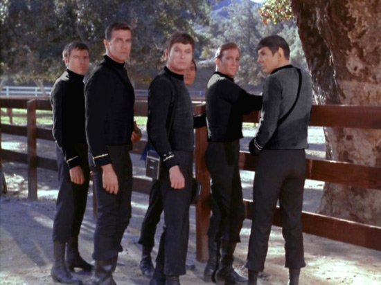
One doesn't have to go back to any of the original colors... I tried out black not too long ago.
This means that once desaturated, I can bring any uniform back to any other color if I want. What is nice is that it preserves the shading/shadows of the original uniform.
This is the original shot fully desaturated.
Basically all I do is create a new layer, desaturate it, crop out everything else but the uniform, then work to bring the color back to which ever branch I want (though it helps if someone else in the shot has that color for me to match up with). So the two main tools are Color Balance and Hue/Saturation. More often than not, I don't get the exact color I want in Color Balance and end up making adjustments in Hue/Saturation.
This is an example I did a while back.
One doesn't have to go back to any of the original colors... I tried out black not too long ago.
Thanks for the details, Shaw. It makes perfect sense. Hmmmm... it opens up lots of possibilities.The base uniform colors all desaturate to the same shade of gray... the reason for this was so that people watching the show on Black & White televisions wouldn't know that the uniforms were different colors while watching, making the experience of seeing the show on a color television that much more pronounced.
This means that once desaturated, I can bring any uniform back to any other color if I want. What is nice is that it preserves the shading/shadows of the original uniform.
Btw, very cool effect with the black uniforms. Especially nice "black velvet" look with Dr. Helen Noel.

Helen: (singing) "Black velvet.... if--you--please."

")
I love the black and dark blue uniforms Shaw. Very nice.

Comic Book guy voice: best photoshop ever!.^^Hey I think I found from photo stills from that rare episode!In Simpson's Comic Book Guy voice: What about that rare episode of Star Trek Phase II where Lorne Greene guest starred dressed as William Adama from BSG?


Seriously though that is awesome!
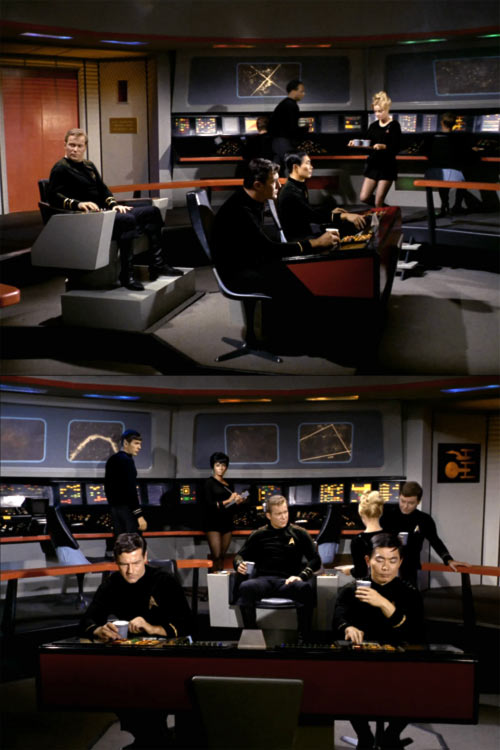
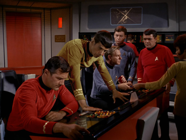
Good sequence of shots.I was catching up on my reading today and came across this innocent posting, which brought me back (again) to one of my favorite themes...Captain Spock.
A few years ago I put together these images of Spock in command...
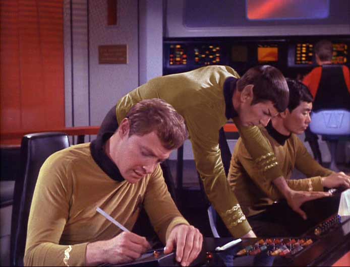
... and determined that Spock would most likely have an unfortunate tendency to micromanage. Strangely enough, when revisiting the idea it is hard not to reach the same conclusion.
 Believable, too, considering Spock is First Officer. Well done.
One doesn't have to go back to any of the original colors... I tried out black not too long ago.
The blue is nice. But while the black is interesting it's kinda jarring and looks more like t belongs in the Mirror universe.
TAS meets chiaki and ona.
I really enjoy the website photo of chiaki and ona, http://chonastock.deviantart.com/gallery/#Star-Trek-Series-1 as well as TAS so I created a little photoshop montage using this TAS image as inspiration.


I really enjoy the website photo of chiaki and ona, http://chonastock.deviantart.com/gallery/#Star-Trek-Series-1 as well as TAS so I created a little photoshop montage using this TAS image as inspiration.
The base uniform colors all desaturate to the same shade of gray... the reason for this was so that people watching the show on Black & White televisions wouldn't know that the uniforms were different colors while watching, making the experience of seeing the show on a color television that much more pronounced.
This means that once desaturated, I can bring any uniform back to any other color if I want. What is nice is that it preserves the shading/shadows of the original uniform.
This is the original shot fully desaturated.
Basically all I do is create a new layer, desaturate it, crop out everything else but the uniform, then work to bring the color back to which ever branch I want (though it helps if someone else in the shot has that color for me to match up with). So the two main tools are Color Balance and Hue/Saturation. More often than not, I don't get the exact color I want in Color Balance and end up making adjustments in Hue/Saturation.
This is an example I did a while back.
One doesn't have to go back to any of the original colors... I tried out black not too long ago.
On the black unis, I would have reversed them, and have the collar be the departmental color.

The all black uniforms look very cool. Great work on everything though.
That is one scary pic, dude. Shatner looked better aged in "The Deadly Years."
If TOS kept going with Shatner in command
Similar threads
- Replies
- 482
- Views
- 60K
- Replies
- 0
- Views
- 66
- Replies
- 5
- Views
- 774
If you are not already a member then please register an account and join in the discussion!