Follow along with the video below to see how to install our site as a web app on your home screen.
Note: This feature may not be available in some browsers.
Welcome! The TrekBBS is the number one place to chat about Star Trek with like-minded fans.
If you are not already a member then please register an account and join in the discussion!
Ah that one, yes. That one is turd I'll give you that, the older 'montage' ones I like that I was referring to are TMP, TWOK, TSFS, TFF TUC, the TNG ones all seemed to have their own style of poster, which while different but just as good in their own way. I would so like them all framed but it would cost me a fortune!
^ Why is it "turd"?
Yeah it doesn't look like the actual Enterprise in the movie (ie the nacelles, saucer section.) But it's still a great drawing/painting
I just don't think it's any good - obviously a lot of skill has gone into the painting of the Enterprise, but the composition, dull colour and the cast photos at the bottom make it look incredibly cheesy and dated whereas the original rainbow TMP poster is colorful and exciting - it doesn't look like it even belongs to the rest of the posters in the movie series, it's very 'Space 1999'
I was using the term 'dated' as a criticism, the poster in question looks 'dated' but not in a good way IMO, whereas the original TMP poster, whilst aged, still looks great to my eyes and conveys an epic feel with great use of color that the other one fails to do for me. Obviously this is all subjective but thats why I started the thread, I'm interested to see other opinions on this.
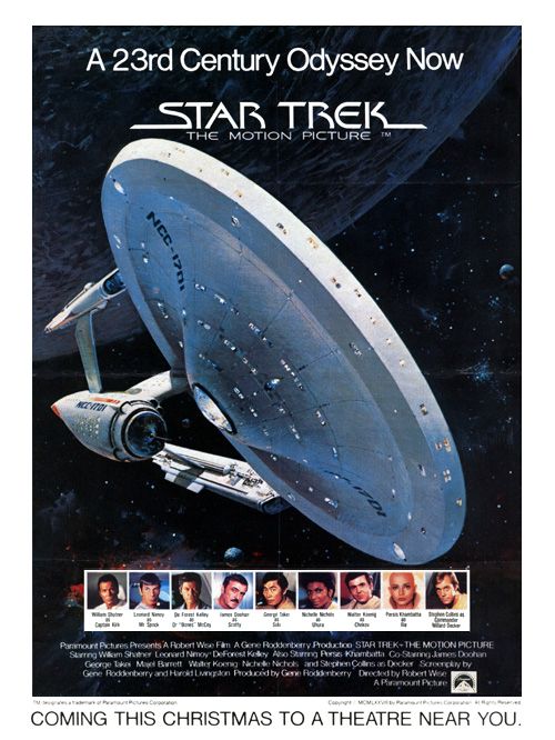