• Welcome! The TrekBBS is the number one place to chat about Star Trek with like-minded fans.
    If you are not already a member then please register an account and join in the discussion!

Enterprise Pic

Dayton Ward said:
Aragorn said:
No, I mean the James Horner seafarer-type music from Star Trek II and III. :)

::: does Jedi Master finger wave :::

No, you mean Jerry Goldsmith.

::: does Jedi Master finger wave again :::

;)

Yeah, keep that up and I'll start declaring Cliff Eidelman or Leonard Rosenman as the ultimate Trek composer. :p
 
ancient said:
I did some brightness/contrast manipulation and erased the big boom out of the background. Then I traced over it. The layers below are the result.

[image]http://img165.imageshack.us/img165/9260/00newentqx1.png[/image]

Looks like those things under the bridge are staying.

Could you post more pictures in which the color and brightness/contrast and gamma have been adjusted?

This could reveal more detail.
 
Here are some comparison shots that i ,, borrowed,, from other ST site. :p
Enterprises.jpg
 
SeamusShameless said:
The synopsis of the teaser says that the ship is being constructed planetside.

Ah, gotcha. I've been purposely steering clear of info about the trailer until I can see it. Thanks for the additional info.

Manticore said:
TrekkieMonster said:
I know the conversation has gone well beyone this by now, but after getting home from work and looking at the pic on my own monitor I felt I needed to note that, now, I too can see a definite Gabe influence.

You're all definitely right about the "bulginess" of the forward end of the nacelles, just behind the bussards. Just about identical. Likewise the general shape of the saucer, itself, down to what someone up-thread described as a "step" below the traditional B/C deck teardrop construct.
Actually, the 'steps' are quite different. On Gabe's, it's a difference in the gradiant, but it still flows from the saucer. On the Abramprise, it's at a sharp angle and has a sharper chamfer. Also, it's inset so that it's lying on a flat surface.

The only real similarities that I see to Gabe's version is the nacelle's and the slightly more solid intercooler (though Gabe's doesn't flow into the hull nearly so much). Of course, this is based off of saying maybe 20% of the ship; who knows, the secondary hull might be completely different!

Sorry if I wasn't clearer in my earlier post. When I said "general shape of the saucer", I meant that to also apply to my comments about the "step". I'm not saying it's identical to Gabe's, but the fact that it exists at all is reminiscent of Gabe's design, as is the cowling behind the bussards. Again, it may not be identical, but the only place I, for one, have previously seen these particular design elements is on Gabe's model some months ago.
 
Scott Hayden said:
Here are some comparison shots that i ,, borrowed,, from other ST site. :p
Enterprises.jpg

This picture only further cements my beliefs into the 'Its A Reboot' camp. I just can't buy the new look fitting in before the TOS one. It looks more like a stage in between TOS and TMP.
 
After seeing the nacelles on the new 1701, I'm starting to see why Gabe K's version made the SotL calender. What better way to gage fan reaction to the new design than to hide it (or elements anyway) in plain sight. Looks like Gabe's may have been a bit of a "pathfinder" to soften us up a little.
 
Dale Hoppert said:
Methinks you've spent too much time staring at this pic today. That's not a dot after the second C, it's a dark bit of hull plating. And this is a dead-on view of the ship... the seam up the middle of the saucer is centered.

As for the "Where was she built?" controversy... this is not a scene from the movie, It's non-canonical. It's all there just to have the play on words "Under Construction" and it's set on earth so we won't see any spacesuits which would be a dead giveaway that it was a spaceship they're constructing. It's an elaborate visual joke. This teaser is meant for an uninitiated audience who won't even consider such issues as "Why are they building her on the ground?"

This is a good tell for the general look of the redesigned ship, but the "plot" of this teaser reveals nothing about the movie.

While I agree with the overall sentiment, that's all speculation. It may or may not have anything to do with a scene in the movie.

The early TF teaser with the Mars Rover had everyone scratching their heads, and everyone assumed it wouldn't have anything to do with the movie. But it did end up appearing in a limited fashion.

So you might see the E under construction, you might not. Might be in space, might be on the ground. We'll have to see. From the sounds of the trailer description I've read, the camera angles and focus of the trailer doesn't lend itself very well to the actual movie, but that doesn't mean we couldn't see similar construction shots in the movie. It's all anyone's guess.
 
decompiler said:

Let's say there are 3 ships are being built at any one time in San Francisco. If the ships were built on ground, wouldn't 3 ships cover an area the size of San Francisco itself? That's why I see floating ship yards. Something just short of orbital dry docks.

The Enterprise isn't that big, especially the original. Even downtown San Francisco covers many square miles, check out the fan-pic earlier in the thread of the Enterprise in a dry dock, it's accurate. In fact, the comparison in length between the star ship and a modern super carrier is a pretty good one, just under 1000 ft (280-290 m). CVN-65 is actually 1100 feet long. You could put 10 Constellation class ships into just Golden Gate Park quite easily, and almost fly one clear under G.G. Bridge at low tide.

Now the Galaxy class is a pretty big ship, you could basically fit the CVN-65 into one of it's engine nacelles. Twenty five times the volume of the original.
 
Not to ruffle feathers, but is it possible that the apparent size of the nacelles in the 'classic E' shot is being influenced by the camera lenses that were used in the 1960's filming of physical models -- creating a distortion of the proportions of the nacelles...

and that the nacelles of the new "E" are the same diameter?
 
I keep staring at it and thinking

"this is what "Enterprise" should have had"

I know the movie has a larger budget than "Enterprise" and it shows. The first shots of the NX-01 pale in comparison to what can be done on the big screen
 
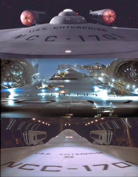
In the gamma-adjusted images, it's clear that these nacelles DO resemble Gabe's. They aren't Gabe's however. The "guts" on the inside of the bussards are totally different, and the topside "window" on his nacelles aren't present.

However, the "hoodie" on the top, over the bussards... that is virtually identical to his work. And since he is the FIRST person I ever saw who did that, I sure hope he gets at least a small credit for that.

Honestly, I'm not really taken by these nacelles. I was hoping that, in the dark view we were able to see on the screen, that we were seeing them partially completed. But that's not really true... they're MOSTLY completed, it seems.

Ah, well... the nacelles WERE designed to be virtually "hot-swappable" so as long as what we're seeing isn't intended to be the Enterprise as commanded by Kirk, I can deal with it. Hell, I have no major problem having this be the Enterprise as it was FIRST commanded by Pike. Or the Enterprise in an altered timeline... or whatever.

It's easy to explain away that part, so far. The short form is this... someone took Gabe's "nacelle hoodie" and is using it, but those aren't Gabe's nacelles as he showed us here.

That's also not Gabe's primary hull. Not even close. One thing that stood out about Gabe's primary hull, TOPSIDE at least, was that he was really pretty faithful to the original up there. What we see here is far LESS faithful than Gabe's work, up there, was. Granted, he did a lot of what I considered to be pointless "graphics art" stuff up there... color variations and so forth... but overall, it was VERY reminiscent of the original.

I'm not thrilled by the replacement of the nomenclature or the font (go ahead, rip into me over that one... but I'm just having a hard time seeing what's being gained by changing that stuff). Of course, as has been pointed out, it's not hard to strip off paint and put new paint on, so perhaps the "FJ Font" is supposed to represent what was originally done, the "Machine Extended" font used in TOS was put on later (maybe the 1701 wasn't refit to "Cage/WNMHGB" status at SFNY, but at some other starbase, and they used different stencils there?). It's not hard to explain, just hard to justify... ya know?

The A/B/C-deck superstructure is... troubling. Because if this is representative of what's going to be seen on-screen (and honestly, that's still not KNOWN, though it's definitely being implied here)... they've kept "general appearance" but abandoned FUNCTIONAL elements that we've all known for the past 40+ years. It's... troubling. Not because it will make for a bad movie, but rather... it begs the question of "why make this change?" I can't see how it would make for a better, or a worse, movie, in and of itself. Can any of you?

SO... if things are being changed "just because we can" without any real logic behind them, THAT would concern me. We can all live with changes... and we all know that SOME changes are inevitable. But if they don't add something to the mix... if they're just being done because someone wants to change stuff to "make it my own," that doesn't bode well.

I like how it looks, from a purely artistics standpoint. If this weren't clearly portrayed as the ENTERPRISE, I'd be perfectly happy with it. But I'm somewhat MORE concerned now than I was before, because it reflects changes that add nothing to the mix other than "well, we COULD, so we DID."
 
Franklin said:In the theater I expect to hear:
-- at least one painful groan,
-- a loud rant followed by storming out of the theater,
-- someone breaking down in sobs,
-- a "Fuck you, Abrams," shouted out of nowhere,
-- a cry of, "They HAVE raped my childhood," and
-- Junior Mints thrown at the screen by someone.

While the rest of us enjoy the cinematic beauty of it all.

-- Oh, and someone's cell phone will go off. Always happens.
Faith of the Heart ringtone. Check. :lol:

Samurai8472 said:
I know the movie has a larger budget than "Enterprise" and it shows. The first shots of the NX-01 pale in comparison to what can be done on the big screen
Make that a much larger budget but at the end of the day it's just two hours. Enterprise still has some of the best television CGI, even compared to series running today.
 
The old girl never looked better. Going to see Cloverfield and the teaser this afternoon!
 
OK a question...

Why is everyone so sure the construction scenes in the teaser will not be in the movie ? I keep reading this in this thread...

Anyway the picture looks nice and i hope we see more soon.
 
I think it's funny that the first pic revealed of the big E is A) under constuction, and B) a shot of the bridge exterior. We're all talking about it, but we still don't know what it looks like yet. Abrams and co. are going to play with us for the next year. This feels like it will be Batman 89 type hype.

Looks good so far. :bolian: :thumbsup: :bolian:
 
If you are not already a member then please register an account and join in the discussion!

Sign up / Register


Back
Top