Yes, the colors are used in this arrangement to indicate direction of travel. Depending on the angle, for instance if you are head on and it's dark, you don't be able to tell if the plane is coming in your direction or not.
I'm going to guess that it was screwed up for that shot. Because that is wrong wrong wrong wrong wrong.
What always irked me is why some models for alien designs also used that red/green convention for port & starboard, that should technically be a humans-only thing. I remember seeing some Klingon ship model with red/green running lights and I thought, why not make them pink and yellow? Why have them at all? Who's to say that another alien race sees the same visual light spectrum that humans do? Then I thought that I was over-analyzing it and stopped. :-S
So this is off topic, but is it just me or are all the starships on Discovery missing red and green nav lights?
Not all. I've done a lot of research on Discovery ships due to my job as a ship artist on STO, and it's wildly inconsistent. The new Enterprise has the appropriate red and green, but the Discovery, Shenzou, and Section 31 ship, for instance, have blue. Then again I think there are ships that are present in the Battle of the Binary Stars in which they have red and green nav lights. Interesting...the original teaser for Discovery in which they revealed they were using the McQuarrie design has the appropriate red and green, but they were changed to blue later in the production.
Unlikely, since they were "correct" in the teaser and then he was gone. Having seen Hannibal and PD, I have no doubt he micromanaged it to be that initial red/green and having seen DSC, I have no doubt the post-Fuller showrunners did not micromanage that aspect, just a broad directive to make everything glowy blue.
To be fair, I've seen my share of actual aircraft where the starboard light tended bluer than greener. Star Trek made that part of my education a no brainer.
I had the sense that Fuller was pushing for some TOS accuracy in production that was reversed when he left. Didn't the Europa have TOS typeface for the hull lettering and name in the trailer? I miss that. Would have been nice for Discovery to reference specifically TOS, instead of the all-encompassing everything-post-TMP-but-mostly-TNG.
According to Eaves' book, Fuller was the one that requested the square nacelles. So I don't think he was pushing for TOS accuracy at all.
Guys, I just realized I left off the small red ring decals circling each of the navigation lights. Minor fail. 
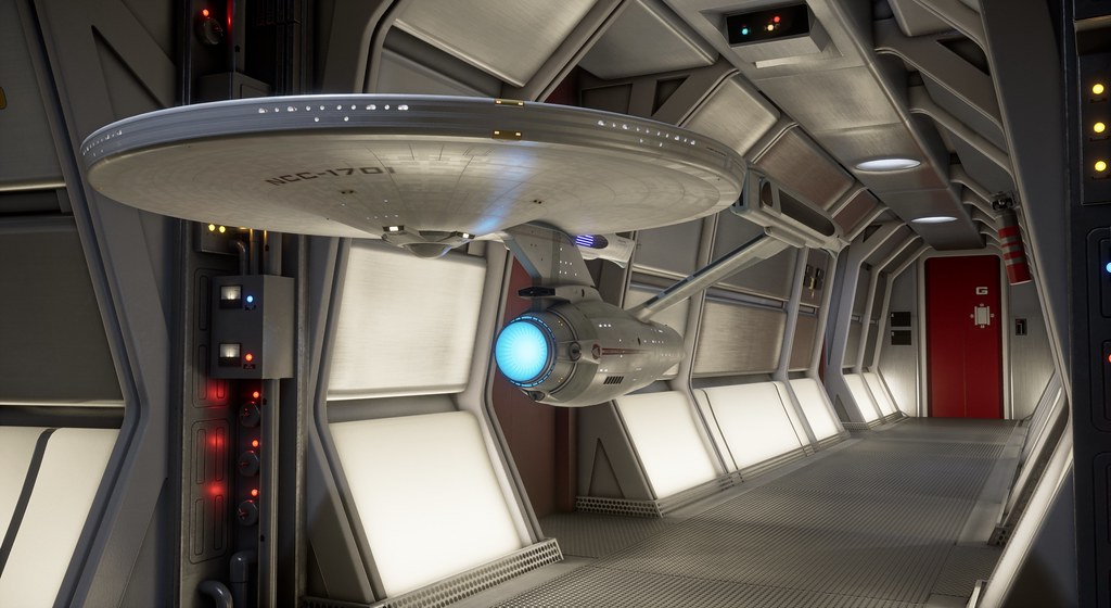
But an easy fix. Not taking new renders just for that though. I’m also finding it very hard to take this “break” I keep saying I need. Hmm...
I apologize @Donny. I mistakenly thought the inside brackets of the warp nacelles (in front of the glowy grilles) has a white light but I can't seem to find any examples of it and I think it is unlit. From TMP wormhole scene, Approaching Cloud, and V'ger hit. Other than that, fantastic renderings and close-ups of your Enterprise! In the DVD version (I'm watching it now), the top port and starboard lights of the E-A are white (no colors). Is this picture from a magazine?
Yep. Not only are there shots in trailers of the Europa with TOS markings, there's even a shot in the actual episode of the Shenzhou with them. There are also scattered production sketches where the ships use the TOS fonts and, apparently, one of those was used as reference by Eaglemoss for their Buran model, since it uses the TOS font instead of straight-up Microgramma as in the show. I've been really curious about what led to the back-and-forth over that, since the Comic-Con preview and the leaked shots of the models as done by the first in-house VFX team all used Microgramma, then the TOS font started showing up on production art and trailers, and then finally the show came out and it was all Microgramma and TMP pennants (and, honestly, I'm not sure what bothers me more, not using the TOS font, or not using the custom TMP variant of Microgramma with the "1" that doesn't look like a "7").
That must be the case. In the Blu Ray it seems the lights are correct, though the colors are barely discernible, especially on the starboard side. Different color grading in TFF makes the port light warmer and the starboard light dimmer. In TUC, the color grading is different again, but the lights are still correct.
I had forgotten how many “portholes” the NX-2000’s bridge had back then. Kinda weird to look at, actually.
It's a publicity still. I had a (gorgeous) poster of that. But look at the greebles that surround the deflector. The port and starboard ones are missing.
Hmm. Perhaps I should wash out my nav light colors as well. On film they always appear washed out it seems. It's a shame, I like the color they add to the model.